
⟿ lighting, again

"T R A U M A"
..lighting, again.

˓ ִֶָ𓄲 ☁️ BEFORE WE START 𖦹 ࣪˖ ˒
This is not as complex/detailed as the chapter before this one, because it is all based on my own experience and opinions this time.
Just a little disclaimer beforehand, we all constantly learn new things and improve, I also still make mistakes and stuff. So this really is just me gathering a few infos from the Internet and sharing stuff that has helped me personally.
⛓
˓ ִֶָ𓄲 ☁️ EXPOSURE, KINDA 𖦹 ࣪˖ ˒
To get the overall lighting and exposure right is much more difficult than one might think. I still struggle with it too.
₀₀₁ bright concepts:
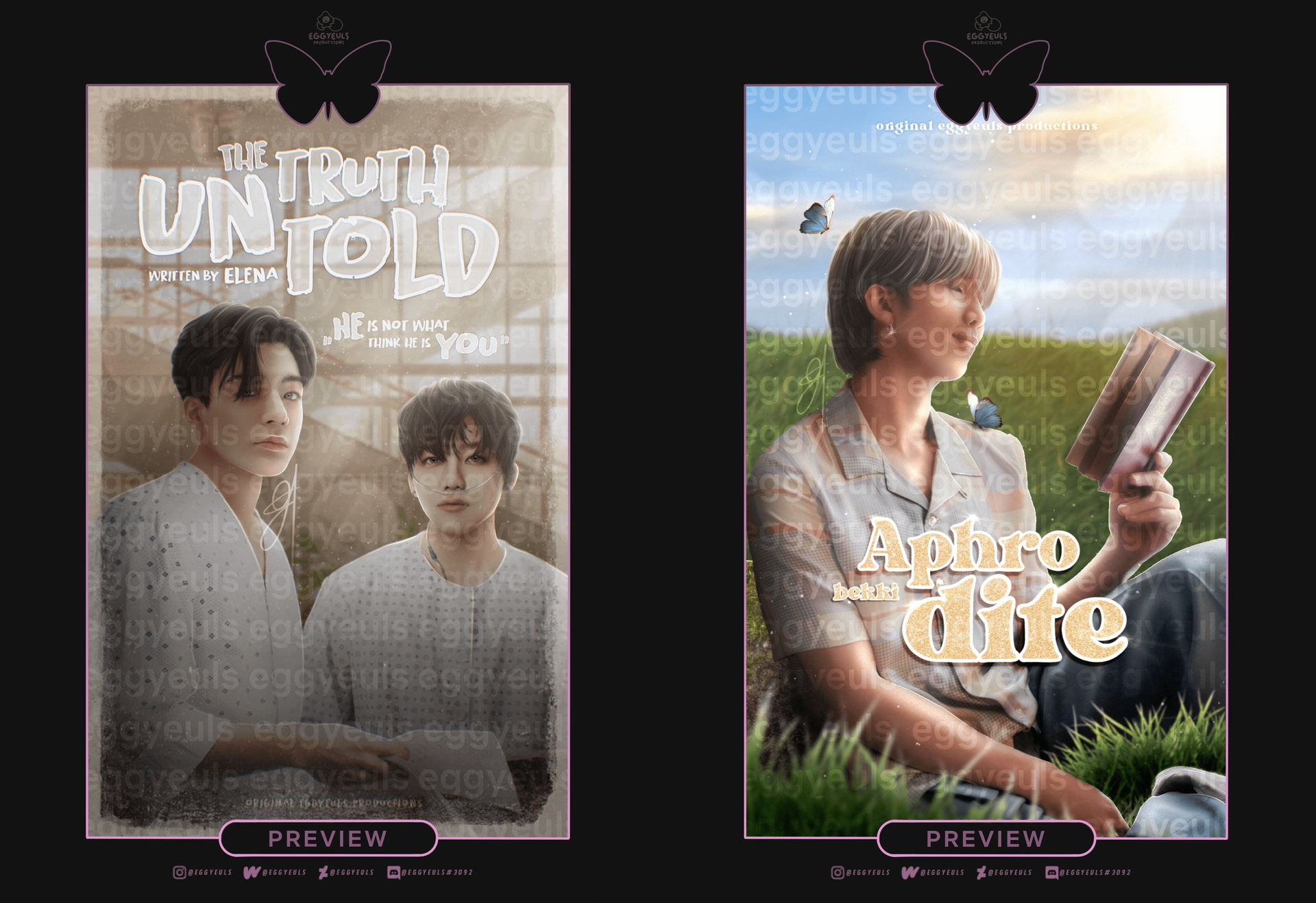
Actually I would like to let the examples speak for themselves.. but one thing I got to mention is that bright concepts expose much more mistakes you make than darker concepts, whether that be colors not being blended well enough, patchy surfaces, textures and so on. Maybe it is just me, but to pull off bright concepts flawlessly is quite difficult. As soon as I have to work with bright concepts I loose about 2/3 of my skills. Suddenly I can not handle textures anymore, I struggle to get facial adjustments (contouring, highlights etc.) right and just light adjustments in general. To get light adjustments right on bright concepts is already difficult, but if the models also wear bright clothing it is over, that is the end boss. Brighter hair too, like blonde, white or anything that is not dark brown really. But hey, just because it is not my cup of tea, does not mean it is not yours either — maybe you are gonna be a pro at bright concepts, who knows.

I do like to look at graphics with bright/vibrant concepts and just watch others work on them, but I really hate to work on them myself.
Yet people keep on requesting them from me.. I mean, practice makes perfect I guess, but this is slowly turning into torture.
₀₀₂ dark concepts:
Now, dark concepts are obviously my favorite children. You can easily hide so many (tiny) mistakes and flaws in between shadows and all, that is if you know how tho. Obviously dark concepts can not save everything you fuck up. But overall I still prefer working with dark concepts, as I feel like it gives you also more opportunities to play around with light sources and more intense highlights, especially for neon themes for example. But that is just my opinion and I also have not worked on many bright concepts, which makes it difficult to make a good comparison between both.
(I would add examples here too, but I have already added enough dark designs as examples throughout this whole book to "prove my point", plus I can not add any more images to this chapter at the moment.. sorry!)
₀₀₃ filter & colorings:
Now, whether your original work has a bright or a dark concept, some filters and colorings can really switch it all up, depending on the presets used and their intensity of course. Tho that does not mean it always works in your favor. The example down below shows the original on the left and an edited version on the right. I basically just threw some psd colorings from deviantart on it and also adjusted some curves for exposure and colors myself. It does have some sort of aesthetic, but I would not say it is a really pleasing one. Lots of smaller details got swallowed, especially the sparkles and glow, as well as darker areas being mashed together (her body can barely be separated from the dark background on the right example).
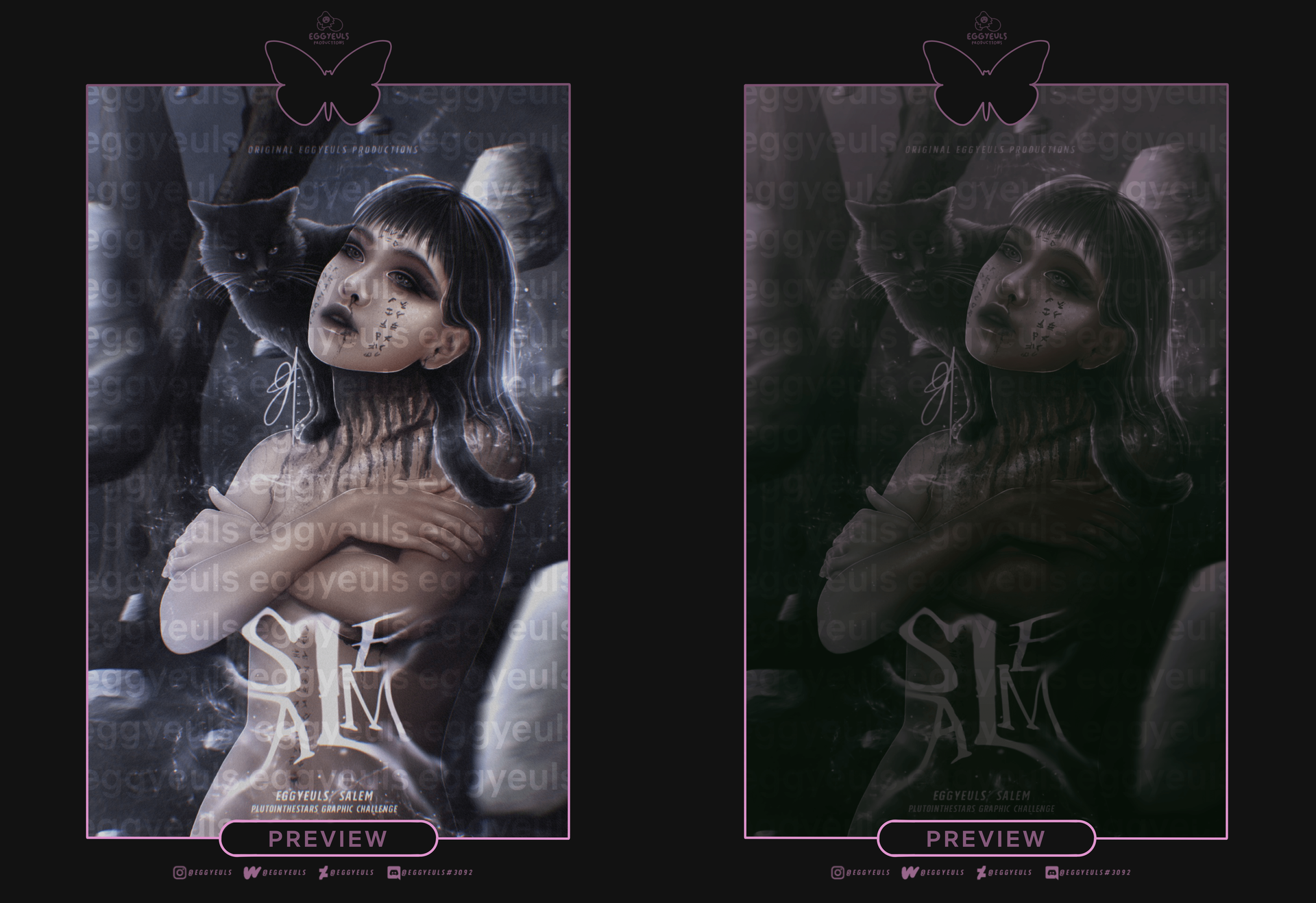
You can definitely use psd colorings and other presets/features to easily adjust the exposure and colors, but do not expect them to work wonders for you.
₀₀₄ devices & stuff:
This may sound ridiculous, but no one sees your project the same way as you. Not only does it depend on how they see light and colors themselves (like, naturally, the way their eyes and brain work), but it also depends on the devices that are being used to display the artwork (or whatever else). For example, my phone got a completely different kind of display than the iPad i am working with when creating something. On my phone everything is a bit less saturated and got this „milky"/more brightened kinda veil over it. I work at night and at that time everything of course looks much more vibrant and sharp, whereas in a bright room or at day it looks a bit different already. It is hard to explain, but long story short: every device displays colors, lighting and all that differently. On smaller displays details (whether that be highlights, colors or shadows) also get swallowed more easily, in comparison to what you are able to catch up on when looking at the artwork on a really huge display. Which actually leads us to the next topic...
⛓
˓ ִֶָ𓄲 ☁️ WATTPAD'S TINY PREVIEWS 𖦹 ࣪˖ ˒
Now, one thing you should keep in mind is the tiny a$$ image/preview Wattpad displays for the book covers, especially on the app. And I am talking about the actual cover previews, not the images displayed inside chapters.
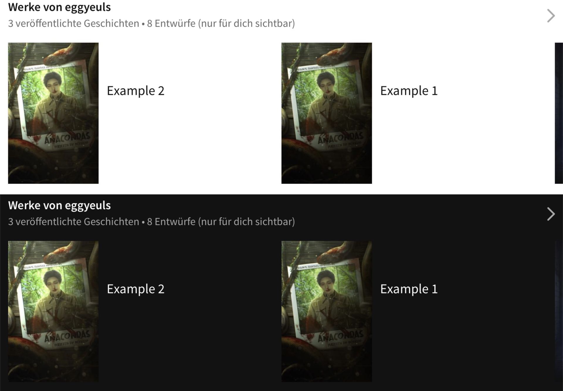
It is really frustrating most of the times, as a lot of details get swallowed or mixed together. Colors can suddenly appear much differently (Wattpad hates red), gradients or shadowy areas can suddenly appear like a big dark splotch and so on. So when working on a cover for wattpad, keep that in mind and make every a bit brighter than you would have originally intended to, sometimes that can save some of the details. As it can be seen above, "Example 1" is the original design and "Example 2" is the same design but a bit brighter overall. It doesn't always work wonders and this might not be the best example, but it does help sometimes. Tho dark covers always appear "too dark" with the bright wattpad version.
Not me giving tips when I forget about them myself all the time, which leads to my works often being way too dark in the end — no matter how nice they may look up close, they always suck as tiny previews.
⛓
˓ ִֶָ𓄲 ☁️ DETAILS.. AND STUFF 𖦹 ࣪˖ ˒
I do not really know how to summarize this section and on the other hand it is not even everything I would like to talk about (but i almost reached the max amount of images I can add to a chapter). Of course we could try and talk about how lighting works and how to edit in in much more detail, but I am not good at providing detailed tutorials and rather keep it generalized instead of making things helpful for only a certain amount of people (which would be those that would use the exact same devices and edifying methods as me then). Enough said tho, let us move on.
₀₀₁ balance:
Of course sharp highlights and "outlines" have always been some sort of trend and probably always will be. I do them myself I'm a lot of my works. But it is important to try and balance out dark details and bright details on your design. If you add highlights, you also need to add softer glow and of course shadows and contours to really help make the details stand out in the best way possible. Down below are a few examples to further explain what I mean.
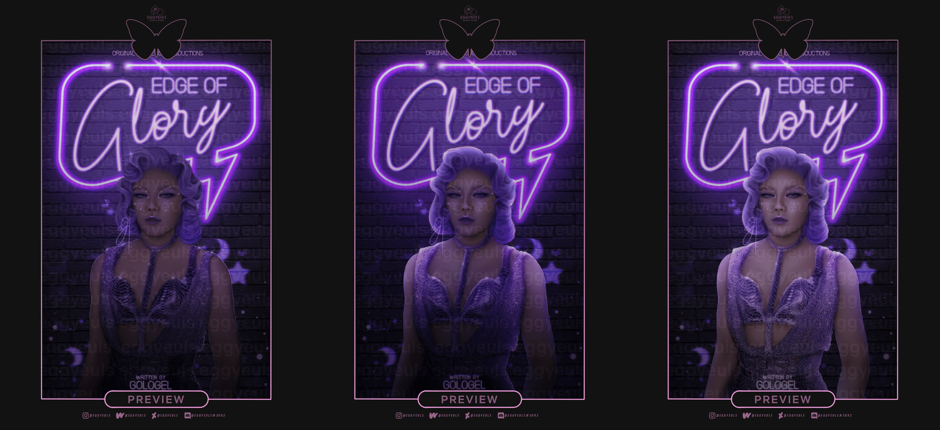
As for the example above we have the final version in the middle, a version without much contouring or shadows but lots of highlights on the right and another version with a lot of contouring and shadows but without much highlights or glow on the left. Only sharp outlines or lazily smudges/blurred glow will not do the job. You need a balance of both to make it work out (and look at least halfway realistic). Even tho I still have to learn such things too and am nowhere near being a pro at this yet.
Another example to show how important it is to pay just as much attention to contouring/shadows and darker details as you do when it comes to colorful and bright highlights/glow.
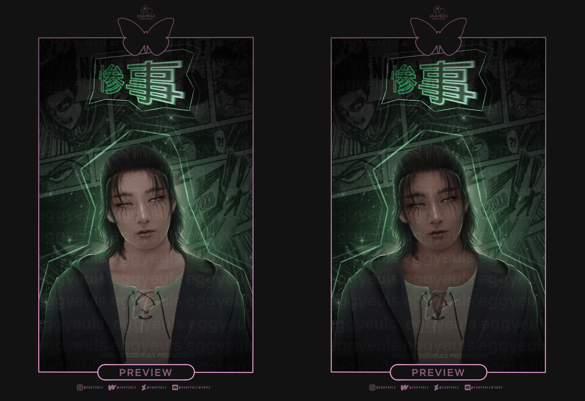
₀₀₂ details:
When saying "details" I mean things like bokeh effects/brushes, glitter, dust, simple glow and all that stuff. Sometimes it can really work wonders and change the whole atmosphere — Whether it is a bright or dark concept. Just look at the examples down below. On the right side we have the final versions and on the left side I added the raw versions, without any details such as glow, bokeh or whatsoever.
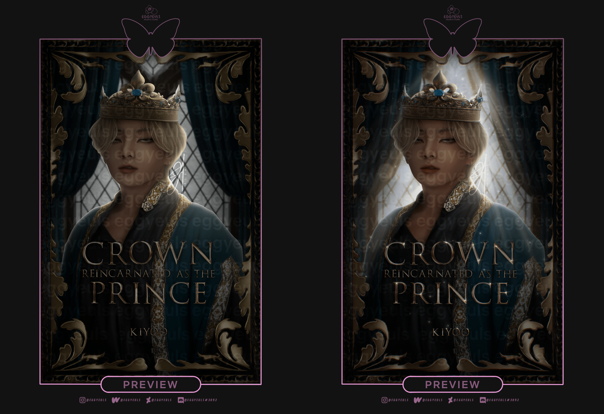
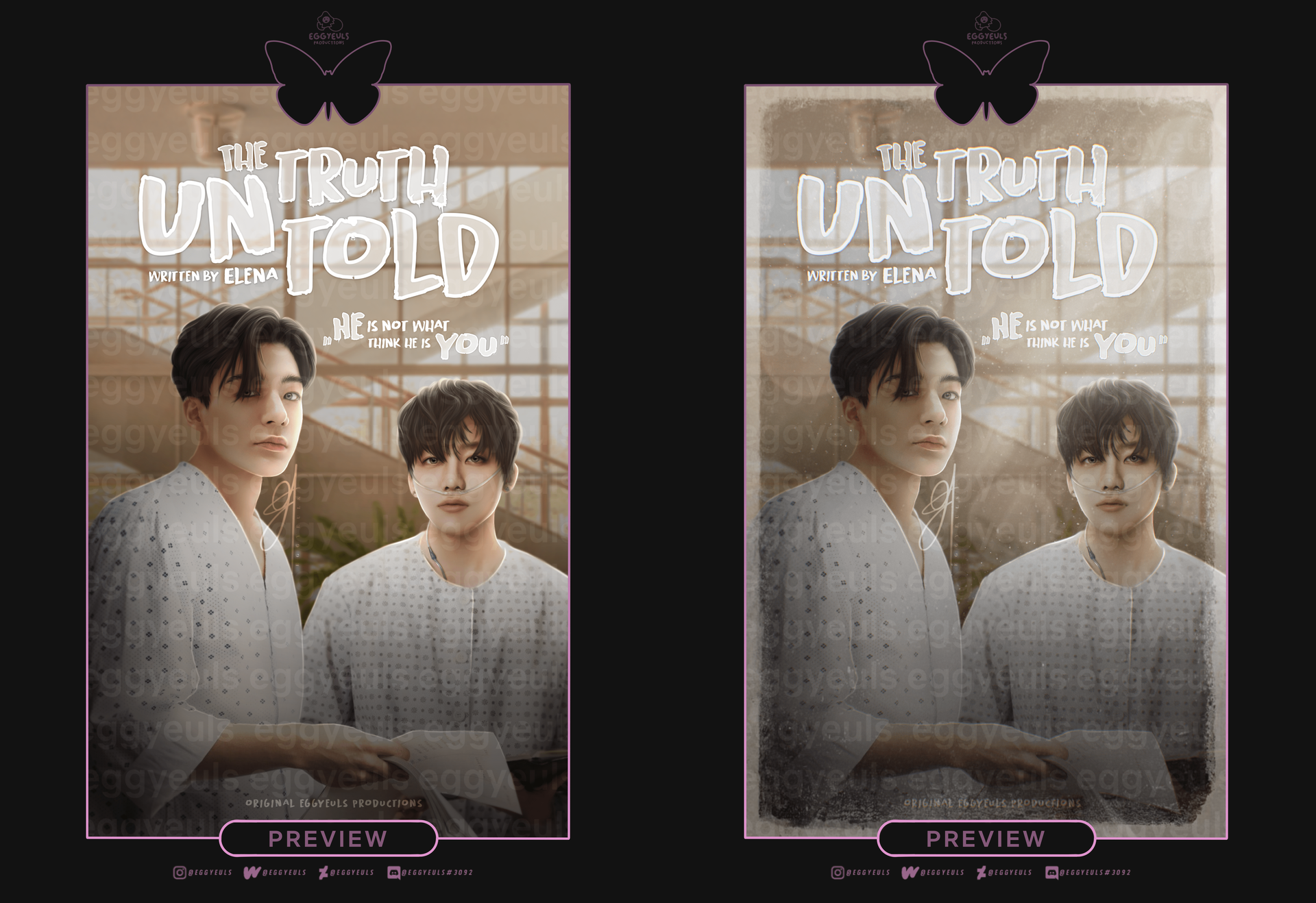
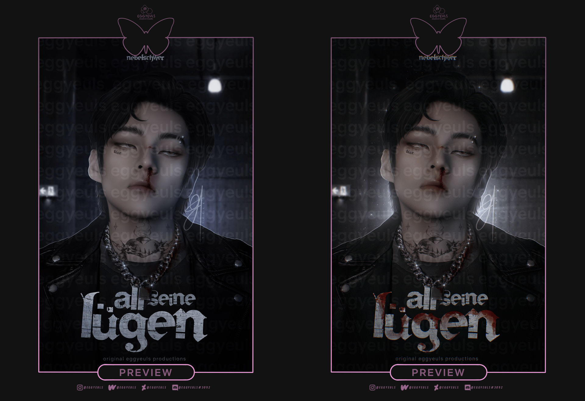
These kind of details can really help make some parts (whether that be models or something like else) stand out, guide the attention of the viewer, pull the whole piece together or just set a certain mood. And everything looks pretty with a bit of glitter.
₀₀₃ creative freedom:
Of course there are certain physical laws that we can not just ignore. But just like that we also have our creative freedom.
My graphics also are not always accurate when it comes to lighting or what would have been actually realistic instead. But that is the fun thing about any form of art, or does not always have to be perfect or accurate.You are free to experiment with various concepts, editing techniques and just try whatever makes you happy or works best for you.
⛓
˓ ִֶָ𓄲 ☁️ SOURCES 𖦹 ࣪˖ ˒
SOURCES 𖦹 ࣪˖ ˒
Down below is a summary of all sources used for this chapter.
₀₀₁ Text(s):
No external ones actually, everything said are my personal opinions/experiences
₀₀₂ Image(s):
All of them are my very own (intellectual) property
₀₀₃ Information(s):
No external ones actually, everything said are my personal opinions/experiences
⛓
© eggyeuls, 2022
Bạn đang đọc truyện trên: Truyen247.Pro