
𝗡𝗼𝘁𝗵𝗶𝗻𝗴 𝗯𝘂𝘁 𝗙𝗼𝗻𝘁𝘀
𝗡𝗼𝘁𝗵𝗶𝗻𝗴 𝗯𝘂𝘁 𝗙𝗼𝗻𝘁𝘀
Hey everyone!
This is just a short chapter to discuss something that is very close to my heart.
Fonts.
I adore everything about them. From the styles to the swashes to the special glyphs and everything else in between...they are simply magical.
One day, I hope to be rich enough to afford the demo fonts I use for my personal covers.
One day, if I ever publish original books, I'll probably scrape up the money to be able to afford the license since I would've trained myself to enjoy designing with these pretties.
But that's not the focus of today's chapter.
I'd like to discuss something called unique font placement. Or what I like to call font play.
This is more than just finding the right way to place your title on your cover. It's about how it interacts with your overall design.
Not just letting the text mesh with the image but how the size and strategic placing of the font influences how eye-catching the cover becomes.
Font play doesn't really mind how long or short your title is, but I've seen longer titles look better with it. Shorter titles tend to call for larger fonts as well, which can make font play seem interesting.
But what exactly do I mean by 'font play'?
Well, you've prbably seen it in action many times. Especially on paranormal or fantasy covers.
- That backwards R in a title.
- The size disparity between fonts in a single-word or multiple-word title.
- The usage of a similar object to replace a letter in the title. Think of a moon PNG to replace the letter O. Or the blade of a sword to replace a lowercase L or I.
- Text that conforms to the shape of an element on the cover design. Like a drape or dress. Common for illustrated covers.
The above are the simple examples but there are more variations, I'm sure. Some that I can't even behind to wrap my head around (which means I'll probably do a future fonts chapter as I continue my graphics journey).
Font play goes beyond adding effects to your title. It's a unique, refreshing take on a rather standard design.
Standard designs are awesome on their own, and I will almost always recommend keeping it simple and readable.
However, if you have the skills, time and inspiration then feel free to start a passion project dedicated to font play. Break out the passion project in writing and designing and post it and see how it does.
The worst that can happen is that you get no views. The best, you get a lot of people commenting on your cool cover (and an even cooler story).
That being said, the more seasoned professionals will already be aware of what I'm talking about and I'm sure there's a design term for it.
But for the authors like me, who are trying their hand at making their own covers, I want to be able to offer information in an easy, understandable way to help them make the best version of their covers.
Covers are more than just slapping on some fonts to an image.
Cover design is an incredible art and experimenting with fonts is a huge part of that art.
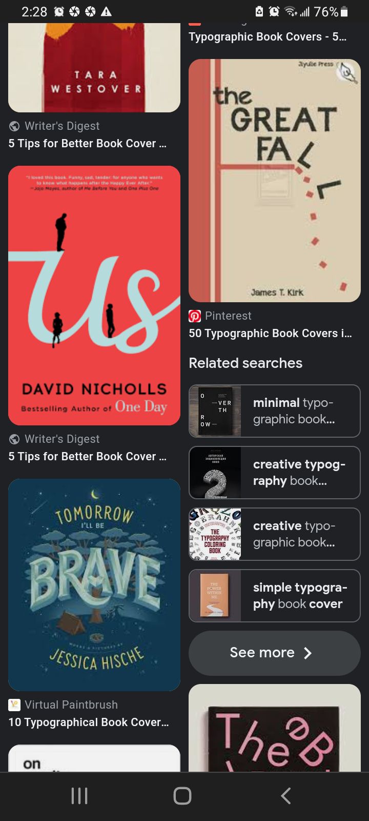
Now, here's a few screenshots I took off Google to show you what font play looks like and how designers make it look so damn good or...so damn weird.
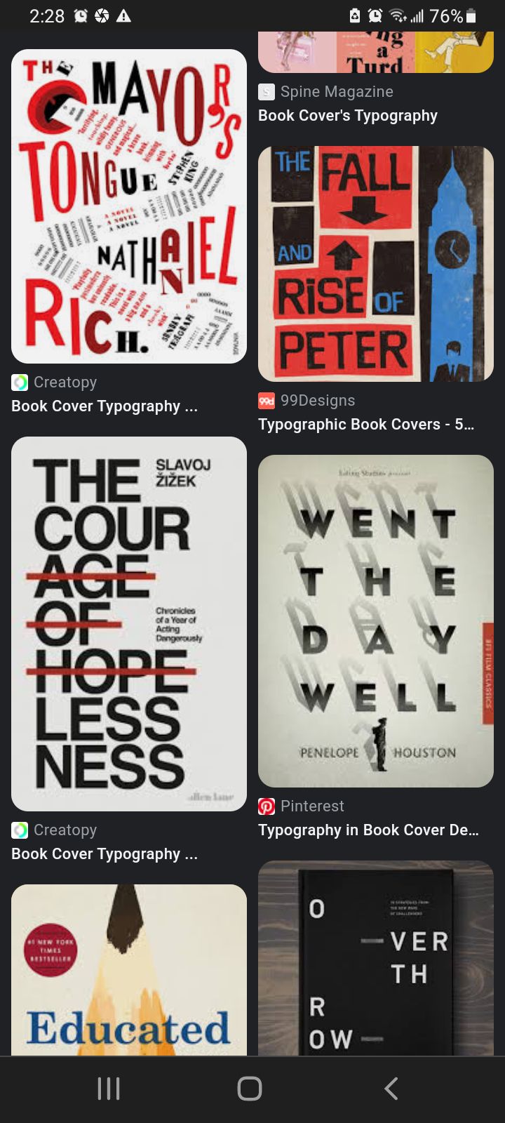
The above are examples of how crazy you can get when you're mixing up your book covers look through font play.
Take The Mayor's Tongue, that's a whole bunch of stuff going on.
I personally dislike it, but this is the level of strange and eccentric you can get.
If you were to subtract the font from the design, you'll see that it's just a white background (lol!).
The Great Fall is a perfect example of title interaction in font play. The falling letters adding to the imagery itself.
I would always recommend sticking to a level of cleanness and simplicity in your cover.
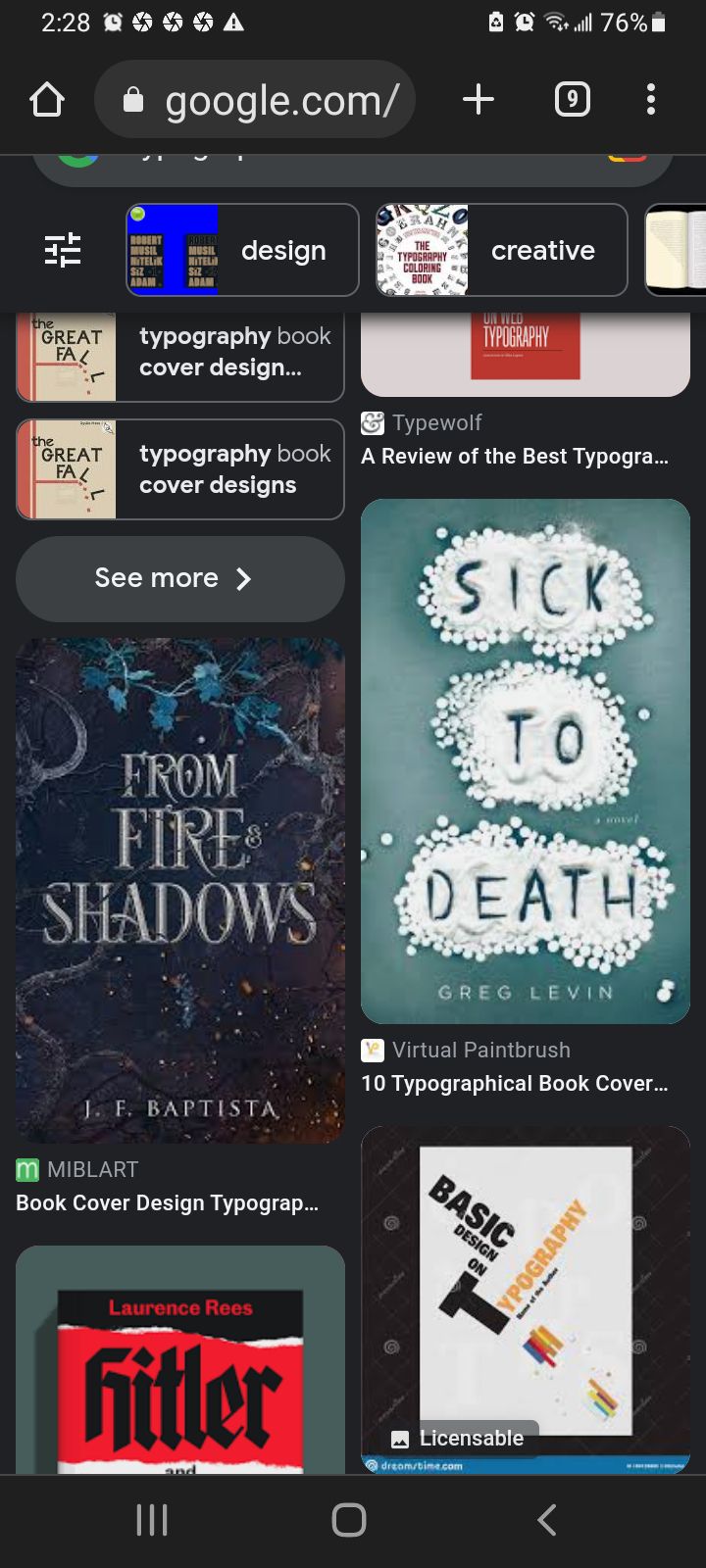
I'm bringing attention to Sick To Death as a little bonus. I'm sure this effect can be achieved if you have time on your hands but more than likely, someone would've set up a mini photoshoot with the piles of sand and they probably had someone draw the letters in with their finger.
This is stuff that you might not want to get into right now but, while I may not have the skills to achieve this via photo manipulation, I'm sure it can be done.
If you have anything to add, comment inline at the respective paragraph or comment here 》》》》》
Thanks for reading!
– HEAVEN
Bạn đang đọc truyện trên: Truyen247.Pro