
𝐑𝐄𝐒𝐔𝐋𝐓𝐒 🏆
First of all, we want to greet a very hearty thank you to all the participants, who took their precious time, and joined in our quest of exploring the hidden artists, and cooperated with us till the end. We heartily appreciate your efforts and toil, and throw confetti at you for your zealous moil.
Secondly, we want to show our thanks of gratitude to all the judges, who had put their hearts and mind in conducting the toilsome task of measuring the works that were done by our participants. Their labor and prudence is greatly appreciated by us, and we accord claps of appreciation, and respect to them.
So, without further ado, we shall diffuse the among you all the much awaited results for which we too had been waiting longingly for.
And, the scores are :
Scores For Imfine000Ithink
Creativity: 3.5/10
Quality: 2.5/10
Typography: 2/10
Overall Look: 1.5/5
Colour Scheme: 2/5
Concept: 3/10
Total : 14.5 / 50
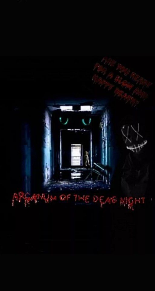
Review : At first I'd like to appreciate you for taking part in this Graphic contest and hope you'll learn more things instead of becoming discouraged. Now coming to the point of review, I'd like to say certain things. For a graphic, one of the vital things is quality. In the era of HD if it doesn't meet the viewer's requirements, then no matter how much creative you're, none would feel so good. So a little suggestion in this regard is that, try to work with high quality pics. However in this entry, I guess the organization could have been better in comparison to the resources you've used. So instead of just the hall way being the main focus, the dolls(blood being added) in the resources could've been the main focus which I thought a pretty good idea. Also this anonymous mask give more mysterious vibes rather than horror. However typography could've been better and placed in a clear way, coz it's almost invisible and hard for the viewer to understand what's actually written.
Creativity - 7 / 10
Quality - 7.5 / 10
Typography - 5 / 10
Overall Look - 4 / 5
Colour Scheme - 3.5 / 5
Concept - 6.5 / 10
Total - 33.5 / 50
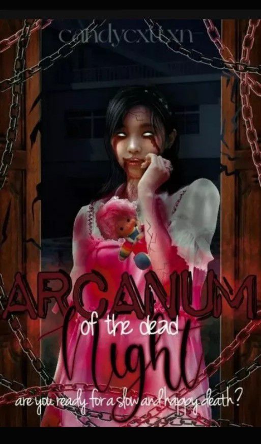
Review: Firstly thank you for participating in this graphic contest and hope you'll do more better in future. Now coming to your entry, I pretty liked the way you did a manipulation edit and has managed to create the creepy theme along with darkness. Overall judging from the quality and concept, it's pretty interesting to me and quite suitable with the prompt. However on correcting certain things, it'll look more realistic and perfect. For eg. The doll which is included in her hand, it's kinda seeming odd and forcefully added amid the cover. So it'd have seemed realistic if some shadows were added. Also if the dress wouldn't have been changed into major pink, ig it'd have been better. Anyways. The number of chains made it a bit crowded in general but not a major problem. However I expect a better font, kinda simple or eerie font mostly white in colour so that it'd fit the background. Other than these points overall it's pretty.
Scores For - HawtHawtHeatGurl
Creativity - 4.5 / 10
Quality - 4 / 10
Typography - 3.5 / 10
Overall Look - 2 / 5
Colour Scheme - 1.5 / 5
Concept - 4.5 / 10
Total - 20 / 50
Review: Firstly I'd like to convey my greetings for taking part in this contest and hope you'll do more better in future. Now coming to your entry, there's certain things that need to be pointed out. It's really appreciable how you've joined all the resources to create an eerie atmosphere. But somehow due to the inproportion in saturation, exposure, hue the quality of the picture has been quite degraded as well as the idea of the cover is not fully visible. The font is good however again not visible enough. My suggestion is to correct the colour of the font. In certain places like near the objects, try to give shadows so that it'd seem realistic and well blended with the prompt. And try to use high quality pictures as well work with a high pixels canvas, so that the quality of the final product will come out clear. Colour Scheme could've been better. From overall look it's not really suiting with the prompt, however has still managed to keep up with the dark theme.
Scores for StridentTranquilizer
Creativity: 5.5 / 10
Typography: 2.5 / 10
Quality: 5 / 10
Overall look: 2.5 / 5
Colour scheme: 3 / 5
Concept: 4.5 / 10
Total=23 / 50
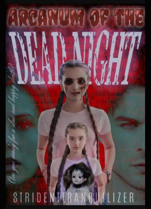
Review : First of all, I would like to thank you for participating and giving this your time. I hope that the review will not discourage you and might help you in any way. Now, for the review... The choice of picture for the parents is a good touch to the background, it fits the prompt. The edit for the first or maybe I should say tallest girl is a nice one. However, there are a few things that don't go well with the flow. That would be the font, color scheme, a few things in the concept and the arrangement of all the elements. For the font, it is okay, but the typography could have been better. The color scheme also doesn't blend well with the elements, seems slightly chaotic, but not in a good way. The concept; a few parts were great for the graphic, but the arrangement of all the elements don't fit well.
Scores for Dont_call_me_ginerva
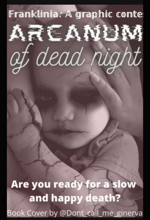
Creativity - 1 / 10
Quality - 2 / 10
Typography - 2 / 10
Overall Look - 2 / 5
Colour Scheme - 1 / 5
Concept - 1 / 10
Total - 09 / 50
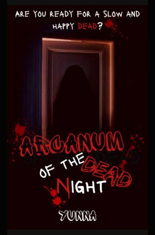
Review : First of all thank you for participating amidst your busy schedule. And don't take this review as your demotivation but as a way of improving. So let's start by the concept. It actually doesn't suit with the prompt. The prompt was about a girl but The main thing on which you've focused here is a doll which isn't accurately related to the prompt. Anyways. Next comes the typography. It's too simple to give a mysterious and eerie vibe. Specially that word "Arcanum" seem kind of sci-fi related font. Next comes the creativity.. as we have seen the resources used, you didn't do much editing as such except a sepia filter which you've applied which is kinda fine ngl. The colour scheme chosen was a bit different frm the one suggested but it's good that you chose your own scheme. But if you would have addded some spooky effects in the bg your graphic would look spectacular even in this light themed colour scheme. The last but not the least, overall look. It's average. It could have been better perhaps if the mistakes outlined wouldn't have been there. But still don't feel discouraged. Practice makes a man or woman perfect. So keep these things in mind when making a graphic next time. You'll surely improve.
Scores for _loveyourself000
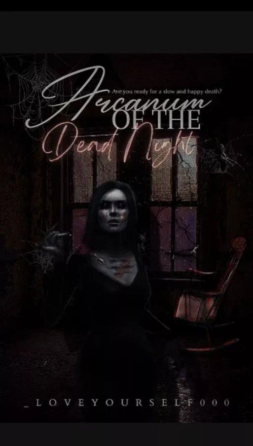
Creativity - 6 / 10
Quality - 7 / 10
Typography - 7 / 10
Overall Look - 3 / 5
Colour Scheme - 3.5 / 5
Concept - 7 / 10
Total - 33.5 / 50
Review : Thanks for participating first of all. We hope you enjoyed making the graphic. So lets come to the review. Your choice of elements is kinda in general. Nothing to say about it. The typography was pretty good and the colours used and the effects applied also match the vibes of the prompt. The subtitle could have been in a bigger font but not much issues tho. Overall the work looks neat but a bit too dark which I personally don't like much. The girl's brightness could have been more. And the contrast in the background could have been increased which would let the elements used be more clearly visible. The concept goes well except for the fact you could have added a bit something related to blood or murder or anything blending properly with your background. Finally, it's a good one. Keep it up and keep in mind the things which are outlined here next time you make one. Thank you.
Scores for ravenclaw_witch_9
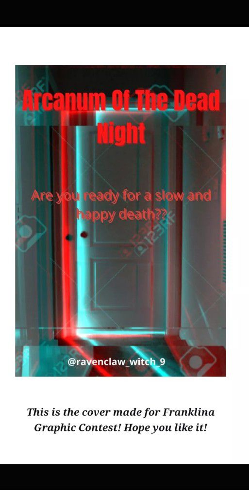
Creativity- 3.5 / 10
Quality- 2.5 / 10
Typography- 5 / 10
Overall look- 2 / 5
Colour scheme- 2 / 5
Concept- 3.5 / 10
Total: 18.5 / 50
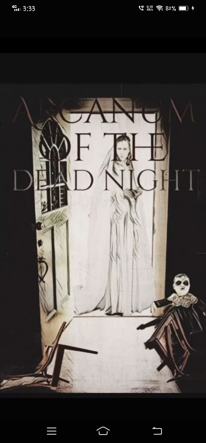
Review : First of all, thanks for participating our contest I hope it help you to learn new things. So let's come to review.. The elements used are very simple and not that much innovative, which I expected. See, in graphic designing, we have to combine all elements and use them in a creative way. That's the main motive of graphic designer, to invent a unique and imaginative design. But the design you made is too simple and common. You can use the more elements like chair, blood and more to innovate ur design. You focus on the main object "door" and forget to add any other elements, which are also important. I hope you will word on that point. Anyways, next thing, typology which is the main thing of any design, and you did pass on it. But personally I think if you made a lil good design the typology u choose will be op!! Over all look is good but I hope you work on ur weak points!! All the best!
Scores for flydhaani
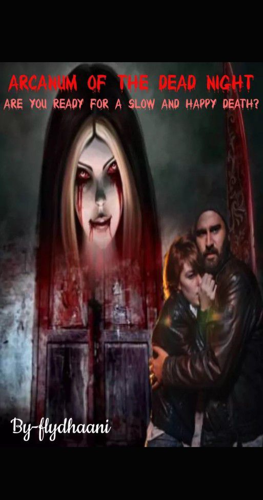
Creativity - 5 / 10
Quality - 6 / 10
Typography - 1 / 10
Overall Look - 2.5 / 5
Colour Scheme - 3 / 5
Concept - 6 / 10
Total - 23.5 / 50
Review : Hey there! Firstly, I would like to thank you for participating and giving this entry your time. I hope my review helps you in any way in your journey.
And now, for the review. If I had to review each elements of the graphic, the background is a little bothering as it remains different in both of parts of the picture, and thus takes the thrill away. The parents too, just one of them looks scared while the other seems neutral... There's also not much editting which makes it seem like a collage of pictures. The typography is bothering too and doesn't help the overall look. The color scheme is also neutral, but I would suggest making it slightly darker with better font and blending. Some better editing and creative choices from your side would be a good addition to the graphic.
I hope the review wasn't too harsh and it helped you see the negative points and offered some help. Once again, thanks for joining the contest, we appreciate your effort.
Scores for captaingryffindor

Creativity: 3 / 10
Quality: 7 / 10
Typography: 3 / 10
Overall look: 2 / 5
Colour scheme: 2.5 / 5
Concept: 4 / 10
Total= 16.5 / 50
Review : Firstly thank you for participating. Please don't take this review to mind but take it as a scope of improvement. So the first thing which I would point out is that there is lack of originality in it. The fonts used could been designed in a better way with giving more mysterious and thrilling effect such as effects of blood dropping from the bottom surface of the letters. But it had to blended well if you would have done so it it wouldn't look good. Next comes overall look. The marks have been deducted because the things aren't blended well and the man who's in front has become the main focus and it isn't clear either what he's doing. You have stick with the only suggestions given in the prompt but you could have brought out the real artist within yourself and add something which could have made the graphic unique. Colour scheme is kinda normal and okay. Not much issues with that. And the quality of the graphic is neutral. And that's all.
I hope the review wasn't too harsh and it helped you see the negative points in the graphic and offered help in some way. Once again, thanks for joining the contest, we appreciate your effort.
Score for SuriyaAhsan002
Typography: 7 / 10
Creativity: - / 10
Quality: 4 / 10
Concept: - / 10
Colour scheme: 1 / 5
Overall look: 1 / 5
Total: 13 / 50
Review : First of all, thank you for participating.
The main thing which I would like to point out is that the picture used was against the rules. It was clearly mentioned in a chapter previously that artworks should not be used; but from the sources, we can infer that you did use one. We accepted the submission just to say this. Please look out for this as Graphic Designing is more about creating your own creative design than using someone else's art to make a cover. There's a huge difference, and I hope I pointed that out clearly.
The only thing we can actually review in the graphic is your typography, which is good and I don't have much comments about it. The others would unfortunately have to either have blank spaces or 1 marks. We are very sorry, but please look out for the mentioned problem. I hope the review wasn't too harsh and that it helps you in any way.
Scores for AlfionaLia

Creativity- 7.5 / 10
Quality- 7 / 10
Typography- 8.5 / 10
Overall look- 4 / 5
Colour scheme- 4 / 5
Concept- 8 / 10
Total- 39 / 50
Review : First of all thank you for participating in the contest. Please don't take this review to heart but as a scope of improvement. The first thing which is really appreciable is that you chose another colour scheme other than black and red. Using blue in a spooky and mysterious graphic is something quite unique. I liked it personally. The way you've blended the things is also good. It doesn't seem edited it seems quite realistic and it matches with the prompt as well. The typography is cool. Has all the vibes required frm it. Not much to say abt quality, it's good. Overall, it is a good work.
And now, with honor and glory, we announce our final winners of this graphic contest.
Our winners are :
1st position belongs to
-
AlfionaLia
2nd position belongs to
-
LESB3AN- and _loveyourself000
3rd position belongs to
-
StridentTranquilizer
Honourable Mention
-
flydhaani
Tag Fest Winner
-
Mr_Tara_Nath
With honor, we hand the prizes to our winners who had won them with their skill and toil. A very hearty congratulations to each one of you.
(Your stickers will be given to you via PMs)
Bạn đang đọc truyện trên: Truyen247.Pro