
𝐞𝐧𝐭𝐫𝐢𝐞𝐬
ENTRIES FOR ROUND I OF BATTLE I
others may choose to vote for another participant's cover by commenting 🧚🏻 next to the cover on this chapter. there is no voting limit.

entry i
CeciliaMohandas
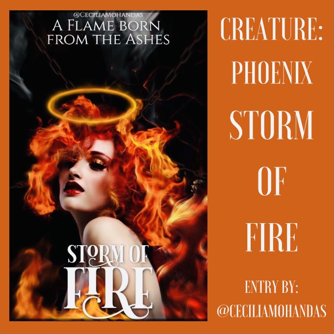
THEME
[4/5]
the theme is great, but this reminds me more of an action-themed cover than a fantasy cover.
STYLE
[4/5]
i like how you styled everything — it just doesn't give me a fantasy feeling
ELEMENTS
[4/5]
you have included all elements, but it took me a while to see the phoenix
TEXT
[3.5/5]
the font of the text is perfect, but i would make the text of the title a little bigger and the subtitle a little smaller so you can make room for your author name
MERGING
[4.5/5]
the blending is better than anything i could ever do, but try to blend the phoenix in more with the rest of the cover by enlarging it so it stands out instead of the girl
COLOR
[5/5]
the color matches the theme and the color scheme i gave you, making it perfect
DESIGN
[5/5]
the design is very eye-pleasing, so well done
NEATNESS
[5/5]
you have organized everything beautifully
CREATIVITY
[4/5]
the phoenix could have been placed in the cover in a more creative way, making it more visible. well done, anyway
PRESENTATION
[5/5]
the presentation of the cover is beautiful. it's not too plain and not too fiercely contrasting
TOTAL
[44.5/50]
——————————
entry ii
Rosshh_hh
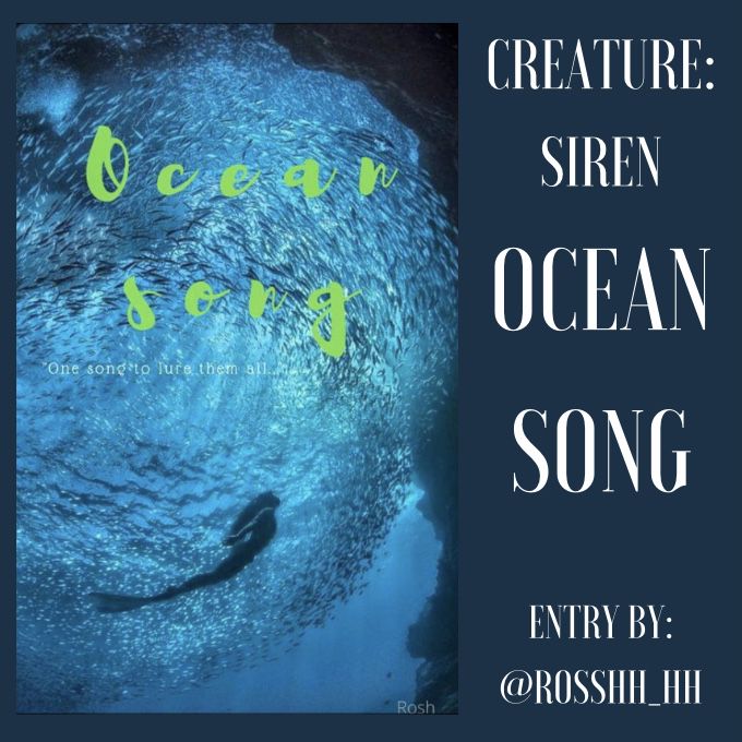
THEME
[3/5]
the theme is suitable but doesn't really correspond to the genre, which is fantasy
STYLE
[2.5/5]
as said before, the style and theme do not really match the genre given
ELEMENTS
[4/5]
you have included the right elements, but the siren is a little far away
TEXT:
[2/5]
the font of the text is okay, just not really the color. i know in the color scheme i gave you green, but try to make the green blend in more with the cover, not standing out too much. try to make the subtitle and your author name more visible as well
MERGING
[2/5]
i don't really see anything on the cover to blend but the text and the background. maybe try to use different shades of blue or green on the background of your color to make it more magical
COLOR:
[3/5]
the blue is fine and part of the color scheme, but try to use different shades, along with various different colors
DESIGN
[2.5/5]
the design is simple, but not really aesthetic or pleasing to the eye. try to add more color and effects
NEATNESS
[3/5]
the layout is quite neat, just arrange the text differently and maybe make it bigger to take up more space to make it seem more neat
CREATIVITY
[2/5]
add more elements and colors to make it more creative and decorated
PRESENTATION
[2.5/5]
the presentation was okay, just maybe change the text and add more elements to make it more designed and less plain
TOTAL
[26.5/50]
——————————
entry iii
@RK_Edits
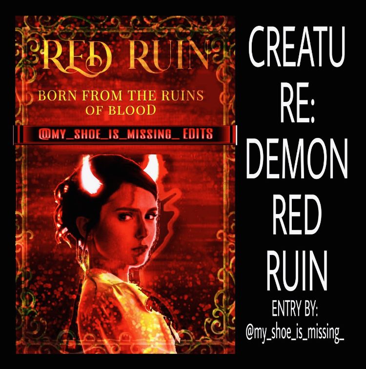
THEME
[4/5]
this is great, just make it slightly darker to match the theme more
STYLE
[4/5]
like the theme, the style is good, just make it more mysterious to add to the creature (demon) and their theme
ELEMENTS
[4/5]
you have included the demon, which is good. the only i would fix is the cut-off devil horn
TEXT
[3/5]
i would make the title larger to take up more space and make it bolder so it catches the eye but at the same time blends in with the cover.
MERGING
[3.5/5]
the blending is nice, just a little scratchy and blurry around the borders
COLOR
[4/5]
the colors followed the color scheme i gave you, so well done. the border just looks a little green.
DESIGN
[4/5]
the design is very eye-pleasing, just slightly blurry and the greenish border ruins it a little
NEATNESS
[3.5/5]
the organization is slightly messy due to the scratchiness, but other than that, it's great
CREATIVITY
[4/5]
i really love how creative you were when turning the woman into the demon.
PRESENTATION
[4/5]
the cover definitely is not plain, so good job with the presentation
TOTAL
[38/50]
——————————
entry iv
@Jesalyn-asher
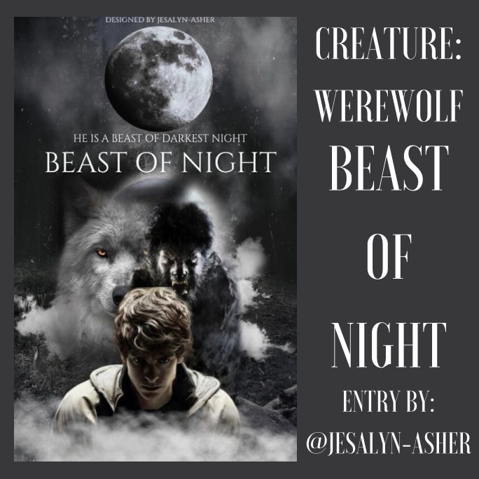
THEME
[5/5]
this fits the theme perfectly, giving a mysterious and fantasy/paranormal look
STYLE
[4.5/5]
the style is perfect, the only thing i would alter is the darkness — i would make it slightly darker in style
ELEMENTS
[5/5]
all elements are included, and you even added some of your own, and it really made the cover come to life. i can clearly see the elements as well
TEXT
[3.5/5]
i would make the text larger to catch the eye and more visible. the font is perfect, though
MERGING
[4/5]
the blending is wonderful, just do the same for the moon as at the moment, the moon looks as if it had been just pasted there
COLOR
[4/5]
the color is perfect for this cover. i just saw a few hues of grayish blue and grayish green which seemed out of place
DESIGN
[5/5]
the cover is very pleasing to the eye. well done
NEATNESS
[5/5]
the elements were very organized in this cover
CREATIVITY
[4/5]
good job, but i would be more creative with the text and it's arrangement, along with the blending of the moon
PRESENTATION
[5/5]
this cover is far from plain and is presented perfectly. great job
TOTAL
[45/50]
——————————
entry v
@FizaKhan3
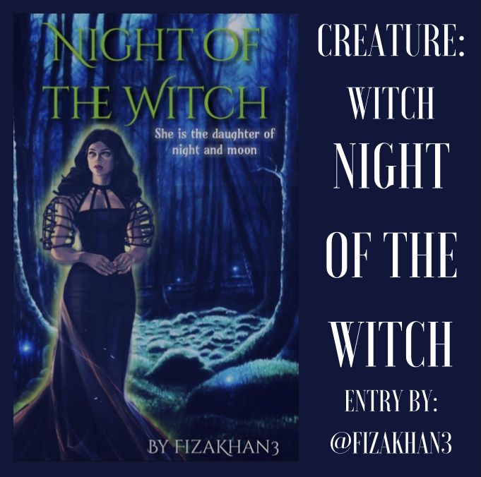
THEME
[4/5]
this cover does give me a dark wicked feeling, so we'll done. i would make it slightly darker just to match the mysteriousness behind the cover
STYLE
[3.5/5]
the style is a mixture of simple and decorated, which creates a nice balance. just make it darker to create a dark and mysterious effect
ELEMENTS
[4/5]
you have included the elements given. just make it darker or create a sense of darkness to add to the elements to make it seem like an environment a witch would live in
TEXT
[3.5/5]
though the text is appropriate, the color of the text is slightly off-putting. try to change that. the subtitle and the author name are good
MERGING
[3/5]
i see you tried to create a glow around the witch, but make it less transient and make it blend in with the rest of the cover more
COLOR
[3/5]
the cover's background has nice color, just not the text or the glow around the witch. try to make the background darker as well
DESIGN
[3.5/5]
the background makes it more eye-pleasing, but the glow around the witch slightly ruins the cover. try to make it blend in more with the surrounding
NEATNESS
[3.5/5]
the organization is great, just a glow and ruins the neatness and order of the cover
CREATIVITY
[3.5/5]
i think you were quite creative, though i saw the resources you used and you only altered the elements slightly. try to make it darker and maybe add (not too many) more elements to add to the background and surroundings
PRESENTATION
[3.5/5]
the presentation of the cover is good. just try to alter the darkness and of the cover, the text. though it is simple, it is still very good
TOTAL
[35/50]
——————————
entry vi
@Squishy_2021

THEME
[3/5]
the cover gives off an enchanting feeling and a sense of beauty, which is suitable for the theme, but try to incorporate a little more magical or fantasy feeling to it
STYLE
[3/5]
the style of this cover is very simple but very elegant, so well done
ELEMENTS
[2.5/5]
you have added the creature as requested, but i can see the faint outline of a logo of some kind in the creature. is it meant to be there? and as for the water, it would be better if there were more elements (around the he border or something similar to that)
TEXT
[3/5]
i like how the text swirls, but try a different font for the subtitle and the author name as it is hard to make out
MERGING
[3/5]
the merging of the creature and the background of water is nice, but some parts are a little blurry and slightly plain
COLOR
[3/5]
the colors are the very ones i gave you, so very good job on that, but it would be much better if maybe a few tinged of purple or fake blue was added it give it more life
DESIGN
[3/5]
the cover is quite eye-pleasing, but it looks slightly dull, so try to add more colors or elements to make everything stand out
NEATNESS
[3/5]
your cover is neat, and there aren't too many elements or elements lying around the place messily, but one thing i would try to rearrange is the subtitle and the author name so they are more easily seen
CREATIVITY
[2.5/5]
i like how you blended everything nicely, but i fell you can try to be more creative with more images and colors
PRESENTATION
[3/5]
you presented your final piece well, and nothing seemed too out of place
TOTAL
[27/50]
——————————
entry vii
@Kymberly180
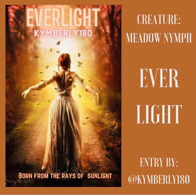
THEME
[3.5/5]
there is a very light, carefree, and magical theme to this cover, so well done
STYLE
[3/5]
though your cover is quite simple, i do like the beauty and elegance within the graphic
ELEMENTS
[3/5]
the creature was a meadow nymph, and though there isn't really a meadow, you have included the nymph, and she looks very radiant
TEXT
[2.5/5]
the text could improve slightly. i like the glow around the text, but the color of the author name is off-putting and try to change the font into something a little different, not elegant perhaps
MERGING
[3.5/5]
i can't really tell if you have merged anything, but the text blends in well with the background
COLOR
[3.5/5]
the colors are beautiful, and they match perfectly with the colors i gave you, so good job. try to change the color of the author name, though
DESIGN
[3.5/5]
i love the design in general as it is very eye-pleasing, especially with the colors
NEATNESS
[4/5]
your design is very neat with the text arranged in all the right places and nothing seemingly out of place
CREATIVITY
[3/5]
the background, i think, is one picture, but you have chosen it well. just try to be more creative with the text — the color and the font
PRESENTATION
[3.5/5]
you have presented the graphic well overall, so well done
TOTAL
[33.5/50]
——————————
entry viii
@Sammy_8813
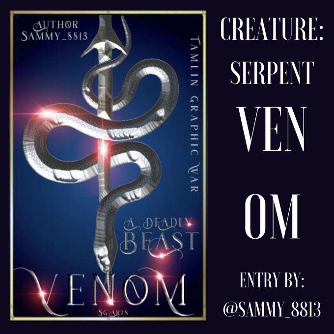
THEME
[3/5]
the theme is fantasy or magical, and though there are some aspects of that in your cover, it is not entirely fantasy-like.
STYLE
[3.5/5]
your style is more simple than sophisticated, which i think is a good look for your cover
ELEMENTS
[4/5]
you have added the element required and i do like how you made it silver and glowing
TEXT
[3/5]
the font for the title is perfectly fine, but try to use a different font for the subtitle and author name
MERGING
[3/5]
you merged the elements very well and nothing is too scratchy or blurry and everything blends in nicely
COLOR
[3/5]
though your cover isn't the most colorful, the simple style of it is very nice, and it is good that you did not die that many colors
DESIGN
[3.5/5]
your design, though simple, is quite eye-pleasing as there are not any unnecessary elements lying around
NEATNESS
[3/5]
there aren't any elements lying messily around, but one thing i would alter slightly is the arrangement of the text
CREATIVITY
[3/5]
i love how creative you were when you made the serpent silver, and it looks very nice. try to be more creative with the font of the subtitle and author name
PRESENTATION
[3/5]
overall your presentation of the cover is beautiful and simple, so well done, though there are still some places that can be made slightly better
TOTAL
[32/50]
——————————
entry ix
@loyaltybetrue
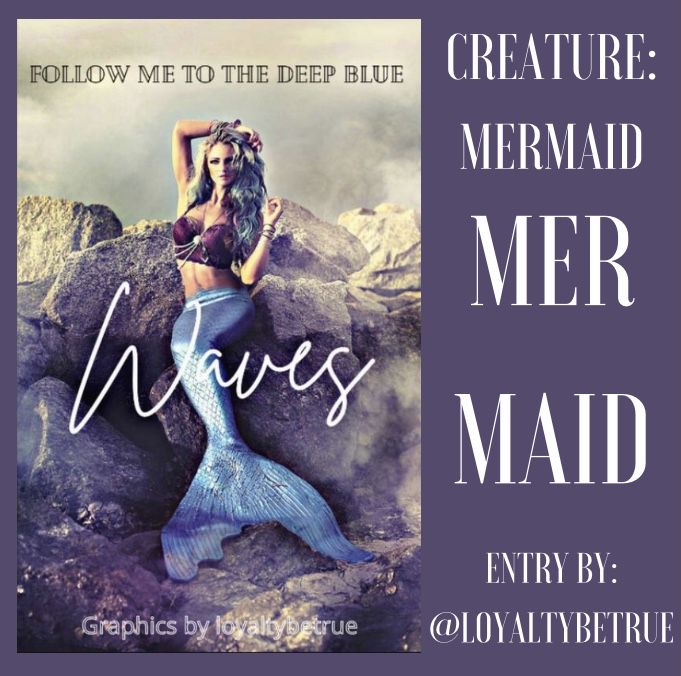
THEME
[3/5]
the theme is very enchanting and elegant, which makes it very lovely and accurate
STYLE
[3.5/5]
the style of your graphic is very simple but the simplicity makes it beautiful
ELEMENTS
[3/5]
you have included the mermaid as asked, and it is very clear on the cover. other elements such as the rocks around give it a bit more life, so well done. maybe add in a few more elements such as fish of some sort to bring the cover to life
MERGING
[2.5/5]
i didn't really see anything more elements other than the background with the mermaid merged together, but the title was blended in nicely
TEXT
[2.5/5]
the font of the title is nice and elegant (wavy, matching the title) but alter the fonts for your author name and subtitle as they seem a little out of place. try to make the author more visible
COLOR
[3/5]
i love the colors used in this cover as they all match very nicely. i would add maybe more of a touch of blue to the cover
DESIGN
[3/5]
the design is very eye-pleasing and aesthetic, which is good, but try to alter the font of the subtitle and watermark
NEATNESS
[3/5]
the cover is very neat, but the place of the subtitle seems slightly out of place. you didn't add any unnecessary objects, so well done
CREATIVITY
[3/5]
you were creative with your choice of color for this cover, but try to be more so with the font of the text and more elements (maybe a border of some kind)
PRESENTATION
[3/5]
the overall presentation of the cover was beautiful and i loved the aesthetic appeal to it
TOTAL
[29.5/50]
——————————
entry x
@Silhouette_Girl13
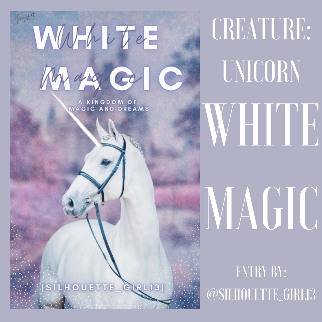
THEME
[4/5]
the goal for the theme is to make the cover magical and fantasy-like and you have done that especially well. it looks very dreamy and enchanted
STYLE
[3.5/5]
your style leans toward simple, but that simplicity is beautiful
ELEMENTS
[3.5/5]
you have included the unicorn as requested, and the elements surround the unicorn are extremely beautiful, but try to add smaller objects maybe such as butterflies
MERGING
[3.5/5]
you have done the merging especially well and the unicorn looks as if it is part of the background
TEXT
[3/5]
though your text blends in, i don't think the wavy letters over the bold letters really work, and try to alter the font of the title
COLOR
[3.5/5]
the colors are just as i asked and are presented in the cover very nicely, and all of it fit perfectly with one another
DESIGN
[3.5/5]
the design itself is very eye-pleasing and promising, so well done
NEATNESS
[3.5/5]
there aren't any elements lying messily about the cover, and the text is arranged nicely, but try to change the title with the wavy letters over it as if looks slightly out of place
CREATIVITY
[3/5]
you were creative, especially with the colors, but try to be more so with maybe the font of the title
PRESENTATION
[3/5]
the overall presentation is wonderful and a very beautiful and aesthetic graphic
TOTAL
[34/50]
——————————
entry xi
@Madstellar
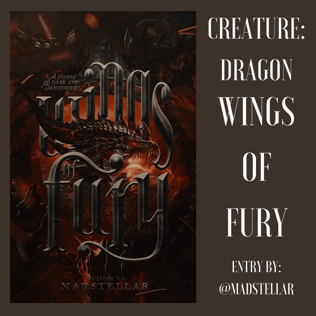
THEME
[4.5/5]
the cover has the majestic and fantasy effect exactly wanted, well done
STYLE
[4.5/5]
the style is sophisticated, but not in a way that makes everything very displeasing to the eye
ELEMENTS
[5/5]
you have included the dragon, along with various other elements, and this is great, giving the cover more life
MERGING
[4.5/5]
wow. the merging is brilliant in this cover, and all the elements are put together very nicely
TEXT
[4.5/5]
the text is large, taking up most of the space very nicely, along with the font being the right one chosen, and i like the effect of the text. the subtitle and author name are both very well arranged and the font is suitable
COLOR
[4.5/5]
the coloring is perfect and all the colors i have given you are used in the graphic, so well done
DESIGN
[4/5]
the design is spectacular and very eye-pleasing, not sporadic and random
NEATNESS
[5/5]
with the sophistication of your cover, it is hard to maintain a neatness, but you have done that perfectly. the elements are not out of place and the text are all arranged nicely
CREATIVITY
[4.5/5]
it is clear you were very creative with your cover, and the placement of different elements and the text, so well done
PRESENTATION
[4.5/5]
the overall presentation is wonderful, and i am speechless
TOTAL
[45.5/50]
——————————
entry xii
@ColeReveals

THEME
[4.5/5]
the theme is very angelic and magical, with a hint of adventure, so well done
STYLE
[4/5]
i love the style of this cover as it brings out a gentle but powerful message
ELEMENTS
[5/5]
you haven't included just the angel, but also an assortment of others, and that brings your cover to life. i like how to placed them in the cover
MERGING
[4.5/5]
the merging is perfect, and all the elements and the text for nicely together
TEXT
[4/5]
the text effect is very nice, but maybe make the title larger to occupy slightly more room in the cover
COLOR
[4.5/5]
i love how the gold stands out against the background of white and gray and blue, and it is breathtaking. no colors are out of place
DESIGN
[4.5/5]
the design is especially eye-pleasing and lovely
NEATNESS
[5/5]
the cover is very neat and the elements don't litter the place messily. the text is arranged in the cover very well and not randomly
CREATIVITY
[4.5/5]
you were very creative with your design, especially the elements within and the effect of the text, so well done
PRESENTATION
[4.5]
your overall presentation of the cover is beautiful and it gives off a very angelic feel to it, the exact impact needed
TOTAL
[45/50]
——————————
entry xiii
@roguehopes

THEME
[4/5]
you have followed the theme very well and the cover is quite fantasy and enchanting
STYLE
[4/5]
i love how you included the elf in the background very well, giving it a very elegant style
ELEMENTS
[4/5]
you have included the elf and the background is very suitable
MERGING
[4/5]
you have merged everything perfectly and the cover looks like one piece
TEXT
[2.5/5]
i like the effect of the text, but it would be better if it had more of an elegance to it as the cover itself is quite elegant, and maybe raise it slightly so it takes up more of the space above. i like the font of the author name but try to make it slightly bigger. you did forget the subtitle, which you let me know about.
COLOR
[4/5]
your colors are wonderful and they match very well together, so well done
DESIGN
[3.5/5]
the design itself is very eye-pleasing and beautiful and graceful. maybe altering the font would enhance that grace
NEATNESS
[3.5/5]
your cover is very neat and nothing seems too out of place. as mentioned before, try to move the text upward tit are up more space
CREATIVITY
[4/5]
you were clearly very creative with this and i love how to positioned the elf in the cover to match the background
PRESENTATION
[3.5/5]
the overall presentation of it is lovely and very beautiful
TOTAL
[37.5/50]
——————————
entry xiv
@_joviitq_
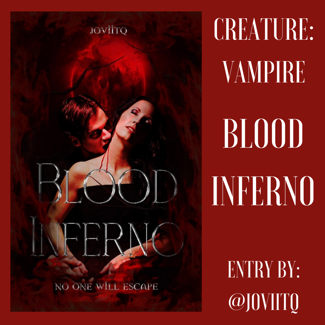
THEME
[4/5]
as your creature was a vampire, you have conveyed the theme perfectly and made it spooky but beautiful all at once
STYLE
[4/5]
the style of the cover is wonderful and i absolutely love it
ELEMENTS
[4/5]
as requested, you included the element needed and you have also included the moon and the woman, which makes the cover come alive, but i would suggest maybe adding a little more in such as bats
MERGING
[3.5/5]
all the merging had been done very well and it looks as if one piece, but the woman could be a little more blended in color
TEXT
[3.5/5]
the text is very big and takes up much space and the font is suitable, but two things i would alter is the size of the author name and the subtitle, as well as the boldness of the title
COLOR
[3.5/5]
the colors are very beautiful and i love the different shades of red. maybe try to make the women blend in more slightly in color
DESIGN
[4/5]
i love your design and it is very pleasing to the eye; well done
NEATNESS
[4/5]
there are no messy areas around your cover and everything fits very nicely
CREATIVITY
[4/5]
you were very creative with your cover, especially with the elements and details, and i love that
PRESENTATION
[3.5/5]
the overall presentation is lovely and very life-like.
TOTAL
[38/50]
——————————
entry xv
@Arafisabu
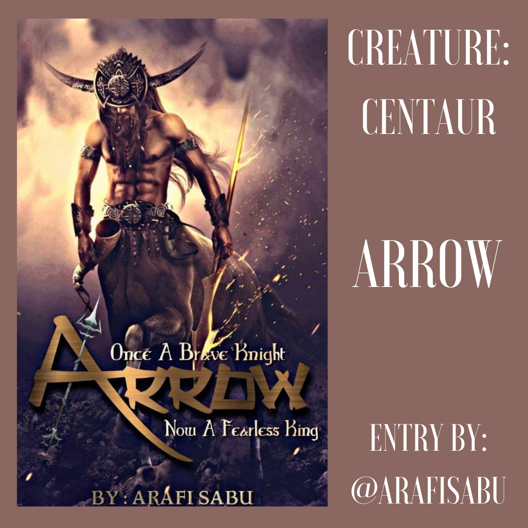
THEME
[4/5]
i love the theme of your cover and the bravery and adventure and action is very nicely conveyed
STYLE
[3.5/5]
i do like the style you went with when making this, so well done
ELEMENTS
[4/5]
the centaur is included, along with a spear and horn and the background is very suitable; good job
MERGING
[3.5/5]
the background merging of the elements is very nice, and the text blends in with the cover
TEXT
[3/5]
i do like the text, especially the title and the way you arranged it all, but the subtitle's font could be altered slightly
COLOR
[3.5/5]
the colors chosen are great and match the theme and elements of the cover perfectly
DESIGN
[3/5]
the design is lovely, but maybe make it a little darker to give it the adventurous thrill
NEATNESS
[3.5/5]
your cover is very neat and there are not objects or unnecessary elements lying about the place, but maybe move the text of the author name up a little
CREATIVITY
[4/5]
i love your creativity with this and the choice you made with the centaur and the feeling it gives out; well done
PRESENTATION
[3.5/5]
the overall presentation is lovely, but a little darkness or saturation could really make it pop out
TOTAL
[35.5/50]
——————————
entry xvi
@BrownieGirl1106
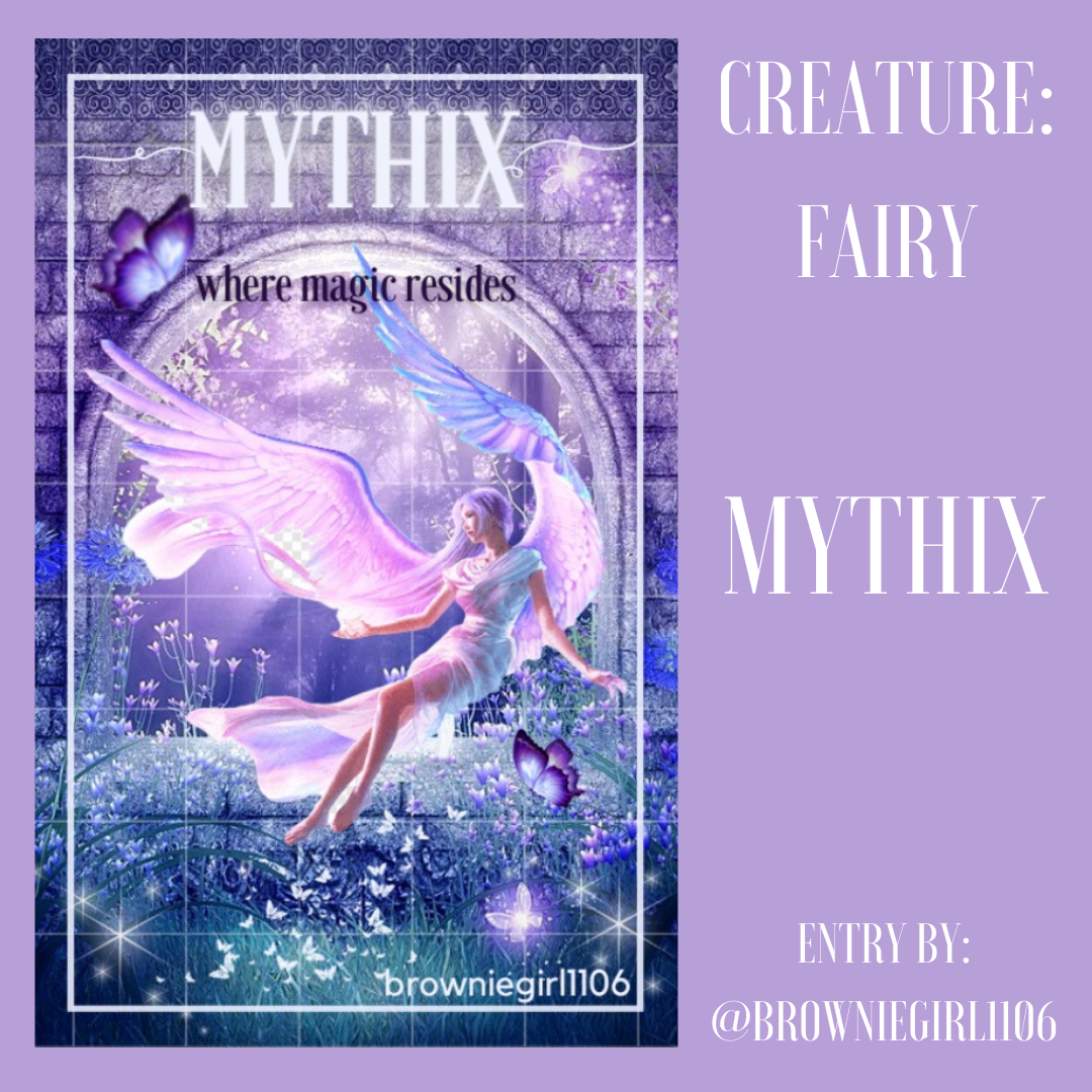
THEME
[4/5]
the theme and feeling conveyed is perfect, giving it an enchanting feel; well done
STYLE
[3.5/5]
i love the style of your cover as it is very magical and lovely
ELEMENTS
[4/5]
not only have you included the fairy, there are also butterflies and the background adds to that life; good job
MERGING
[3/5]
the fairy looks like it is sitting on the arch of the window, but maybe make it a little more purple or a little darker to help it blend in with the rest of the graphic
TEXT
[3/5]
i love the text effect (glow) on the title, but maybe make the subtitle not black and glow as well to match the cover and its theme. as well as that, maybe alter the font of the title and the author name into something more elegant?
COLOR
[3.5/5]
the colors chosen match what you had been given and it is beautiful
DESIGN
[3.5/5]
you design is very light and fun and stunning, as well as very pleasing to the eye, but maybe make it just the slightest darker
NEATNESS
[3.5/5]
the general cover is very neat and there are no elements out of place, but maybe make the butterflies smaller so they fit in with the rest of the small flowers
CREATIVITY
[4/5]
i can tell you were very creative with the cover and you have chosen everything nicely; great job
PRESENTATION
[3.5/5]
your overall presentation is lovely and i think you have done a wonderful job
TOTAL
[35.5/50]
——————————
entry xvii
@sarahellemaryilin

THEME
[3/5]
the theme is magical, but it doesn't hold too much enchanting feeling to it
STYLE
[3/5]
i quite like the style you went for (action-based) but try to add more elegance to it
ELEMENTS
[3.5/5]
you have included a girl, who i imagine to be fae, and the background is very suitable
MERGING
[4/5]
you have merged everything very well and nicely, including the text
TEXT
[3/5]
the subtitle and author name are good fonts and you can see them, but i am not quite sure of the title font as it is a little out of place with the rest of the cover
COLOR
[3/5]
the colors are wonderful, but try to make it darker or add some contrast
DESIGN
[3/5]
the design is quite eye-pleasing, though i think maybe the font of the title could be altered to suit that elegance, as well as more contrast to the cover
NEATNESS
[4/5]
each part of the cover is proportioned every nicely which makes it very neat; good job
CREATIVITY
[3/5]
you were creative with this cover but could be more so slightly with the font
PRESENTATION
[3.5/5]
the presentation overall is lovely
TOTAL
[33/50]
——————————
entry xviii
@Lightingsky
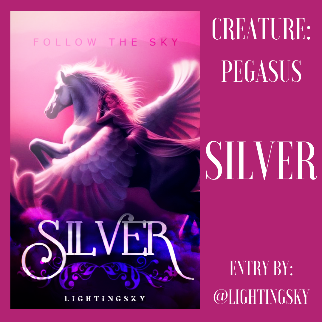
THEME
[4.5/5]
the theme is absolutely beautiful and magical. i love it
STYLE
[4/5]
the style you went for is perfect and lovely
ELEMENTS
[5/5]
you have included the pegasus, as well as a girl to finish it off, which is wonderful
MERGING
[4.5/5]
you have merged everything nicely, and the soft effect you have used for the cover is beautiful
TEXT
[4/5]
the text is perfect, and you have arranged them very well. one thing would be to maybe make the subtitle slightly bolder so you can see it better
COLOR
[4/5]
i love the colors used as they suit one another perfectly and blend nicely
DESIGN
[4/5]
your design is almost flawless and very eye-pleasing
NEATNESS
[5/5]
each element and has been arranged and proportioned nicely, and nothing is out of place
CREATIVITY
[4/5]
i can tell you were very creative with your cover and it is beautiful
PRESENTATION
[4/5]
the overall presentation and layout of the design is wonderful and it awed me when i saw it. very well done
TOTAL
[43/50]
——————————
entry xix
@AKTennisPlayer
N/A
——————————
entry xx
@_MidnightBlues_
N/A
Bạn đang đọc truyện trên: Truyen247.Pro