𝐂𝐇𝐀𝐌𝐏𝐒 𝟐

here are your reviews!
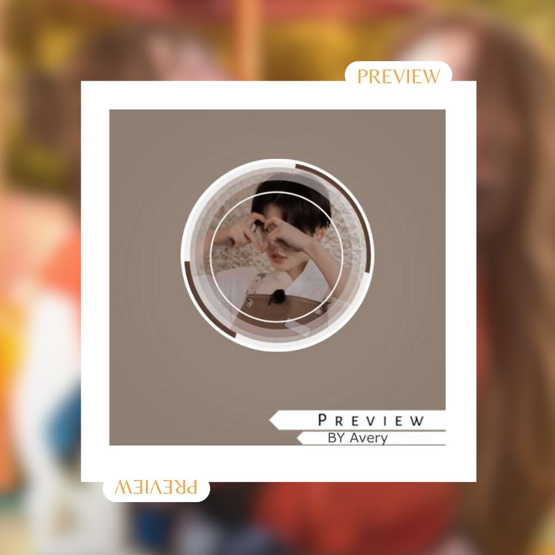
made by Jincymin
review by cupidyunjin
genre relevance - [ 9/10 ] ,,
it actually gives cafe vibes and it's as if yeonjun is sending a heart to his customer. the only thing bothering me is that i can't really see yeonjun's face properly, it took me a few looks to realise that it was yeonjun.
colour co-ordination - [ 6/10 ] ,,
the background color seems a bit dull in my opinion and the colors in the cartwheel border aren't in equal ratios. for example as you can see, the top right brown part of the border is bigger than the bottom left brown part and vice versa for the white part, so you would have to look on that.
is it appealing? - 8/10 ,,
both yes and no in certain ways. if you look properly for sometime, you would notice that there are some changes which are needed to be made in the theme, thus, there is room for improvement. from the pic selection to the header color pick, i think there are small changes needed to be made everywhere.
what was your 1st impression? - 7 /10 ,,
it was actually really cute when i first saw it but slowly i started to realise the mistakes. so, the mistakes are not really noticeable but are still present. overall it's a nice theme.
Total: 30/40
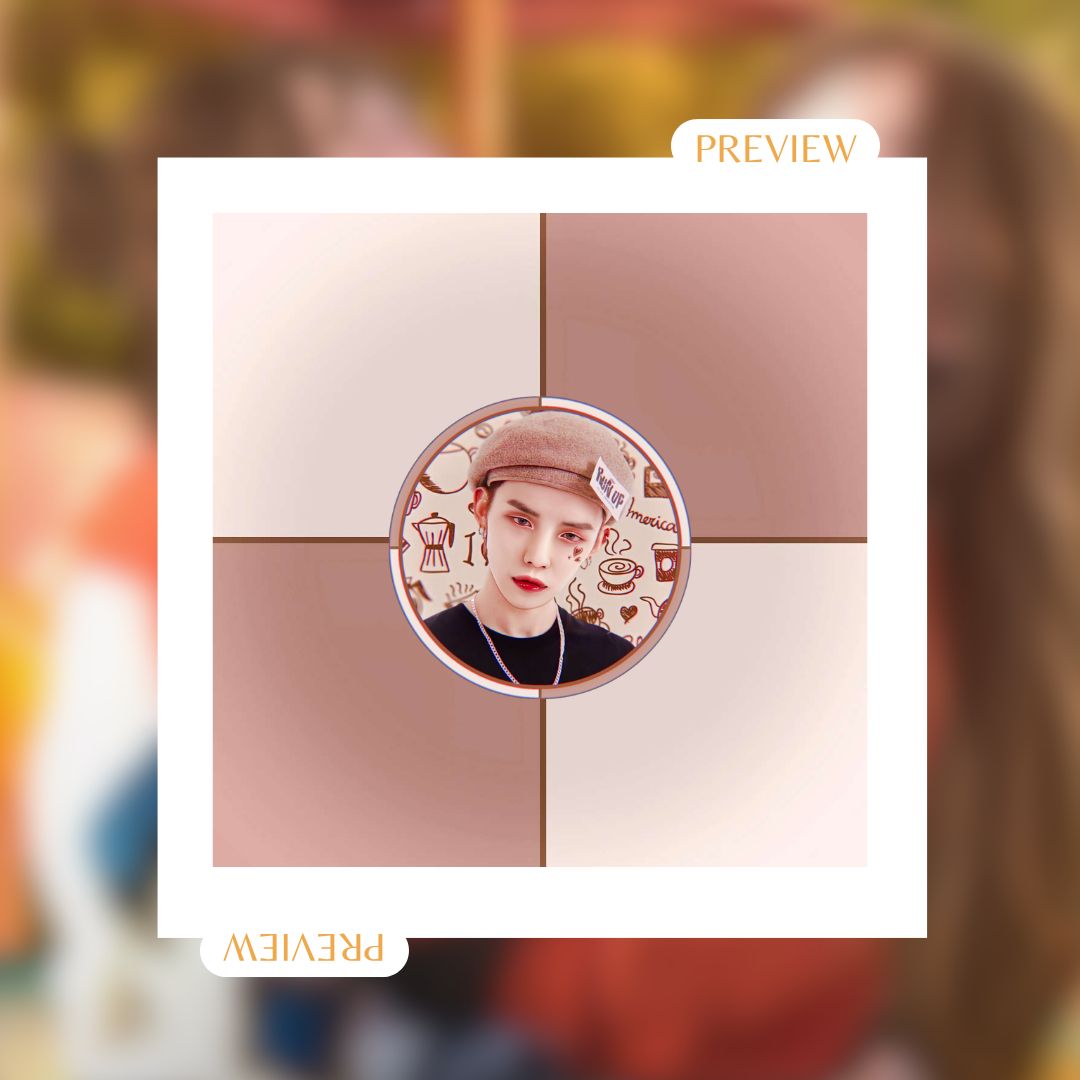
made by Reeruworld00
review by cupidyunjin
genre relevance - [7/10] ,,
in my opinion, the theme gives cafe vibes only because of the background of the icon. yeonjun looks really intimidating in this picture. the manipulation quality is immaculate and i just love it. the highlights in the eyes and the "run up" tag, and those cute little hearts tone down the intimidating nature of the picture a little bit.
colour co-ordination - [ 9/10 ] ,,
the header colours match the colors of the icon very well and i love the fact that you used the same colors and didn't change it. over all i love the color scheme and co-ordination.
is it appealing? - 8/10 ,,
at first glance, i fell in love with it. the manipulation was the one which caused me to like it a bit more but the picture selection could have been better.
what was your 1st impression? - 10/10 ,,
i was gushing at first how pretty the theme was but in my opinion, this picture of yeonjun doesn't really match the cafe vibes. a picture with softer expressions of yeonjun would have been better. the background of the picture with little doodles was so cute. overall this theme was really good.
total: 35/40

so the winner is!!
•.~ 1st place goes to Reeruworld00
score: 35/40
•.~ 2nd place goes to Jincymin
score: 30/40
(winners please dm to claims your prizes)

Bạn đang đọc truyện trên: Truyen247.Pro