𝐂𝐇𝐀𝐌𝐏𝐒 𝟏

here are reviews of the entries.
[note- the review is not to demean anyone.
kindly do not take the remarks to your heart, the judges have given their honest observations which will help you to work on your weak points. do not hate anyone or cuss anyone in the comments.
do not get disheartened, the marks do not decide your contentment. so just enjoy the process.]
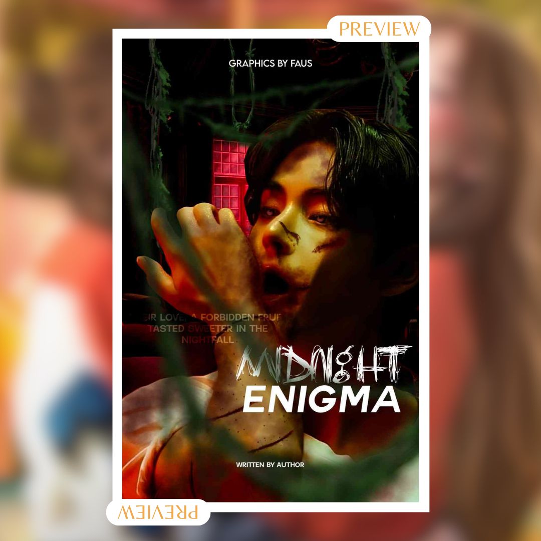
• typography: 5/10 - the typography is consistent and easy to read but feels slightly generic.
• color scheme: 9/10 - the colors are eye-catching.
• originality: 8/10 - these colors are not common together but work well. a unique color combination.
• innovation: 8/10 - there is not much difference in the layout of this graphic, however, it is a unique combination of colors.
• clarity: 8/10 - everything is easily legible and the colors make the important elements stand out.
• impact: 9/10 - eye-catching, and memorable.
• overall: 15.5/20 - this work is effective and the choice of colors are appealing.
• total- 62.5/80
-
by aestheticvip3012
• typography: 2/10 - the font used for the subtitles is not visible at all. it is hard to read. the editing looks fine but the title isn't matching up with your editing skills.
• color scheme: 9/10 - i loved the red, green, and yellow combination.
• originality: 7/10 - no, i think the cut marks on the hand could have been more realistic. it ain't co-ordinating with the scares and blood that is on the face. once again, the fonts aren't placed in a good way.
• innovation: 6/10 - it is the color combination for sure. other than that everything seems pretty decent.
• clarity: 3/10 - i wouldn't say this was very clear. i mean the quality can be improved but it depends upon device performance as we. sometimes sharing graphics automatically reduces the quality for easy sharing.
• impact: 6.5/10- there is a high scope for improvement. you need some brush up with your skills, you are good to go.
• overall: 10/20 - overall things look put together, it is just that the fonts can be done better.
• total: 43.5/80
-
wingsofwaxx total score- 62.5 + 43.5
= 106/160

by novelist_susanna
• typography: 8/10. the font is clear and elegant. however, the subtitle is a bit too small and hard to read, and the floral pattern behind it is distracting.
• colour scheme: 7/10. the dark red and black create a sense of mystery and danger, which suits the genre of the novel. however, the color scheme is also somewhat cliché and predictable, and it does not convey much originality or innovation.
• originality: 8/10. the cover is nice but it's very similar to the other covers.
• innovation: 6/10. the book cover does not have much innovation or creativity. the book cover does not stand out from other similar novels in the market.
• clarity: 9/10. the graphic does not have any major flaws in clarity.
• impact: 7/10. the cover could have more impact if it had more details or features that would make it more appealing or intriguing
• overall: 14/20. the book cover is decent and professional because of the highlights and colour scheme but not exceptional or impressive.
• total: 59/80
-
by aestheticvip3012
• typography: 4/10. the subtitle font is obvious and agile. but the main attraction is the title, the hairy font used for enigma isn't going well, plus the color used for 'e' doesn't match the cover. the hue is a bit on the higher side and i think a brownish shade would have looked better.
• colour scheme: 7/10. - it's a sleek combination which i absolutely love.
• originality: 6/10- i mean it's good but nowhere it's giving vamp. the ears make it look like a feline theme.
• innovation: 5/10- i do see some creativity but it is not according to the provided prompt.
• clarity: 7/10- it's decent. by the way, just loved the shoulder and hand highlight. it enhances your style.
• impact: 5/10. there is no contact between the colors and the background. the details would be hard to notice. but overall it is good, it has some fine details.
• overall: 14/20. the book cover is decent and professional because of the highlights and colour scheme but not exceptional or impressive.
total: 48/80
-
-Samia_ total score- 59+48
= 107/160

by novelist_susanna
• typography: 7/10. the font is legible and stylish, and the yellow color contrasts well with the black background. however, the font is also somewhat generic and bland, and the quote is also too small and hard to read.
• colour scheme: 8/10. the color scheme is simple and elegant. however, the color scheme is also somewhat monotonous and dull, and it does not reflect much diversity or vibrancy.
• creativity: 6/10. the graphic does not have much creativity or originality. it does not stand out from other similar books in the market.
• innovation: 5/10. the graphic does not have much innovation or novelty. the graphic does not challenge or inspire the viewer.
• clarity: 9/10. the image and the text are well-aligned and balanced, and there is no unnecessary clutter or confusion.
• impact: 7/10. the graphic has a moderate impact on the viewer. however, it does not have a strong wow factor or a unique selling point that would make it memorable or distinctive.
• overall: 13/20. the graphic is decent and professional, but not exceptional or impressive.
• total: 55/80
-
• typography: 6/10. the font is readable. however, the font in subtitles is way too small, like it's not perceptible.
• colour scheme: 7/10. i liked the vibrant yellow used, it kinda shows your creativity. where everyone thought of red, you decided to go with yellow. this shows that you are out of the crowd.
• creativity: 7/10. the color gives it a different perspective. plus, the design isn't creative. plus, i don't understand the concept of a butterfly in the background. what does it represent?
• innovation: 4/10- nothing much. it might attract some reader cuz of the colour scheme.
• clarity: 5/10. the text is clear, though the editing isn't. it looks sort of messy. there is a scope of improvement.
• impact: 4/10- i don't think using the cover would give an immense impact, i mean it's good but not so good to create an impact.
• overall: 8/20
• total: 41/80
-
luvmin_kook13 total score- 55+41
= 96/160
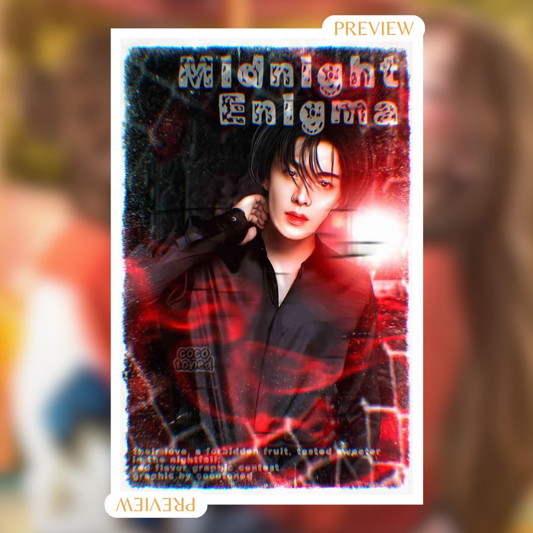
- typography: 5/10. the font does not match the vibe of the story. the placement of the title does not feel right. it would have been better if it was on the bottom of the cover.
- colour scheme: 8/10. the color scheme is simple and effective, and it creates a sense of tension and drama. but, the color scheme is also somewhat common and predictable, and it does not show much diversity or originality.
- creativity: 7/10. the graphic has some creativity and originality, but not a lot. you have given the perfect amount of highlights and stuff but the white snowy border doesn't go well with it.
- innovation: 6/10. the graphic has some innovation and novelty, but not a lot. the cover could have more variation or experimentation that would make it more challenging or inspiring.
- clarity: 10/10. the graphic is clear and easy to understand. the image and the text are well-aligned and balanced, and there is no unnecessary clutter or confusion.
- impact: 6/10. the impact could be higher if the image had more details or features that would make it more appealing or intriguing.
- overall: 10/20. it could benefit from more creativity and innovation, and more differentiation from other similar books.
-total: 52/80
-
by aestheticvip3012
- typography: 4/10. please don't feel bad, but these kinda fonts make the cover look cheap. no matter how much time you spend on the base, the font just dooms it.
- colour scheme: 7/10- simple, sleek, usual color scheme.
- creativity: 5/10. it's a simple cover. the manipulation is good but it isn't genre relevant. it gives no hint that there are vampires involved in it.
- innovation: 7/10.
- clarity: 9/10. the subject is clear, what ruins its clarity is the overlayer used.
- impact: 6/10. the subject will make an impact but overall it is i don't think it will create any major blow.
- overall: 10/20. you need to focus on font and styling. your manip skills are good but there is a huge scope of improvement.
-total: 43/80
-
cocotoned total score- 52+43
= 100/160
by novelist_susanna
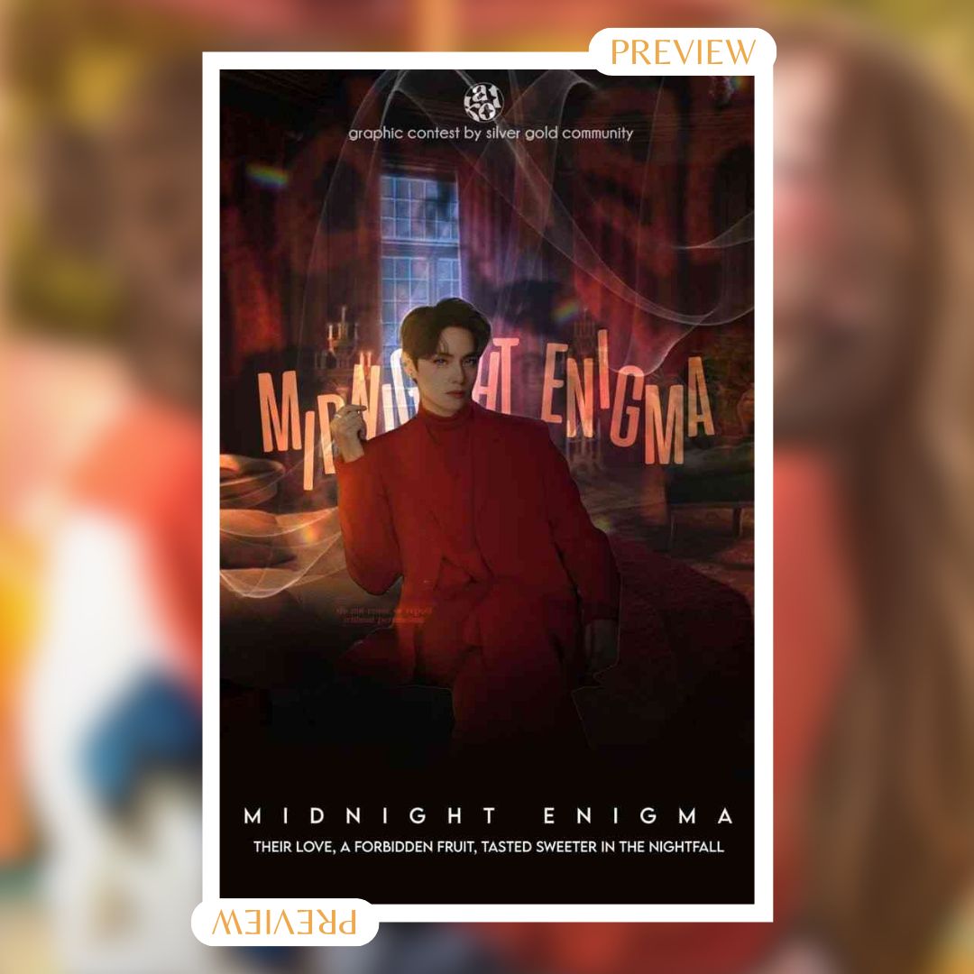
- typography: 8/10. the title and the subtitle are well spaced and aligned.
- colour scheme: 9/10. the colour scheme is consistent throughout the poster, except for the text at the top, which is white and does not stand out well against the background.
- creativity: 7/10. the cover has a creative idea of but it does not show much of the plot and it could have used some more elements to make it more interesting and unique.
- innovation: 8/10. the cover does not have much innovation in terms of design or technique. it uses a simple layout and a common colour scheme. you could have used some more effects or features to make it more eye-catching and original.
- clarity: 8/10. the cover conveys the genre well and it also gives a hint of the theme of forbidden love but does not give much information about the setting, or what is the conflict.
- impact: 7/10. it does not have a strong impact, as it does not have a memorable or striking feature that would make it stand out from other posters.
- overall: 15/20. it is a decent cover. however, it could have improved on its innovation, details, and originality, as it does not have a high level of design or technique.
total: 62/80
-
by aestheticvip3012
- typography: 9.5/10. i loved how you aligned the title at the back of the subject. accessory font used are also decent and remarkable.
- colour scheme: 10/10- red with a hint of yellow is just gorgeous.
- creativity: 8/10- the subject is giving dominant look. plus, the dusty room (background) is also matching theme.
- innovation: 7/10- i do agree with sussana. there are no elements that represent that this a vampire genre.
- clarity: 9/10.
- impact: 10/10.
- overall: 17/20.
total: 70.5/80
-
TheAshenPlane total score- 70.5 + 62
= 132.5/160
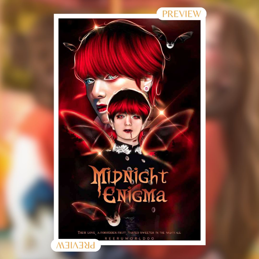
- typography: 8/10. the title font matches the theme of the cover. the subtitle font is plain and does not stand out.
- colour scheme: 8/10. the black, red and orange colours create a contrast and a sense of danger and passion.
- creativity: 9/10. the book cover is creative and intriguing.
- innovation: 6/10. the book cover is innovative in some aspects, but it also follows some common tropes of the genre.
- clarity: 9/10. the book cover is very clear about the genre, plot or characters of the book.
- impact: 8/10. the book cover is impactful and eye-catching. it draws attention with its colours, fonts and mystery.
- overall: 18/20. the book cover is great among all the submissions. it has some strengths and weaknesses, but it is still very great.
total: 71/80
-
by aestheticvip3012
- typography: 9/10. the font is pretty fetching. the subtitles can be more visible.
- colour scheme: 8/10. sleek yet catchy.
- creativity: 9/10. i loved that you added the bat wings. there are many elements that represents that this is a vampire theme.
- innovation: 8/10. cover is different from the crowd. i like it.
- clarity: 7/10.
- impact: 8/10. the book cover is pretty shiny so of course it will catch a lot of attention.
- overall: 16/20.
total: 63/80
-
Reeruworld00 total score- 63 + 71
= 134/160
by novelist_susanna
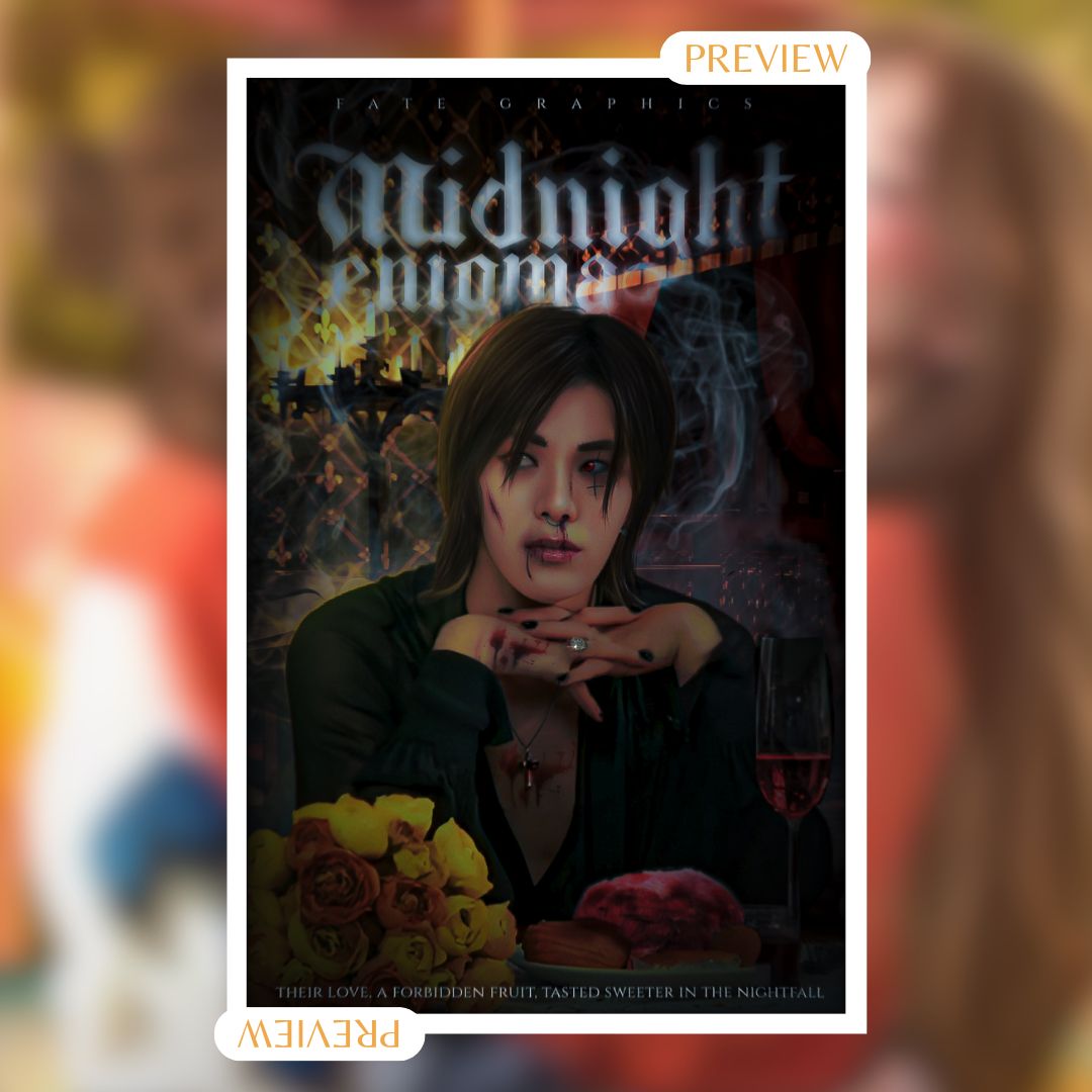
typography: 7/10. the title font is suitable for the theme of the book, but it is not very legible.
- colour scheme: 8/10. the color scheme creates a contrast and a mood of danger and romance. the colors also reflect the rose and the wine elements on the cover.
- creativity: 9/10. the book cover is creative and captivating. the rose and the wine also hint at their love or personality.
- innovation: 6/10.
- clarity: 5/10. the book cover is not very clear about the genre, plot, or characters of the book.
- impact: 8/10. the book cover is attention-grabbing.
- overall: 14/20. the book cover is good but not great. it has some strengths and weaknesses, but it could be improved with more clarity and originality.
total: 57/80
-
by aestheticvip3012
- typography: 7/10. the title font looks good but subtitle isn't visible. i also love the smoky effect.
- colour scheme: 9/10.
- creativity: 9/10. i loved it. the roses, the red wine and the meat plate are some of the hidden hints that captivated me the most.
- innovation: 7/10. though there were some additional elements the editing somewhat seems a bit incomplete.
- clarity: 8/10.
- impact: 8/10.
- overall: 16/20. the book cover is good but not great. it has some strengths and weaknesses, but it could be improved with more clarity and originality.
total: 64/80
-
-eclipxze total score- 57+64
= 121/160

by novelist_susanna
- typography: 6/10. the title font, while elegant, poses some readability challenges.
- colour scheme: 7/10. the black and white choice, while creating a mysterious atmosphere, might be considered somewhat dull.
- creativity: 8/10. the cover is somewhat creative, but it still lacks a bit in originality.
- innovation: 5/10. the poster relies on a common romance trope without introducing any groundbreaking elements.
- clarity: 4/10. the poster's messaging could be clearer, especially regarding the movie's genre and plot.
- impact: 7/10. it generates curiosity and appeals to fans, but there's room for improvement in engagement.
- overall: 12/20. a creative poster with some minor issues in readability, colour choice, and clarity.
total: 49/80
-
by aestheticvip3012
- typography: 7/10. simple with glow effect, the repeated watermarks ruin the show.
- colour scheme: 5/10. the colour scheme is giving vintage vibes.
- creativity: 3/10.
- innovation: 5/10.
- clarity: 4/10.
- impact: 8/10. people might think of other genres like historic or romance and might give the book a try.
- overall: 14/20. a creative poster with some minor issues in readability, colour choice, and clarity.
total: 56/80
-
TVD_is_bae_1980 total score- 56+49
= 105/160

so the winners are!
•. ~ 1st place goes to Reeruworld00
score- 134/160
•. ~ 2nd place goes to TheAshenPlane
score- 132.5/160
•. ~ 3rd place goes to -eclipxze
score- 121/160
CONGRATULATIONS GUYZZZ!!
(kindly dm to claim your prize)

Bạn đang đọc truyện trên: Truyen247.Pro