
𝐫𝐨𝐮𝐧𝐝 𝐭𝐡𝐫𝐞𝐞 𝐞𝐧𝐭𝐫𝐢𝐞𝐬 😭✌️

thank you so much to all the participants and their entries !!
and now ,, the wonderful graphics !!
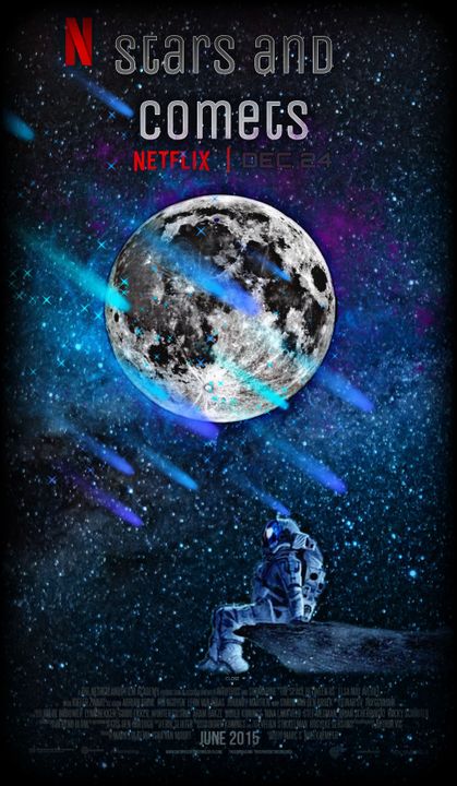
[ 8 / 10 ]
THIS IS SO GOODDD I love the cast member list / info at the bottom [ I cant really read it though ] and the astronaut w the moon is a really really cool effect!! i especially love the comets too they really match with the overall aesthetic of the poster
its really cool how the exposure and contrast of the moon and the astronaut matches so one doesn't stand out so much
if you want, you can add a glow effect underneath the moon for a glowy effect but that's up to you :))
ALSO THE NETFLIX SYMBOLS LMAO
love them
you could also try making the text pop out as much as the moon so it matches a bit better
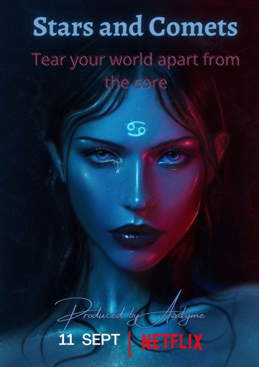
[ 8 / 10 ]
BROBROBRO I LOVE THE FCC they look so perfect for the alien like this is amazing
I also love the contrasting colors it really makes the poster more edgy and the fact that they're the main focus is super super cool and very aesthetic?? like minimalistic type of manip graphic
AND THE RUNE ON THEIR FOREHEADD
AND THE HIGHLIGHTTTSSSS LFSJLE
the font could be lightened so you can see it better [ the produced by thing to be specific ] but the other fonts are also super good!!

[ 10 / 10 ]
FJSL:FJFLF THIS IS SO GOOD WHAT
ok first off, I love the colors they're absolutely gorgeous and are my favorite colors lmao
the fc for the astronaut alien person is really really good and matches so well with that intergalactic type of vibe?? also love the silver eyes
the planet overlays are so smart!! some of them are reflecting off the glass helmet and you can even see the shadow on their face and the type of glowy ethereal effect!!
and the subtitle position is so smart
THE FONTTT THOUGH I lovelovelove the bevel type of shine effect [ I think its overlay but it looks sm like a bevel with no depth alfjslfjs love that ]
anyways, just the whole thing, the placement and the authenticity of this is amazing
[ 9 / 10 ]
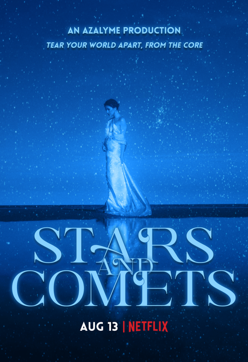
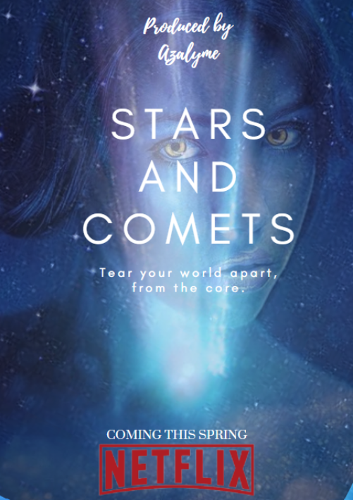
MINIMALISTIC COVERS WITH A SMALL FOCUS POINT ARE SO DANG AMAZING
like the entire color scheme is so perfect w all the different shades of dark blue
the person on the poster are also >>> like they look like a greek goddess
the fade at the bottom and top to a darker color is also really smart and idk if you did that purposefully or if it was just the image
but the fonttt I love the glow effect with the text overlapping each other that's so smart
[ 9 / 10 ]
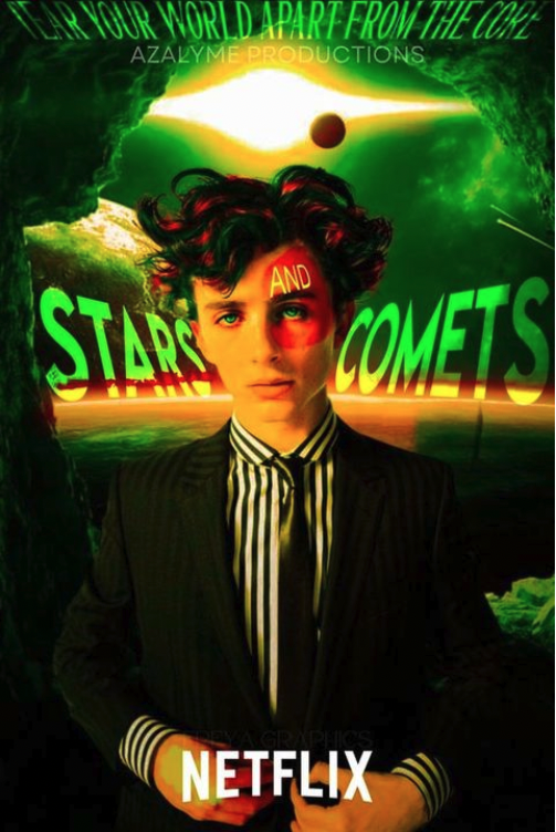
the fact that I'm pretty sure that person looks like timothee chalamet and idk even know who he really is is so weird
BUT ANYWYAS
THE DISTORTED TEXTSTSTSTT I LOVE THATTTT
also the overlay thing on their face and the 'and' on their forehead is amazingajf
BUT SERIOUSLY THOUGH THE TEXTT
but the entire thing is so so cool!! the color scheme too like not a lot of people can make a good graphic with green and orange
especially w that shade of green lmao but you made it work!!
[ 9 / 10 ]
THE GLOWWW OK YES LOVE THAT
the fc is also top notch they look so cooolll and v aliencore yesyes
the vibe is very mysterious and chilling, which is literally everything about aliens and space
also the stars overlay is super super cool and the text tooo
I'm normally not one with just a simple white text but w minimalistic covers or ones with one main point of focus THEY CAN LOOK SO GOOD
amazing thoughh
if you wanted, you could center the text and make it large so it looks like the alien [ ?? ] is looking through the words
[ 8 / 10 ]
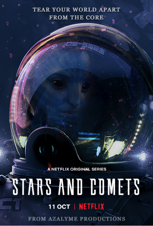
AVATAR UYES SLAY
that is so unique though w the astronaut helmet and the reflection of the intergalactic being!!
i really really love the background though like its so perfect with the entire thing
maybe you could center the helmet next time?? unless that's the cut off of the image but yeah
I feel like you were trying to make the main title stand out a bit more with the pure white while the other ones are either small and white or just blue gray which is a smart thing while doing graphics centering around a certain text, but maybe you could choose a closer color scheme bc the difference kinda stands out a bit to me, but maybe that's just me personally idk
[ 8 / 10 ]
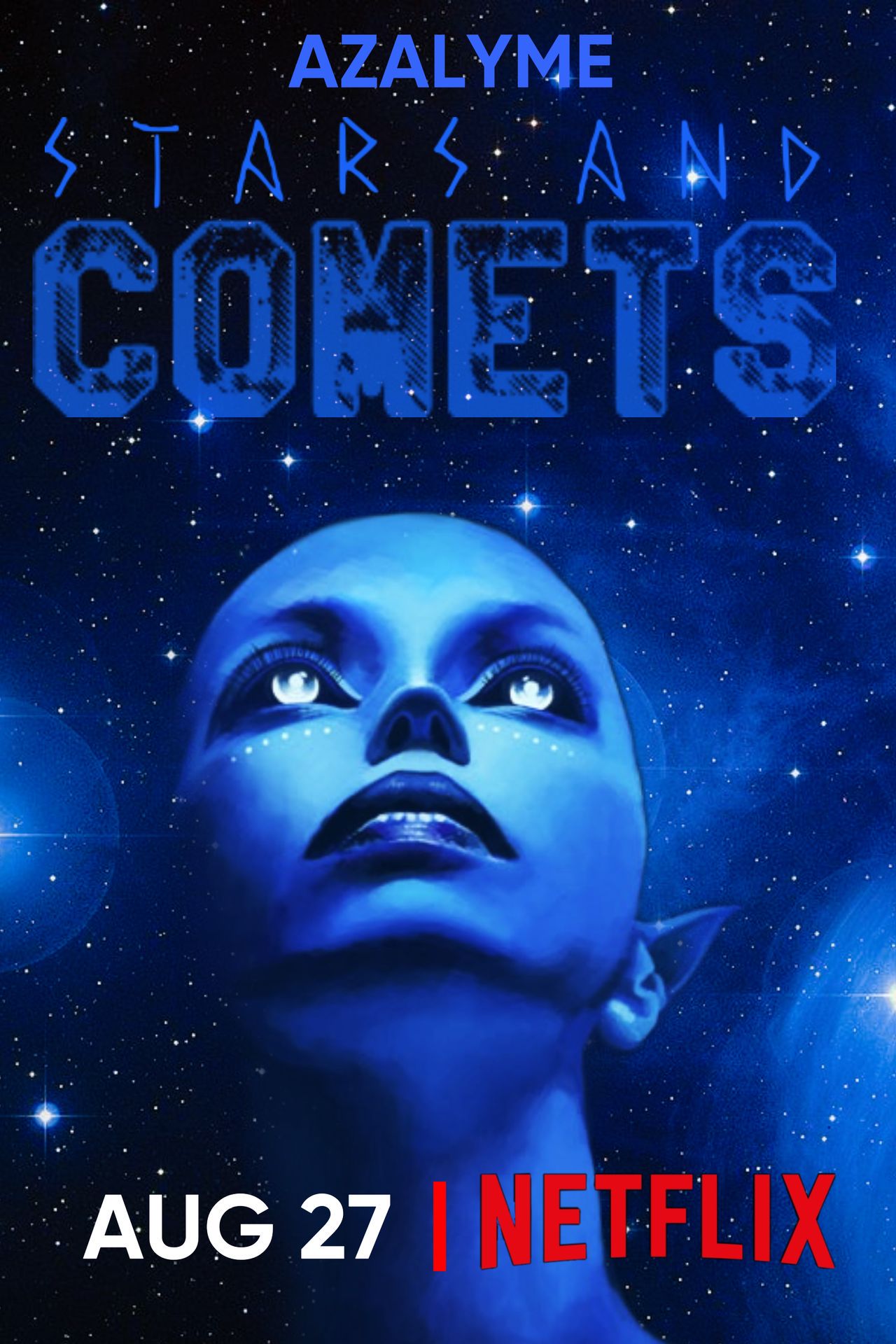
THE. FC. AGAIN THESE FCS ARE AMAZING THERE ARE SO MANY ETHEREALISTIC ALIEN PICS ONLINE
BUT LIKE THIS ONE ESPECIALLY
the skin tone is amazing and the eyeyeysyysy super super cool
also the dotted makeup thing >>
I love how the alien is the same hue as the background and has the starts overlay behind them
maybe you could try centering the picture so it's not skewed to one side, that would help w the symmetrical type of minimalistic one focus thing so many people are doing!!
also for the font you could try to stick with one or two main ones and have them a similar shade :)) or if you want to make it a clear difference you can choose two drastically different shades of blue to make it stand out more
[ 7 / 10 ]
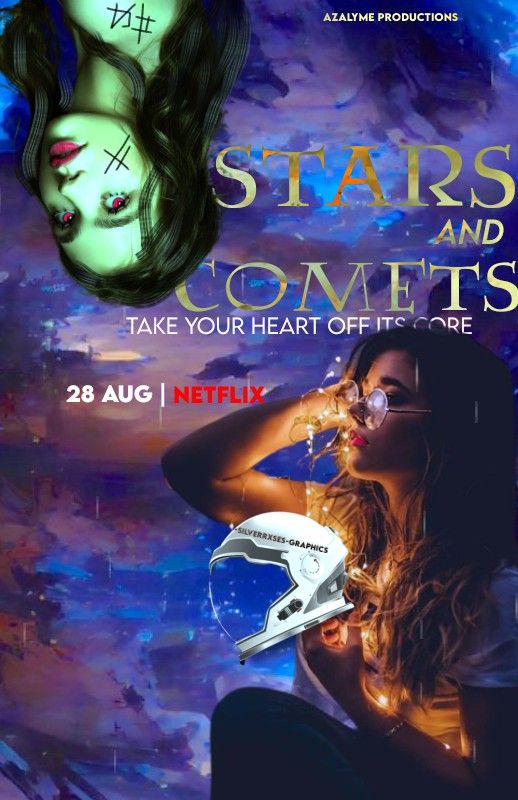
AHH OK THE SYMBOLISM IS SO COOL like love how the human looking girl is holding an astronaut helmet w the fairy lights that's so cool and the alien is upside down and has runic tattoos
you could try to make the entire poster one or two central shades like blue and green or smth so it looks more natural and you can also try centering the text and moving the netflix thing down to the bottom
but like overall, I love the creativity and the bevel effect thing on the text!!
okk so I'm so sorry this is so late but yeah :)) as we progress toward the last round, I'll be criticizing harder and taking away more points for certain things soo yeah it'll get harder sorry ajflsjd
anyways yeah here are all the wonderful entries!! i hope you all have a wonderful day and good luck on the fourth round!!
round three results will be out either tmr or a bit later, but not later than sunday!!
byeee
calcalcal xx

Bạn đang đọc truyện trên: Truyen247.Pro