↳ ᴍᴀᴅᴅɪᴇ ༉‧₊˚✧


Username: 9/10
• I like it but maybe you could've just made the '3' into an 'e' instead. I just feel like it looks a little tacky because there's only one, but you could've also made the other letter 'e' a '3' or you could do the letter 'a'.
Display Name: 9/10
• I'm not sure what it's supposed to mean, I'm a little confused. But I do like the font that is used.
Icon: 9/10
• Yeonjun looks amazing! But I feel like you could find better pictures of him on Pinterest. This one doesn't really do him justice yk.
Header: 7/10
• You can't really see Yoongi in the pics because it's so close together and too large. So maybe you could find a different header on Pinterest that suits the space best.


Bio: 8/10
• I think it's alright for a long bio, but maybe you could add more dividers and sections. Like, add section titles so that it looks less messy and add dividends between things or something.
And the lyrics at the bottom need to be spaced away from the one on top of it. And for your stan lists, add bullet points so that it doesn't look so messy.
Location: 4/5
• I like it, and it's true haha, but you could change the font and add different symbols. I don't really like the symbols in the last part so maybe you could change them.
Link: 5/5 (N/A)

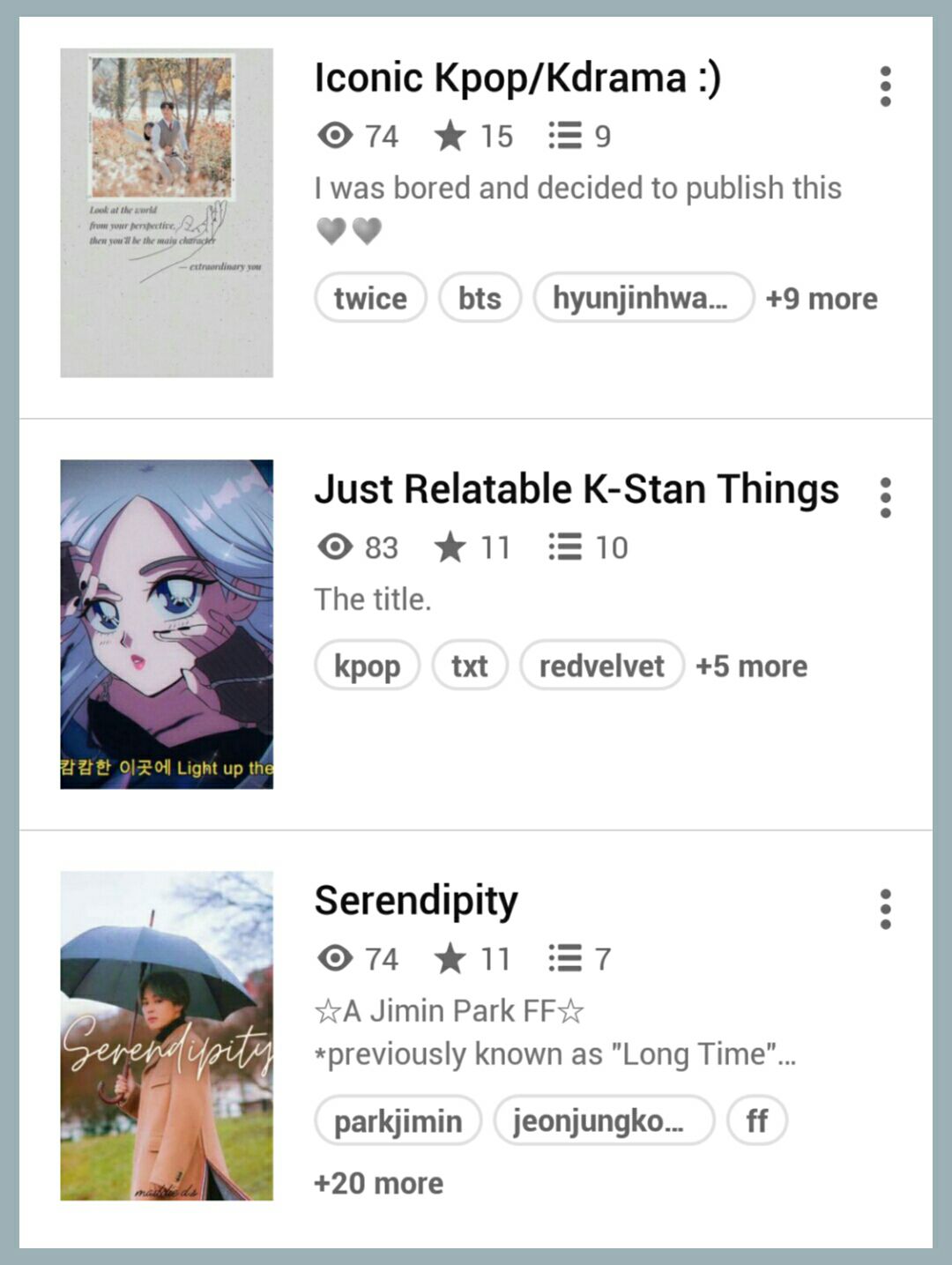
Book Covers: 6/10
• I feel like your covers kinda look tacky and more like a poster rather than a book cover, yk?
The first one looks like a phone wallpaper like it looks like there wasn't much effort put into it. So maybe find an image of a pop idol as a face claim then use that and add the title with a nice font. And I don't like the smiley face at the end of the title because it makes it look tacky.
Then for the second one, maybe change the picture into something else because it doesn't really look like a cover that I would click on. So find a different image and add a title with a nice font. Also maybe remove the smiley face on the title of the book because it also makes it look tacky.
For the last one, the image is nice, but maybe change the font of the title and make it more prominent and easy to read.
You could also seek help from cover designers here on Wattpad and they would be able to make your covers.
Book Description: 6/10
• Too short in my opinion. Even if it's a book that's not a fanfic, the description still needs to have some sort of information. Which it has, but it's only a sentence long and such. So add more to it so people could know more about the book (that's the purpose of a description after all).


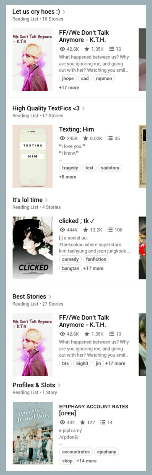
Reading Lists: 8/10
• It's good that you only have a few reading lists. But maybe change the font of the titles and add symbols to make it more aesthetic.
Overall Vibe: 7/10
• The vibes are too all over the place that I don't really know what I'm looking at, so you need to work on that. And maybe make it more aesthetic, then it would be perfect!

78/100

Hi Maddie, your account is quite nice despite the few things that need tweaking. I like how you add your whole stan list to your bio and how you keep things fairly simple and neat. There are only a few things that you would need to change then it would be perfect! Please don't get offended by anything that I've said, it's just my opinion and it's your opinion that matters in the end. Have a great day! <333

Thanks for visiting!

Bạn đang đọc truyện trên: Truyen247.Pro