↳ ɴᴏᴄʜᴜ ༉‧₊˚✧


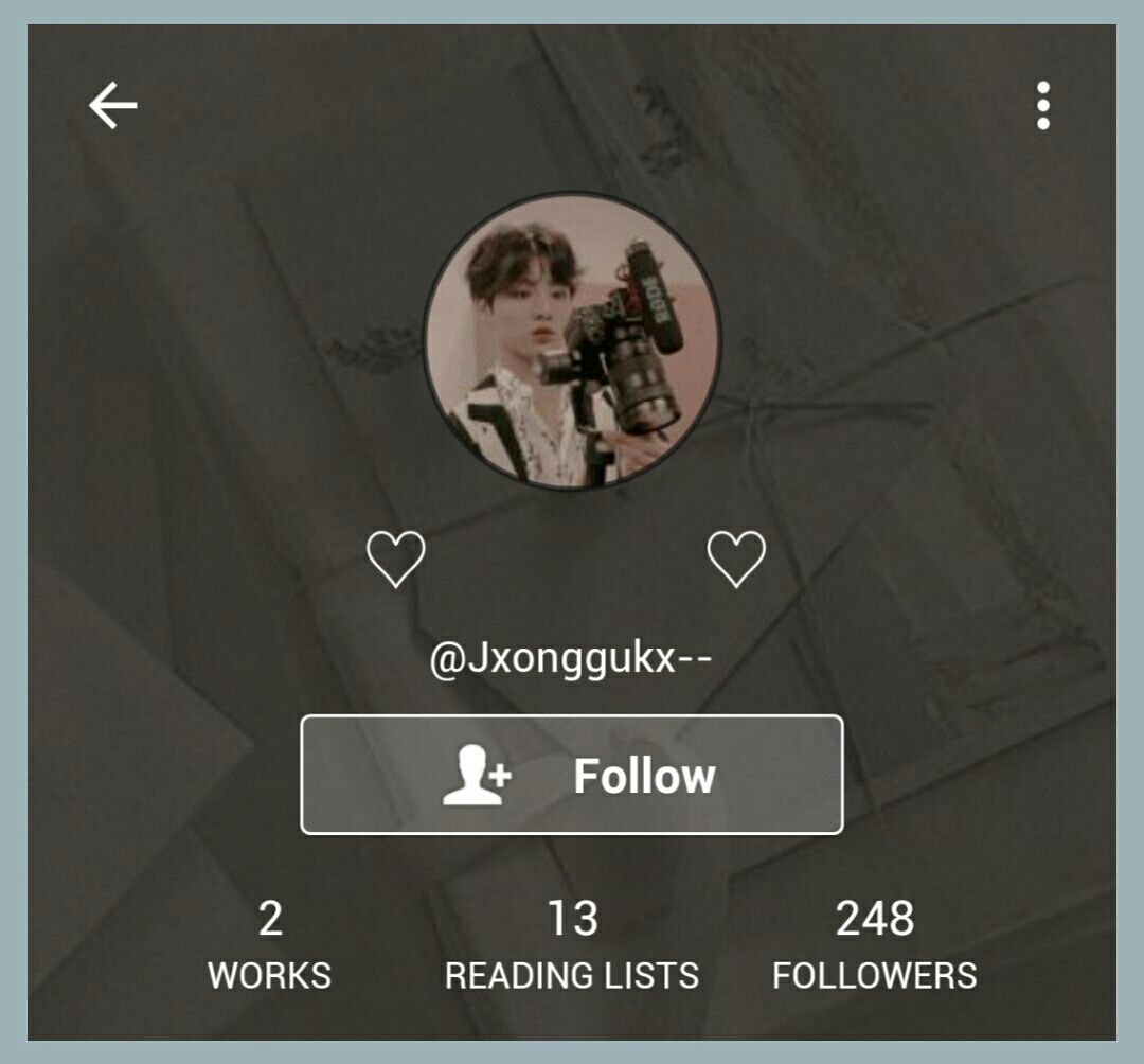
Username: 9/10
• I luv it! It's pretty unique because of the two 'x's that you used. However, you could've put the dash (-) on both sides instead of just on one side because it could make it more centered ig.
Display Name: 7/10
• As you could see from my screenshot, I couldn't view it on my phone. But I used my desktop to view it and it's nice, but maybe your could use your nickname instead. It's a little plain.
Icon: 9/10
• I love that pic of kookie because he looks so cute and the pink tones are a vibe. But maybe you could add a border to it or something.
Header: 6/10
• It's a cute pic not gonna lie, but it doesn't really match the icon. I feel like the colours don't match and it got darkened too much that it doesn't match.
And it looks a little tacky? Yk what I mean? It's kinda hard to explain, but it just doesn't look right. Maybe you could change it into something with pink tones. Pinterest has many options to choose from.
But don't get me wrong, it's nice but just doesn't suit the vibes.


Bio: 8/10
• I like long bios so yours is nice, and I really like your song choice! But I feel like you could make the music player thing a little smaller (like remove some stuff and rearrange it to make it take up less space).
As for where you mentioned your friends, maybe you could add a space just before the divider. Then add a label that says "My friends" or "Watty Fam" or something like that. And maybe don't add a space between each one and just add a bullet point for every category.
Location: 4/5
• It's cute but bland, maybe you could add some symbols and change the font so it's cuter.
Link: 5/5 (N/A)


Book Covers: 7/10
• I like how your covers have a brown tone to each of them. Covers don't necessarily need to match the theme, that's up to the author to decide (and personally I don't want my theme to match my covers since I like them to have their own style and so they stand out to me. But yours, they're lacking.
The one for Behind The Smile, it looks like a poster rather than a book cover because the picture is so small. And the words on it are quite small as well. It looks as if it's just a quote book rather than a novel.
As for the other cover, I feel like it's lacking something. And even if it's just a random book, not a novel, it should be more interesting and make people want to look at it. But they're both pretty nonetheless.
Book Description: 6/10
• I feel like they tell about the book but it's too little. Especially the one for your fanfic, it doesn't say anything about the story and it's a little bland for a description.


Reading Lists: 7/10
• You have quite a lot of them, and I feel like since not every category has many books, you could just combine them into one rather than having one for each.
And maybe you could add a font to the titles of the reading list to make it nicer. You could also add some symbols to it as well.
Overall Vibe: 8/10
• I like how the icon and the book covers go well with each other. But the header should be changed and add some fonts and it would be amajin!

76/100

Hi Nochu, please don't get discouraged by my words. I really like your account regardless of what I've said. Also please don't get offended by anything that I've said because it's just my opinion, and at the end of the day, it's your account and you do you! I love you so much! <333

Thanks for visiting!

Bạn đang đọc truyện trên: Truyen247.Pro