⠀ text styles pt.2

eyyyy i'm back at it again with the text styles~
a lot of you guys said that you really liked the pt. 1 of this, so i decided to make a second part, ahaha!
and as i said last time, feel free to use these styles in your works! i can't exactly "claim them as my own" and force you to credit me or anything. so don't worry about credit or anything and you're welcome to steal any styles that appeal to you. :)
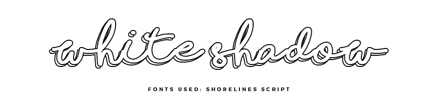
how to create: outline your text layer with a black stroke, and then duplicate that layer and place it behind the top layer, offset to the side by a few pixels.

how to create: place a white rectangle over your text layer (the font should preferably be kind of tall? in my opinion, ahaha) and then choose a different font to write the text inside the white box (i personally think that using contrasting font types is good for this, like serif and sans-serif or serif and handwritten/script etc.).
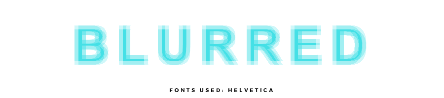
how to create: type out your text and then (in photoshop) go to filters > pixelate > fragment and adjust the settings if need be. if you don't have photoshop, i imagine you could take an eraser tool in any program, lower the opacity by about 50%, change the thickness to about 1/3 the thickness of your font, and then carefully eraser around each letter.
note: if you have photoshop, the gaussian blur effect is also really good for making cool blurred text!

how to create: just take a paper texture and use a clipping mask to conform it over your text.
note: i feel like this would look really cool with an inner shadow effect too? so that it sort of looked like it was engraved or something ahaha idk

how to create: give your text a colored outline and then go to fill (in photoshop) and lower the opacity all the way to 0% so that the text is transparent.
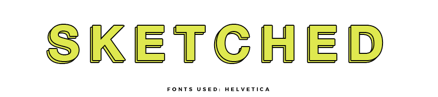
how to create: give your white text a black outline and then duplicate it and place the second layer behind the first and offset it by a few pixels.
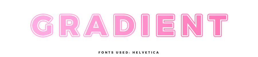
how to create: give your text a gradient fill (if you have photoshop you can go to layer effects > gradient fill but if you have another program you can use a clipping mask to mask a gradient over your text) and then give your text a white/transparent outline, and then a gradient outline (in photoshop you can change the type of fill from color to gradient) using the same gradient as your text.
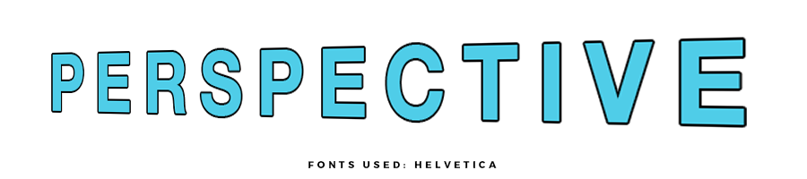
how to create: (in photoshop) change your text into a smart object and then enter the transform mode (go to the move tool and click on one of the four corners of your text, if that makes sense, ahaha!) and right click on one of the little box/corner things around your text and select the perspective option. then just take the top right corner and drag it up slightly (or a different corner, depending on which angle you'd like your text to be).
note: i imagine you could achieve a similar effect in any other editing program with a lot of patience, ahaha! from what i can see, to make this effect, you can make the first letter of the word narrower/thinner, and then make the second letter slightly larger and slightly wider. then just continue making each letter progressively larger and wider than the last. i hope that makes sense lmao and if it doesn't you can just study the example above to see how the letters behave.
wow, i really need to think of some more text styles, ahaha! these were just sort of random styles i made while playing around in photoshop, but now i'm completely out of new styles lmao
also, are there any other types of styles you'd like to see? like ways of outlining/accentuating png's or various styles of simple covers, or a guide to different types of cover styles or idk just comment what you want to see next huehue~
Bạn đang đọc truyện trên: Truyen247.Pro