| r e v i e w s : p a r t 1 |
Disclamer: They are in a random order.
1.
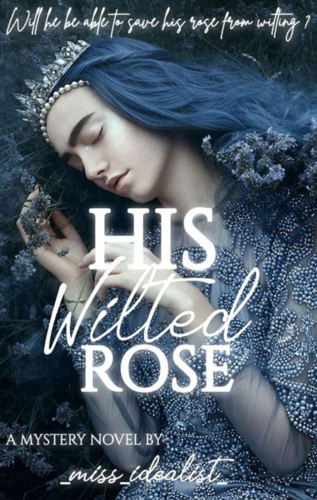
💜 The cover looks really pretty!
💜 The font style and your colour choice is nice too.
💜 I liked your sub title and your idea behind the graphic:)
🖤 I know you've put your best efforts but in the end it's just a single picture with text.
🖤 The placement of the text ' A mystery novel by' doesn't look good.
🖤There's no manipulation or much editing done in the cover.
🖤In my opinion it looks more like a fantasy cover. You could've been more creative to make it a look like mystery cover according to the prompt of the contest.
2.

💜 This cover looks very creative, your idea is unique. I have never thought or seen anything like this before!
💜 I just have never imagined Harry Styles as a watermelon before!
🖤 To be honest I don't like the font a all.
And you could've used different fonts for the title and subtitle. The font color doesn't stand out.
🖤 And it doesn't look much like Harry styles. I know you've tried your best so I really appreciate that.
🖤 The blue background looks very dull.
3.
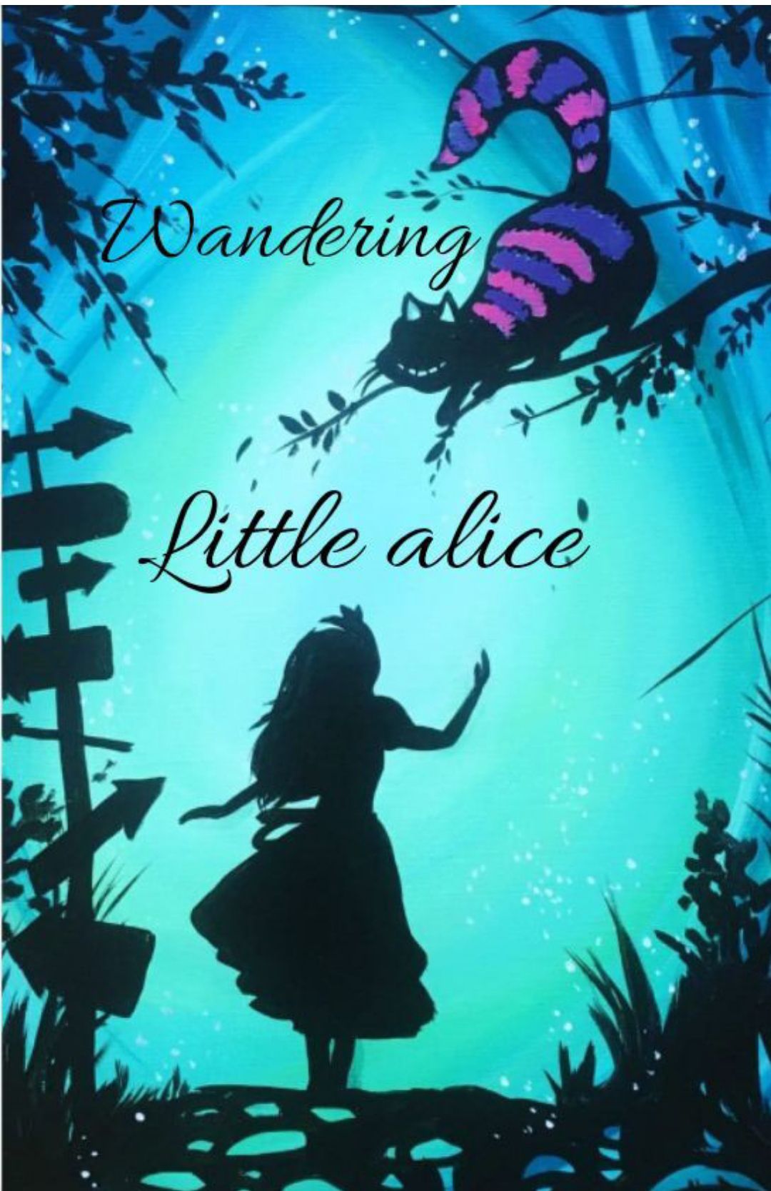
💜 I loved the colours and the silhouettes. It looks really magical!
💜The font looks very plain compared to the vibrant background so it could've been more creative there.
🖤 You haven't shared all the resources and I don't know whether you've just put some text on a single photo or have actually edited the whole thing.
🖤Your prompt was to portray Alice differently if I'm not wrong. But I don't find anything unique in this cover.
4.
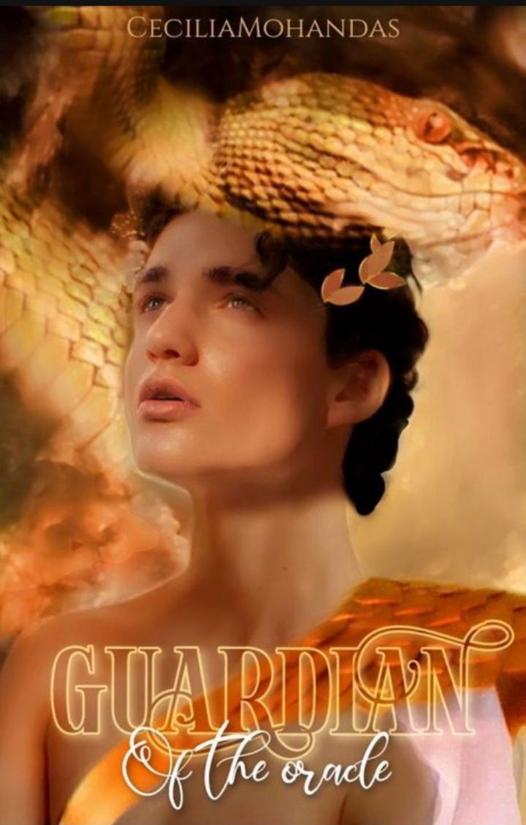
💜The whole edit, the colours, the fonts come together very well!
💜 It's wonderful how you've added various elements of greek mythology in one picture.
🖤In my opinion, the picture is too much softened, especially the top left part. I prefer sharper images.
5.
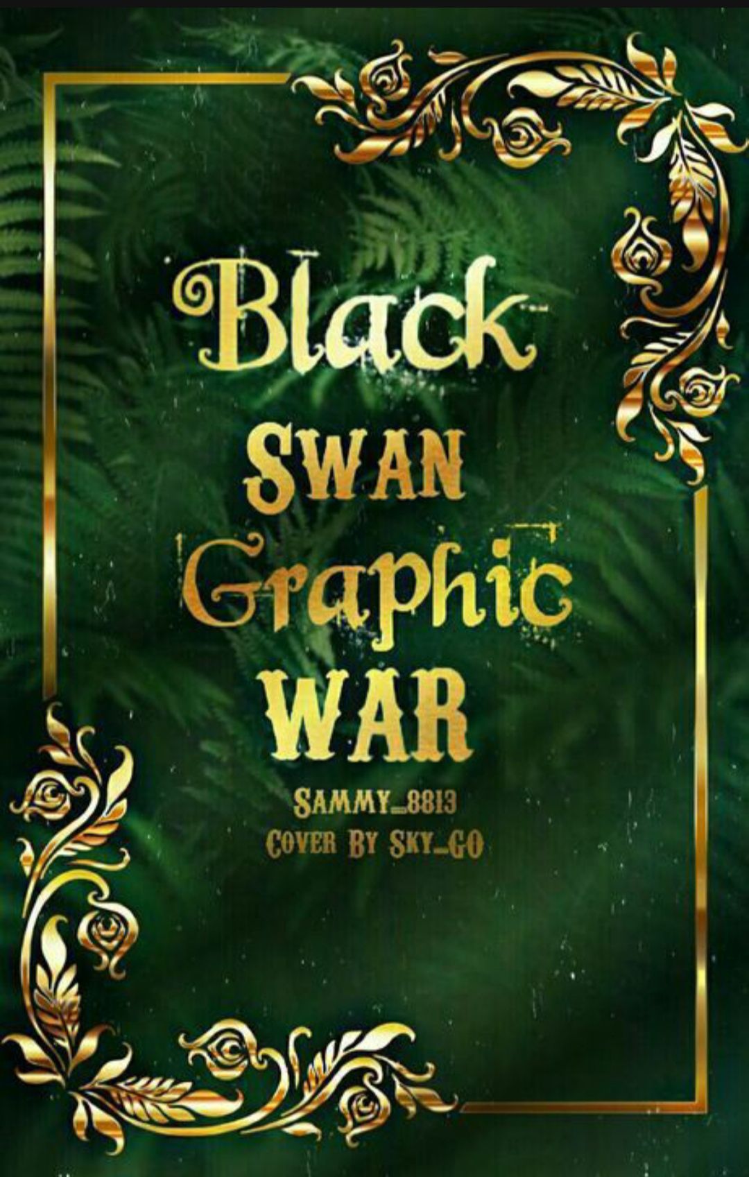
💜 This cover looks very simple at first but there's a lot of resources used and editing done behind.
💜 I really liked the golden borders and your editing. Good job!
🖤 The font is good but the scrapped off marks/ scratches ruins the whole central area.
🖤 Also I don't find any significance of the leaves in the background of the cover.
5.
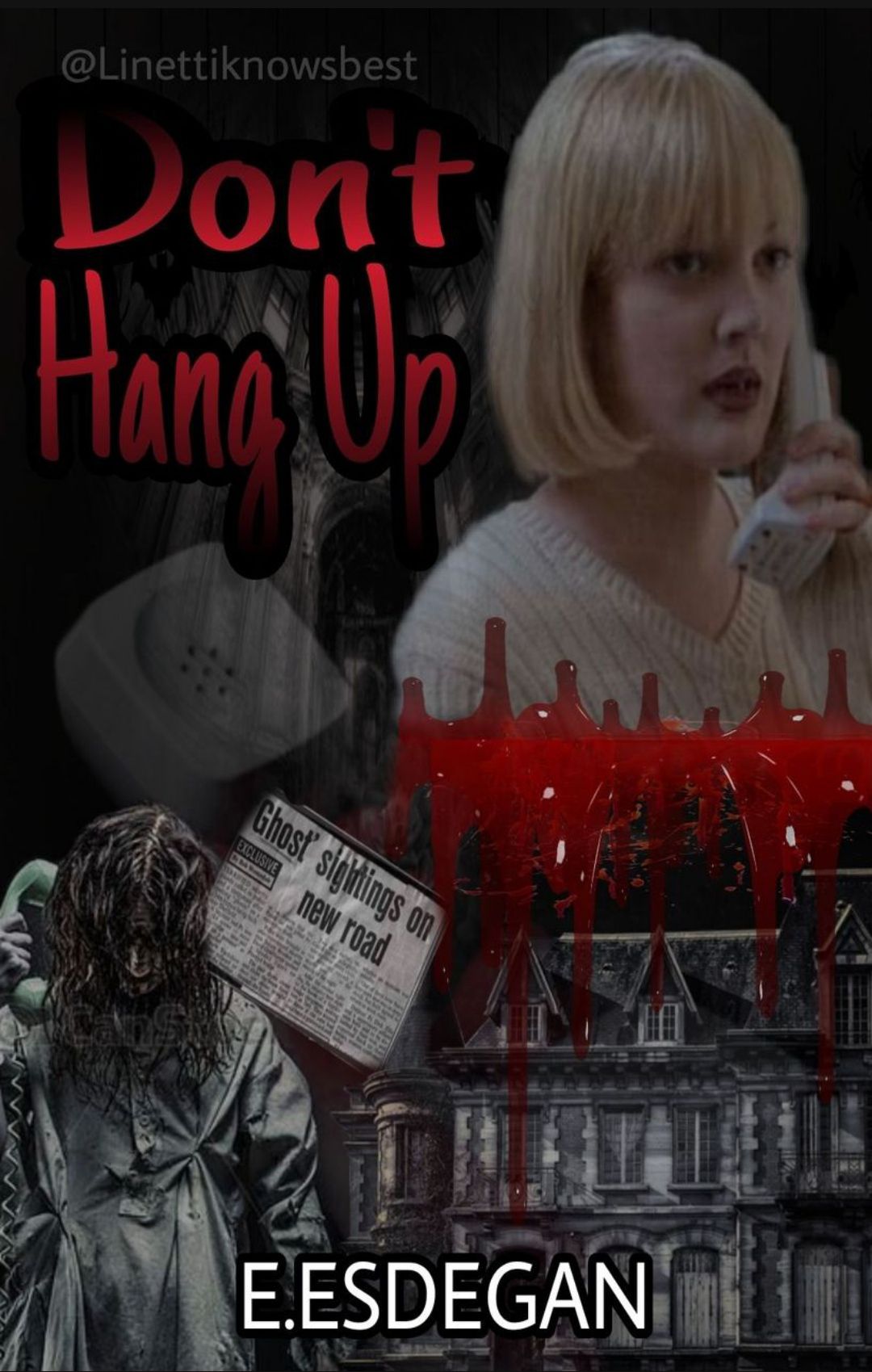
💜I like how you've shown depicted the title on your cover.
💜 The dark colours suite the horror genre well.
🖤The title font is faded too much, especially the 'D' of Don't. You could've been more creative with the font style and placement of the texts.
🖤The cropping of the images isn't neat, the whole edit could've been more organised, I hope you understand.
6.
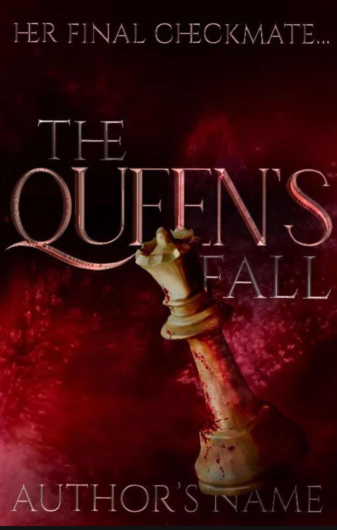
💜 This cover is really cool!
💜 I love how all the colours come together and how the cover depicts meaning of your idea behind it.
💜The fonts look great too!
🖤As you've mentioned yourself, you haven't used many resources but still good job!
7.
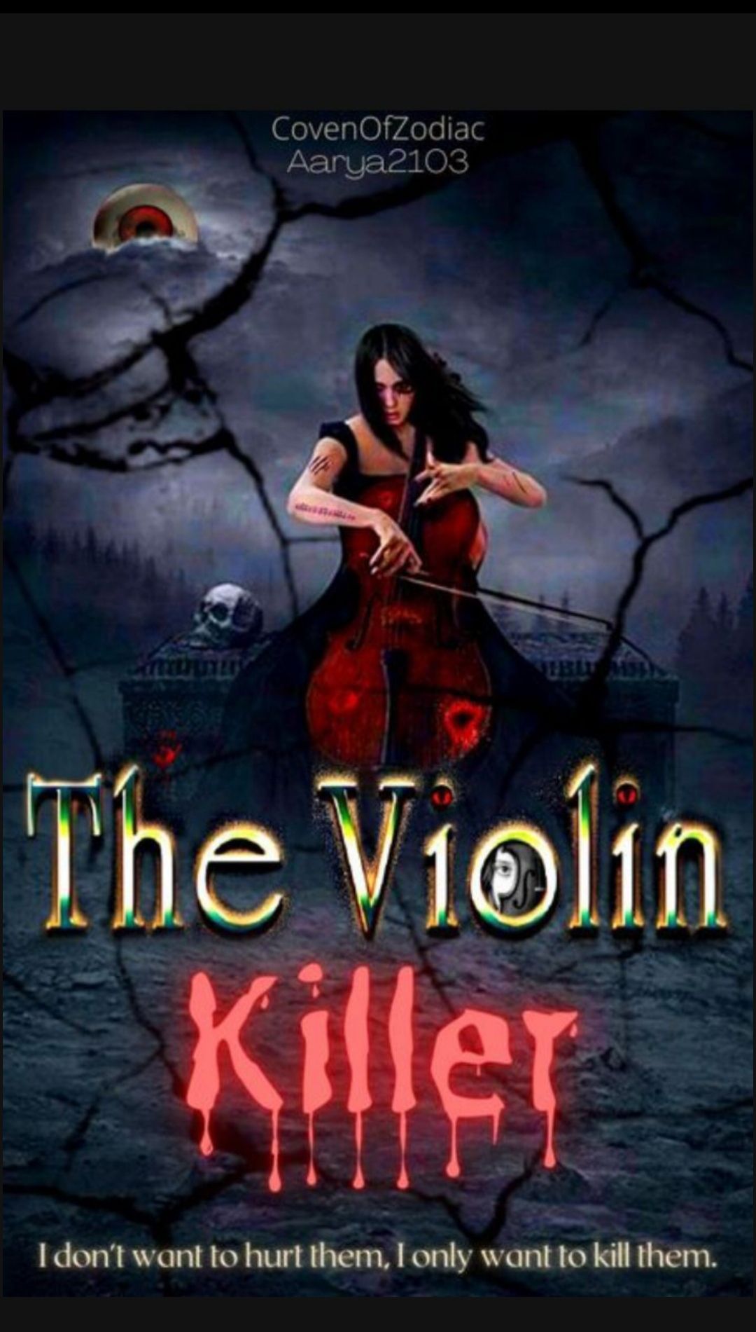
💜 This is such a horrifying cover! 😂
💜 Its amazing how you've added so many horror elements into one cover, yet keeping the main element highlighted.
💜The eyeball moon is such a cool idea!
🖤 I don't like the colour and font of the words The Violin.
Does this girl like kill people by playing her deadly violin?😅
8.
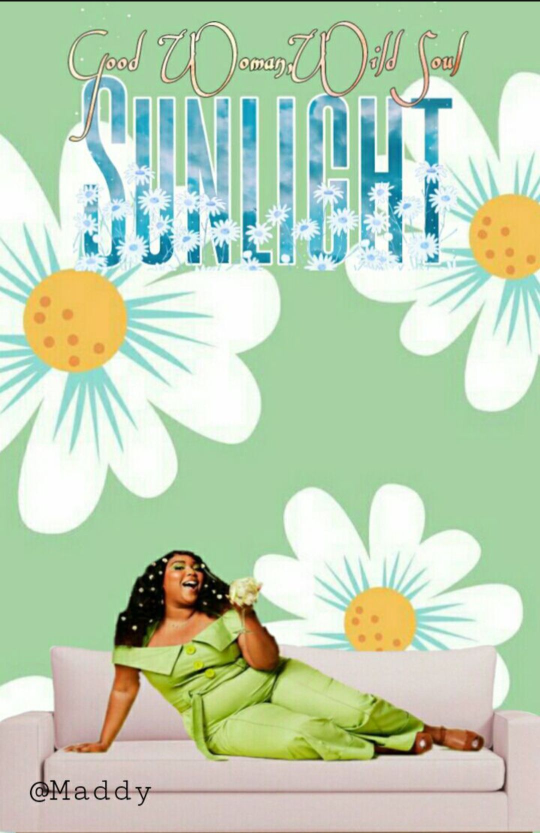
💜The cover is simple and sweet.
💜I like the vibrant colours you've used.
🖤 I feel you've used too many flowers in this cover. It kind of makes it look overcrowded and messy in the title part.
🖤You could have tried some other fonts.
I don't like the subtitle font, it doesn't go well with the edit. Try experimenting with more fonts and be creative.
🖤 The cropping of the character isn't neat.
9.
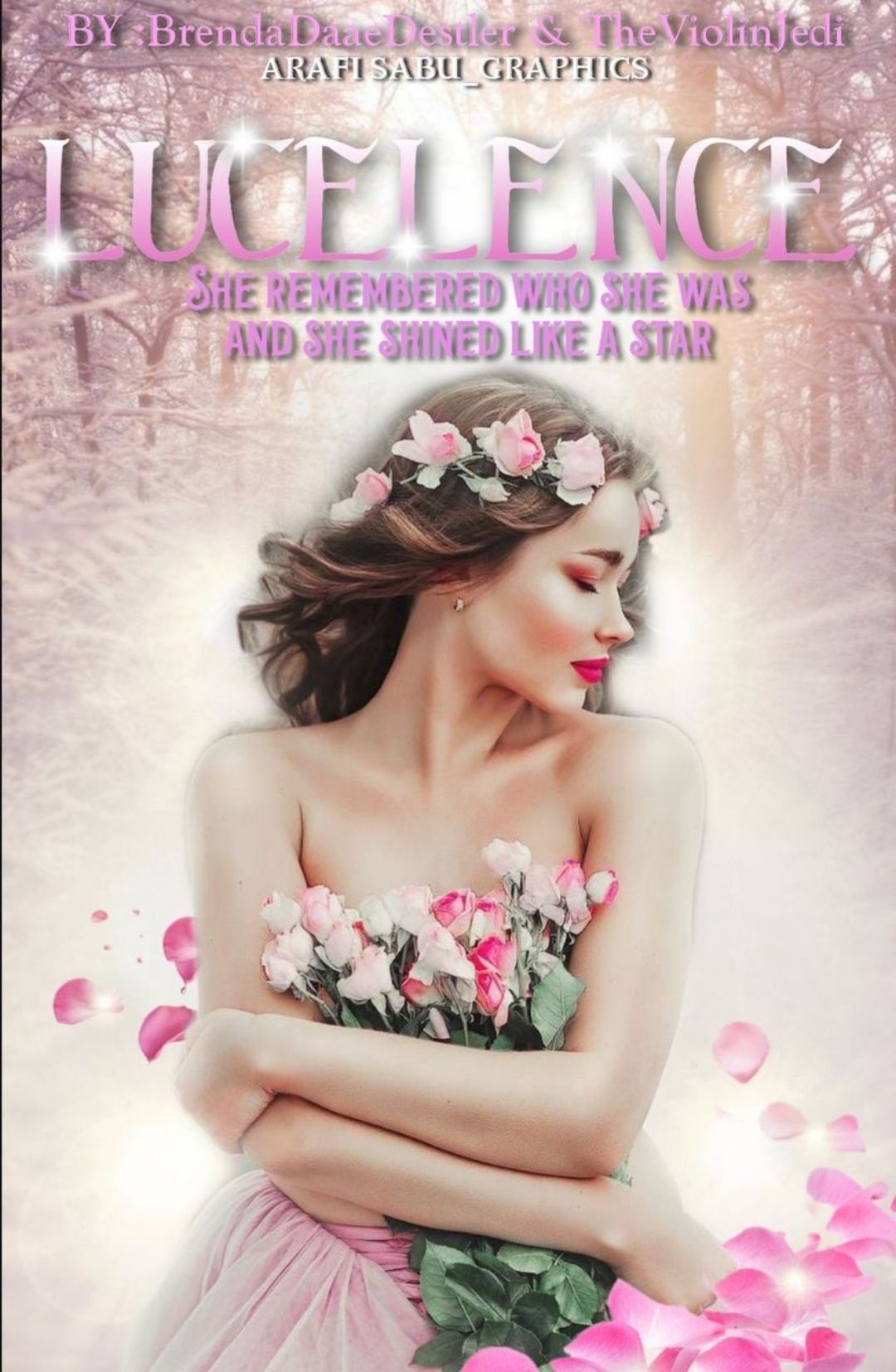
💜 Your cover is just so lovely! The colour scheme is gorgeous.
💜 Your editing, the pictures selection, fonts and everything is amazing.
🖤The cropping near the hair and hand isn't neat but it's not noticable.
🖤The subtitle font and colour could've been better.
10.
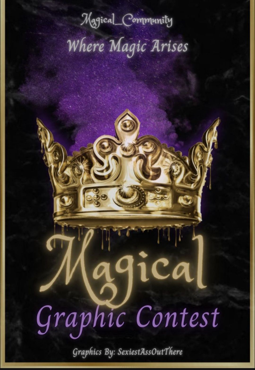
💜 The cover looks really magical!
💜 I love the purple smoke coming out of the gorgeous golden glittering crown.
💜Again the crown is awesome, it's perfect!
🖤 I am not much pleased by the font choice. It could've been better. Especially I don't like the plain font used for the subtitle.
🖤You could've added more magical elements and sparkles to your cover.
Bạn đang đọc truyện trên: Truyen247.Pro