I made crappy art for you, dont judge
I suck at describing things. I know this. And I wanted to learn to draw digitally so meh.
I did the one of Hiccup first then figured I'd do rough sketch things for the other characters because why not. I was thinking of doing a close up of just a helmet but i don't think the helmets they'd use for flying would be too different. So have some crappy art.
By the way, I am way better at resorcinol's art. Like waaaaay better. Sigh.

We've got our wonderful Hiccup, I used a reference of him from the second movie in the flight suit. This is kind of approximately the idea I had for the Roman flight gear. Let you imagination fill in any gaps if you want. The skin tone looks bad and too dark but I think it's cause I had to convert the file cause it was too big to email to my phone from my laptop. Also featuring the death sword itself. Maybe I should give it a name...

And here's Verlin. I don't remember where I got the reference but it was one of those dynamic pose things you find all over the place. The mouth is weird and so are the hands. And also my colouring skills suck all round when it comes to digital. I was trying to make the pants look loose but I think they just look weird.

Aeliana. I don't think there's too much I can say about this one other than I hate it. The colours are okay. The armour looks a little too Celtic-Saxon- English-y for my tastes. And the reference had gloves so uh... yeah. But what can you do?
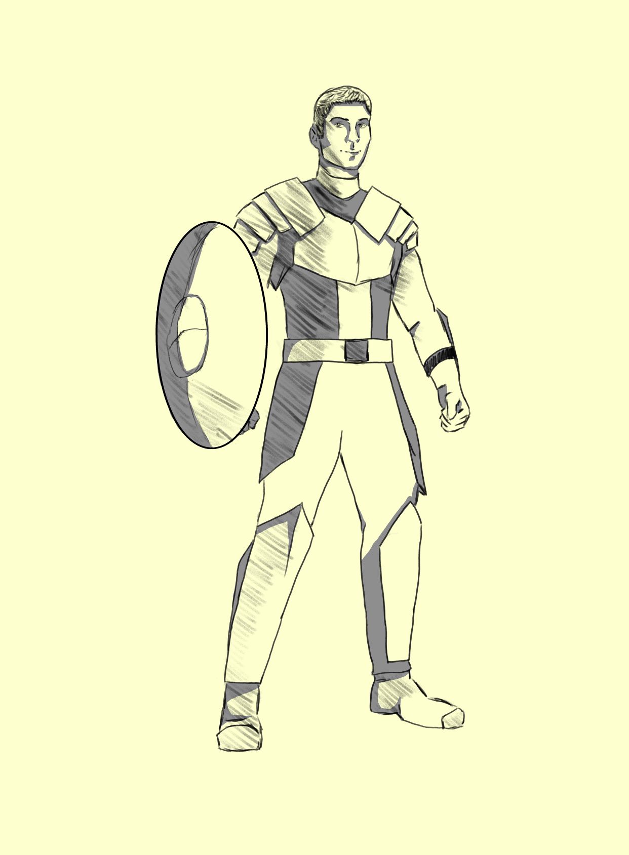
Hands down I hate this one the most. I think you can tell it's Atticus. I think you can also tell the reference was Chris Evans as Captain America. I wanted him to be posing with a shield, good ol' CA is the only reference you can find for that. I'm not too mad, I kinda envision Atticus as basically Evans but a little toned down, not as crazy muscular. Idk, the shadings bad cause I tried something new that failed.
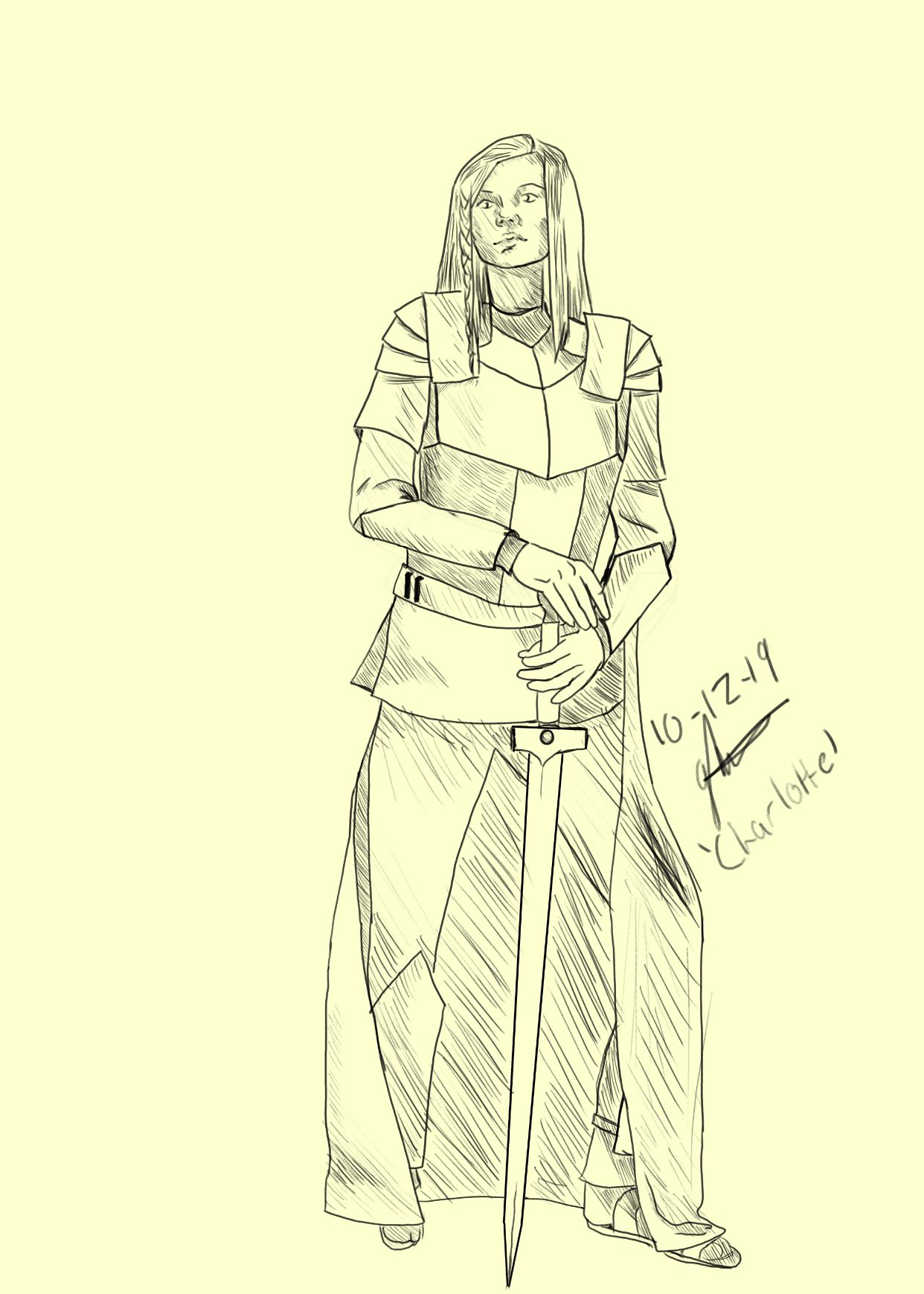
Wooo it's Charlotte. Realistically I think I like this one the most but it still looks wrong to me. I tried out the flight suit/armour design again, I think a middle ground would be best.

And behold the warlock herself, Jael. I actually tried this twice, this is the second one. You have no idea how hard it is to find a reference of a woman with a staff that isn't hyper sexualised. Blurgh. I like how I shaded the hair and the lineart of the wrappings looks... decent. The hands are still crap though. And no, I did not try hard enough with the feet. Am I ashamed? No.
Idk, tell me what y'all think.
See you next update!
Bạn đang đọc truyện trên: Truyen247.Pro