TUTORIAL: Serenity
—requested by RealityKeeper—
alright! the best way I can give advice/tips is to just walk you through step by step how I made the cover, I guess haha;;
I'm super sorry for the long wait!
this is my first 'tutorial' kind of thing, so I hope it makes sense and at least helps you somehow--
(program used: Photoshop CS6)
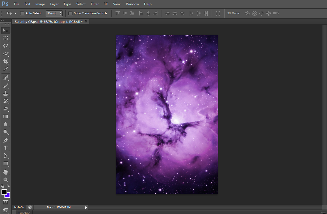
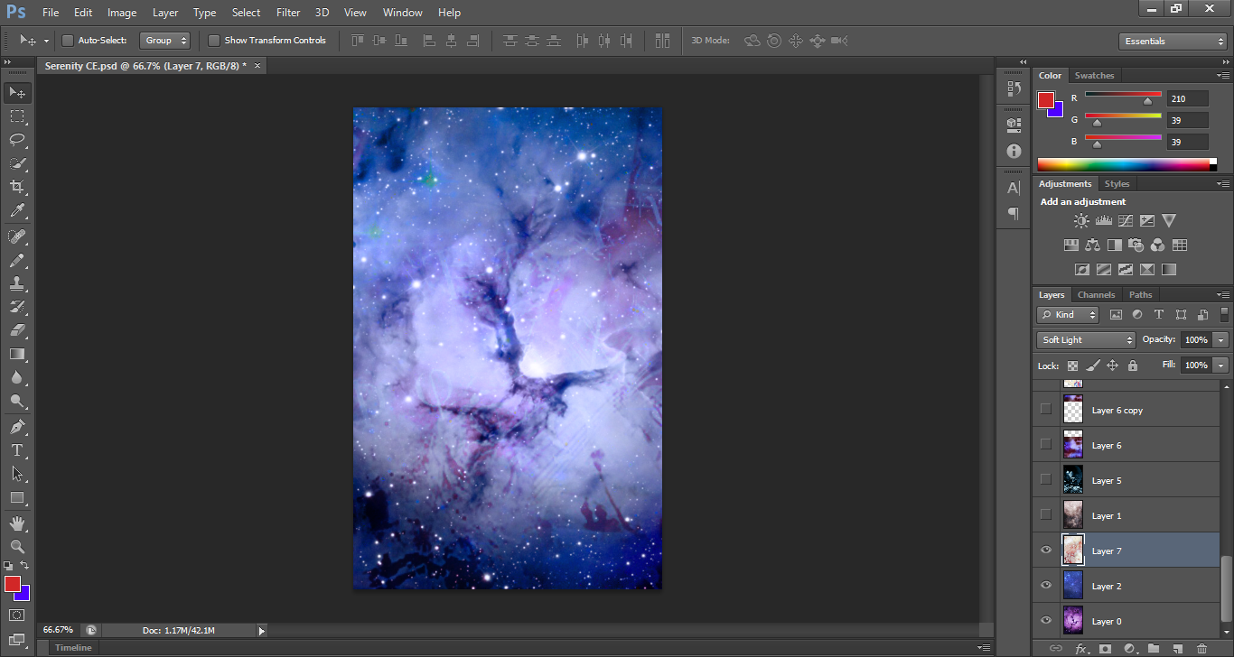
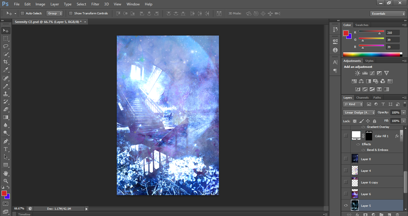
first, I started with a random image that I thought would've been a good 'base'
because calm and peaceful usually brings me to the colour blue, I decided to use a texture(?) that would turn the background to a bluish shade instead.
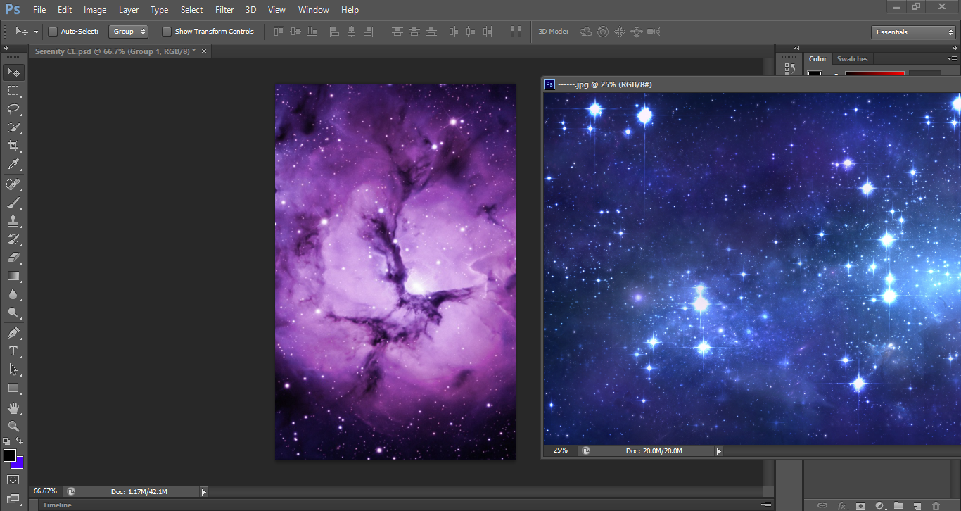
then, I dragged the texture to the canvas, set the blending mode to 'colour' so the shades would adjust accordingly.
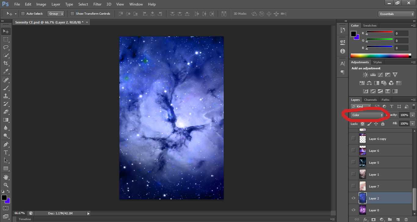
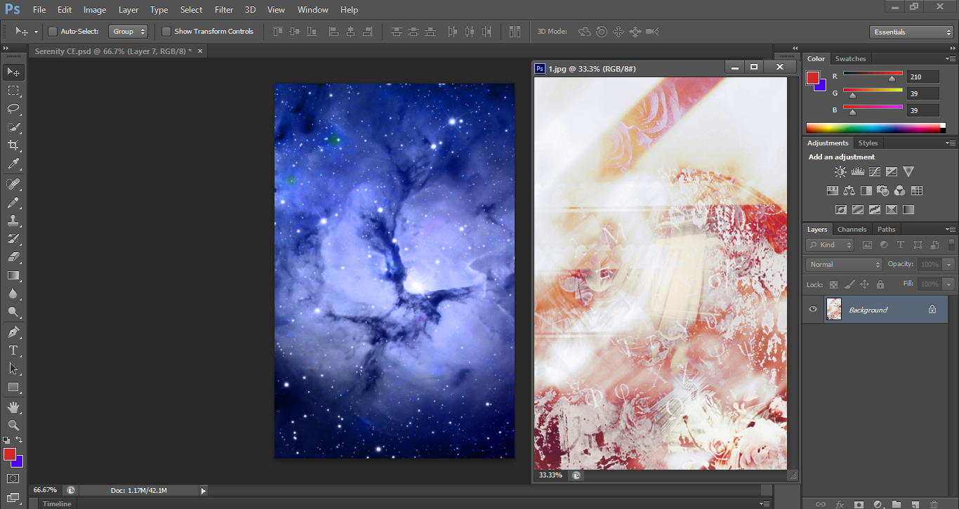
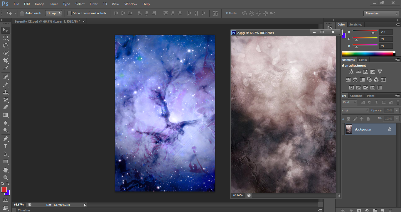
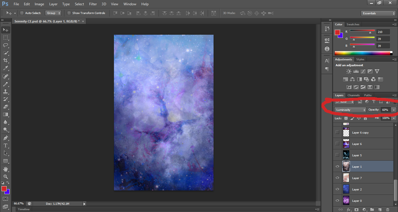
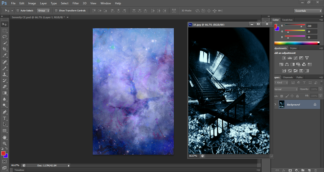
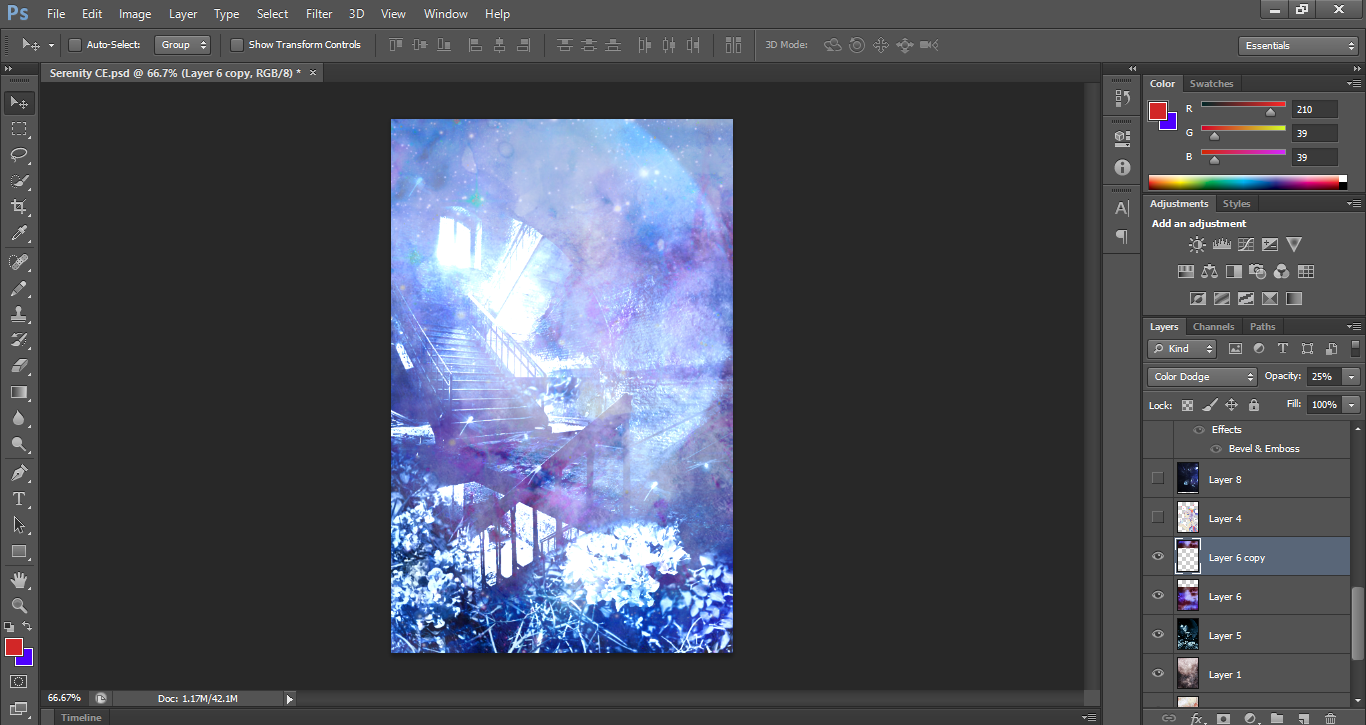
I repeated the same steps from earlier, using different textures and different blending options-- it's usually good to just play around with the options, to see which effects would be the best fit.
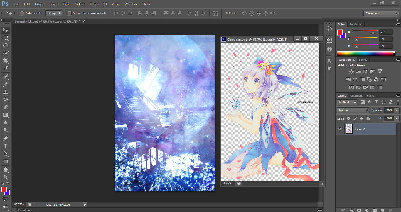
finally, we can add the anime character render now! (in this case, it would be Cirno from Touhou) textures and renders alike, there are plenty of them around books on Wattpad, or sites like deviantart, so I'd recommend scavenging around-- there are plenty of super nice ones.
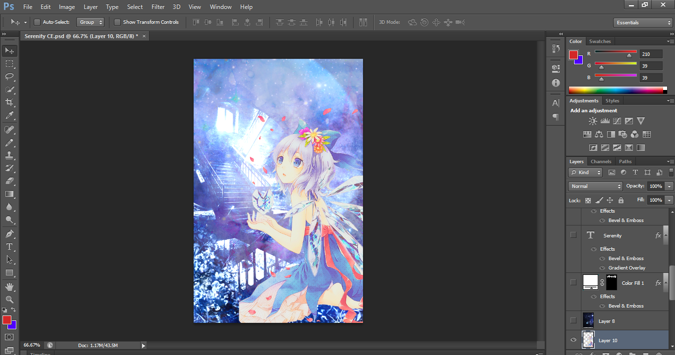
... but wait! the image is too small for my liking. so, what do we do? there are probably more efficient ways of doing this, but personally, I use this website called waifu2x. basically what it does is enlarge your image while keeping the quality and such. it looks like this:
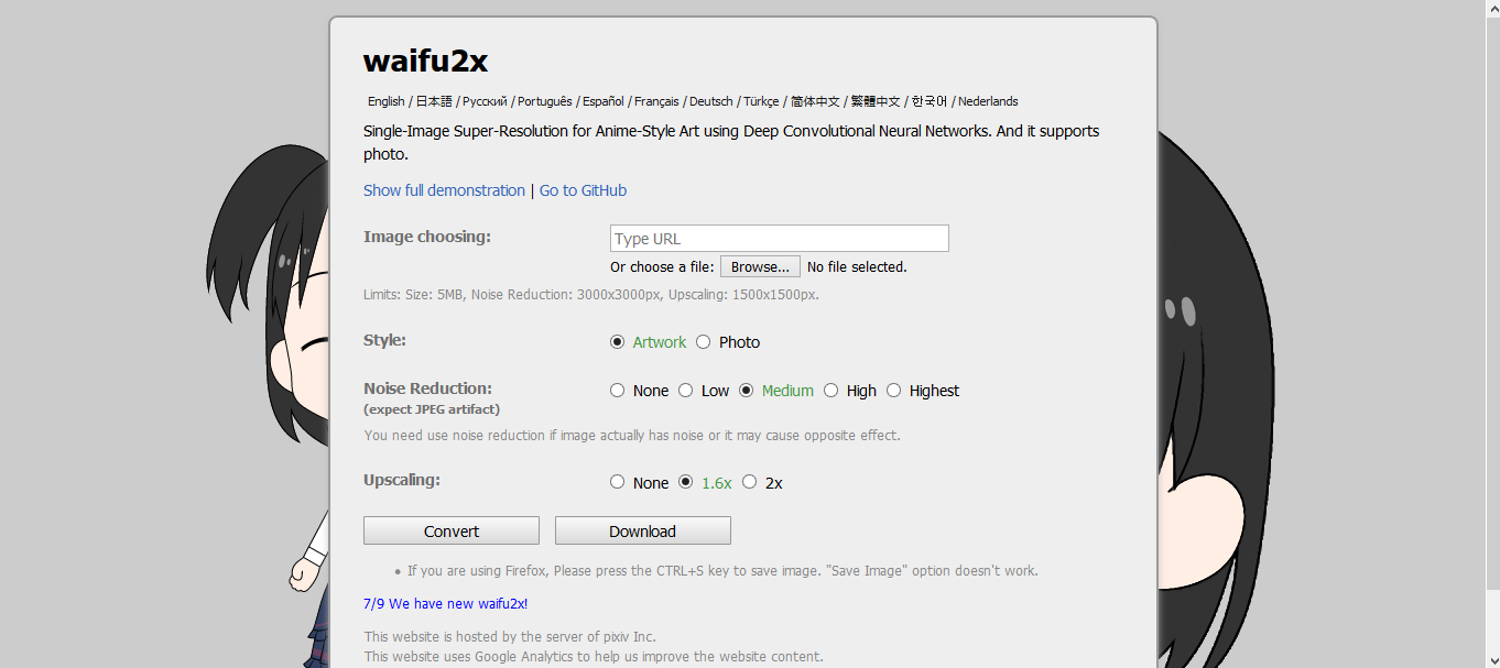
I use the same settings as above, but these are just the default ones. I'm not sure whether I used the 1.6x or 2x scaling, but that pretty much determines how big the image will grow. after that, I headed back to Photoshop to apply the larger image, and tada--
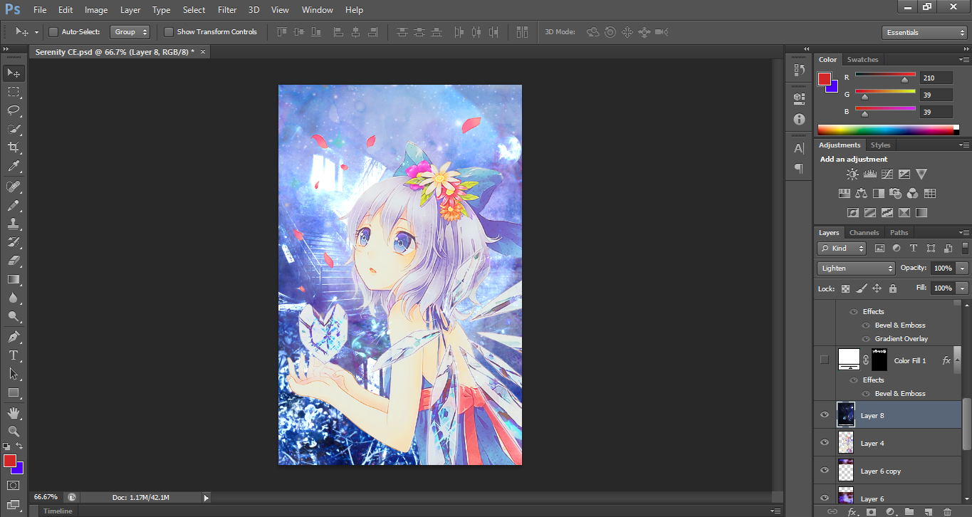
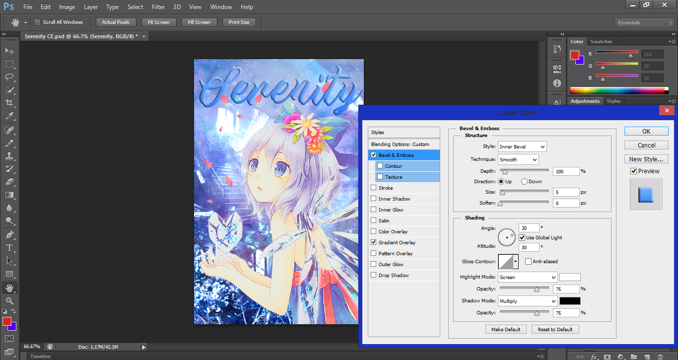
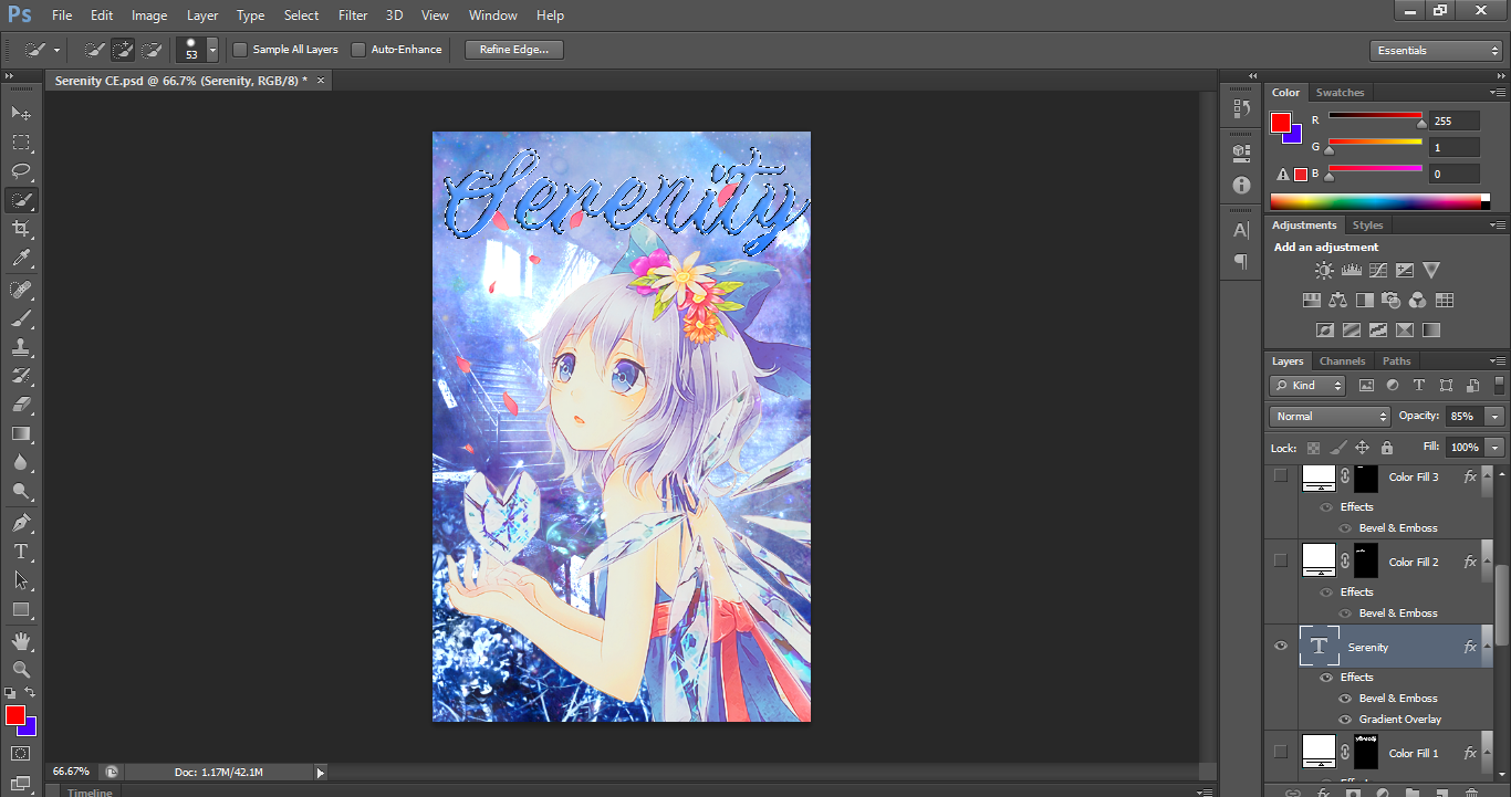
next, the text. I use bevel & emboss for pretty much everything, and I rely on the gradients a lot, too. it should be 100% depth by default, so not much to change, I guess? you can also change the opacity of the text to your liking-- which I used 85% for, so it's very subtly faded.
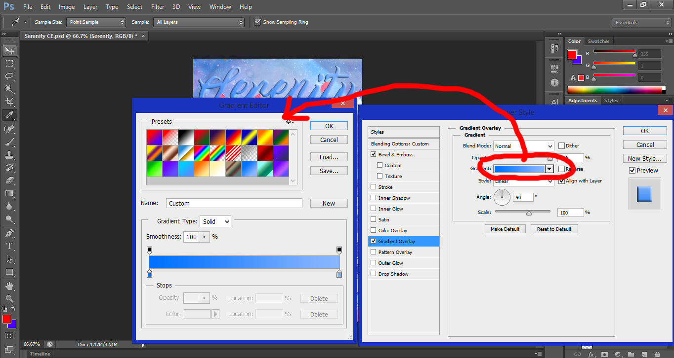
Photoshop offers a set of gradients in the program by default, but you can also mess around and create your own variations in the gradient editor!
next, using the quick selection tool, I dragged it across the text layer so it'd be selected, as shown by the dotted outline.
head over to the 'select' tab above, then 'modify', and finally, 'expand'
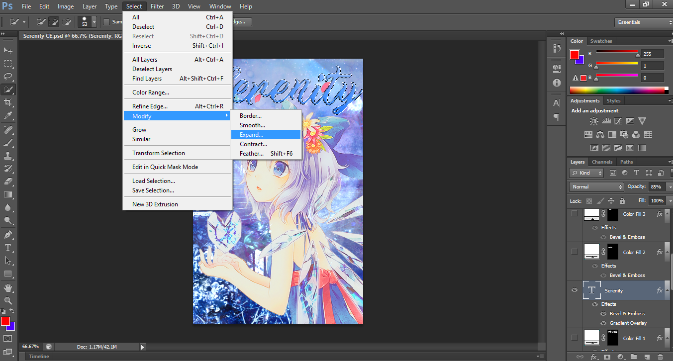
a window will pop up asking about how many pixels to expand by, and usually, I use either 1 or 2 pixels-- generally 2 pixels for lager titles, and 1 for author's names and such. however, for this particular cover, I think I expanded it by 1 pixel only?
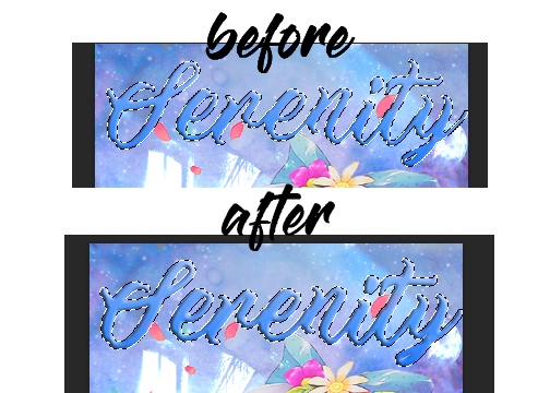
there should be a very subtle difference-- it's only a pixel, after all.
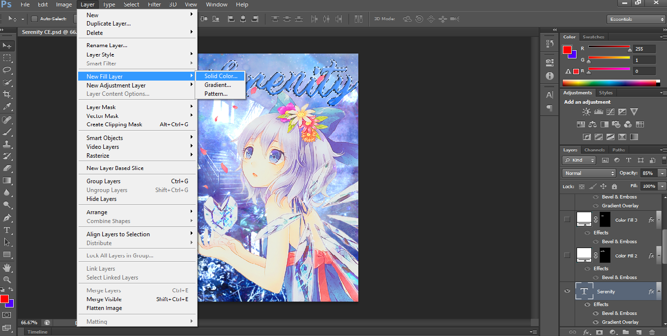
in the 'layer' tab, head over to 'new fill layer', and 'solid colour'
. . . and the rest will come in the next part! unfortunately, I'm terrible at being succinct and condensing my information-- I've reached the 20 images limit, so I'll continue this in part two~
thank you!
Bạn đang đọc truyện trên: Truyen247.Pro