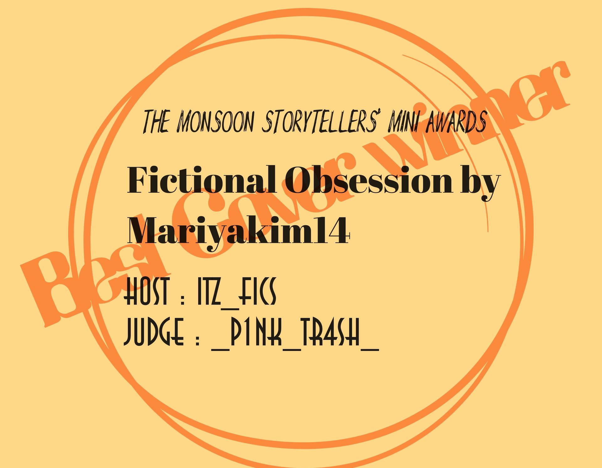
Results: Best Cover
Winner 🏆: Fictional Obsession By @Mariyakim14
First Impression (look, design): 5/5
How well it expresses the story theme: 10/10
Are all the fronts (title, subtitles, author's username, etc.) clearly visible?: 5/5
Total points: 20/20
Points: 20
Review:
While complimenting the cover in theme, the blurb is also interesting and has a captivating hook. The idea of falling for a fictional character who also acknowledges that you’re real and they’re not is also something that has a lot of tragic potential to explore. Everything perfectly fits together. The eloquent synopsis, the suitable title, the pleasant cover with its tragically beautiful caption.
Wonderful first impression so far.
Judged by : _p1nk_tr4sh_
Here is the winning sticker:
And the winning certificate:
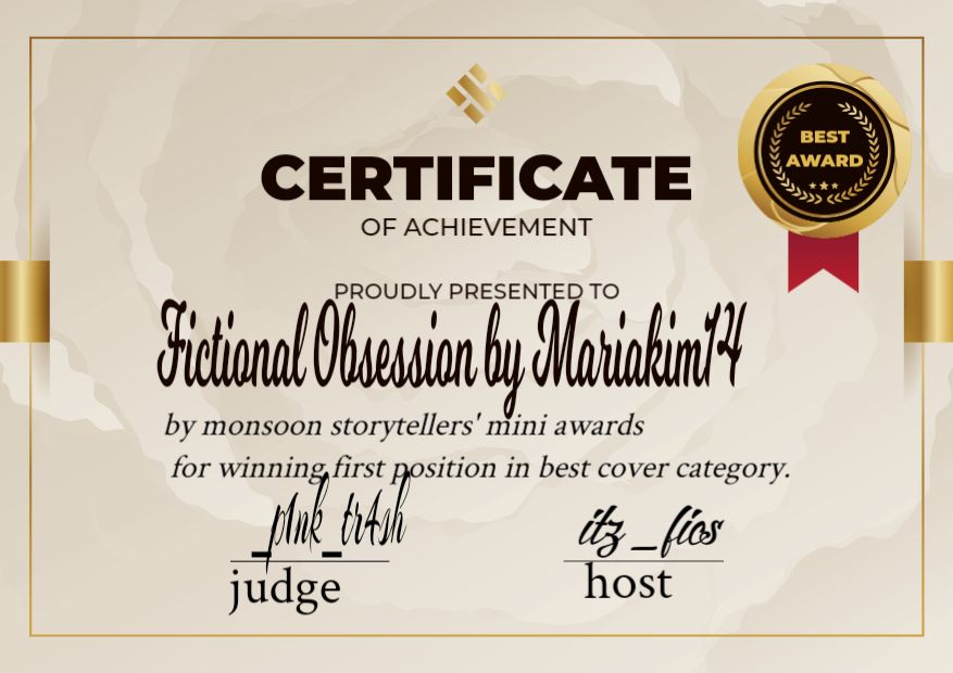
Congratulations 🎉 👏 👏
Romantic Story by @aurora_2604
First impression: 5/5
How well does it express the story theme?: 9/10
Are all the fonts clearly visible? 5/5
Total: 19/20
Review:
The cover is really eye-catching. Even the theme perfectly matches with the cover and the fonts are clearly visible. Very well blended.
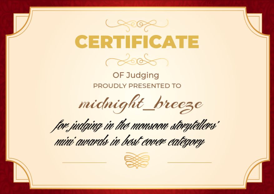
Judged by : midnight_breezee
Reborn in Ink by @Janefanfics
First Impression (look, design): 4/5
How well it expresses the story theme: 10/10
Are all the fronts (title, subtitles, author's username, etc.) clearly visible?: 3/5
Total points: 17/20
Points: 17
Review:
I love the background and color contrast between the two main leads of the story so far (Jungkook and Y/N), considering the different time periods both of them hail from. I think the cover compliments the theme of the story well and you’ve captured the protagonists nicely.
However, the position and angle of the title is not appealing. It is crooked, the ‘in’ in Reborn in Ink is in a peculiar location, and while the cursive of the font is pleasant, it does not seem to fit well here. It feels too cutesy and quirky, especially with the random hearts, when this story actually gives off more of an elegant aesthetic.
Still nice work though! Quite nice to the eyes.
Judged by :_p1nk_tr4sh_
Love Ends All by @k00kiesandch0c0lates
First impression: 5/5
How well does it express the story theme?: 8/10
Are all the fonts clearly visible? 3/5
Total: 16/20
Review:
The first impression is really cool. You could add some romantic vibes since that is also a theme in your book. Fonts are a bit clumsy. Overall great job.
Judged by : midnight_breezee
It All Started With Him by @underthemoment
First impression: 3/5
How well does it express the story theme?: 8/10
Are all the fonts clearly visible? 4/5
Total: 15/20
Review:
The first impression wasn’t that catchy compared to other books, but it makes sense after reading the blurb. The cover matches with the theme but I suggest to reduce the brightness. Fonts are good esp using the man as ‘I’ of ‘HIM’.
Judged by : midnight_breezee
Cyber hearts by @ delulu_alex
First impression: 4/5
How well does it express the story theme?: 9/10
Are all the fonts clearly visible? 2/5
Total: 15/20
Review:
First impression id real good. It matches with the theme Sci-fi. However the fonts are not clear. You could adjust it to make it stand out. And I would suggest you to remove the sticker instead add it in your book as an achievement.
Judged by : midnight_breezee
Butterfly by @Romanticillusion
First Impression (look, design): 2/5
How well it expresses the story theme: 9/10
Are all the fronts (title, subtitles, author's username, etc.) clearly visible?: 3/5
Total points: 14/20
Points: 14
Review:
Upon first glance, I felt as if there was too much going on. There are a couple silhouettes in the background, alongside some glowing butterflies, and while those alone would be enough, it makes it hard to center in on the character right in the middle of it all. There is a lot going on at once and the font, while pretty, is partially cut out from the cover’s proportions with that big letter ‘B’.
The bright pink-purple color of the font also seems out of place with all of the other mostly muted and darker colors in the background.
I like that the synopsis is a poem and it does make me curious to know more. But it is also not too much of a captivating hook either, as there isn’t much else to go off of.
Judged by :_p1nk_tr4sh_
The Rekindled Embers by @RahatfEliwa
First impression: 3/5
How well does it express the story theme?: 9/10
Are all the fonts clearly visible? 3/5
Total: 14/20
Review:
I couldn’t find much creativity in the cover. It was quiet simple. Therefore first impression wasn’t great for me compared to other books. However, I liked the butterfly as a depiction of the theme. Fonts are too small I think you could focus on them.
The Fall from Grace by @alchemy_AJ
First Impression (look, design): 3/5
How well it expresses the story theme: 6/10
Are all the fronts (title, subtitles, author's username, etc.) clearly visible?: 3/5
Total points: 12/20
Points: 12
Review:
I like that the monochrome palette casts a more dreary tone, which does compliment the title and mood for the overall story. The black and white tones work well here and serve a consistent aesthetic.
However, it is hard to discern anything beyond the title upon the first few glances. The author name and any other words outside of ‘The Fall From Grace’ are not as eligible. And I think the slanted camera angle, honing in on the conventionally attractive male lead, may not be a favorite for everyone. It is still pleasing to look at, but one may also say that this sort of tilting is unpopular in a lot of other stories of this same genre.
As for the synopsis, there is only one singular sentence with a few grammatical errors to show. It’s a quote and while it should be enough to tug at some intrigue, it doesn’t quite seem to pull out the right amount. At least, from this judge’s perspective. To each their own since all story writing is subjective.
Overall, a decent first impression.
Judged by :_p1nk_tr4sh_
Lilly in the Grey by @TanshinaAfrin
First Impression (look, design): 2/5
How well it expresses the story theme: 8/10
Are all the fronts (title, subtitles, author's username, etc.) clearly visible?: 2/5
Total points: 12/20
Points: 12
Review:
I think the monochrome Vogue-like background is very fitting for the story and it also compliments who the female lead is well. I do, however, think that the slightly cut off letters for ‘vogue’ in the background and then also a bit with the title as well can be jarring. The caption is also aligned in a way that feels crooked when adjacent to the title, as pretty as the cursive can be.
Still nice work though! A nice blend of muted colors to be worked with here.
Judged by: _p1nk_tr4sh_
It is always said not to Judge a book by it's cover so don't get upset with low points..
I heartily congratulate the winner.
Certificates for Judges:

Thankyou ❣️
Bạn đang đọc truyện trên: Truyen247.Pro