Stef's Guide to Graphic Making 101 [ part 2 ]
My previous guide explained the fundamentals about kick-starting graphic design. This guide will go deeper into graphic design such as the tools and tricks!
1. The cutting tools
When you make a graphic, it is most obviously that you need to cut up some stocks and piece them together to form a graphic. Cutting is very important as you can't make a good HQ graphic without cutting beautifully. There are two types of cutting: hard cut and soft cut. Both uses different tools.
Hard cutting tools:
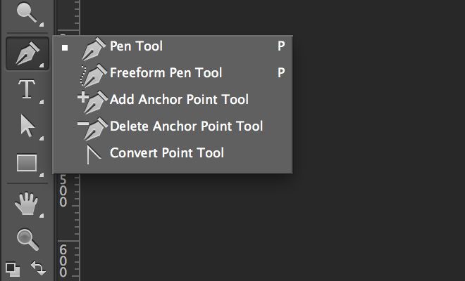
- The pen tool
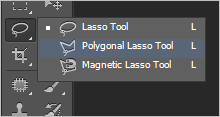
- The lasso tool ( polygonal, free and magnetic)
- The crop tool
- The magic wand tool
Soft cutting tools:
- The eraser
- A brush loaded with black foreground color
When are hard cut and soft cut used?
Hard cutting is used when your stock has solid edges ( such as rocks, statues and buildings). Or when you want a very solid cut of a model.
Soft cutting is used mostly in dark graphics or when you want your stock to meld into the background ( or create a soft/ cloudy/ misty) effect.
If you're cutting a statue, I recommend using the magic wand tool. It selects an entire area with one click and if you hold down shift+magic wand tool, you're able to select many other places. Then hit ctrl+delete to get rid of the space you've selected. Keyboard shortcuts are very important as it saves time.
Apart from cutting, the pen tool is ideal for drawing too! It's one of the main tools in Adobe Illustrator as it can be used to draw perfectly matching hearts, circles and also, great for vectors! But the pen tool needs a lot of practice to get used to. I know the pen tool used to hate me but now I love it!
Oh, and you're even more lazy ( like I am), I use Topaz Remask 4.0.0 for cutting models. Topaz Labs is a Photoshop plugin. But you gotta pay for it. If not, you can use the one month trial. It can do both hard cut and soft cut, you just need to figure out which working brush size is suitable for what stock you're using. Here's my tip: use a brush with a smaller edge for best effects.
2. Blending
Now that we've covered the cutting phase, blending is another important base you must master in order to improve. Blending is a technique in which we take a minimum of two stocks and put them together so that they meld flawlessly and nobody can guess that they are two separate items in the first place.
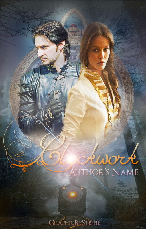
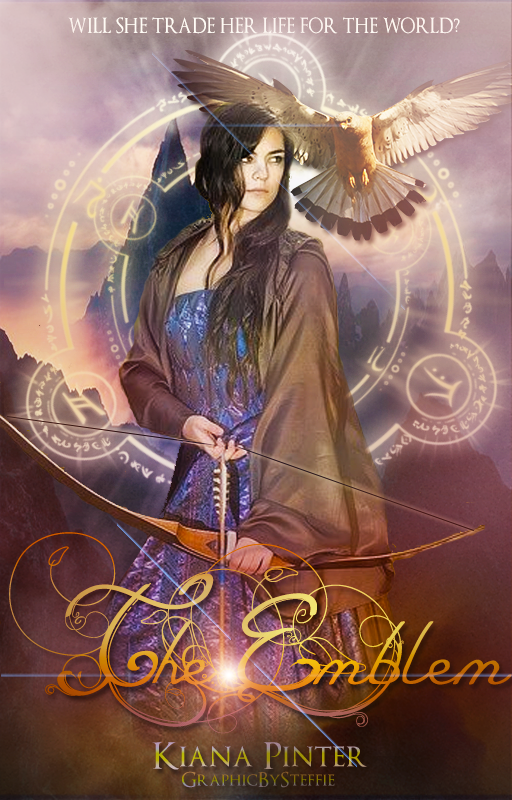
Here are two examples--an old graphic of mine ( from February 2015) and a new one ( April 2016):
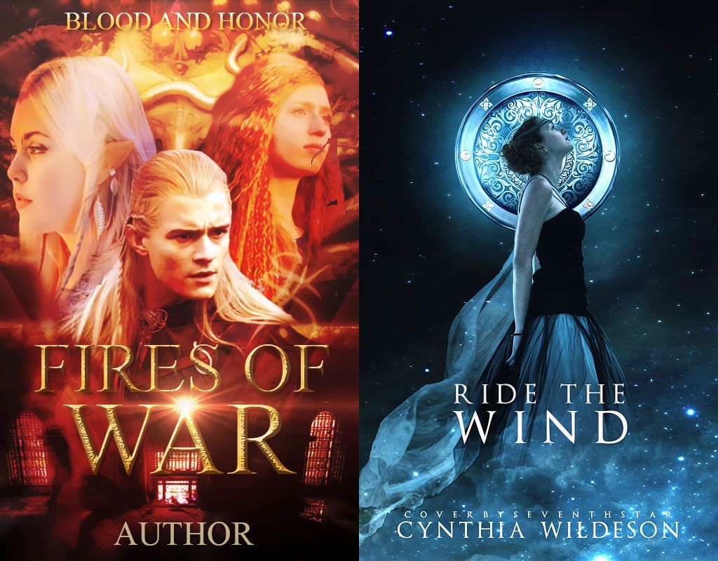
On the left, is an old graphic of mine wheres the one on the right is a newer one.
Let's see the blending in the old graphic. The models are badly cut with even residual bits floating on the upper right. The colors of the models do not match and the text is just one lumpy thing slapped onto the cover. The blending of the models is poorly done and the color tone badly matched.
Now, for the cover on the right, it's one of my graphics that I'm actually rather proud of. The model and the veil are actually two different stocks in which I blended together. But it looks like a while piece on its own! The halo behind her is actually a shield which I polished using a brush tool and then I blended it near her head before I adjusted its colors to match the model. Now, this is what I call, blending.
So, how do you blend?
You blend with a soft eraser, opacity and flow changed to match your art needs. It isn't necessary to use it at 100% all the time. It makes the blending look forced.
Blending is useful when you are lazy to cut. You can just put a model on a background and then blend them with a soft eraser. I do it when I am feeling lazy ( which is like most of the time). When your blending has hit a certain level, you can make crazy photomanipulations!
3. Color adjustment
A lot of people use psd colorings. Psd colorings are great to give a graphic and overall color theme. Some others prefer to paint over or use color overlay/ softlight or textures instead of coloring. I don't really use these for my graphics unless I am looking for a specific tone.
This is what a psd coloring looks like, before and after:
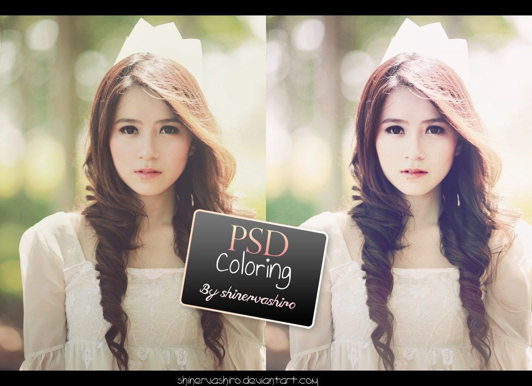
The original was a bit drab and dark. The psd coloring gives it a boost in color and lighting, making it more appealing to the eye. Beware, however, overuse of psd colorings will make your graphic ( especially the model) look over-saturated and as if someone had roasted them over a pit.
You can download psd colorings from deviantart.com. Greatest place ever for resources. :)
Other manual ways to color adjust:
- Color balance
-Levels
-Vibrance
You can find these settings under the f(x) button on the right hand side of your photoshop.
4. Special effects
What are special effects on graphics? Special effects are basically anything that makes a cover look dramatic eg: lens flares, glitter, and shine.
Under what circumstances should I use special effects?
When the graphic calls for it. When I first started, I was a lens flare addict. I would use a lens flare effect on every goddamn cover I made. I would add a lens flare to every text and every single place. It not only made myself looks like a lens flare addict but it also ruins the quality of a cover.
Lens flares are suitable for fantasy, adventure, his fic ( basically dark covers). Don't use a lens flare for light covers because light + light = blinding.
Glitter is suitable for light fantasy, teen fic, and anything happy with sunshine and unicorns. But please, if overdone, it looks very VERY tacky.
Special effects apply to text too. There are some beautiful text effects such as flaming titles, icy titles, stony titles, metallic titles. Those are super cool BUT when used in the wrong circumstances, it turns the graphic off. Sometimes, you don't need a super cool text effect for a fantasy cover. All you need is something clean and clear.
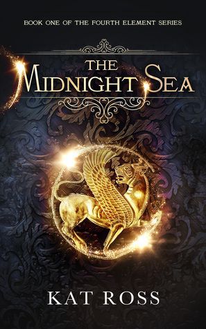
Graphics with good special effects:

Cover by TrafficCop
Graphics with horrible special effects: ( all my old ones lol)
Yep, I know those are absolutely horrible. But I am not ashamed to show them. It proves that I have improved ever since but I still have a long way to go and learn.
5. Composition
Graphic design is not just about making something that is appealing to the eye. It is important that the graphic ( especially a book cover or a CD cover) has something ( actually, a lot) to do with the story. Take Six of Crows and the Grisha trilogy for example. The covers, every single one of them, tells the story at first glance.
Here is the cover for Six of Crows:
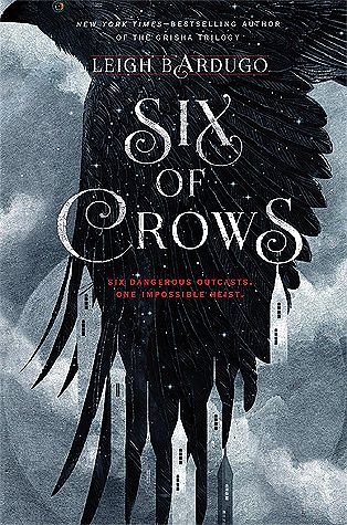
A crows flies over an icy palace. It tells the whole story already. The story is about a crew of criminals, also known as the crows embarks on an impossible mission to break someone out of a prison called the Ice Palace. The cover is simple, beautiful, and it conveys the story at first glance. Now that, is what I call, graphic design goals.
Making a cover is actually simple. You need to tell the story with a graphic!
That is all the tips I can offer for now. ;D I hope you find them useful!
Bạn đang đọc truyện trên: Truyen247.Pro