Contest #7: Zodiacs | Entries II
Woah, first time I've reached over the twenty image limit!
Created by: maajuska__no_name
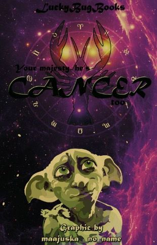
I love the direction you went with this! It's so creative! I'm a Harry Potter fan as well so I have a soft spot for Dobby! The colours and the fonts are beautiful too!
Created by: thejadelover
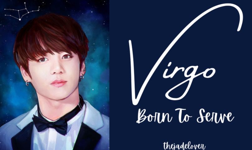
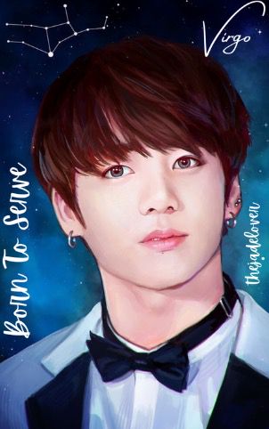
I love what you did for both of these graphics, everything looks so smooth and neat! It is a little simple but I love the fonts you used!
Created by: heyitsmeerikamae
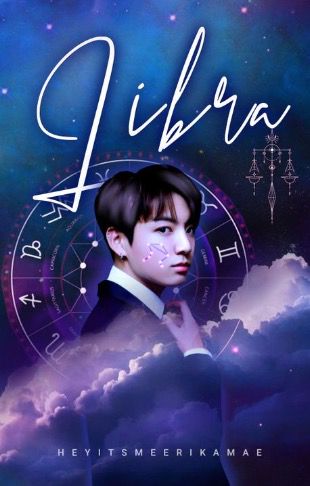
I love this cover! The colours look amazing and the image choices are brilliant! I love how you placed the constellation on his cheek and the font you used for the title! Amazing job!
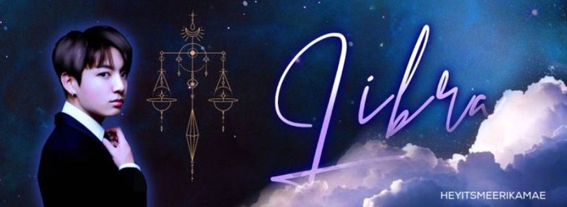
This banner looks amazing as well, I love the scales and the clouds. This is me being annoying but I would've loved if you added the constellation on his cheek again. That was such a nice touch! But it's just me knit picking because this is awesome!
Created by: -Tura-
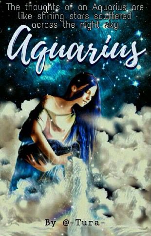
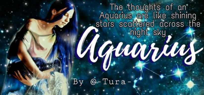
I really love the pictures and the fonts! The background is beautiful and I love that to can see the constellations! The text for your subtitle doesn't seem to fit in well with the theme. Maybe if it was cursive writing it would fit in better with the rest of the cover. As well as placing it with a little more space from the title.
Created By: _Illusionator_
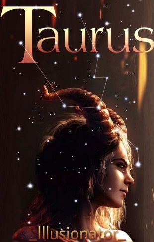
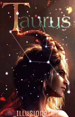
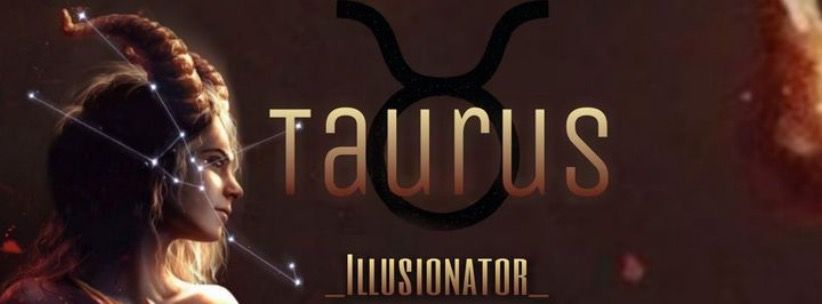
I love these entries so much! They are beautiful! The pictures and the colours all tie together so nicely! My favourite of the two covers you showed me would have to be the first, I love that bronze-copper glow! My one piece of critique is for the covers and its only that it's hard to see your username.
Created by: thesilverlotus

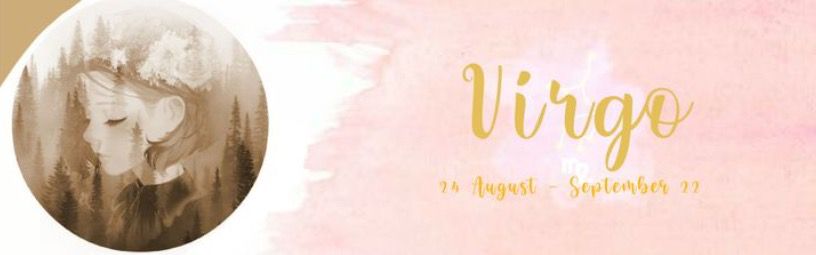
I love the style you chose! It's very gentle and pleasing to the eye. I do like the colour placing of the banner more than the cover with the pink in the background. I find it a lot easier to see and I just really like how it looks but they both look great!
Created by: Tigersx1
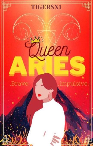
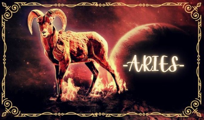
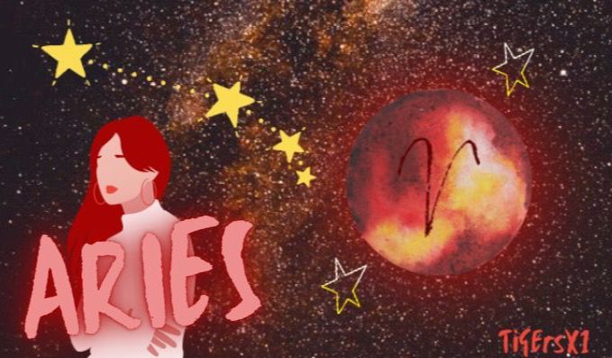
I love the borders you chose and the images! Personally I would've placed the title of the cover farther up but again that's one of my personal opinions. I love these entries. The colours are very violent so maybe if there was something to balance out that overbearing aggressiveness but they look awesome!
Created by: zaandzee12
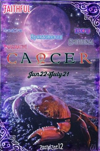
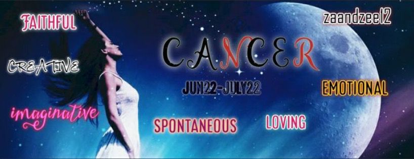
This is a very cool entry! A very unique idea! I love that you out the characteristics on the cover! The colours and the images are so cool and I love the fonts! My little bit of critique is that I would've preferred the title higher on the cover with characteristics under. Your eye automatically goes to the top to read from there and it gets confusing when the title is in the middle under a bunch of other texts. The various colours can be distracting as well, maybe if they were more subtle? But it is a very nice cover!
Funnily enough the various colours and texts work better on the banner! It looks awesome! I think I also of have no critique other than that I would've centred the date subtitle under the title itself. But it looks amazing!
Created by: Zariawriter
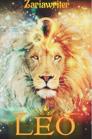
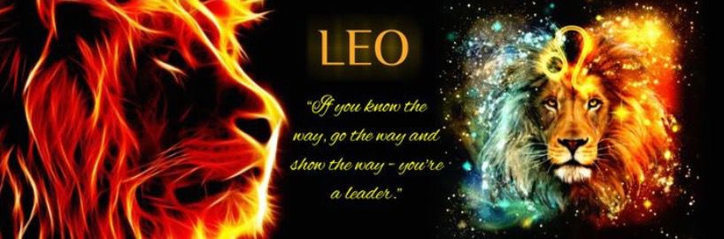
I love these graphics! The images are beautiful! It is a little hard to see the font, maybe if the lion head was pulled smaller with the black background of your banner. But I really love what you did with your banner! It looks amazing!
Bạn đang đọc truyện trên: Truyen247.Pro