
contest 6・results
・ ・ ・
thank you to our guest judge HYUNSUKVEVO!
・ ・ ・
Honorable Mention || aeriina_
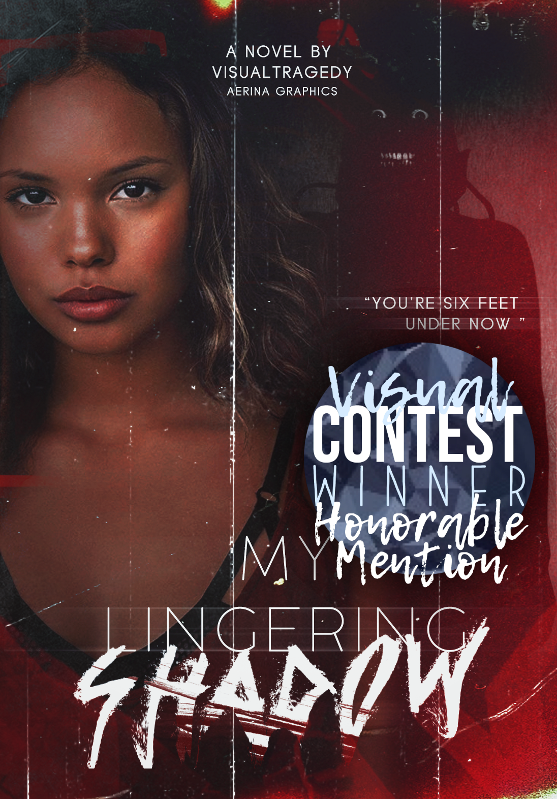
host commentary; I personally just really love the clarity of this cover. You can clearly see the subject & the predator, which was a problem for a lot of the other entries and something I had envisioned from the start. An issue I do have is the effect on the 'lingering' line. I see what you meant to do, but since the blur is so straight it's kind of off-putting in some sense, along with the font choice generally feeling out of place. Regardless, I love how you used blood over text & the overlay. Also, not gonna like the face in the back made me laugh a little since it looks like the vine, but great job (:
guest commentary; First of all, your cover looks so aesthetic. Unfortunately, i can't see the horror, thriller and murderous through the font that you choose. I mean, two fonts that you choose don't suit each other and it don't represent horror, thriller and murderous. Also the position of the png doesn't look really good. But i love the shadow behind, it represents the horror vibes. Anyway, you already did a good job.
host rank: 3rd Place
guest rank: N/A
・ ・ ・
3rd place || Shareese86
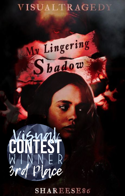
host commentary; I really enjoy the horror aspect of the cover, especially with the effect on your username. Something I would watch is shading since it becomes muddier the farther you look down since it's so dark. I do however appreciate how you stuck to the prompt, so good work.
guest commentary; First of all, I like the way you did the cover. The color scheme is on point and the dark shadow fits the cover really well. The typography somehow looks a little bit off. The font didn't compliment the cover and the font color is too dark which makes the title hard to read. Anyway, you still did amazing.
host rank: N/A
guest rank: 2nd Place
・ ・ ・
2nd place (tie) || ComfortableShows
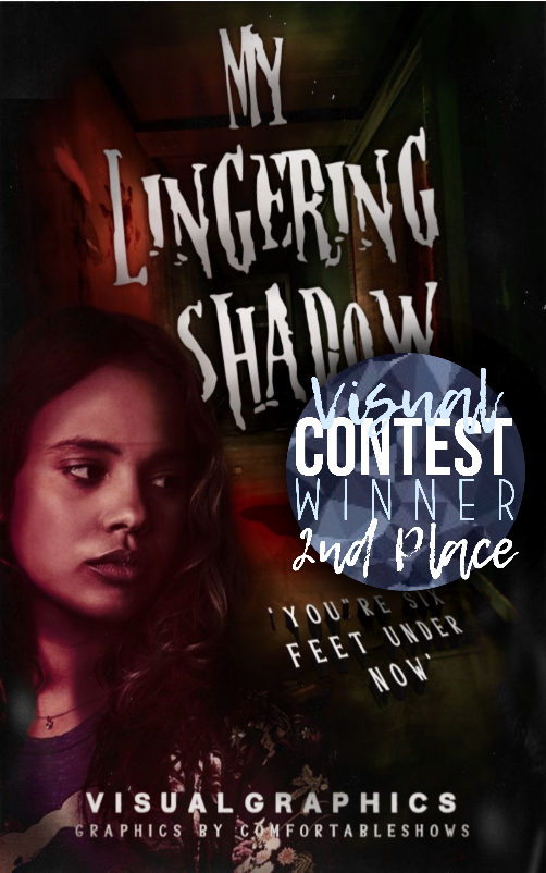
host commentary; Overall, I really like the editing you did here. With the shadow in the doorway and the bloody handprint on the wall, you really captured the 'horror' aspect of the prompt. My issues with this particular lie in two places. First is the face claim, and how the filter makes it difficult not only to see but also to blend w the cover. The other would be the title text. I like the font you used but the effect makes it look like it doesn't belong, but that honestly could be because of the face claim as well (realism vs hand-drawn/GooseBumps feel). Regardless, it truly is a good cover. Good job.
guest commentary; The color scheme of the cover is really good, mainly red and black suit the prompt really well. The only flaw of the cover is the font color. It didn't match the cover and theme. But, I think you already choose the good font tho. Also, I really like the idea of adding the 'shadow' thing in the cover. It makes your cover represents the story well. Good job!
host rank: Honorable Mention
guest rank: 1st place
・ ・ ・
2nd place (tie) || Miss_Sarcastic27
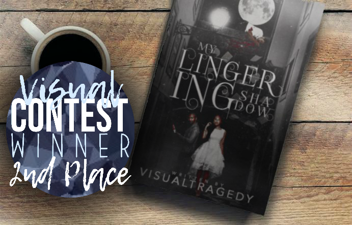
host commentary; I just really love the work and blend you put into this cover. Regardless of the inability to see the detail, I can already tell the cover is put together really well (as no parts stand out in a negative way). I do, however, see what our guest judge meant with the 'fantasy' feel rather than horror. Maybe if it was a full cover we would be able to see that? But I don't know. Either way, I love this cover, and amazing work (:
guest commentary; To be honest, I can't see the details of your cover because you submitted your cover in this form. But, I have a feeling that it's a beautiful cover. From what I see, the only flaw is the font that you choose is to represent fantasy instead of horror, thriller and murderous. You already did a great job!
host rank: 1st place
guest rank: Honorable Mention
・ ・ ・
1st place || bazinga_way
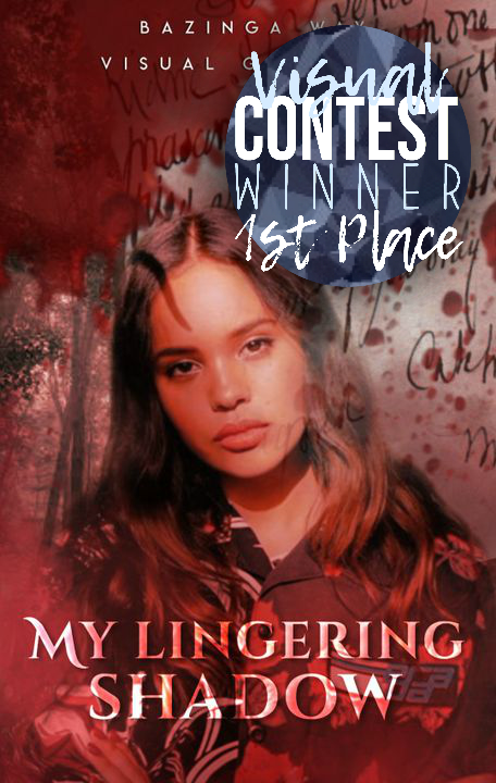
host commentary; I really enjoy the overall effect of this cover. From the jump, we know it's horror because of the blood, which I truly appreciate. I would watch for where your overlays rest since the writing does overlap on the face of the subject. Another thing would be that the text feels kind of out of place, which both critiques could be easily fixed. No matter what, you did an excellent job.
guest commentary; This cover is so pretty. Almost everything looks amazing. But, I think the 'blood' thing is quite messy and some of them look awkward in some places. Also, it would be better if you added some details more for the character. The font that you choose represents fantasy vibes instead of horror, thriller and murderous. Overall, you already did a great job.
host rank: 2nd place
guest rank: 3rd place
・ ・ ・
Bạn đang đọc truyện trên: Truyen247.Pro