Review K00kiesandch0colates
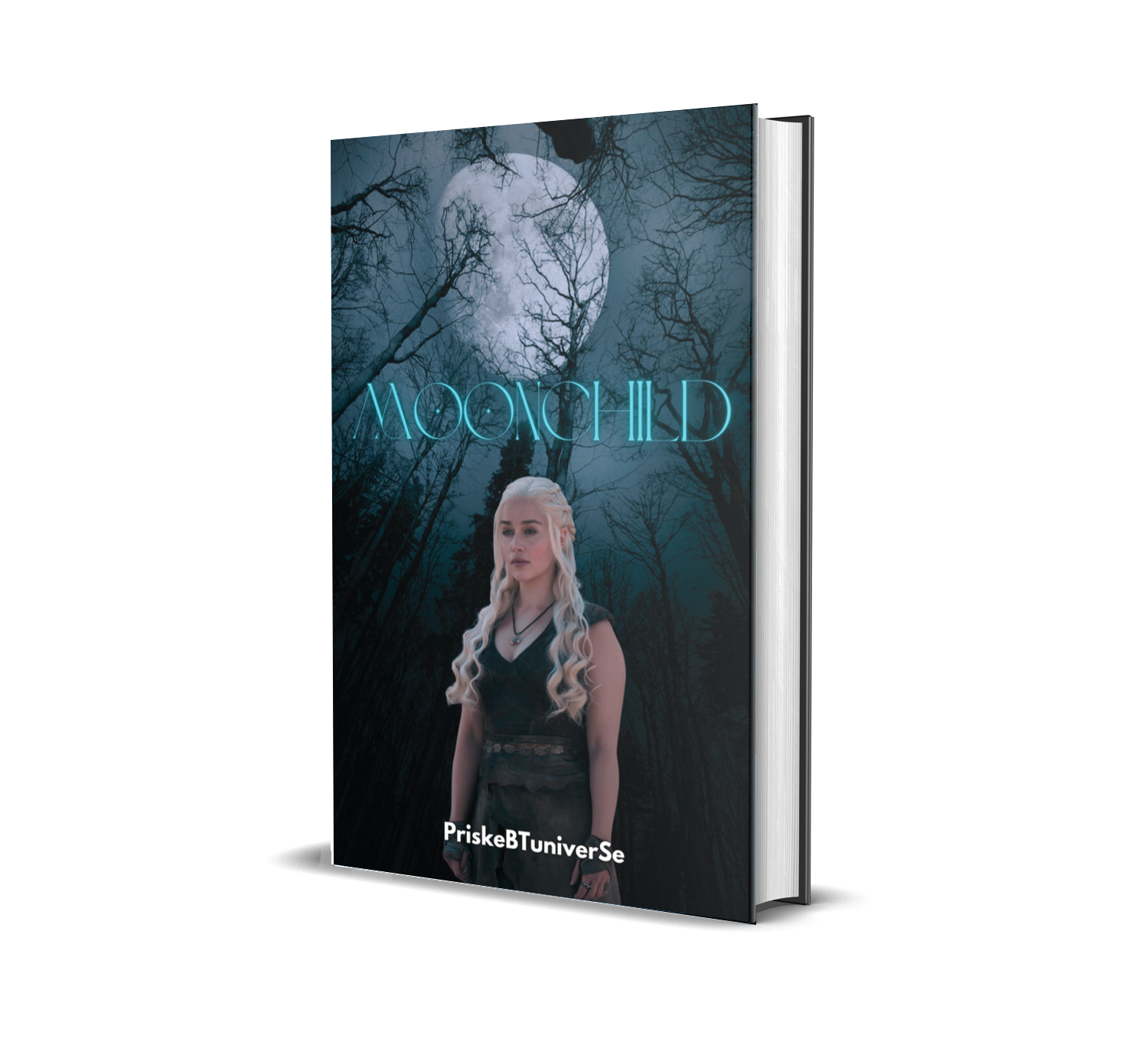
Title – 4/10
The font choice is great, but it's too thin, causing it to blend too much with the trees. To improve readability, make the title larger and slightly bolder. Adding a glowing effect—while keeping it in the cover's color scheme (white)—will help it stand out.
Blending – 4/10
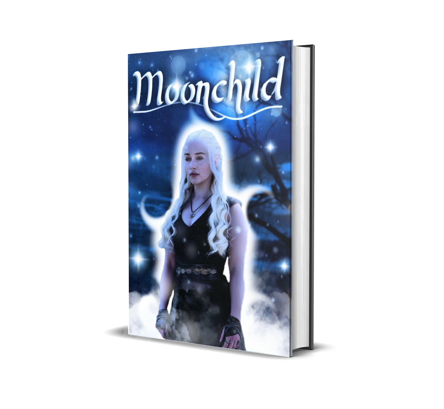
The cutout of Khaleesi is well-done, but the blending could use more effort. A touch of fantasy would enhance the overall look. I added some smoke and blue moonlight to create a more cohesive atmosphere. Since the background has cool blue tones while the subject has warm pink-brown tones, I used the moon's reflection on her to unify the composition.
Colors – 5/10
You used the requested colors, but they are quite minimal. The blue should stand out more to strengthen the overall visual impact.
Image Composition – 5/10
The images used are good individually, but they don't match well together. There's a perspective issue—the background suggests an upward view, while Khaleesi is positioned as if seen from the front. This creates a mismatch in depth and perspective.
Overall Cover – 6/10
The cover isn't bad, but it needs attention to finer details. Small adjustments will significantly improve the final result. Also, using TV characters is fine for personal use (as long as the book isn't for sale), and the fact that AI wasn't used is a plus.
Total: 24/50
Don't worry about the score—these are minor adjustments that can easily be improved. Mastering basic editing techniques is essential for achieving a more polished look. Keep refining your skills!
I also posted a cover that I made with the advice I have giving you with the same 'pictures' you gave me.
Bạn đang đọc truyện trên: Truyen247.Pro