-> colour scheme
I see some people have trouble figuring out their colour palettes hmm.
Don't worry though! Mello is here to help!
Okay firstly, inspect your image. What is the most prominent colour? What are the colours? Is it cool or warm?
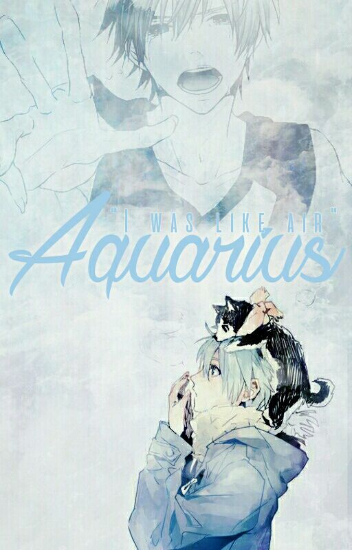
Okay example, look at Kuroko and his outfit. The main colour is blue, which means it's from a cool palette.
Warm palette - bright happy colours, yellow, orange, pink, red, anything bright , neon feel
Cool palette - cooling colours, makes you feel calm, blue, green, purple, anything that is serene and makes you feel calm
Thus, the cover has to be cool-themed. However, since his outfit and hair are blue, the background should follow after his hair colour, or something lighter/darker.
Apart from blue, there is also white, black and pale orange tints.
Take note of the other colours because they're part of the side palette :-)
Main palette: prominent, dominant colours in your cover
Side palette: use these colours for extra touches, effects and other expressions
Also, you need to take note of neons , pales , dark , light , contrasting and fluff colours.
Neons - like your highlighter, bright attractive colours
Pales - usually has a bit of a white undertone, looks a bit like a faded colour
Dark - usually use the darker side of the palette, has a black / grey undertone
Light - use lighter colours, have more brightness to it
Contrasting - use the opposite colours of the palette. example; orange to blue, yellow to purple
Fluff - a combination of light and pale, depends
Depending on the main colour from your image your colour scheme for the cover will depend!
Hope this has helped you :-)
- Melodie
Bạn đang đọc truyện trên: Truyen247.Pro