My cover-designing skills throughout the years
Hey all, this week I've been doing a lot of planning for The Fae Prophecy (Cast Away to the Forest of the Fae's new name :D), and because of that I also had to draw a new cover. I've also been doing a lot of drawing this week and experimenting with a new style (a more 3D based style, it looks more professional but it takes super longggg), and just generally avoiding writing for The Fairy's Poison...
Okay don't yell at me I do have five reserve chapters so *technically* I can take a break but someone tell me to write chapter 33 because I really should be saving those chapters for weeks when I'm too busy to actually write... and also don't yell at me because literally every single chapter I've written starting from chapter 28 (hehe, the one that's getting published this Sunday) is super intense and that stuff drains my writing inspiration like crazy so yeah.
ANYWAY.
This got me thinking about my improvement in designing covers, and my art too of course. (If you want to see an art-improvement chapter then comment, if enough of you want that then maybeeee it'll happen because I can't say no to you guys :D). Since Wattpad has a 20 image limit this'll be difficult but eh, what can you do.
Now presenting: Sylkie's Covers from 2018-2021.
So my first covers started out pretty rough ngl. XD
Take this one for example.
One of the very first covers I made. This was when I still used Canva for literally everything and made transparent images using Microsoft Word. But you can see that it's super choppy, literally just images pasted on without any effects.

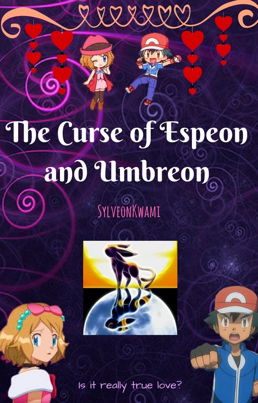
One of the first covers I made with my drawings (can I just say yikes and also I AM SORRY LILLIA AND LIAM FOR NEVER BEING ABLE TO PUBLISH YOU), but you can see it's still pretty choppy and generally unpleasant to look at.
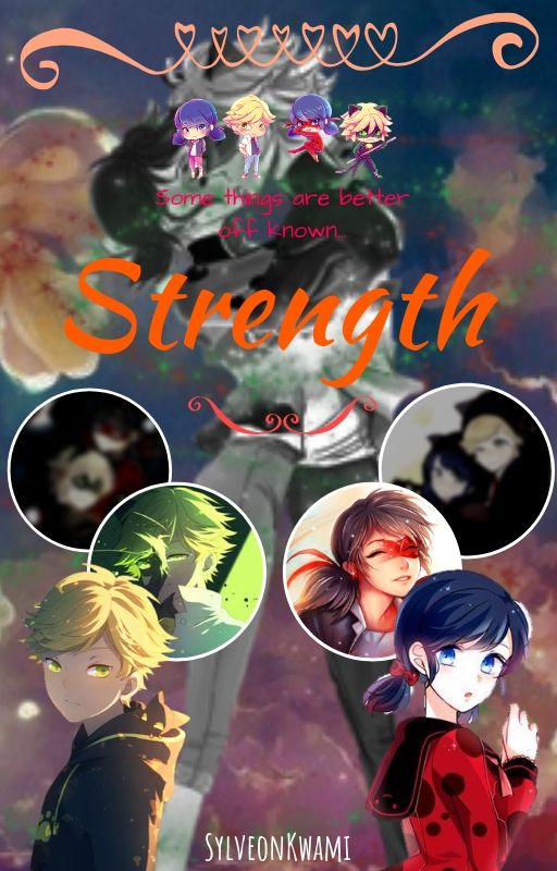
So you can see with this Strength cover I got a little better at that style of cover-making, the bottom half doesn't look half bad. Again though, I used Canva. This was right before I realized that I could use my Sketchbook app to make the covers you see on my profile now. XD
Wowwww it's more of my bad art ANYWAY.
So I had this whole phase when I started using Autodesk to add the images and do the text, but use Canva to finish it up and put the author text (here it's SylveonKwami) at the bottom/top/wherever. This was when I hand-drew all the lettering (and made it look very obvious) and didn't notice the fucking TEXT BUTTON.
Then I started to get more savvy with the app and started trying out layer filters. I also had this phase where I would make the title text cover the center of the cover even if there was a graphic underneath. I stuck with this cover for a long time jeez.. but it's so hard to see anything. Yeah it's bright and colourful but that's all it is, a giant cluster of colours.
Like I said earlier... I put the text over the graphics because I have no idea why.
Then I started to have some common sense. And yes I actually don't mind this cover, it doesn't look half bad I think. This is when I started to overuse the "luminosity" layer on Autodesk. XD
I started getting a bit better at editing the graphics and still hadn't realized that there. was. a. fucking. text. button. in. Autodesk. GAHHH
So fun fact time, I get random G/T story ideas all the time and never have enough inspiration to write them so I make covers for them to get them out of my system. XD But now I'm starting to get smoother text, better graphic editing and not abusing the luminosity layer all the time, I'd say I'm improving.
Haha so discovering the text button and trying to draw my own covers was apparently to omuch on my system. This cover is genuinely confusing and I know what the book is about XD
First version of this cover and we're getting a BIT better.
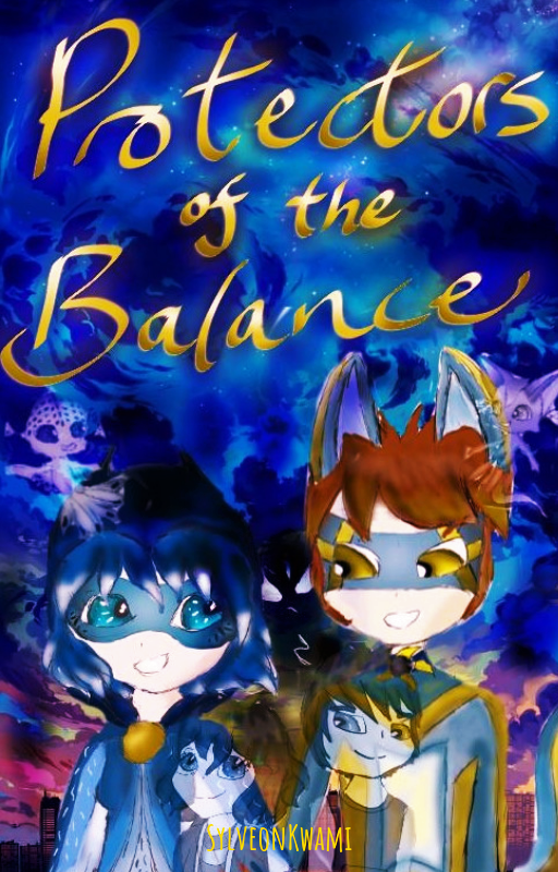
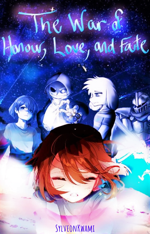
Aaaand that's when I made this cover. This is the cover that stayed with TFC for a long while until I did the giant cover-update. I'm still proud of this cover today, it looks stunning. It's also the last time that Heliux and Layra will ever appear on a cover (Rip)
Heliux: *somewhere in the distance* Ow.
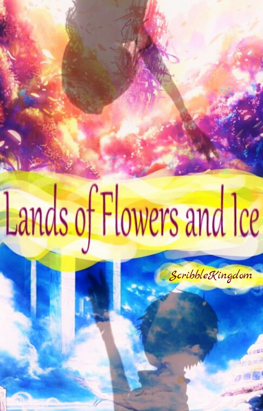
(I'd also like to note that I have over 50 of these previous/draft/whatever covers in my folder and obviously there were covers made between these ones, so it might look like there are jumps but nope, I just didn't add some in because of limits.)
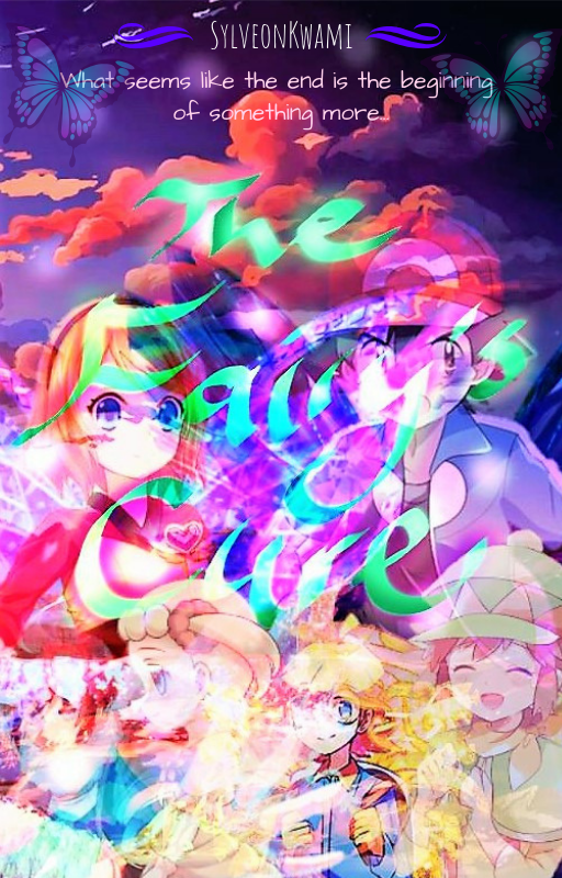
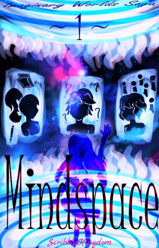
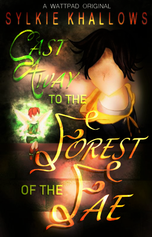
So this was when I really started trying to make some original novel covers and it's a shame that I'll never be using this beauty. But at the same time I was learning about themes- because Mind Space looks like it comes from a sci-fi novel but this is a romance book. XD

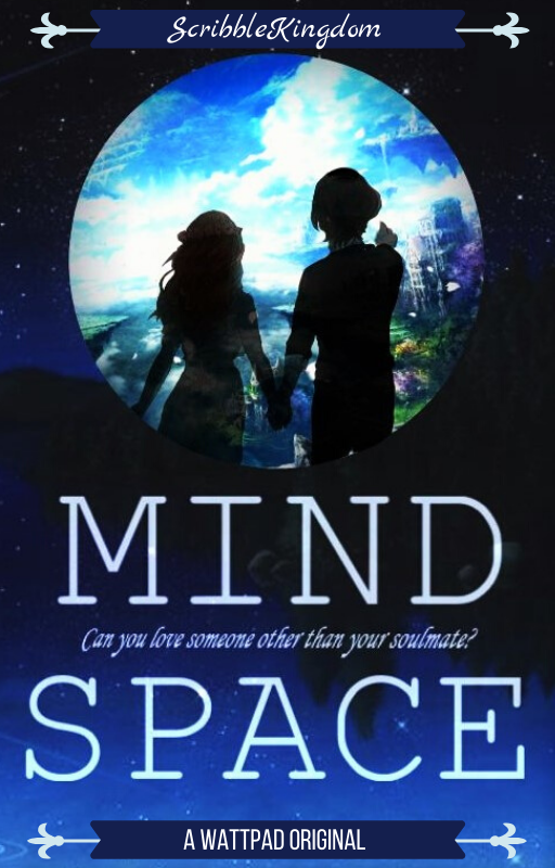
I made this around the same time, I love how the rose turned out (I didn't draw it, I just edited it) and again it's a shame I'll never be using this beauty.
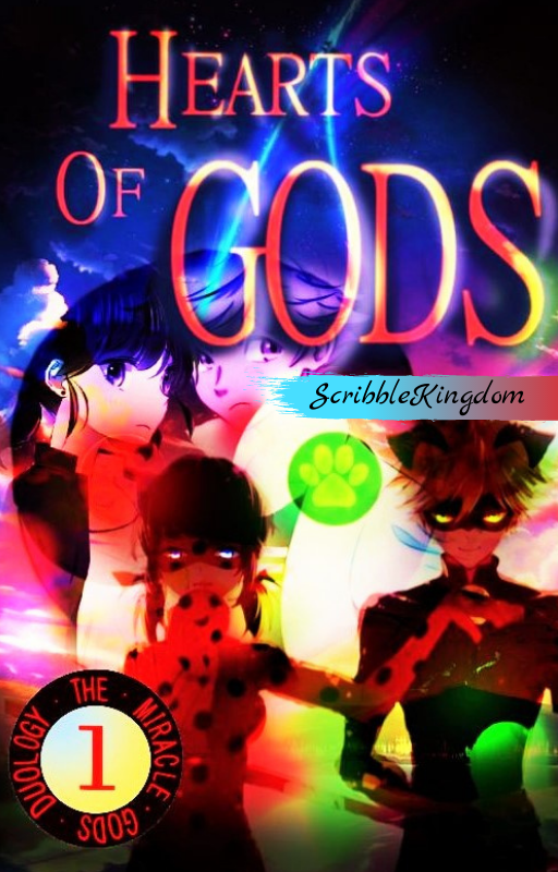
Now we have covers like Hearts of Gods (rip) coming from me- as you might be able to tell my fanfic covers are definitely different from my original novel covers. The fanfic covers HAVE to display the characters because if not, they won't get clicked / tapped on. Simple Wattpad tips for y'all. If your story is fanfiction, especially a ship, HAVE THAT SHIP SUPER BIG ON THE COVER SO IT'S OBVIOUS.
Aaaand THIS is when my covers really improve. As you know I replaced each and every one of the covers of the published books on my profile. I'd wanted to try a new cover style and honestly I'm super proud of this one (really all of the new ones on my profile).
Fun fact. I wanted to try drawing an entire cover by hand. I know I know, unnecessary, but I was getting better at drawing backgrounds and I wanted to try drawing a cover. The cover above is completely mine, all the art is mine, and I think it still looks pretty good. Too bad this book'll never get published though.
I've been saying that a lot about all of these books... there's even more drafts in my unused covers folder that aren't here.
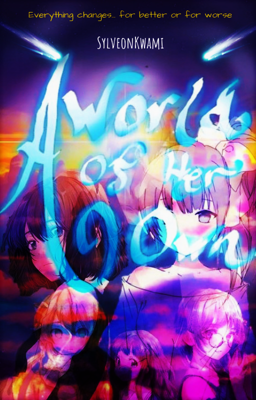
The second cover I drew completely by hand (if it looks different than the one displayed in a previous part that's because I added shadows to make the text clearer) for my upcoming fantasy novel that has recently had a name-change. Still, it took me sooo long but I'm proud of it.
And now... here we have the cover I made today.
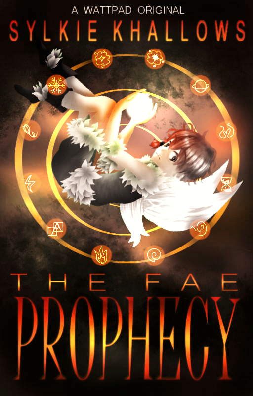
Again, everything in this cover belongs to me- the background, the art of Sorrel, the text, everything. And I'm proud of it. This took me forever to draw (mainly Sorrel took forever to draw XD), but I can let this cover rest for at least a few months before my brain convinces me to make another. I think this is a pretty good cover for an original, no? It at least looks like a cover you'd see on a book at Chapters.
So yeah, that's the cover recap. 19 images. Looking back at it now, wow, my style has REALLY changed. For the better of course. :D
Heliux:
Oh, hello, here to criticize me?
Heliux: I did not even say anything! And no, I am not. I am here to congratulate you on your improvement.
... you okay?
Heliux: Yes, why??
This just doesn't seem like something you'd do.
Heliux: hmph Just because I am strict does not mean I do not recognize achievement. Also Sylkie, will it just be Sorrel on the cover?
Yeah. For now anyway.
Heliux: Then you won't be drawing other characters in this new style of yours?
(He's unusually talkative today...) I will. I'll (attempt to) draw all the important characters in that style- yes that includes you and Layra in that universe. But I actually did draw some characters in the 3D style to practice, you and Val.
Heliux: Oh. *intruiged* Show one.
Sure?
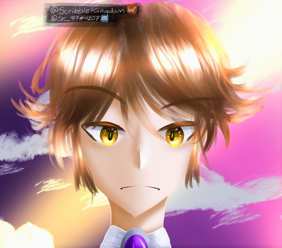
Heliux: That looks- wait, why am I frowning!?
Because you're always-
Heliux: NO I AM NOT!
You're proving my point-
Heliux: *getting ready to smite*
WELP GOTTA GO *publish*
Bạn đang đọc truyện trên: Truyen247.Pro