SB Titles - New Ideas
I'm still fairly unsatisfied with my titles and the relationship between the "Silver Blades" series name and the individual novella titles. I'll use this page to put up my latest typographical whims so you can give me the feedback I crave, without having to update all my covers every time ;)
(and I'll move these down so you can browse through the successively more hideous historical versions ;> )
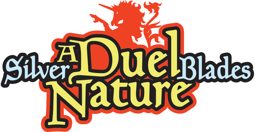
Here's the latest:
Okay, so mixed reviews on the new design... but I don't know if everyone got what I was trying to do, so here is the rendered version on an actual cover. (See? The colors in the design were mostly irrelevant) Any better? Good? Indifferent? More Unicorn? ;>
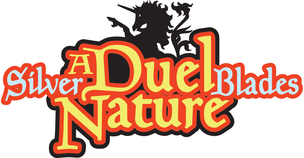
Here's how the one below would look, used throughout the series.
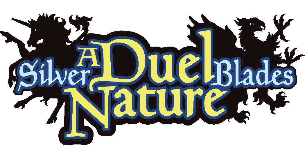
I know, the gap between the "L" and the "Blades" in the last one is a little large... I just saw that. I'll take care of it if this is the one I go with. Otherwise: thoughts?

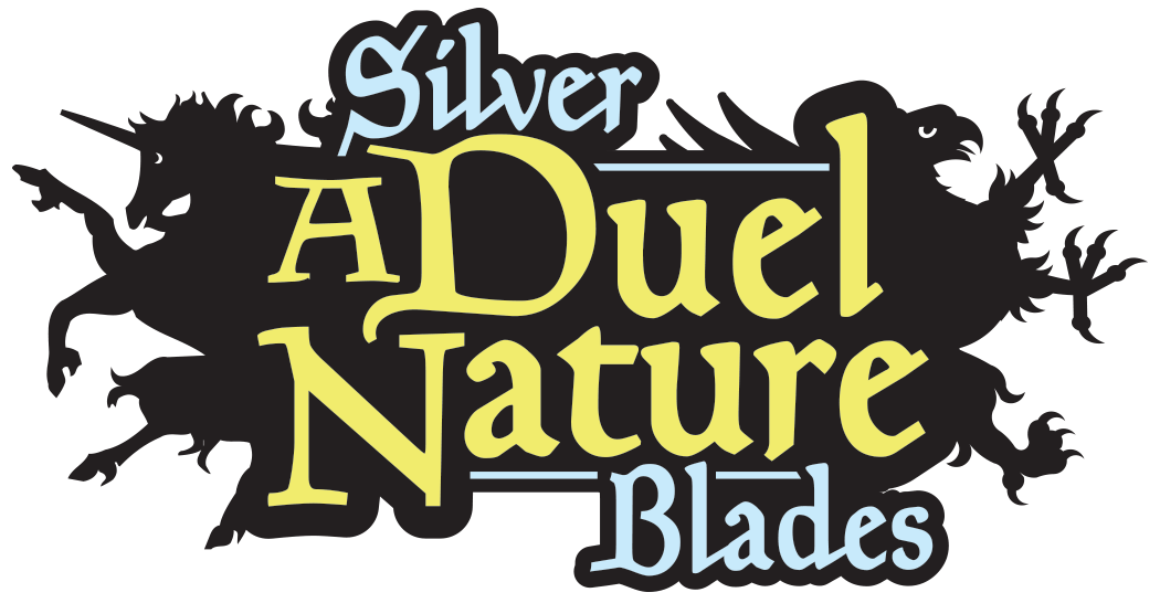
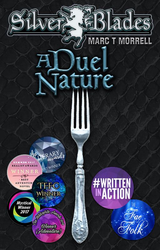
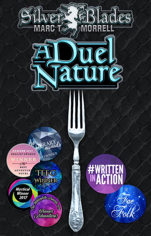
Another option, with entire "Silver Blades" on left of title. I like that this is a little more compact. May have to play with the typography to make it fit a little better around the "s" in "Blades" and the serif of the "A". Also, I liked the contrasting horizontal bars in the one below, so I'll probably do the same on this one.
A simplified version of the new title area... I'll emboss and add lighting effects on the actual cover. I kind of like it, although the "Silver" over the "D" is bothering me. Thoughts?
A Horizontal version of the same idea. Anywhere I put the "Silver" up top, it runs into the unicorn head or doesn't sit well atop "Duel". Maybe left-right is better?
Here's a horizontal version, without the griffon (only put in above to balance the unicorn on the side).
And another version of the one above. Keep in mind, color can change easily... this is just to get a layout that works.
Here are the ideas that have gone before:
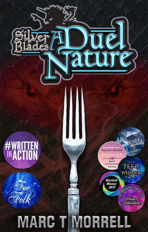
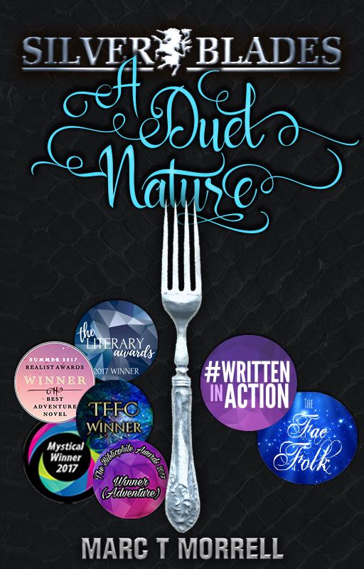
A plainer novella title. Meh. Still doesn't sit right on the cover. The fork is really cramping my style, and this is the launch book, so it has to look AWESOME, not "meh."
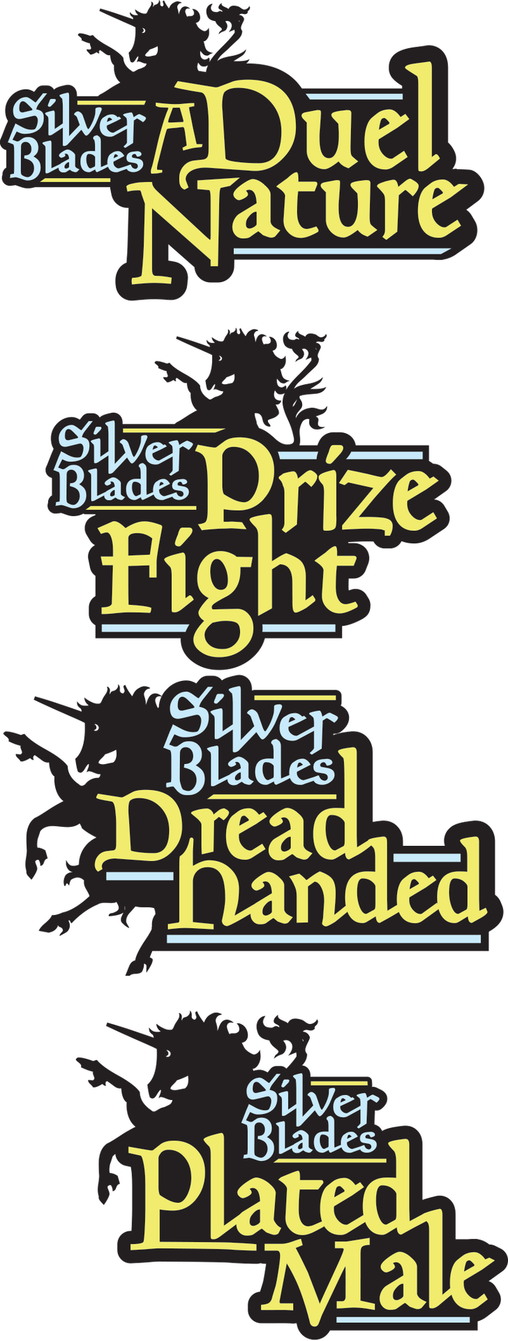
Working on a nicer series title. I decided (actually I knew this before I began) that I don't like BOTH the title and the series name being embossed... So this was a no-go from the start. The series name came out nice, though, so maybe the novella title should be more plain.

Embossed Novella title with black background (a la Wheel of Time) I *really* like the title, but not how it sits awkwardly under the series name. Also, it seems like the series name should be a standard look & feel for all my books.
Bad font. (But I kept this for a while because I liked playing with its many glyphs in my titles ;> )
On this version I decided only to use first place stickers.
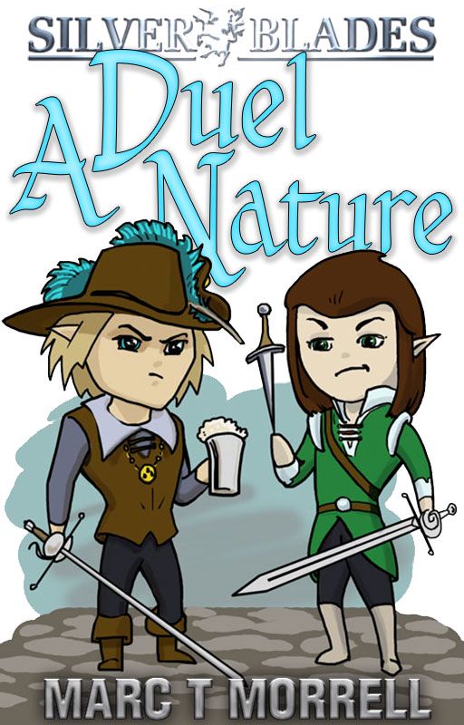
Haha... the infamous Chibi cover, now on its own book ;>
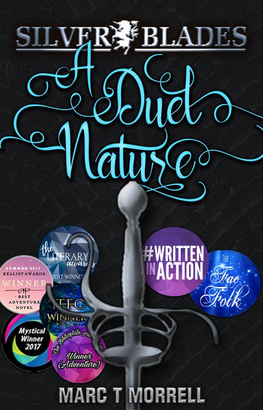
The last version featuring a sword.
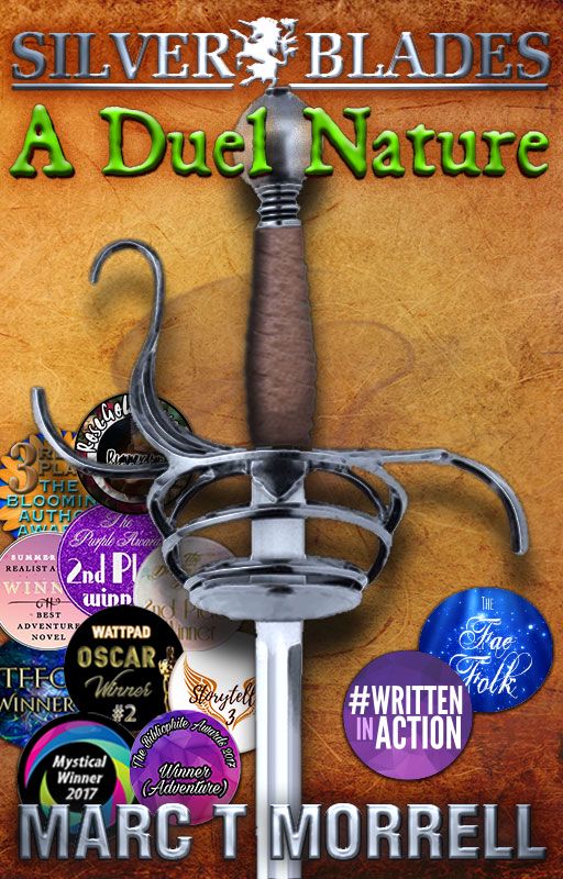
A cover featuring Rip's sword and all its award stickers... and a random font I didn't care about.

The original... sketched, laid out and posted within 3 or 4 hours.
Not a lot of thought was put into this one... I just needed something to use as a cover since I didn't think about it until after I'd posted the book in March, 2017.
Bạn đang đọc truyện trên: Truyen247.Pro