𝔵𝔵𝔵𝔳. Cover Theme for @maenadscult ☕️
COVER THEME for maenadscult
JANUARY 5, 2025 ☕️

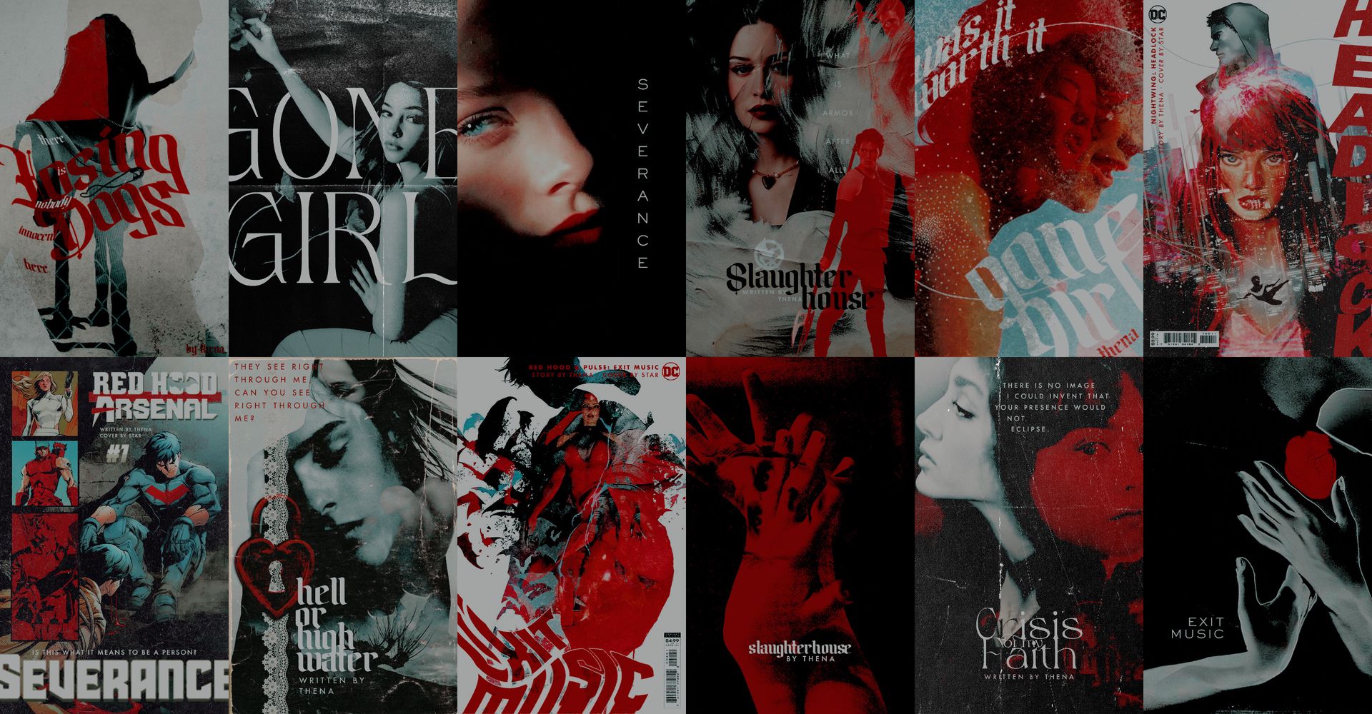
THEME
🪆
HIGHLIGHTS
COVER (SEVERANCE)
ALT. VERSION
🪆
COVER (EXIT MUSIC)
ALT. VERSION

🪆
COVER (HELL OR HIGH WATER)
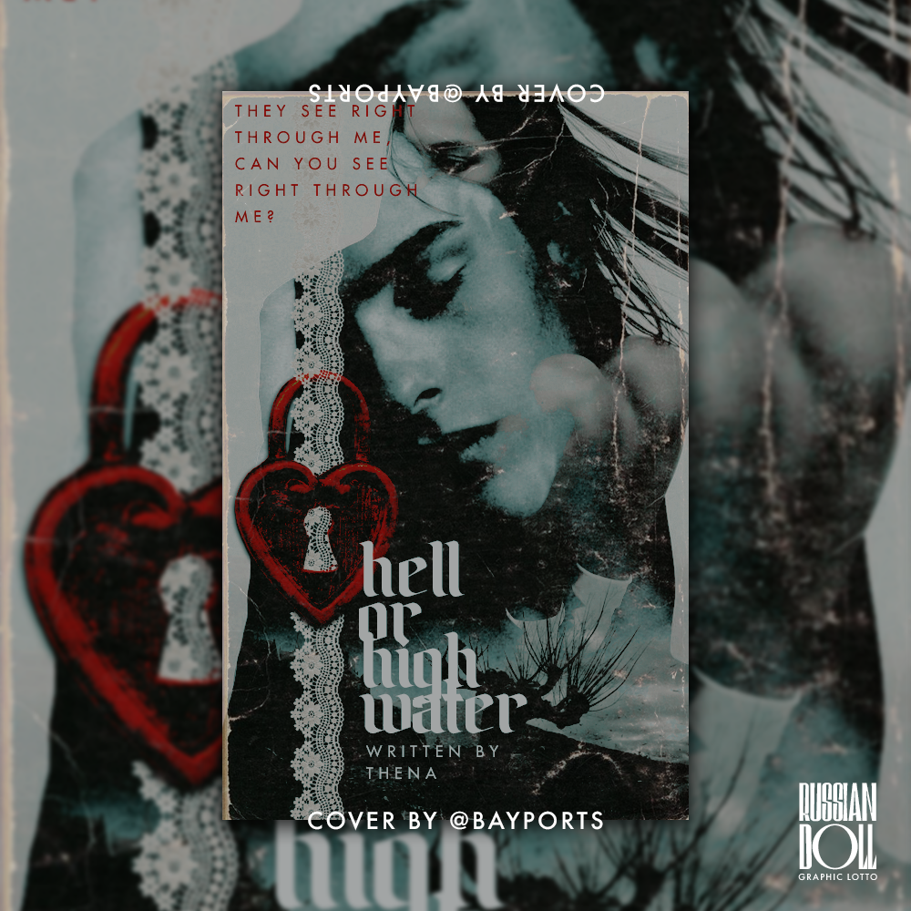
inspired by wulfhall
🪆
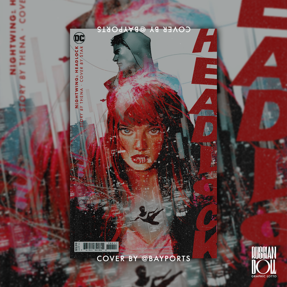
COVER (HEADLOCK)
🪆
COVER (LOSING DOGS)

🪆
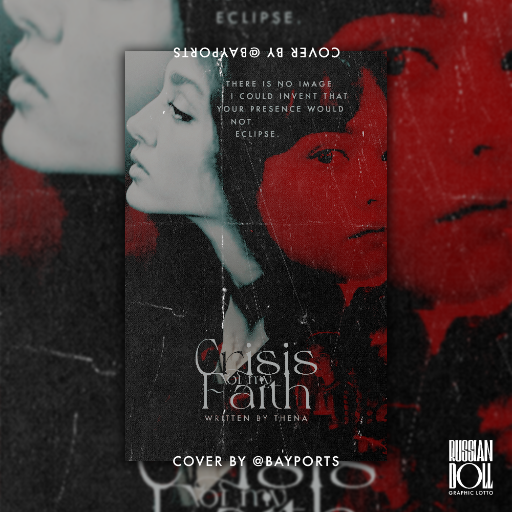
COVER (CRISIS OF MY FAITH)
🪆
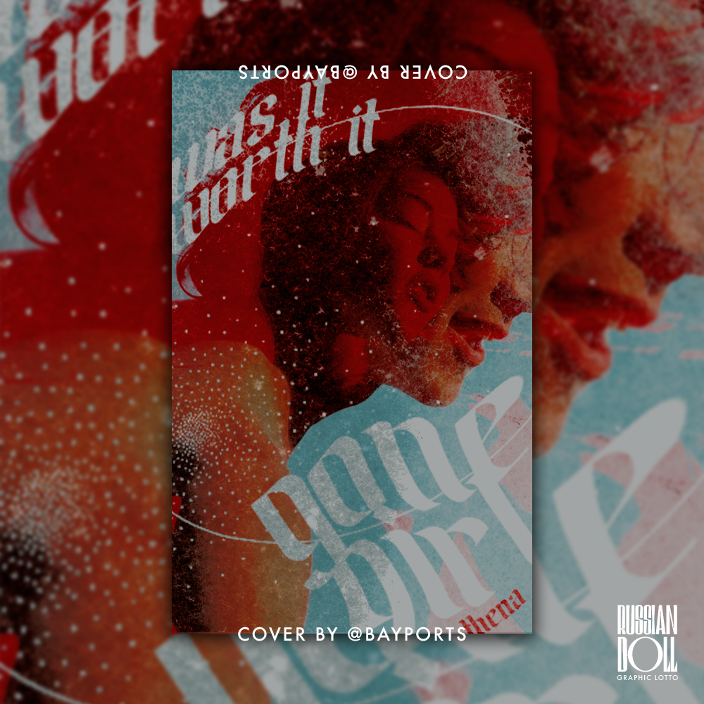
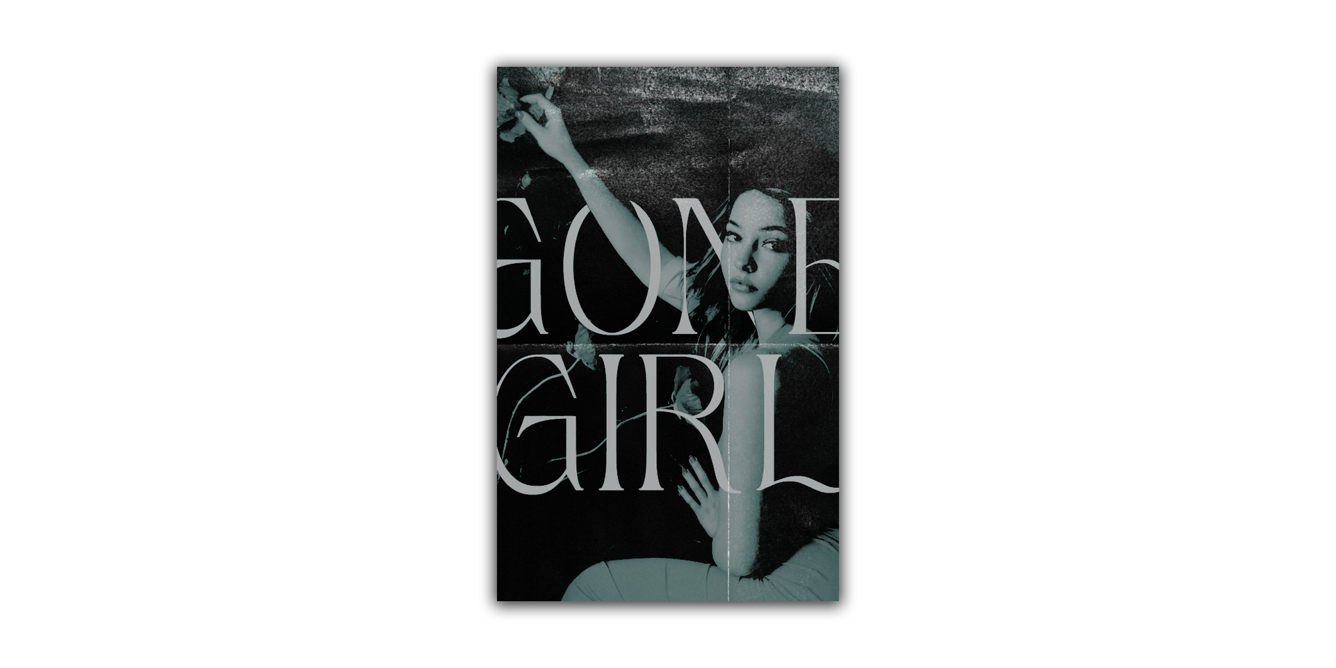
COVER (GONE GIRL)
ALT. VERSION
🪆
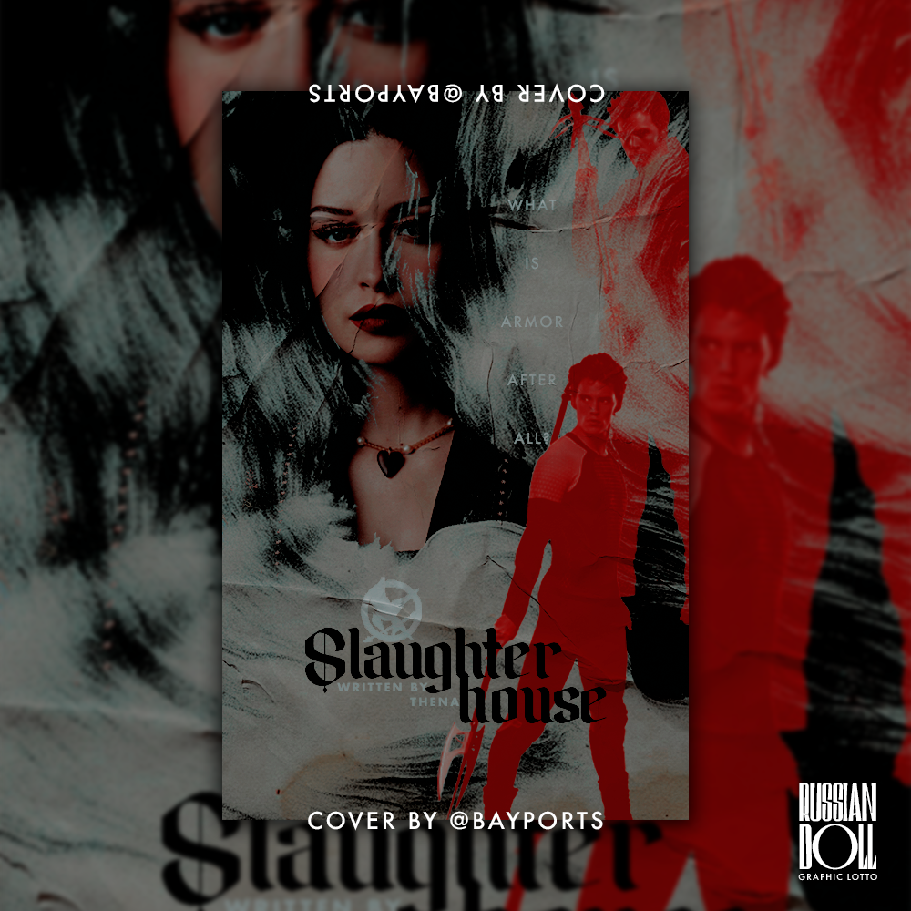
COVER (SLAUGHTERHOUSE)
ALT. VERSION

really pushing the 20-images-per-chapter limit right now... i think we'll just make it. as you guys can see, this update is a pretty big one. you might have seen on the forms and examples page an expression of interest for cover themes. i will put this chapter part down as a reference for my cover themes, as it's very important to me that people who are interested know that not every cover is going to be a complex one. to me, the point of a cover theme is to tie the books on your account together. so some of them may have more dynamic covers, and some of them have very, very simple ones. you'll see the alt. covers in this update are extremely simple, and if you look to my own account, you'll see stories such as DYNASTY, BERENSTEIN and AFTERLIFE have permanently simple covers. often for my most popular stories i have more complex covers; see NOW YOU SEE ME and UNSPUN.
anyways, i'll be talking a lot in this chapter, so i'll move on. this update is for thena (maenadscult) and her account / cover theme! thena has been really patient in waiting for me to get through the bulk of my other requests; thank you so much, angel, i really appreciate it 🫂 for this theme, i was pretty much given free rein to do whatever i wanted. so it was just a matter of putting everything together.
for thena's theme, i first chose three fonts to tie everything together: magero (available free on dafont); amika blackletter (available free on dafont); and futura, which is a system font for both macIOS and windows (if i recall correctly.) i always choose at least two fonts, one sans serif for subtitling and miscellaneous text, and one serif for main titling. in this case i used a fraktur-esque font (amika) and... i actually don't know what kind of font magero is off the top of my head. the point is, magero is a very complex, almost distracting font so it was used sparingly. you can see it on CRISIS OF MY FAITH and the alt. GONE GIRL cover.
i additionally used star guard (dafont) for two of the comic covers. in general, for a cover theme larger than 5 books, i use the rule of two: use *insert element here* on at least two covers. so that means, if i use the colour blue (which is rare for me) i have to use it on at least two covers so that it appears more than once across the board. if i use an attention-grabbing font, i have to use it on at least two covers so it doesn't look out of place.
this is of course not a real rule and i don't always follow it, but i know a couple of you guys like reading my long-ass essays on my graphic design methods, so 🤣 it's also really easy to make things coordinate if you use the same colour palette across covers, and as you guys can tell i was very much in my comfort zone making these. red, black, white... a safe amount of blue... i was very comfortable indeed.
let's move on to individual covers.
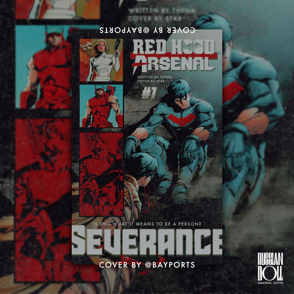
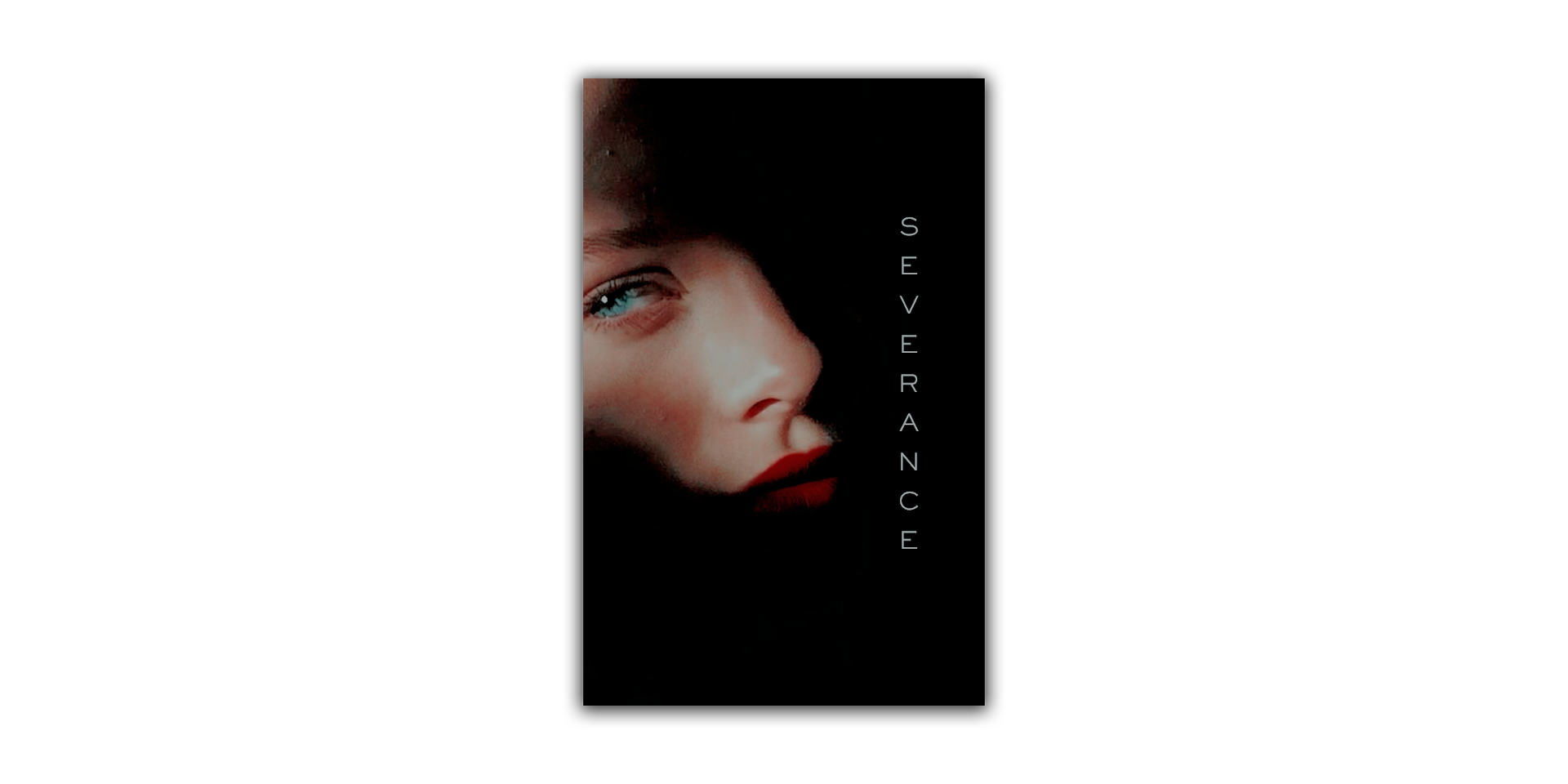
SEVERANCE has both a comic cover and a simple alt. version. for all the capeshit (read: superhero or otherwise dc, marvel, et cetera) stories on thena's account i made comic covers. this is because i would probably consider comic covers to be my specialty and what most people are after when i open my graphic lotto(s) for requests. it's also because i find that without specific faceclaims, dc fics in particular can be really difficult to make covers for. i wanted these fics to stand out on thena's account: in the same way NYSM and UNSPUN are my "flagship" fics, i wanted to designate thena's dc fics as hers.
SEVERANCE features more than one canon character as a love interest, and although they both appear together very frequently, fitting a third character / thena's oc into their art proved difficult. instead of making a conventional cover i used panels from the second run of red hood and the outlaws (shudders) and utilised sharon carter / agent 13 as the oc's faceclaim. bobbi morse was provided to me but i have always struggled with making covers using her; there's just not enough mockingbird to go around.
SEVERANCE's alt. version is there just in case the rest of the account looks too busy. however, since the comic version doesn't have any of my typical crazy lighten-darken-blending bullshit, it's not too distracting to look at and as far as i can tell, the alt. isn't necessary.
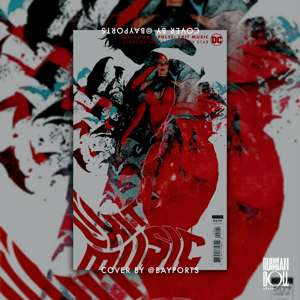
EXIT MUSIC has pretty much the same notes, so i'll move on to HELL OR HIGH WATER. when making a cover theme, i still like sticking to the conventions of covers for certain fandoms. of course the point is that everything matches, but you still don't want everything looking the same. so for this cover, a james potter fic, i went for a more vintage vibe. historically for the covers i've made for various harry potter fics, i tend to keep away from a more whimsical, magical tone and stick to grounded elements. that's just how i tend to do things; you've probably noticed that i don't do anything too intense for superhero fic covers, either. anyways, that's why i kept this one pretty minimalistic. this cover took inspiration from my dear friend wulfhall's various beautiful covers, especially the cover for NOBLE LOT.
HEADLOCK again has virtually same commentary as EXIT MUSIC and SEVERANCE. i will say, making a comic cover for a vigilante x civilian ship can be a bit of a challenge, but i'm really happy with how this one ultimately turned out. for thena's oc mazzy i used mary jane watson.
next up is LOSING DOGS, which is reminiscent of the covers i used to make back in 2021, 2022: the warp text option was my best friend. this cover was also a bit of a challenge for me since i'm unfamiliar with attack on titan and so i wasn't really sure what to do about making a cover for a fic in that universe. (i've watched maybe the first season, way back when, but it was when i was in high school and it was for a boy, so... LMAO. there's a pattern here if you saw my LAST MEMORIES update.) so i just tried to have fun with it, incorporating the literal "dog" from the fic title and mitski song of the same name.
CRISIS OF MY FAITH was a slam dunk. absolutely no issues. golshifteh farahani and olivia cooke have to be one of the most beautiful pairings i've ever come across. just big, beautiful brown eyes like a baby cow's all around. my god.
GONE GIRL was another tricky one, just because... blue! orange! gasp! madelyn cline, the oc's fc, is of course most well-known for her role as sarah cameron on outer banks, so a lot of her resources are very-well lit, very sunny, very apollo and poseidon adjacent. which was great for me. however, as much as i love black, red and white, i really wanted to make this cover "sunnier" than the others. you can't make a percy-jackson-as-the-love-interest cover without incorporating the sea somehow; especially when the oc he's shipped with is the daughter of apollo. the sun and the sea, it's far too perfect imagery to not put front-and-center.
most of my time on this cover was spent fiddling with levels and brightness, hue and contrast, et cetera. that bright, striking blue isn't really seen in any other cover in this theme, at least not at the forefront like it is in GONE GIRL. i added some more astronomical illustrations for contrast and then used an aged paper texture to give the appearance of salt-spray on the cover. i really liked how it worked out.
conversely, the alt. version of this cover is very simple, black and white. it's like SEVERANCE's, in that i intended for the alt. to calm things down a bit if all the other covers looked too busy together.
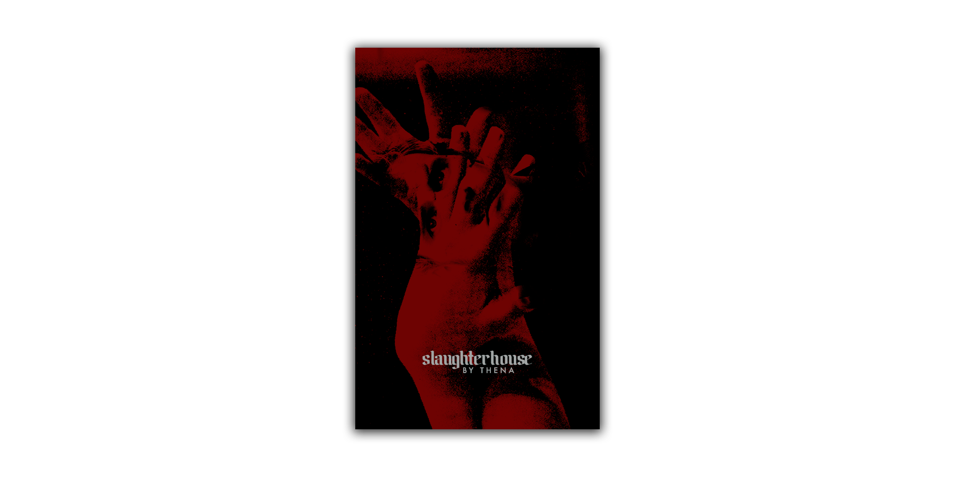
finally: SLAUGHTERHOUSE. this cover was probably the most difficult one for me to make, mostly because the cover i was meant to make would be replacing evie / numskulls' beautiful one. evie is one of my mutuals and graphic design idols, so i was having impostor syndrome making a cover for a fic she'd already done graphics for. i eventually chilled tf out LMAO and locked in. i rarely make the hunger games covers, so aside from my anxieties i was really excited! ffor this cover i wanted to emphasise at least one of the main characters' districts, and ultimately ended up going with finnick's, since district 4's fishing, ocean, water, so on so forth, was a lot easier to incorporate than district 10's. the alt. version of this cover is my classic bayports red, with hands covering, almost suffocating, finnick.
not indicative of the character's fate at all 😃
i also made this cover theme in an alternate colour scheme that has much less blue:
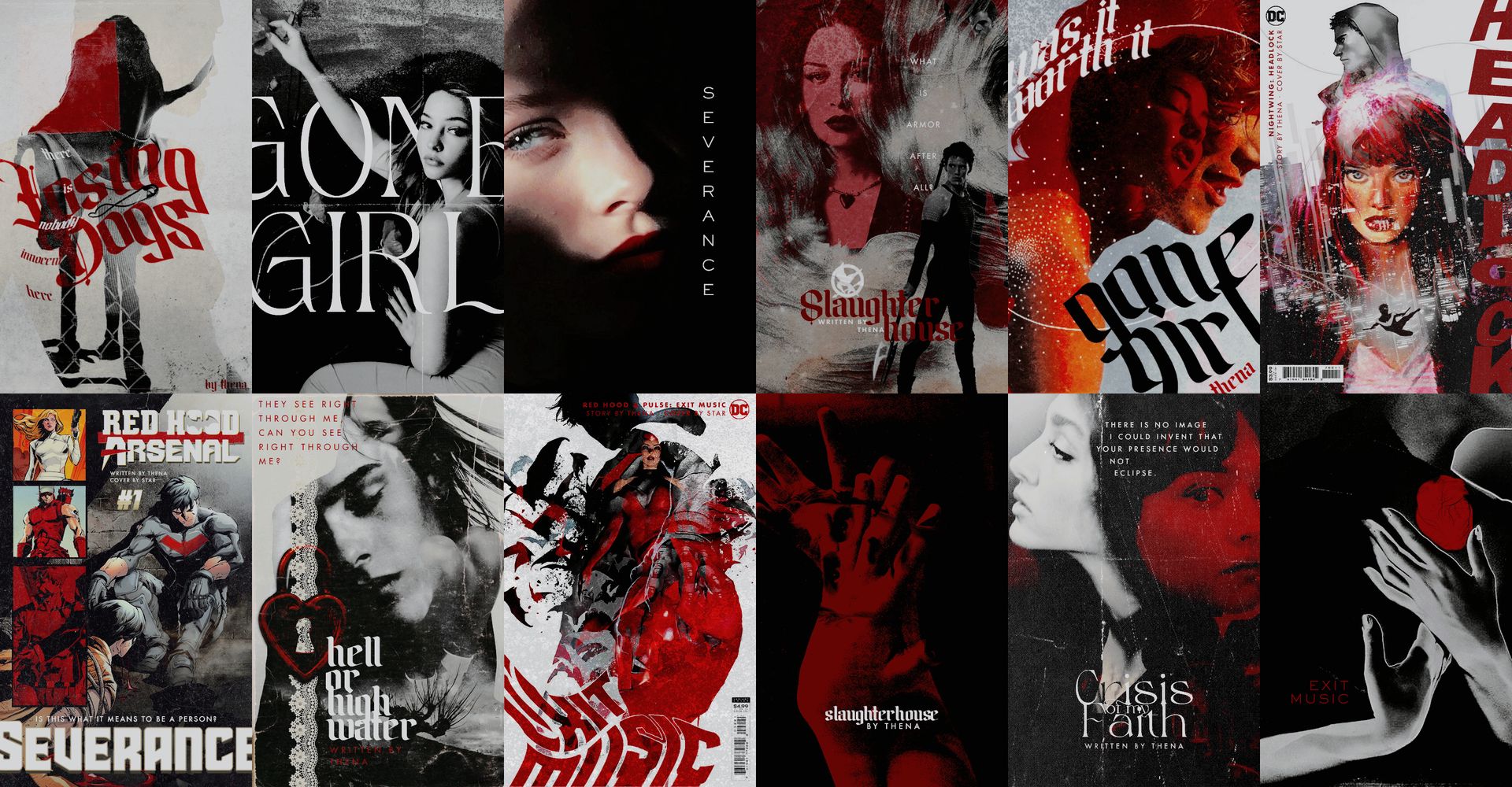
for once, i prefer the inclusion of a non-red, black or white colour, but i wanted thena to have options so. she was also kind enough to tip me on ko-fi, which was so, so lovely of her 🥺 never necessary, but always appreciated! i'm so glad that you like these covers, thena.
to my other readers here, please go check out thena's account! her fics are peak and the covers are too... i might be biased, but maybe just this once i'll let myself be 🙂↕️ as always, thank you all for your support! i'll see you next time.
my ko-fi ☕️: https://ko-fi.com/bayports

THANK YOU FOR YOUR SUPPORT!

Bạn đang đọc truyện trên: Truyen247.Pro