Remembering how to design + Aesthetics rant
Hi! How've you been? Bet you don't miss me like I miss you!
It's been a really long, hot minute since I've designed. I basically took an unexpected hiatus after a really bad wrist injury followed by school and some other commitments; but I'm actually back this time around. I know I said that I wasn't going to design for Wattpad anymore, but like, design is life. I always find myself drawn back here no matter what. I won't jump straight back into accepting requests, because I want to warm my "design mode" up. It's been a while lol.
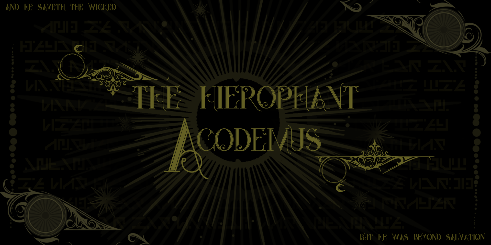
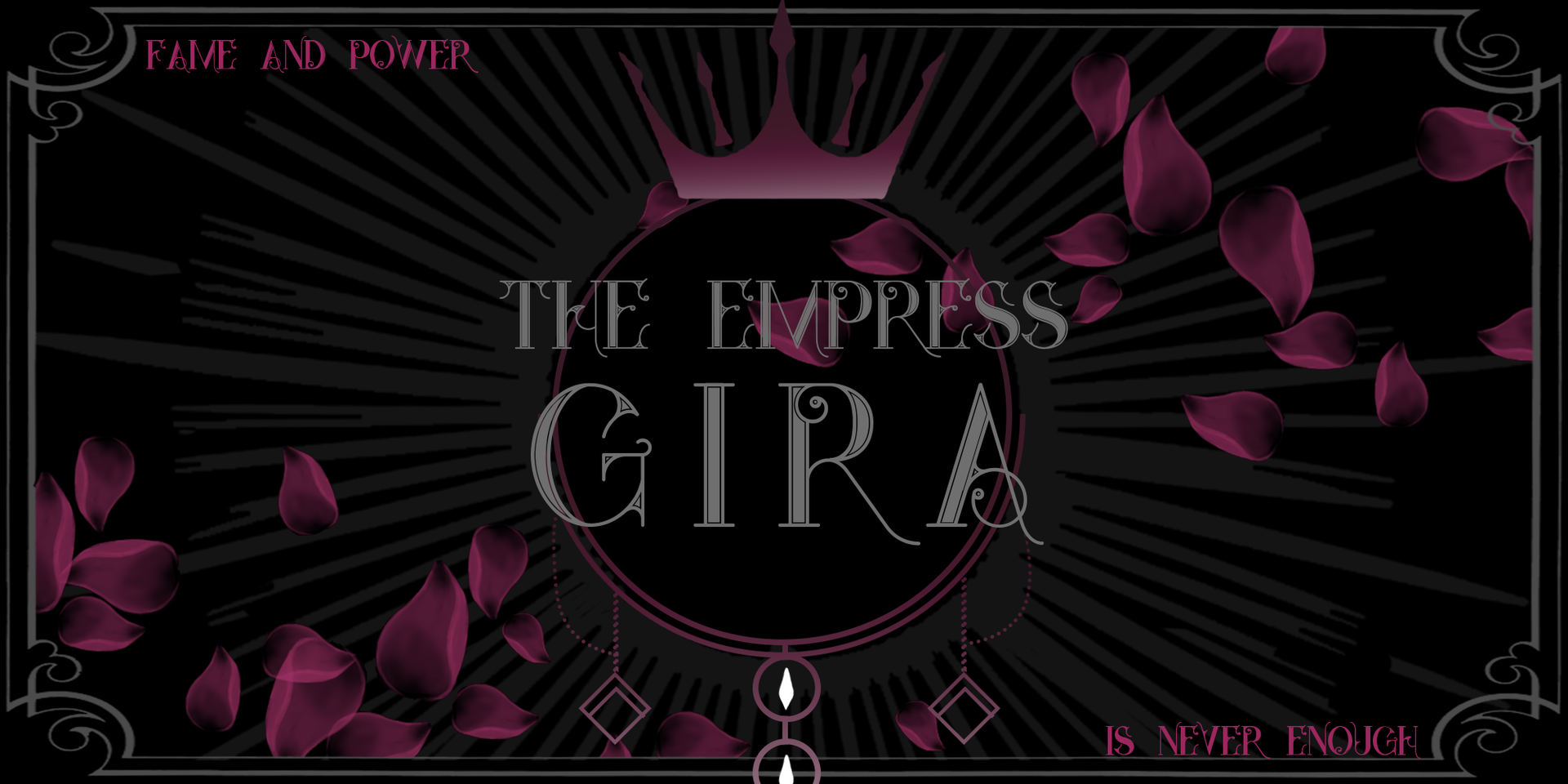
Anyways, here's me trying to remember how to design. These are just a couple of the banners and separators I've made for the short story book, which is a companion read to "The Death of a Dream".
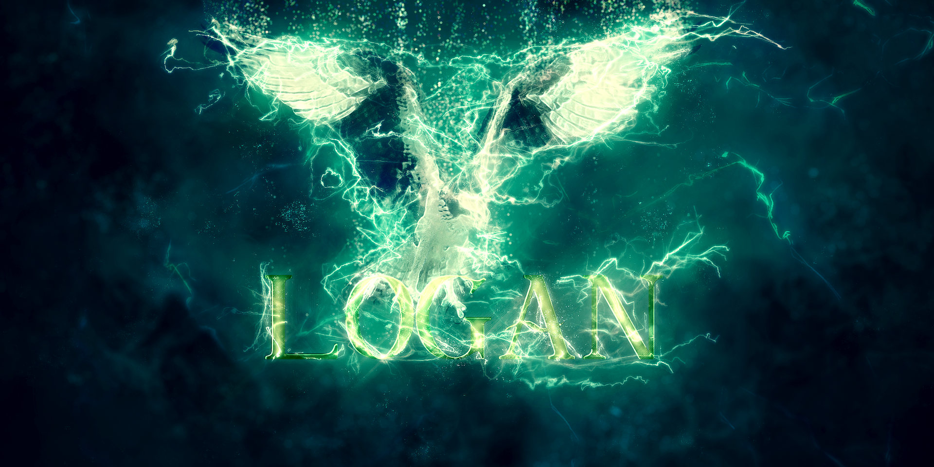
From here on out, the gap in visual impact widens. I was looking through some old designs and realized that I could mix vectors/flats and 3D effects like shadows and whatnot. Suffice to say, my inspiration skyrocketed. I decided to play around with lighting and different effects like fire and lightning, as well as different color combinations.
I basically gave myself permission to go as crazy as possible, composition be damned! The results are pretty alright.
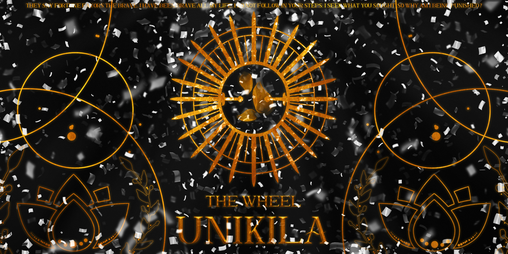
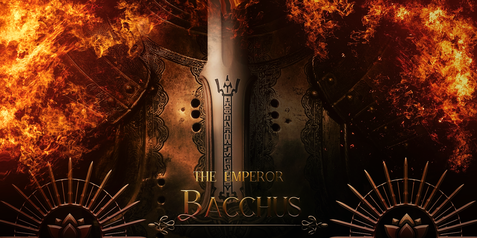
As you can see, the chapter titles are named after some of the tarots and have that reflected in their designs. I'm the kind of designer that likes to have visual and verbal representation of whatever the f*ck I'm designing. It keeps themes consistent and adds to the overall feel of a book.
Also if you look at the banners from top to bottom, you can actually see the improvement lol. I jump from pure vector and text to painted petals to actual 3D. I realize that the lighting in Bacchus' banner isn't accurate but that's just the rust showing. The more practice I get, hopefully the less mistakes I make. So, next time I threaten to quit designing, please yell at me XD
For this round of designs, I was very inspired by the aforementioned tarot cards, but also by fantasy games that I'd been playing during my hiatus; games such as Final Fantasy XV and XIV, Dark Souls, and Fire Emblem: Three Houses. Each had beautiful graphics with a certain ominous feeling lurking beneath. I wanted the characters personalities and stories to come across from just the banners and separators alone.
"But Reppie! It's so much easier to make aesthetics!"
To be honest, I don't like aesthetics. You're putting in certain items and looks that represent your character, yes, but I feel like a viewer's imagination is controlled by that from then on. Shouldn't the point of writing be the fact that you can create "verbal aesthetics" with your own wordplay? The only time you'll see visual depictions of my characters is when I've personally drawn them, but other than that, all of Belvegarde is up to your imagination. The banners and separators are like my own take on character aesthetics but I limit myself to putting titles, names, and visual details that relate to that specific chapter. At least this way, the visuals set the mood instead of controlling how you perceive the world or characters.
Updated Grendy banner
You guys already know that evo_eevee is a very dear design customer of mine. So when she asked for a banner, I happily obliged. And by obliged, I mean that I felt the strong urge to replace most of her banners with new ones because I needed the practice. I'm in the process of updating Macey's and Connor's so I won't post them here, but if you are curious, you could check out her book since they'll find their way there.
Anyways, thank you for coming to my TEDtalk lmao. I'll see you baddies back here in my next "warm-up" design post.

Bạn đang đọc truyện trên: Truyen247.Pro