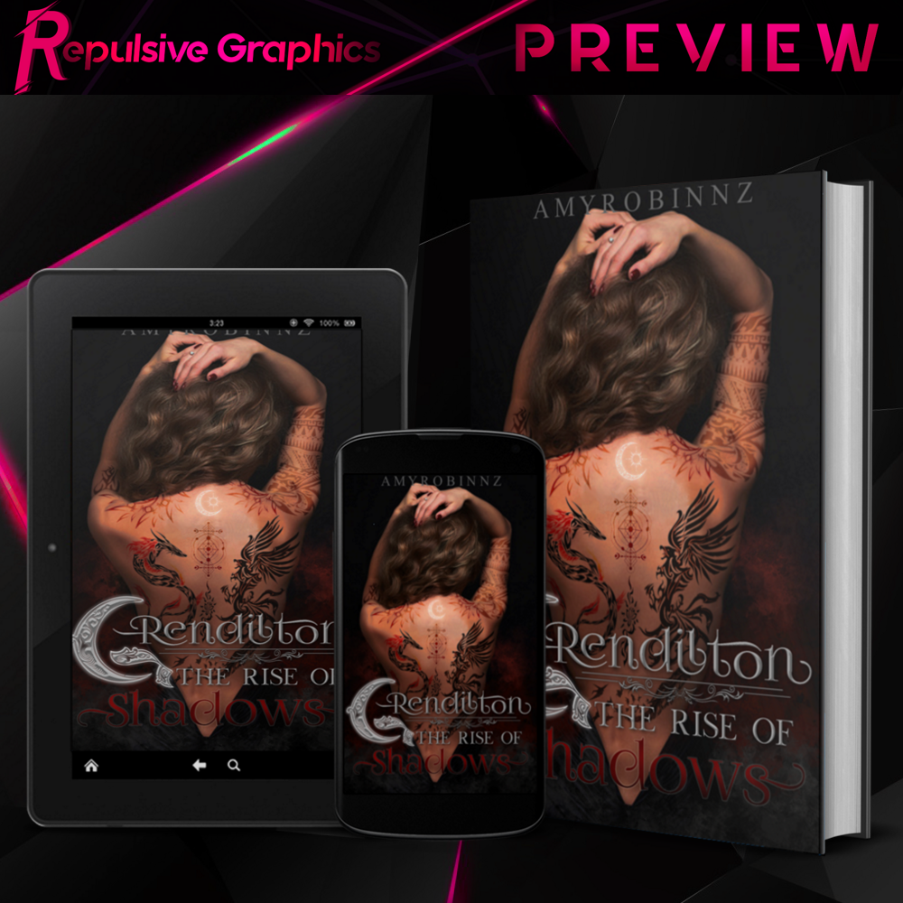
4 🔸 Grendilton Cover
This this was the first cover I have made for a client in over two months. As soon as I read the description, I had to design it. I loved the end result so much that I had to share it here! For those looking to see my cover process, this is it!
This is my FIRST fantasy cover so bear with me. Also, please excuse the hideous blue watermarks; those are gifts for the design thieves.
The Request for amyrobinnz
(sorry for blowing up your feed!!)
-brown haired girl full of tattoos
-glowing crescent tattoo
-blue and orange or red and black color scheme
-some dark magic, urban fantasy
The picture below was the initial design, but I needed to redo the cover to instead use a pic of Macey with her hair down.
CHALLENGE ACCEPTED!
Designing Process: 4 hours, I think?
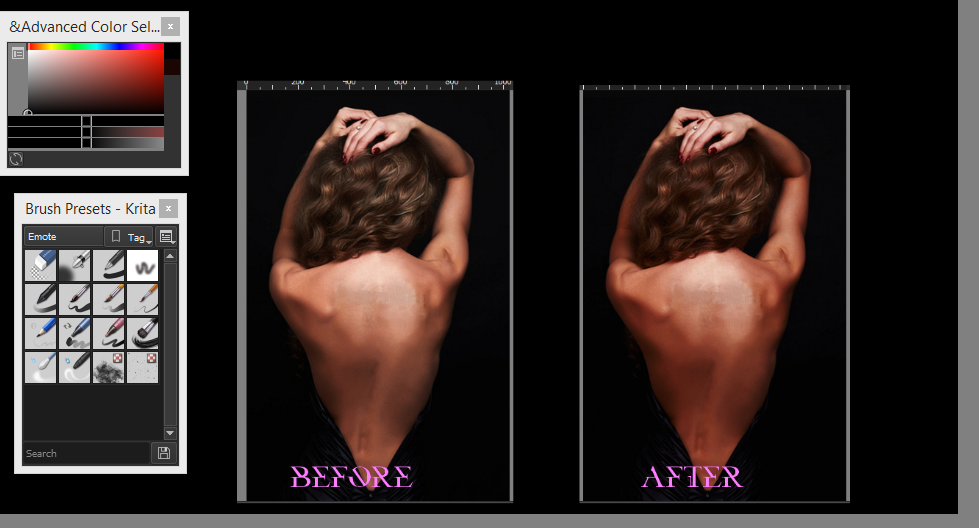
Let's start with a base picture. I ended up looking for pictures of near naked women (god bless my search history). I grabbed this pic from Adobe Stock [thanks sis]. Her skin tone is kinda not warm enough, so I ended up using the color curves to darken and add more red to her.
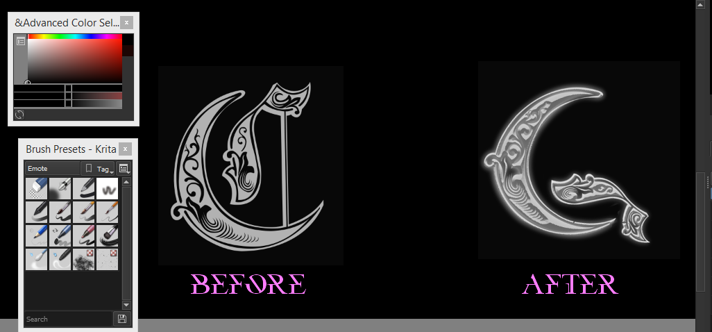
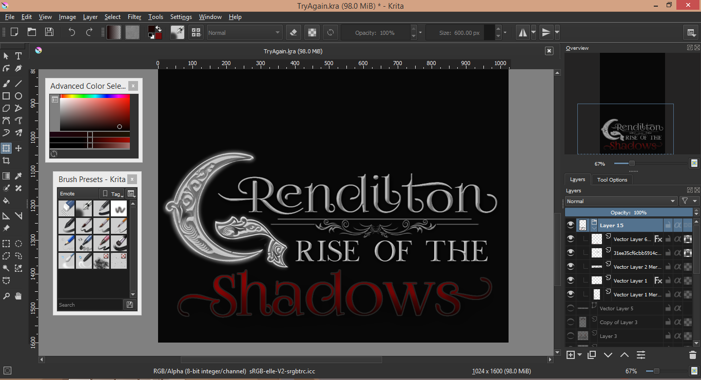
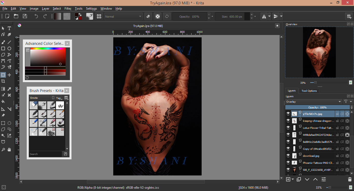
The first thing I made was the title. Font is very important and is usually what makes a book stand out. The request sounded like I should accentuate the moon/crescent idea, so I searched for a typeface that utilized any sort of crescent figure. I ended up finding one, but the crescent was on the C and not on the G. So I surgically rearranged it.
I beveled/embossed it and added an outer glow [white, opacity at 80%]. There was a soft inner glow as well [white, opacity at 30-40%, scatter/noise at 25%]
Next, I wrote out the rest of the main title in gray [beveled/embossed - 100% to the shadow]. I added a silver bottom border to separate 'Grendilton' as the main title. The "Rise of the" portion was made in the same way as the "rendilton" portion. All of the silver colored text have subtle drop shadows.
The "Shadows" portion was the hardest piece of text. I went through like 15 fonts before settling for the same font used on the "rendilton" part. I colored it with a red-to-black ombre, added an inner shadow, and then 'burned' the upper portion of the font with a lighter shade of red to sort of give it a highlight. Lastly, I gave it a thin-ass white outline just so it wouldn't blend too much with the black background.
The next part is the best: TATTOOOOOOOSSS!!!!
I just downloaded a few tattoo png's off google [pngs come with a transparent background]. I stuck them on the picture and used the transform >> warp tool to conform the tattoo's dimensions to the bones and muscles of her back. I blurred it a little bit with the gaussian blur tool [2.8 radius for both] and set the layer style to overlay/gamma dark [whichever tickled my fancy].
I have a pretty solid grasp [or I think I do] of the anatomy of the back with all of the bones and muscles.
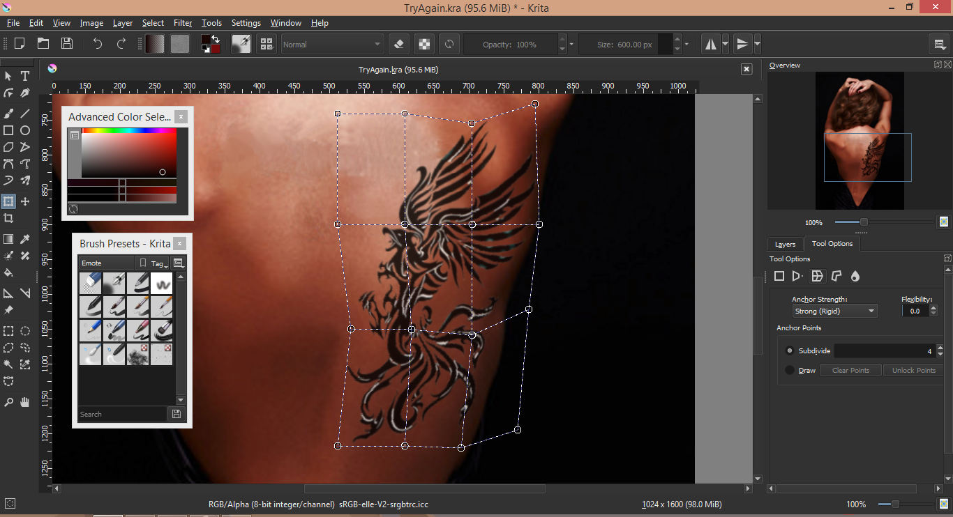
Since this tattoo is on the spine, I pinched it towards the middle.
Just rinse and repeat with the rest of the tattoos. I had to make sure that the lotus tattoo was following the curve of her spine, hence the slight tilt.
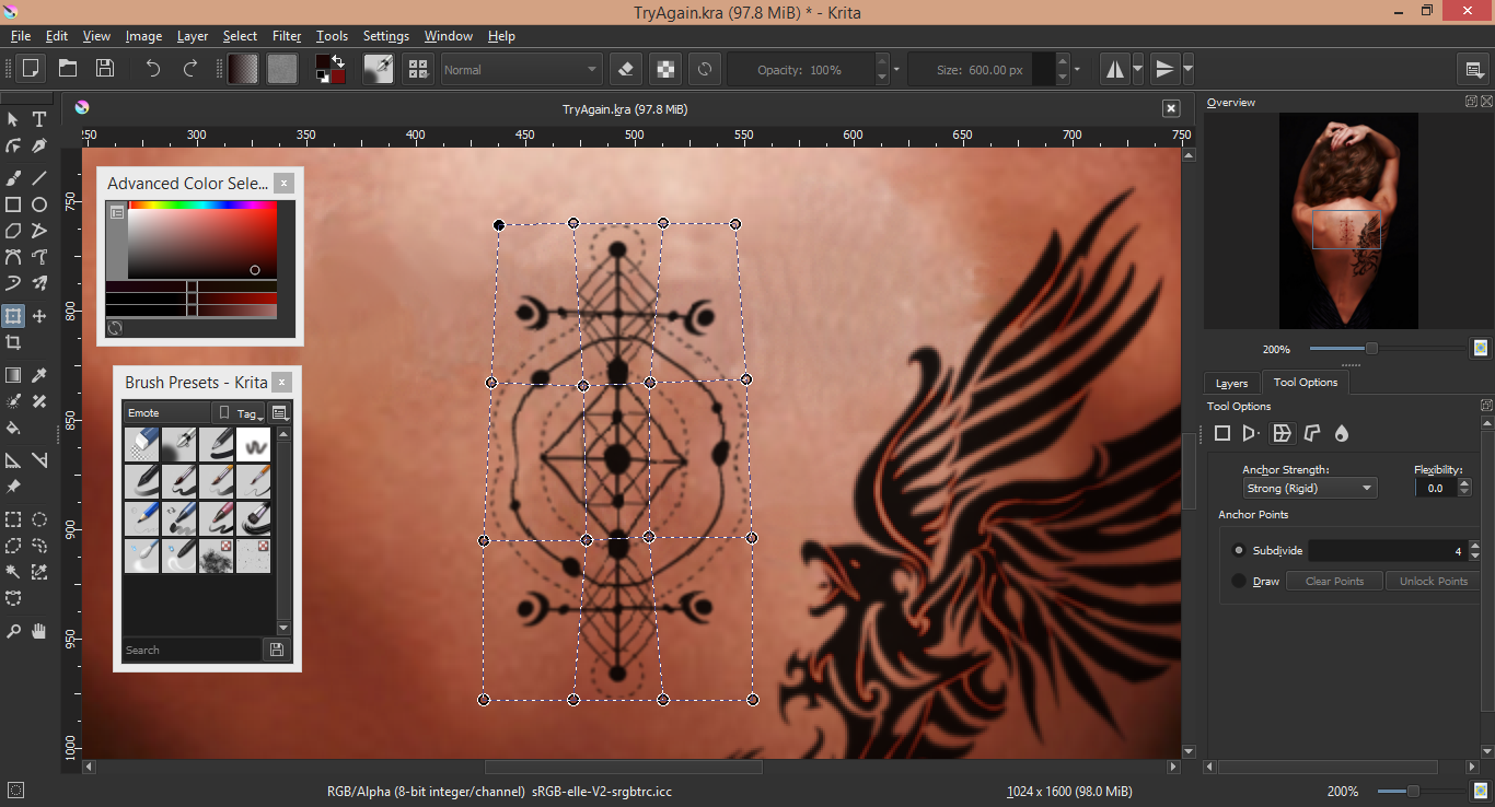
I found these really cool floral disk tattoos and landed them on her shoulders [clavicle if we're being specific]. I had to warp them for a good hour or so because I'm not used to working with arms at that angle. Big shout out to my sister and her cat who I forced to pose in this way just so I could see how the skin would fold.
I'm still not sure I did the right disk tattoo correctly. Will research some more.... Anyways, I erased the rightmost portion of the right disk because I felt like giving her a full sleeve.

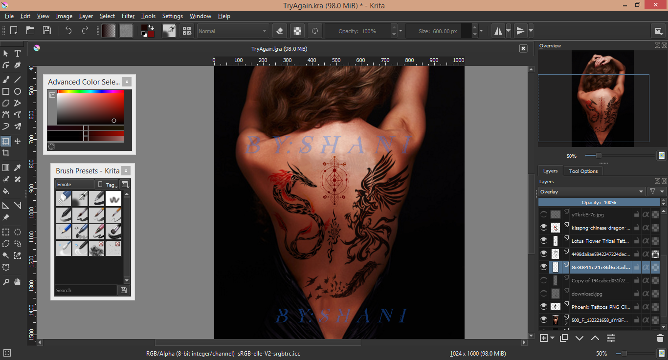
I ended up getting her a half sleeve on her right arm and a small tribal one on her left. I ended up using Soft light SVG layers for those, hence the light brown color.
The final tattoo was the glowing crescent on her back. Unlike the previous design, I added the small sun in there to sorta hint at the other character in the book.

Moving on... I decided to add these black and red smokes/shadows around her body. I really wanted to accentuate the red and black scheme while also framing her back and adding some texture to the background. The lightness of the shadows near her waist will also help the font placed there be more readable [you'll see what I'm talking about at the end].
If you look at my brush presets, the brush responsible for this effect is the second to last brush.
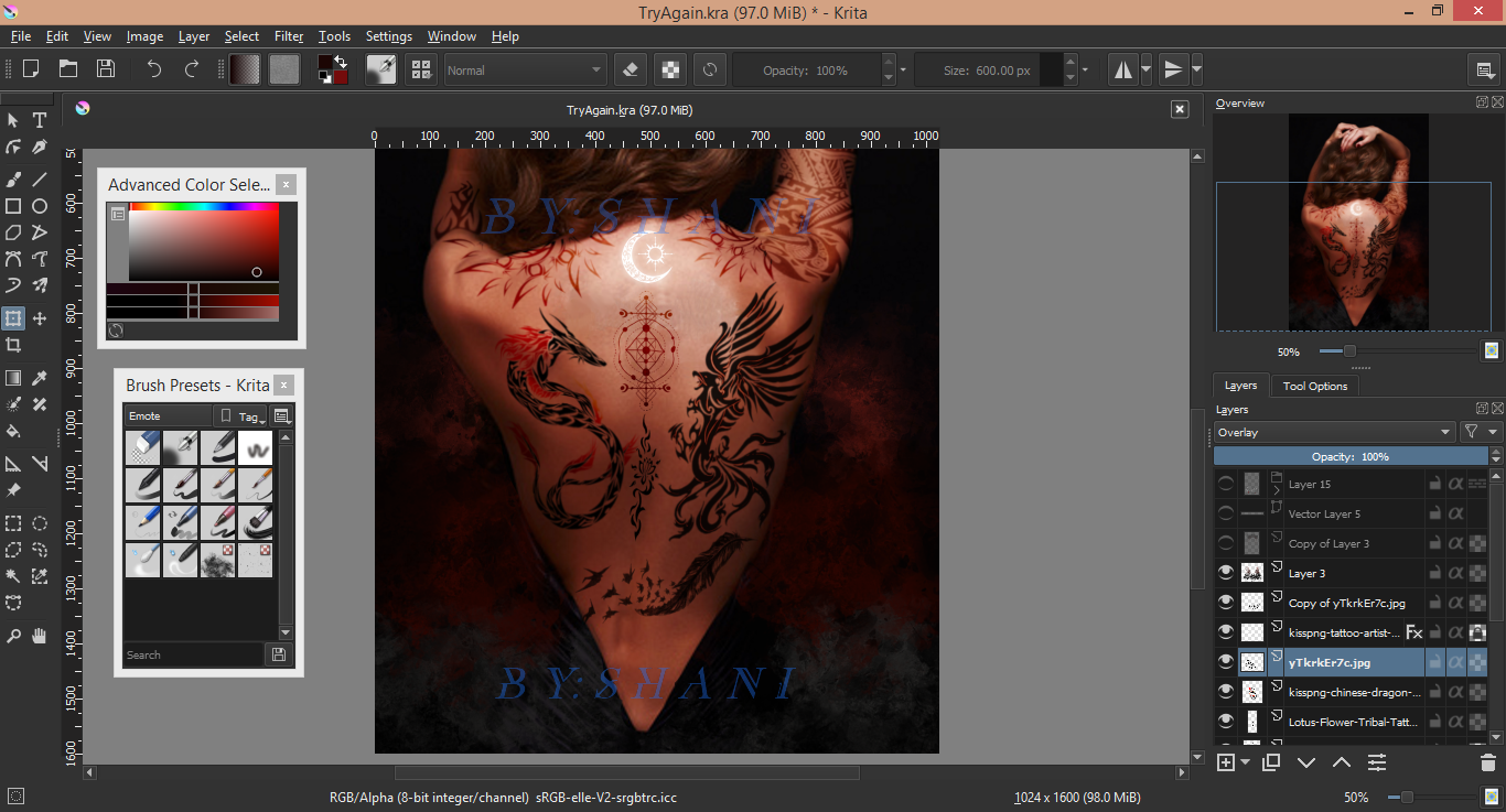
I worked upwards from there. The higher up the cover, the darker the red and the more faded it was. If any of the smoke got on her body or arms, I'd just simply erase it with an airbrush.
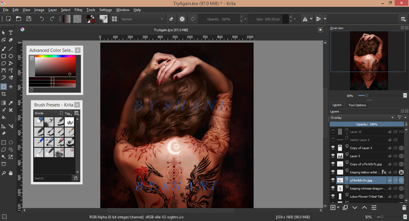
And huzzahh! You can admire the cover at her page! Give it a read while you're there!

--Thanks for following my design process through! If you like the cover, I suggest you read the book. I've only just started and it's pretty fun and wild so far!
----No yoinking these covers! These covers are solely for the author to use!! If you do try to steal, good luck removing that text+watermark lol.

Bạn đang đọc truyện trên: Truyen247.Pro