24🔸EC entry #3 + my logo making process
Round 3 of the Earnesty Graphics Contest and I'm feeling good. The third prompt asked for a logo and I'm no stranger to them. I've made about 3-4 now but this is the first time I've made one in less than a month. Logo making is hard and borderline torture. It can't be too crowded, too colorful, or too complex otherwise it can't be seen properly when printed into a tiny size.
Concept design: Jeweled Fire
The reason I wanted to use the jeweled fire style is because I love geometric designs. You can see that sharp design style all over my shop's banners and aesthetics, albeit mixed with a neon, urban paint splatter visual.
Design Process: 3-4 hours (I is slow)
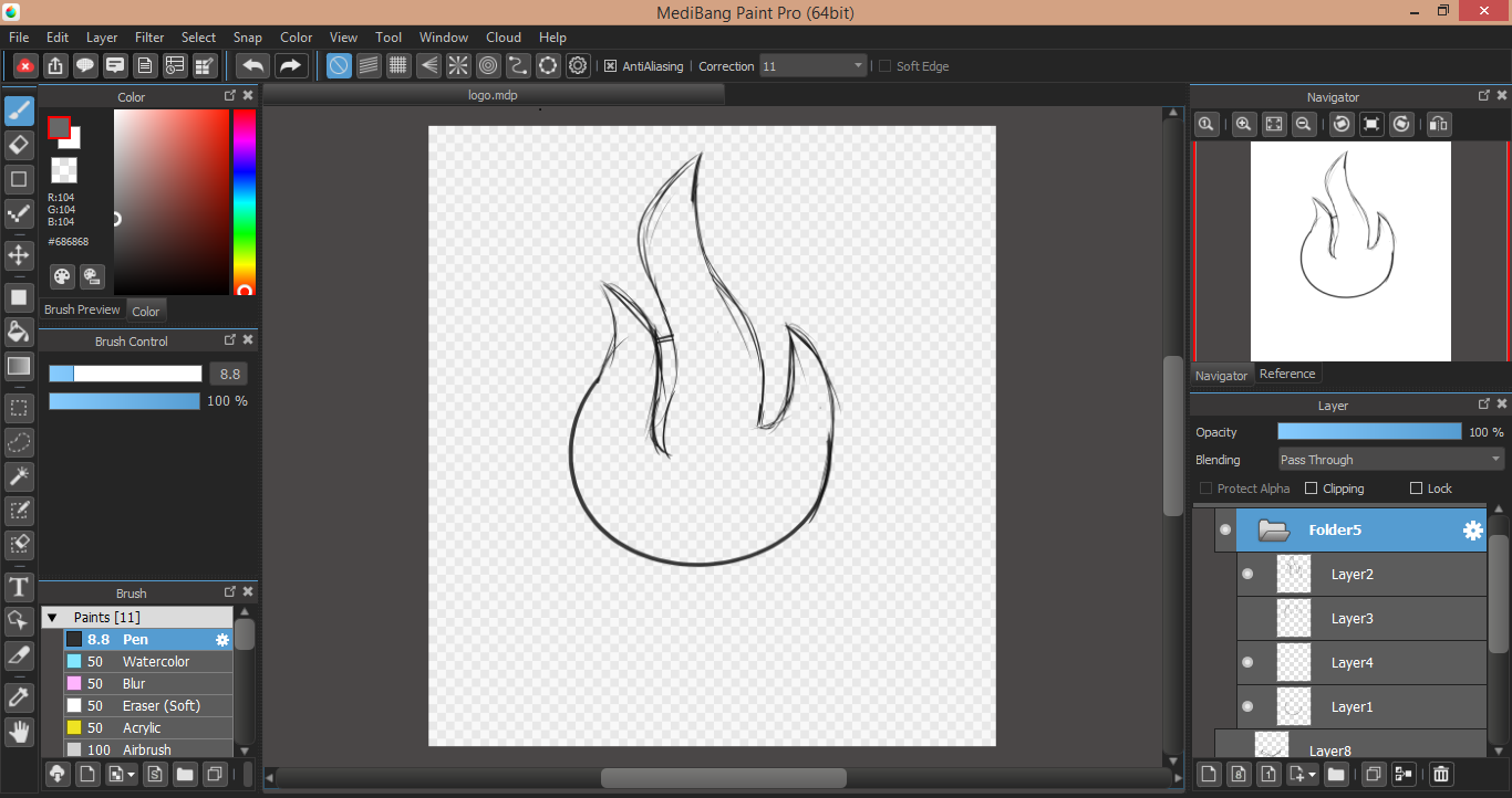
Woo! Ugly sketch time! First step is outlining the fire. I used a circle to create the rounded base and just sketched out the tendrils afterwards.
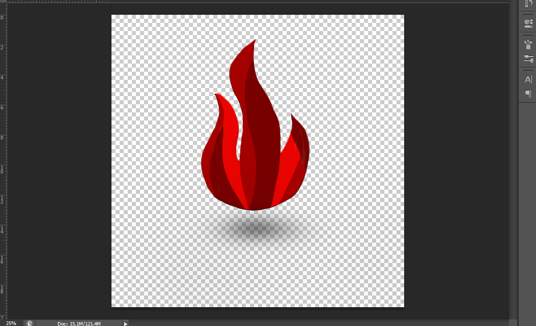
Next, I filled in the body of the fire with different values of red. I did this so that mapping out gradients for the low-poly effect is easier. I then transferred this basic looking fire to Photoshop. I would've used Illustrator to make this, but my sister wouldn't give me access to it so...*shrug*.
Next, I used the polygonal select tool and outlined a portion of the fire that's sharp and geometric in shape. I took my gradient tool and made a dark red-to-regular-red ombre.
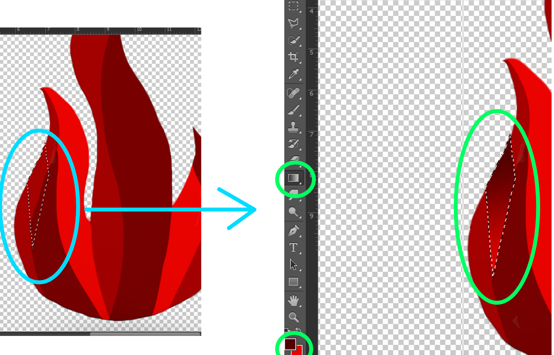
To create that low-poly, jewel effect, I just repeated the process until I established a shard like pattern on the entirety of the fire. The original values I had colored in earlier were used as a guideline telling me where the darkest parts of the gradients should go.
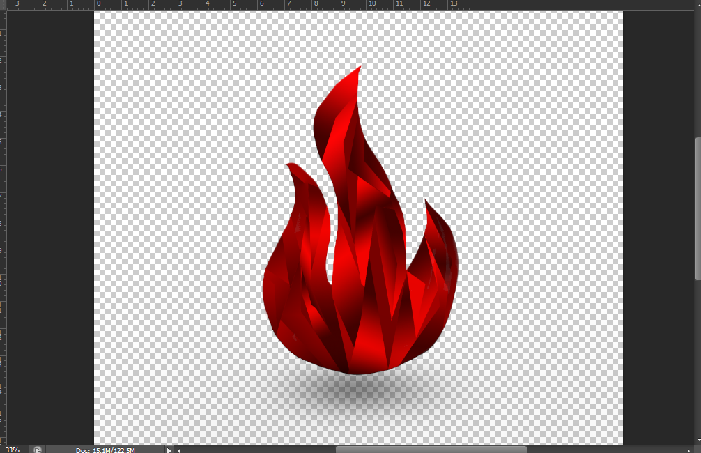
Next, I shaded the outer edges of the fire and brightened up the very center of the middle tendril. I didn't really like the color red as that's something my last two designs already had so I changed the color to a sky blue.

Next, I wanted to really push that 3D effect. To do that, I'll add a frame. I took the same sky blue color and made a diamond out of it. I took my airbrush and shaded the lower portion of the diamond with a darker blue while also shading the upper portion with an icy-blue, almost cyan.
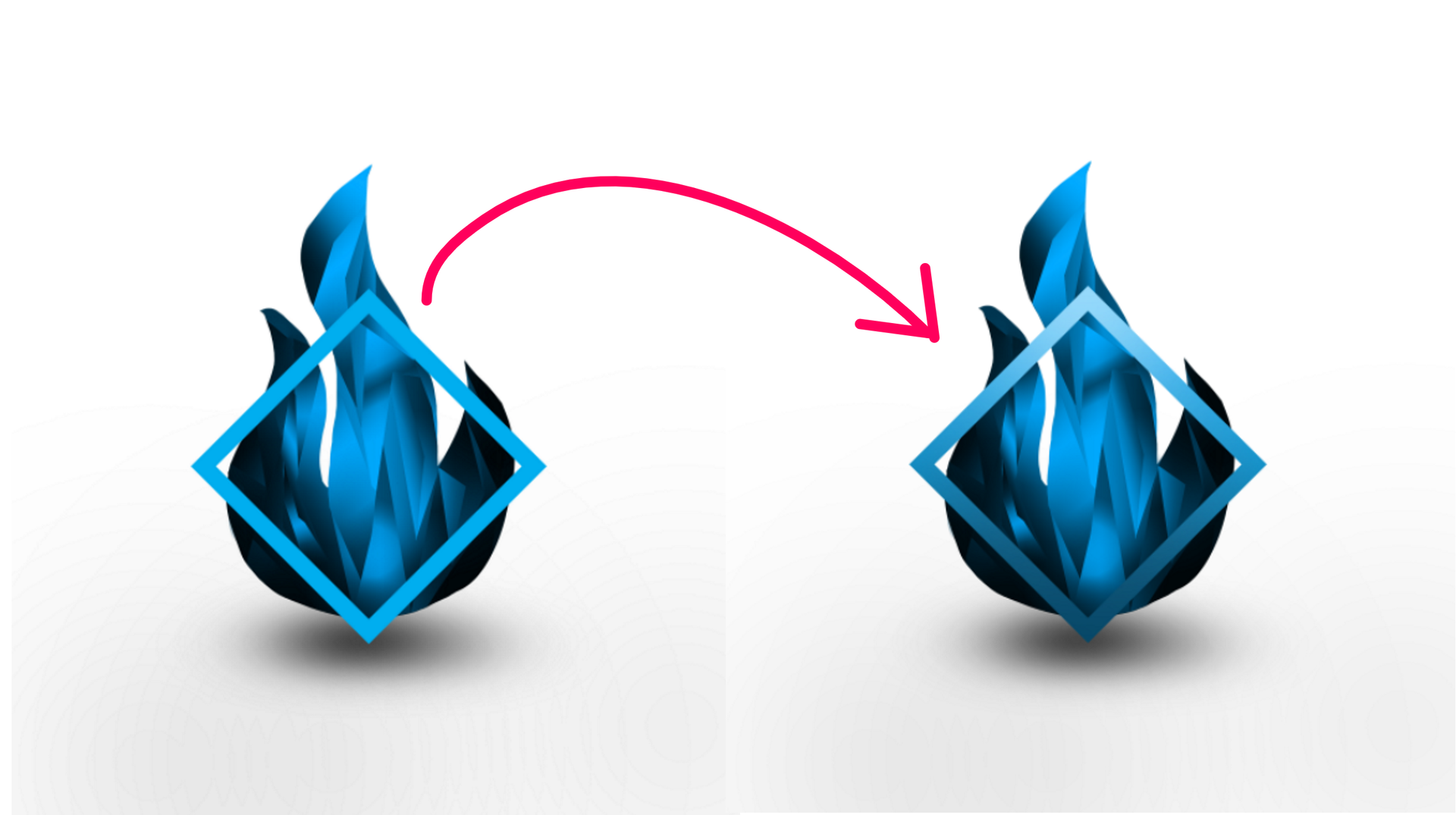
I took the frame and slightly beveled/embossed it. I don't know if it's noticeable in the picture below.
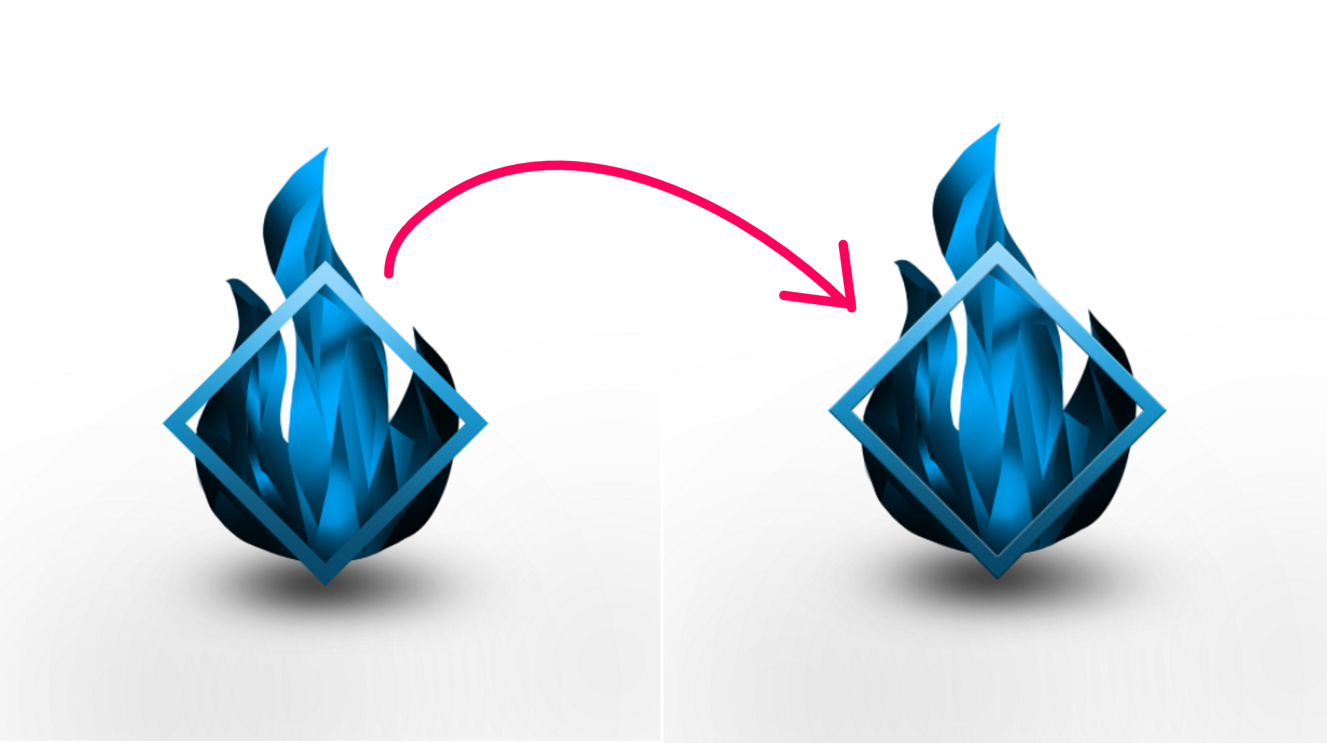
Afterwards, I just erased the portions of the fire to make it seem like the frame is around the fire.
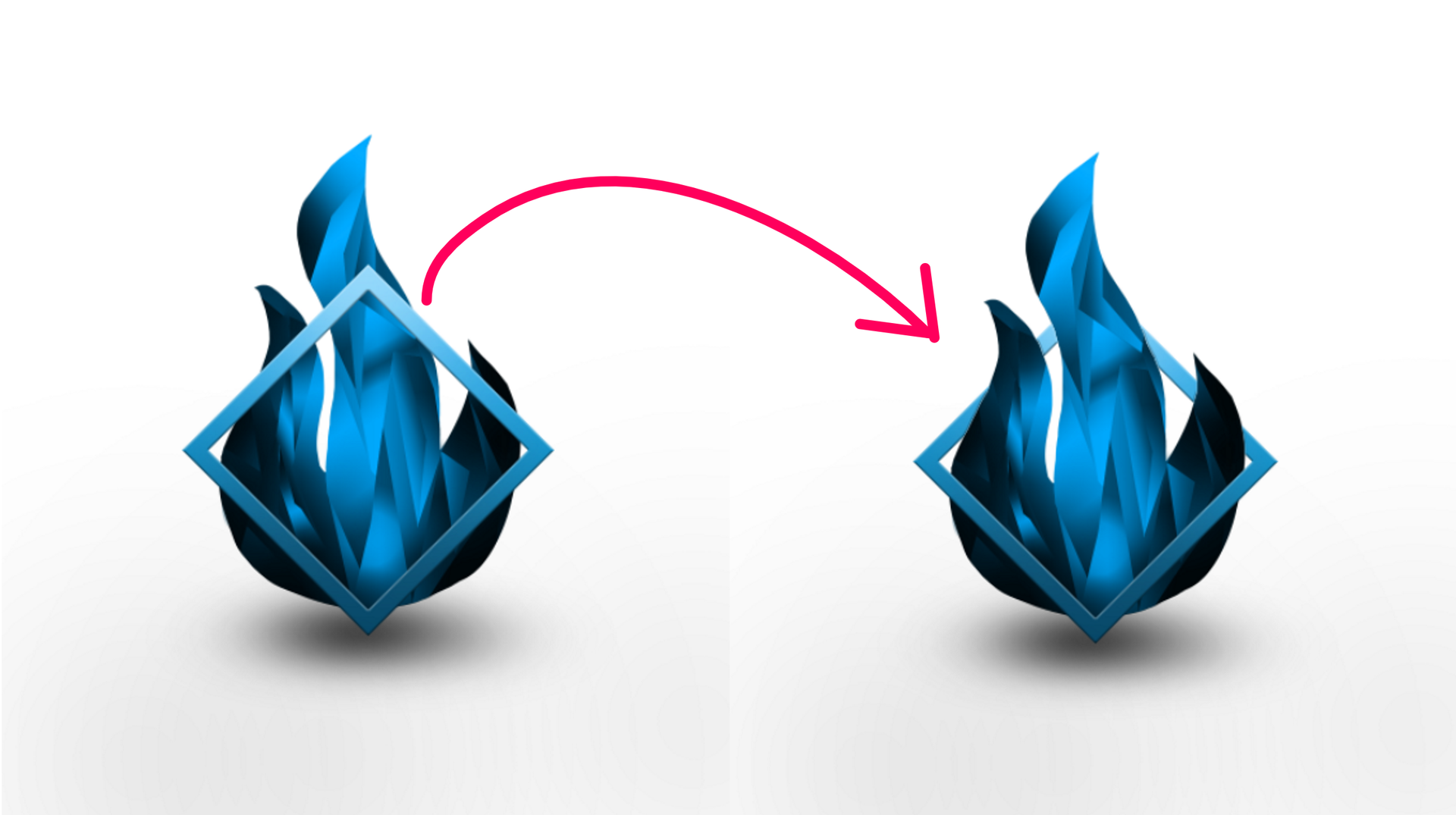
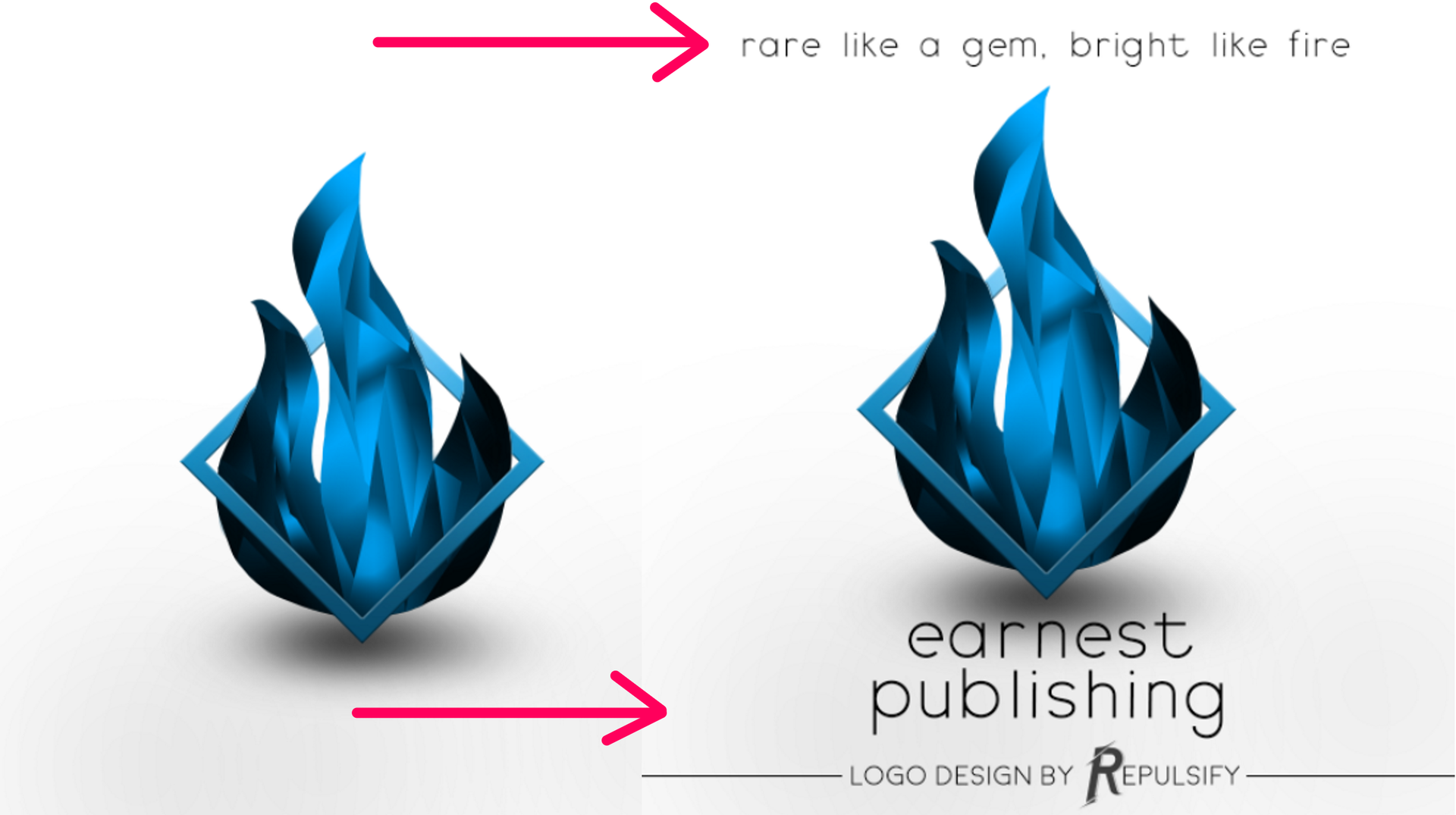
Last to be added was the font. Since the design is super complex with all of the lines the low-poly effect creates, I opted for a simple sans serif font.
This isn't the only way to make a logo. There are lots of methods and programs that do a better job (Illustrator, Inkscape), but this is just how I prefer to make them. I'm a painter first before a designer.
-Thanks for checking out this chapter. I'll see you guys in the next one! Thank you to everyone who voted for me during this contest!

Bạn đang đọc truyện trên: Truyen247.Pro