23🔸EC entry #1 + I still hate horror covers
(In Myst's voice) "It's like a cruel joke."
Whoops! I accidentally quoted my main character from my totally new fantasy novel, "The Death of a Dream". Not suspiciously selling out at all....
Anyways! I've been getting peer pressured by you people (you know who you are!) into joining actual contests. So I decided to join EarnestyGraphics' contest.
The first prompt for the contest, with my shitty luck, was horror. Of course it was. But mama didn't raise no b*tch, so I tackled it head on... In the day time... With lots of sunlight. I have a love hate relationship with the genre. On one hand, I get super creative and make some neat stuff. On the other, I'm a wuss.
The Prompt:
- an infection/disease of some sort kinda like chicken pox
-a demented looking kid
-full creative freedom with the font, tag, title
--Challenge Accepted!--
Design Process: 3 hours
The only things I needed for this cover were a kid, some meat, and a frog. Yes, a frog... Don't judge me.
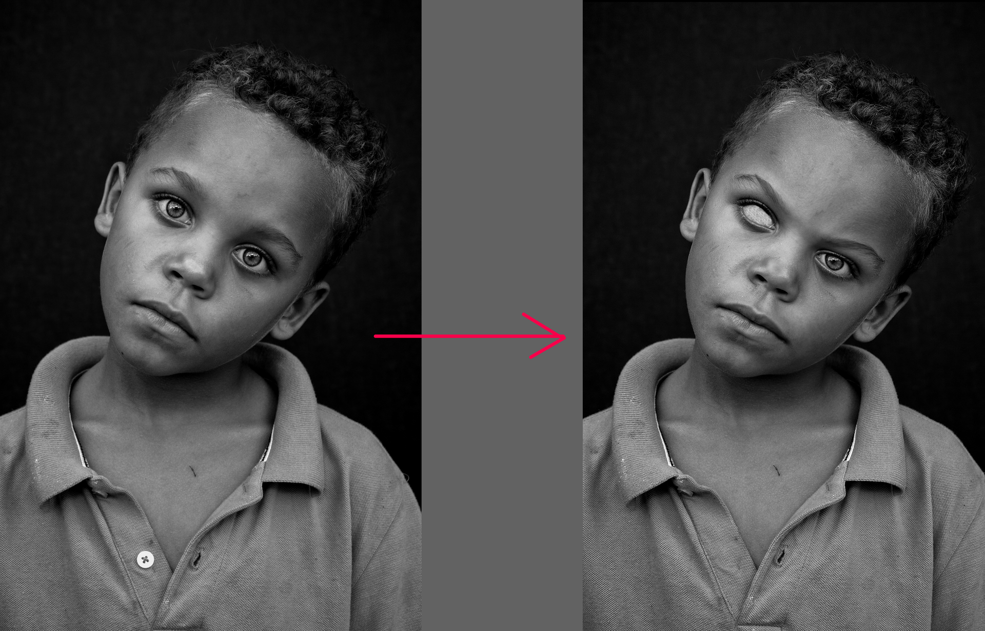
First step in any tutorial of mine is the base picture. So I grabbed this kid off Pexels. He's a little too sweet and cute for what I'm about to do to his face. So I used the liquify tool and made him frown. Then I took my paintbrush and just painted one eye white.
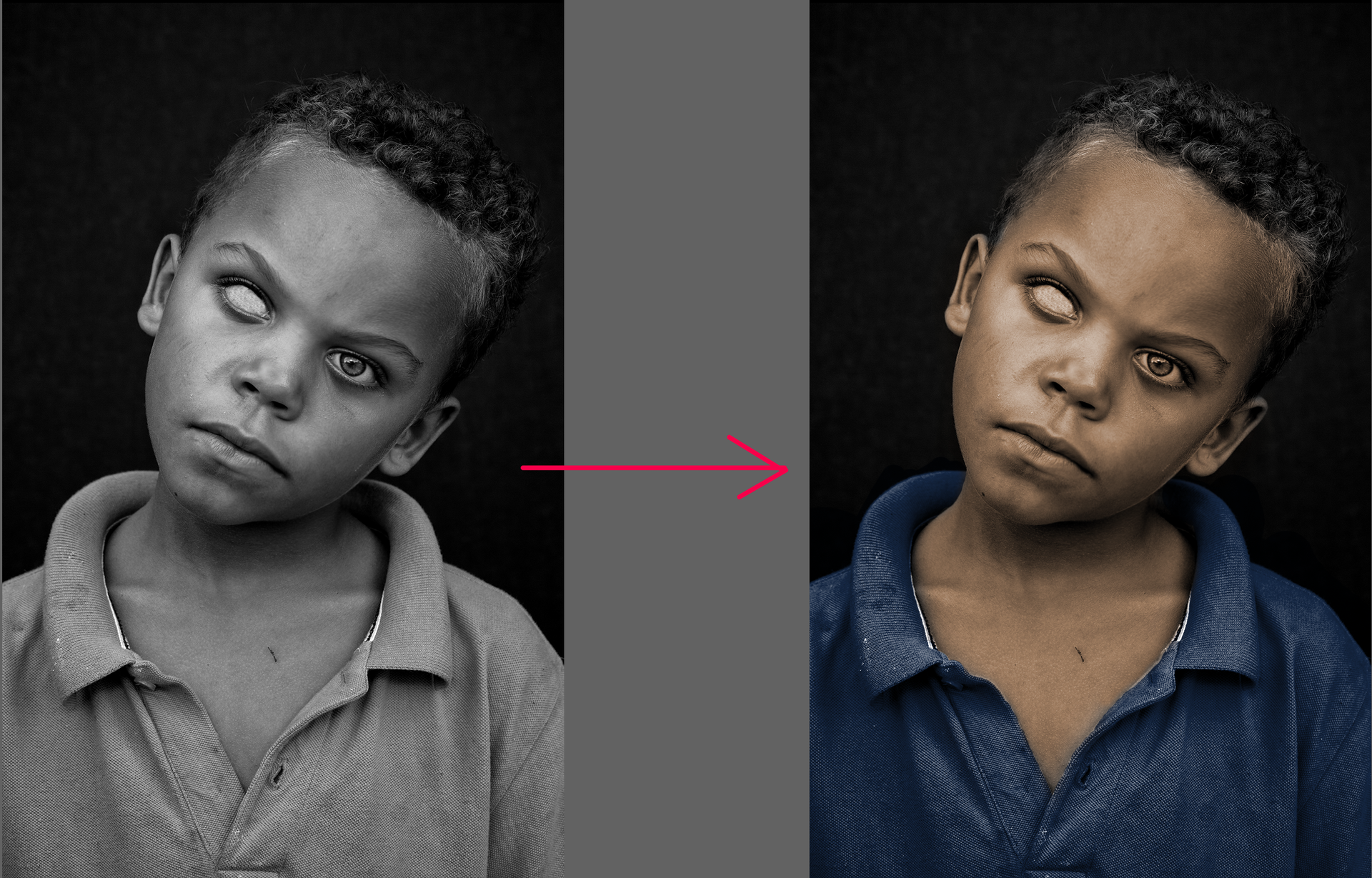
Next, I painted some color on him. Much as I love B/W on horror covers, a pop of color against the darkness is much better.
Next will be to show the infection-chicken-pox thing. I figured that instead of drawing some warts, I should make one big gross bulb. And you know what looks like a giant, bulbous infection? A frog. La grenouille. Hon hon hon.
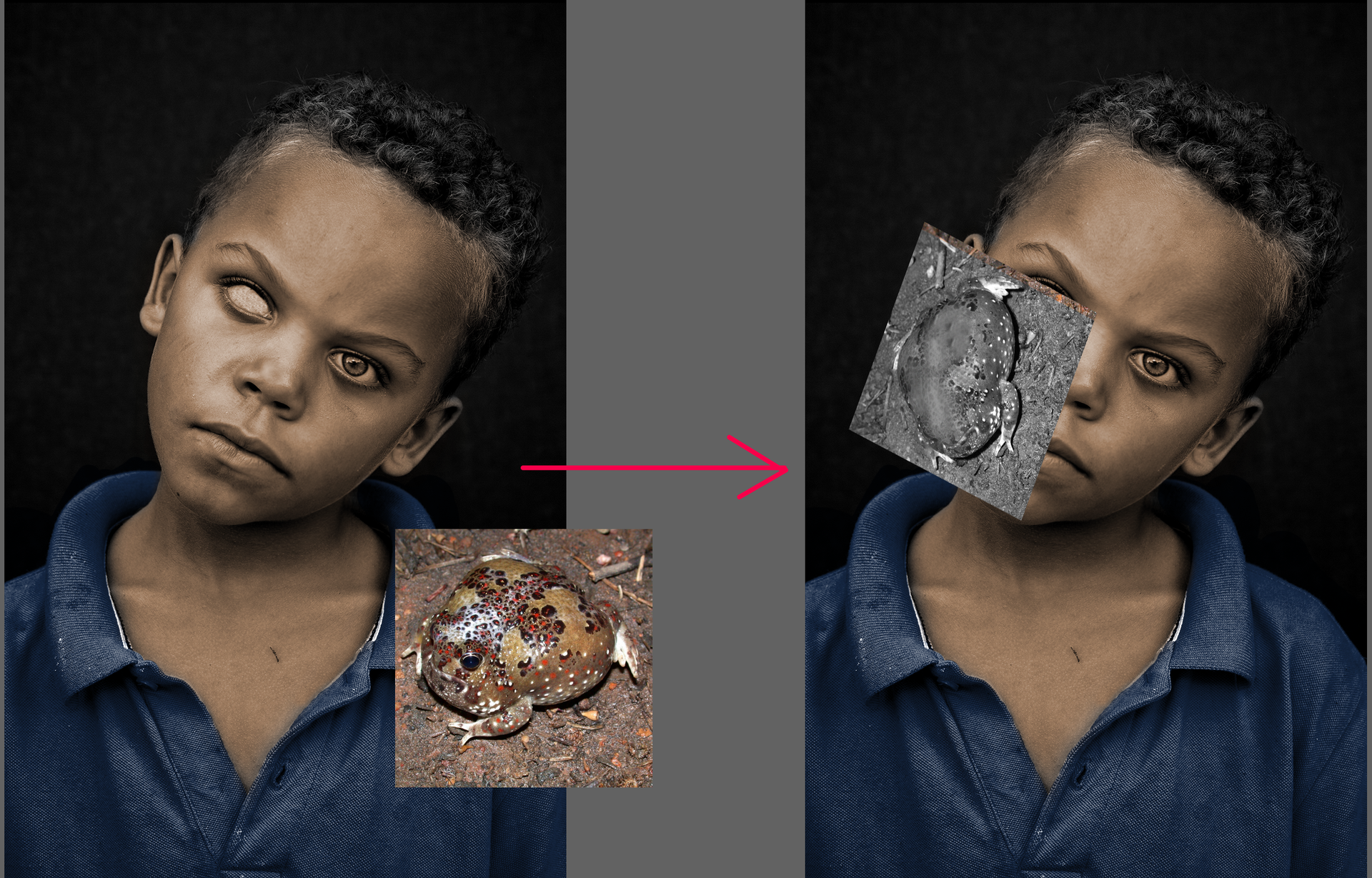
To prep the frog, I used the clone tool to remove his eyes and desaturated the little guy. Then I just erased everything except the parts I wanted.

Yay, blood....Again.... I went the easier route this time because I didn't feel like painting a sh*t-ton of blood. I googled 'bleeding meat' and took the first picture that had an even blood-to-flesh ratio. Change its layer type to overlay/softlight/hardlight or whatever suits your fancy, then plant it on top of his skin.
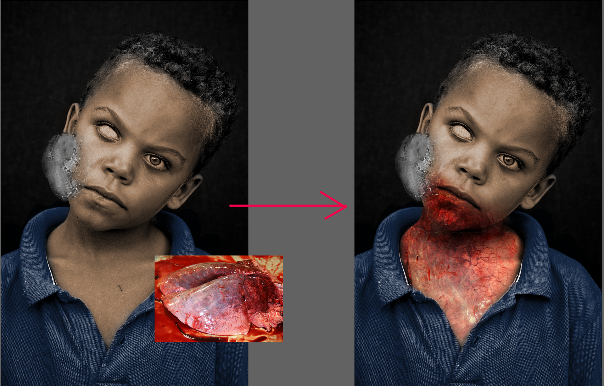
I repeated that until I covered a majority of his face, yucky bulb included.
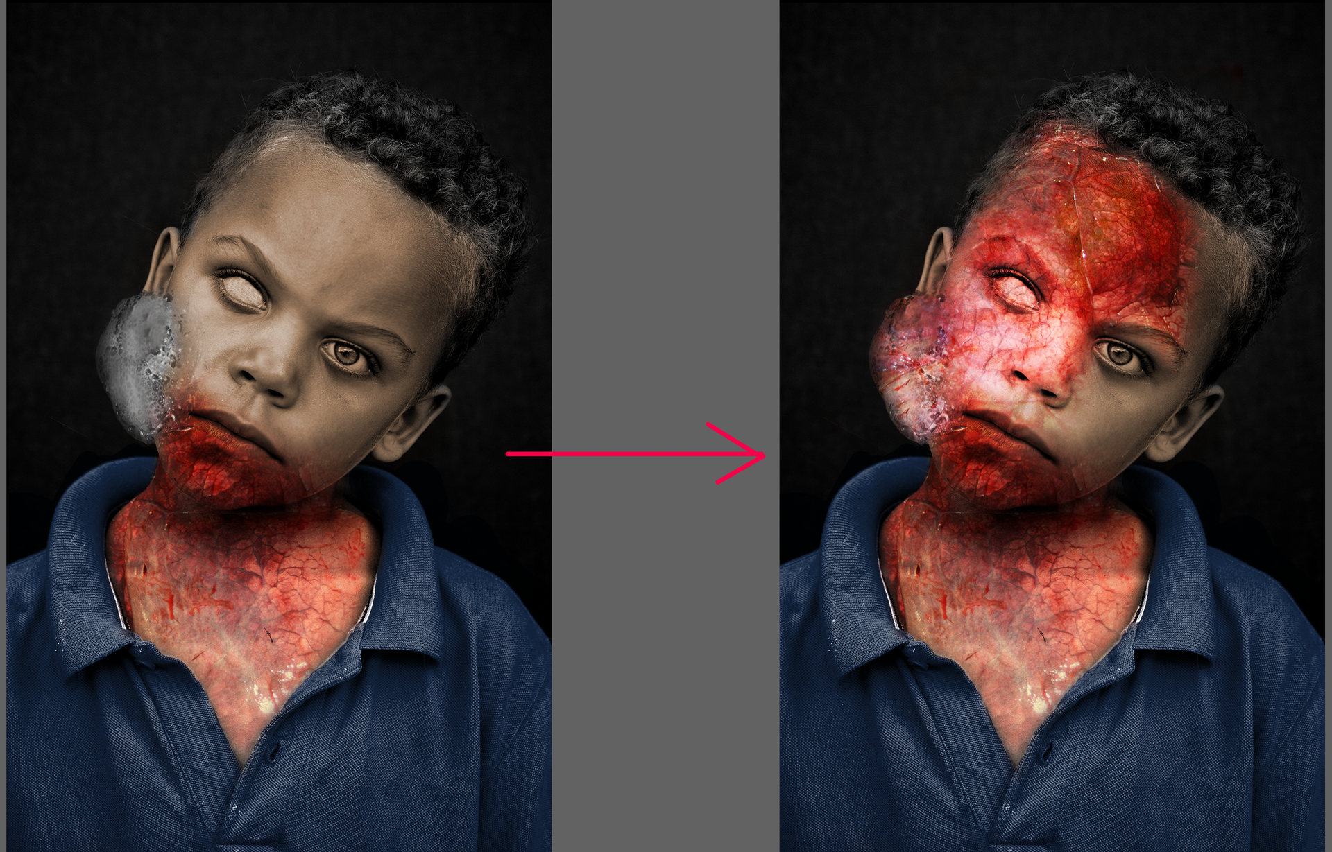
He's a little too bright, so I lowered the exposure. I added some detailing like shading work on his eyes and ears.
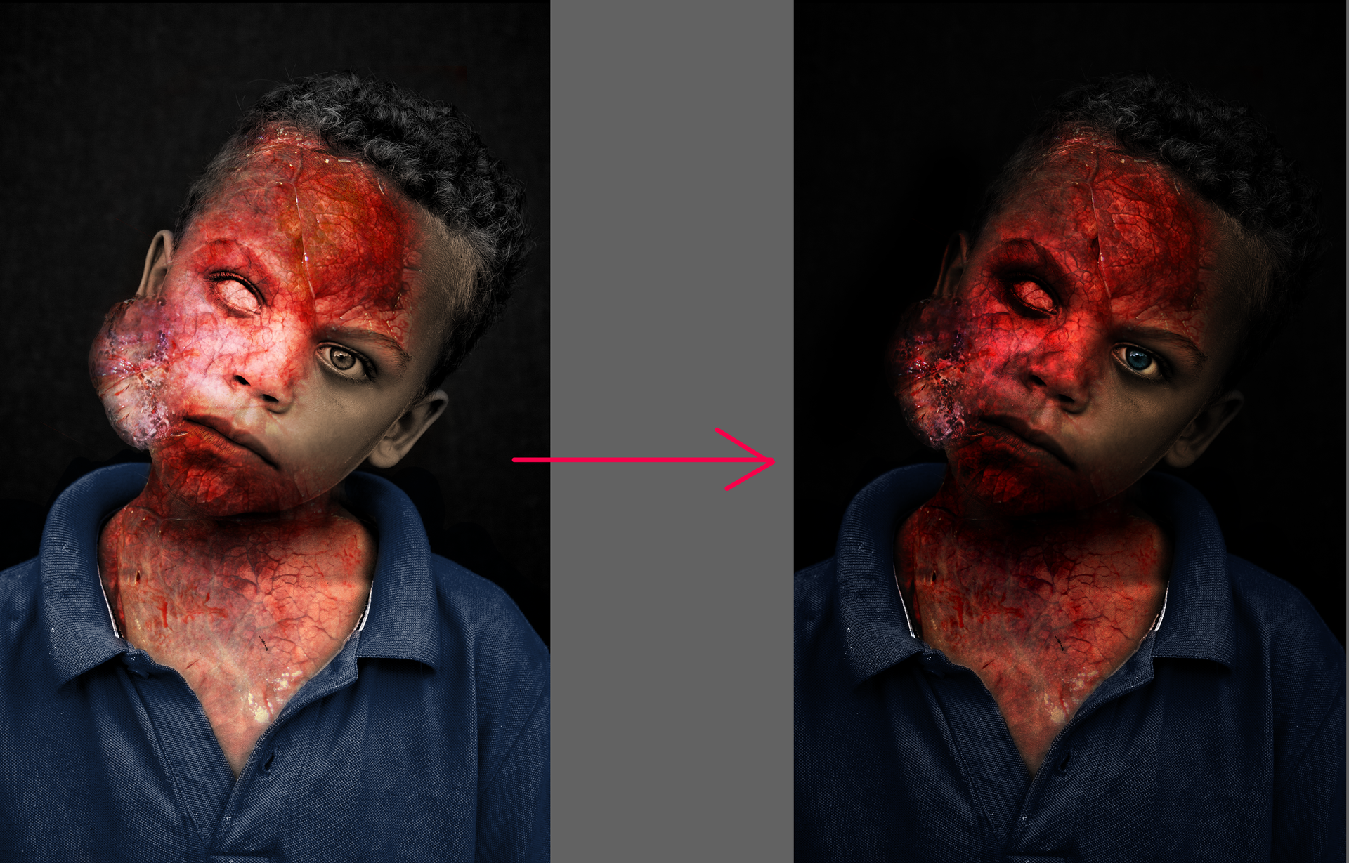
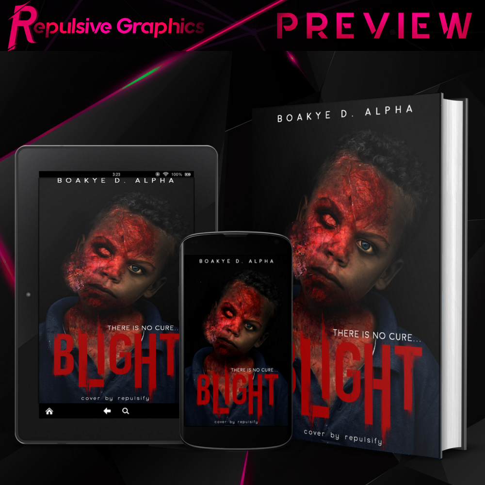
Lastly, I put the text on there. The font was inspired by the typeface used on the cover of the video game, "Dying Light".

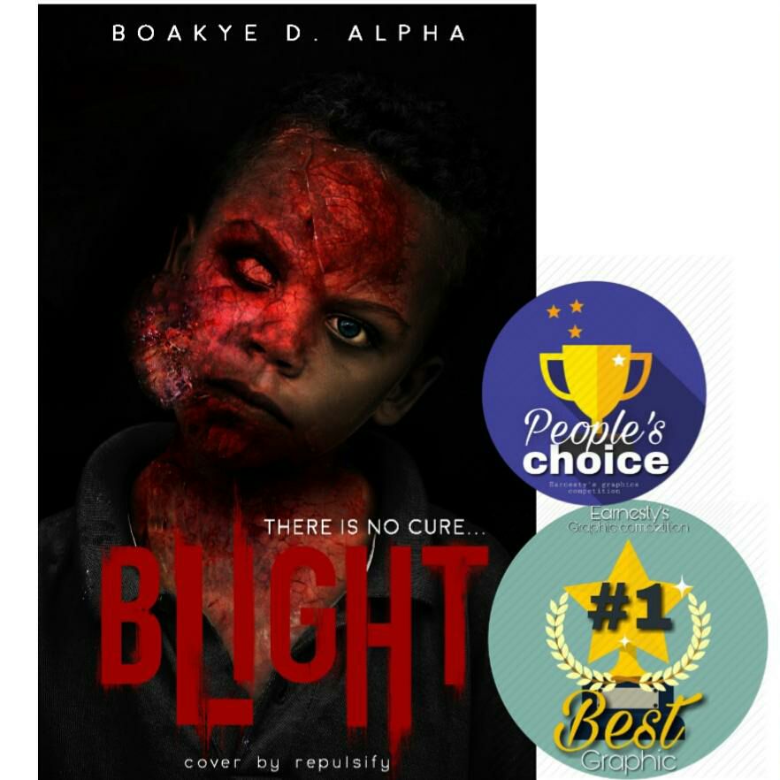
Thank you for checking out this chapter. Big shout-out to the people who voted for me. It was thanks to your support I got People's Choice and scored the #1 spot in round 1. I hope I can get better and make more awesome-r (not a word btw) graphics for you guys and gals.

Bạn đang đọc truyện trên: Truyen247.Pro