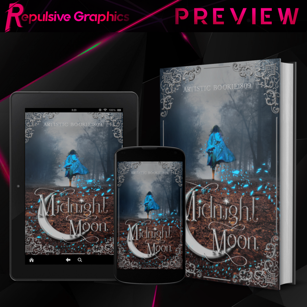
17🔸 Midnight Moon + Fantasy Rant
I've been doing some research on fantasy covers just because they get requested a lot and I want to be able to make quality ones. Back when I first started learning, I decided to Google "fantasy book covers". You know what I got?
A dress. A girl. And a primary color.
OR
A hooded person. A sword. And a dragon.
Now the second option doesn't bother me as much, but the first one tilts me off the face of the planet. 50+ covers of some blonde chick wearing an expensive gown that probably doesn't exist in her time period.
I understand why they're so repetitive. It's a formula that works, BUT! I think as designers, we should be pushing for change and new mediums as opposed to constantly staying in the "tried and true" areas. Like all good writing, there has to be something different and stand-out-ish about the design.
End of rant.
The Request:
-a girl in a cloak
-fantasy
-forest
-blues, browns, and dark shades
-moon and stars
--Challenge Accepted!--
Design Process: 2-3 hours (w/naps)
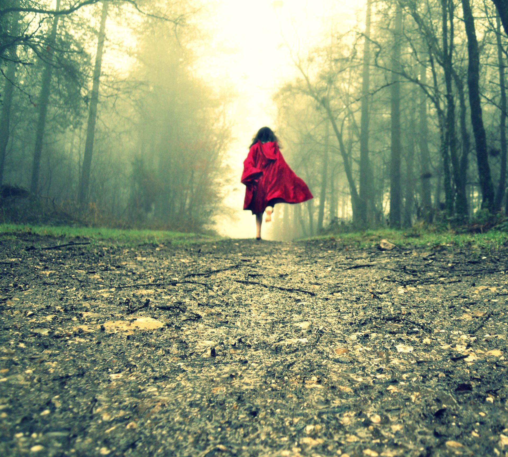
So this is the base picture. It's got the girl, the cloak, trees, and enough space to lay our text over. Problem is: the color scheme reminds me of vomit.
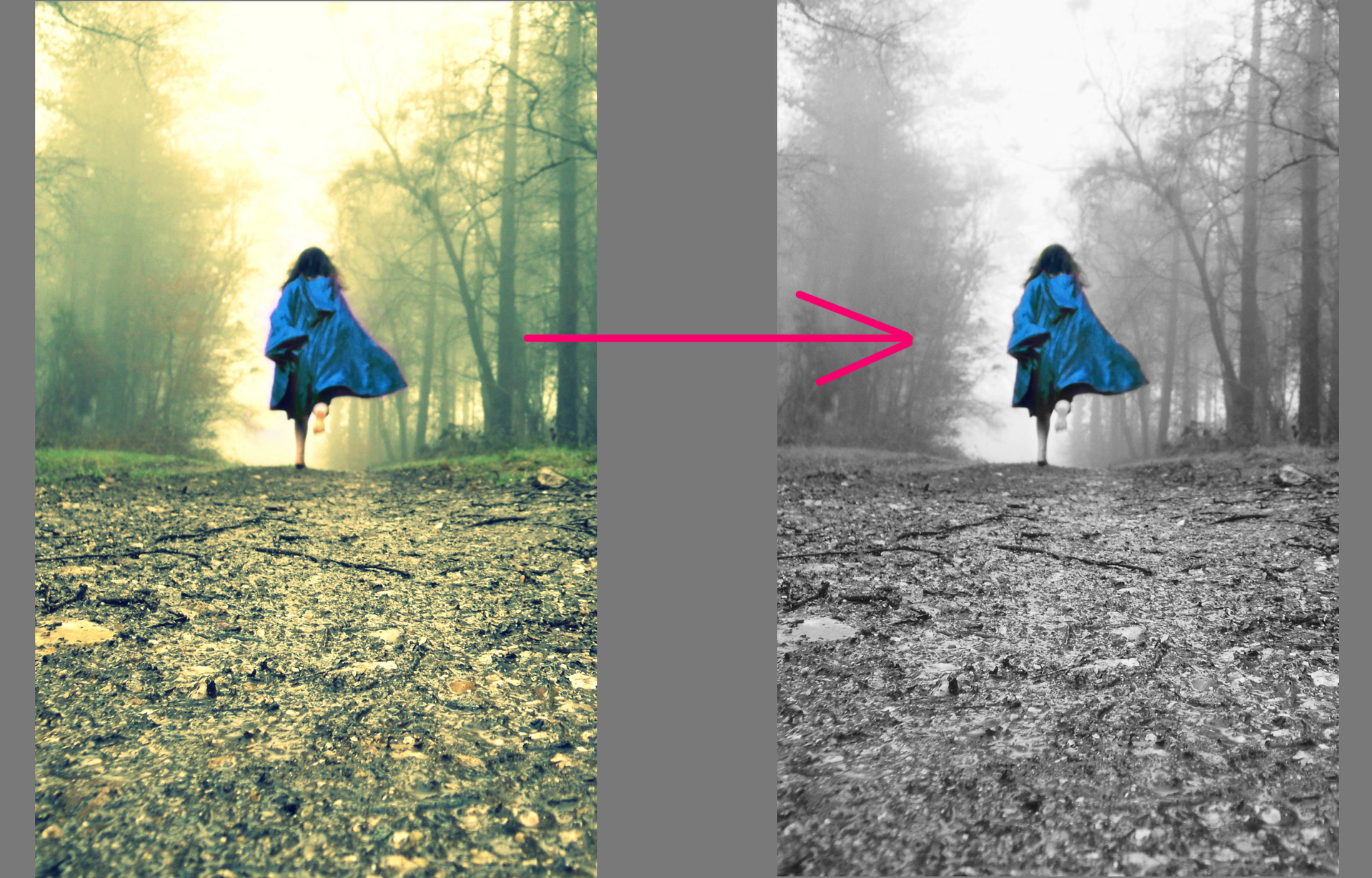
First thing I did was change the cloak from blue to red via the color adjustment curves. To get rid of the vomit colors, I desaturated the rest of the background so it becomes a grayscale pic.
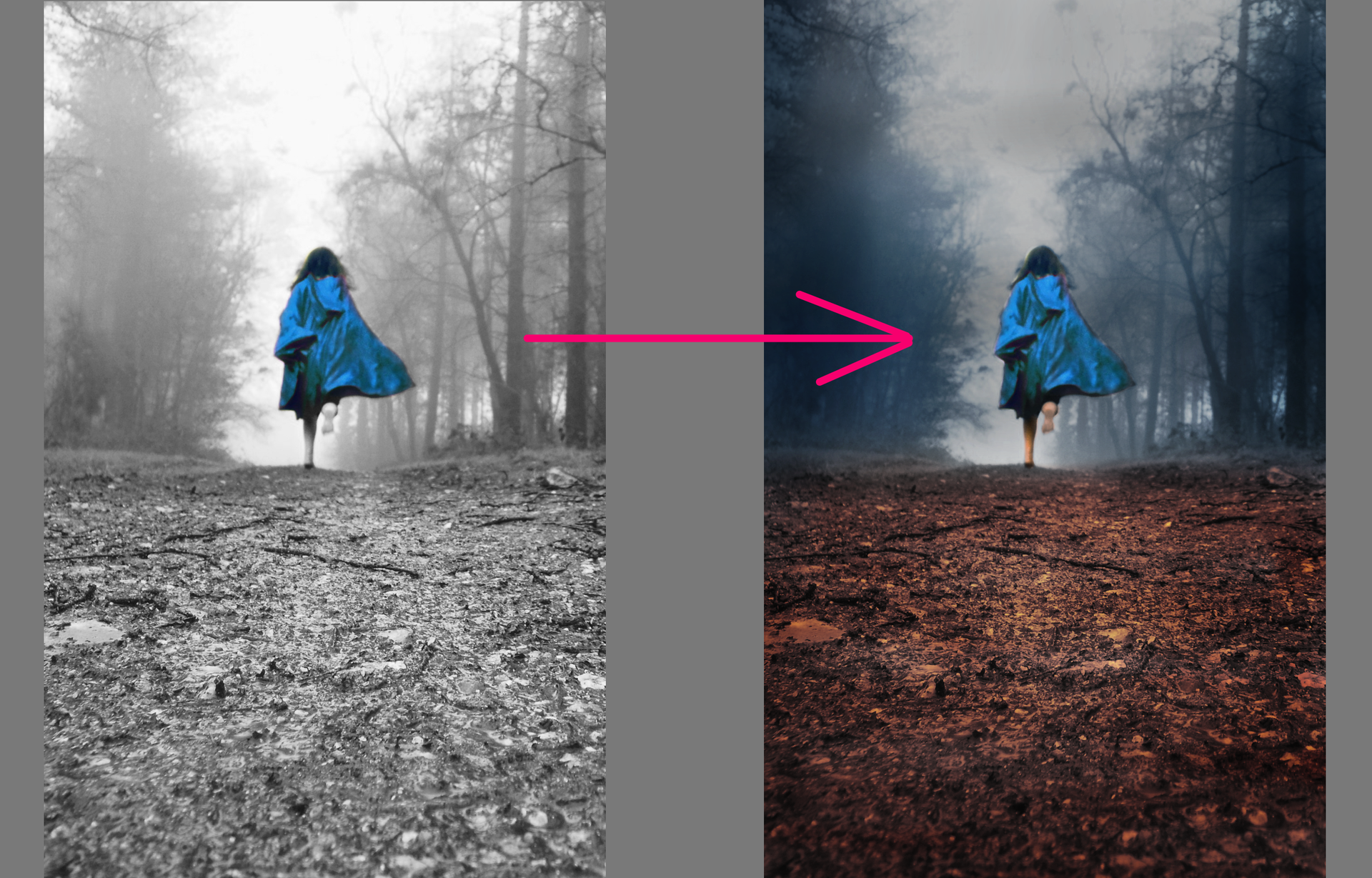
Next, I painted some colors on an overlay layer. I used an airbrush for this. Dark blues on the trees, gray on the sky, and a mix of brown and orange for the ground.
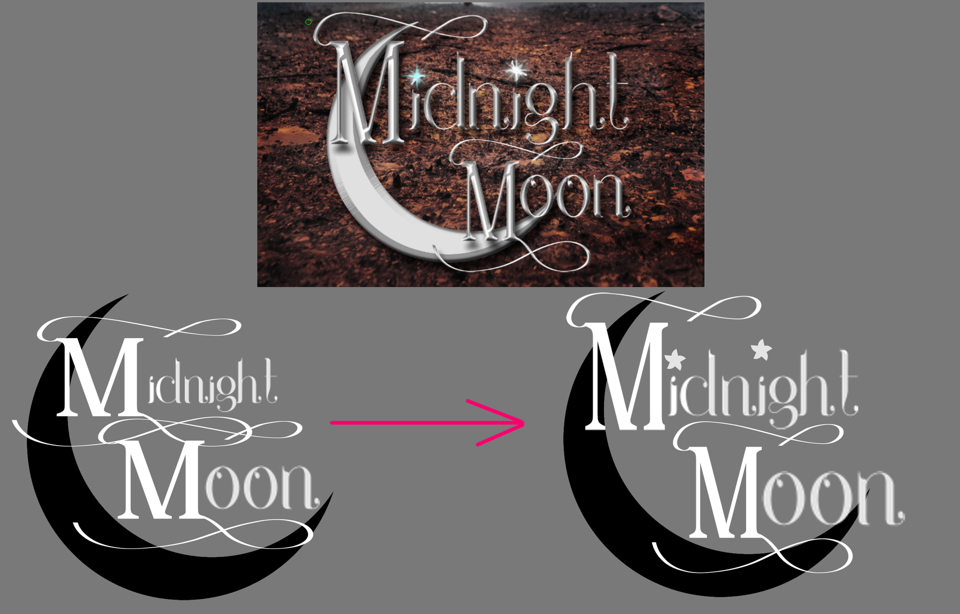
Font time! On the left side is the base. I used two fonts: 1 for the M and a second for the rest of the text. I also erased a giant chunk of a circle to make the crescent shape.
On the right side, I trimmed down the excess ribbon from the top M, made both skinnier and taller, and added these cute little stars as dots over the I's.
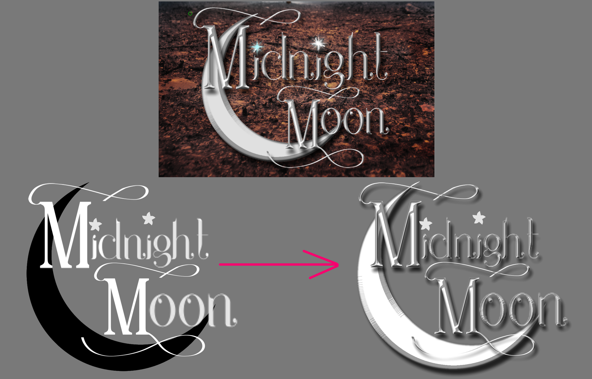
Next step is to bevel and emboss the fuck out of everything. I also painted the moon white before bevel/embossing it. After that I added drop shadows.
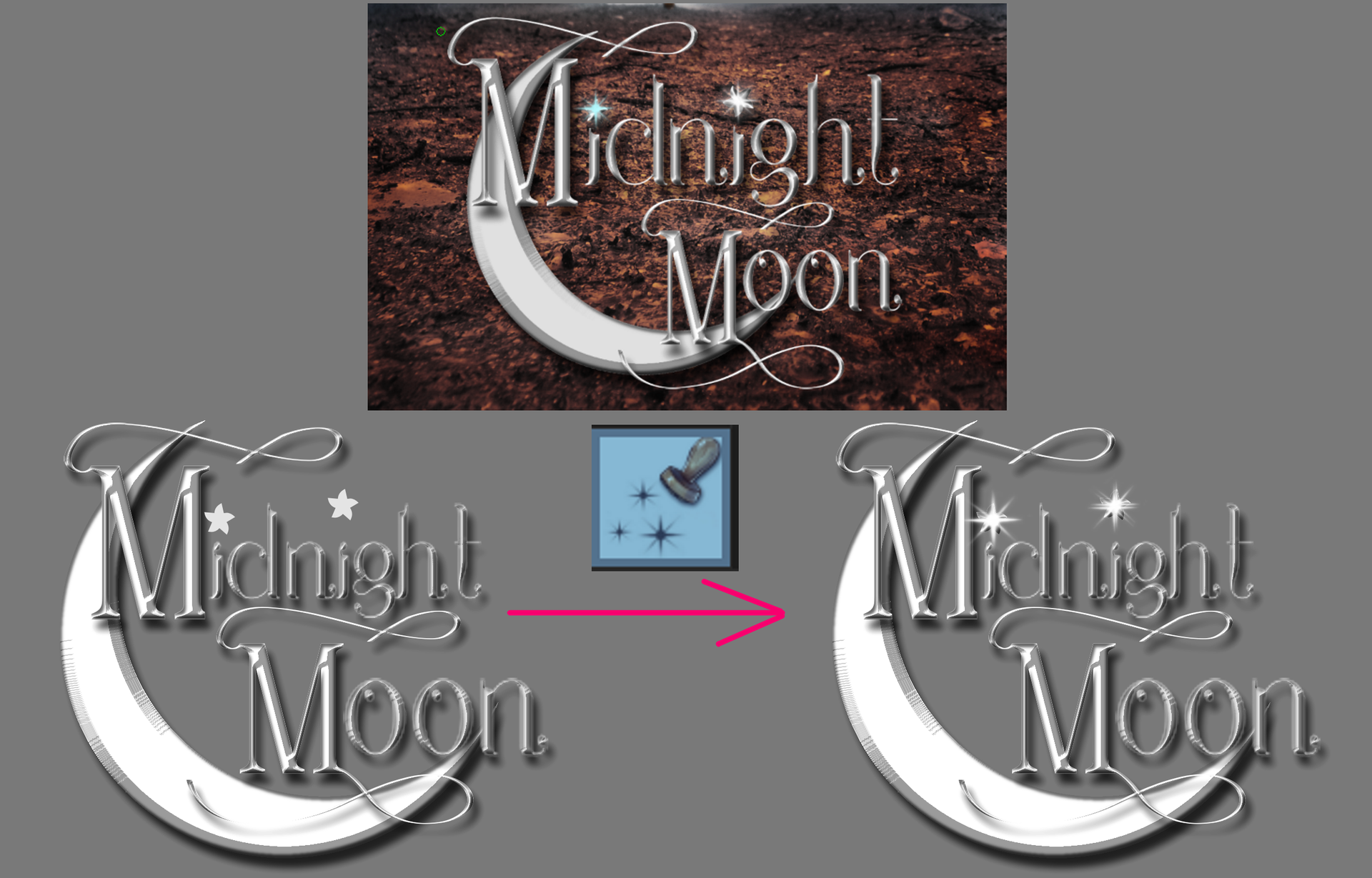
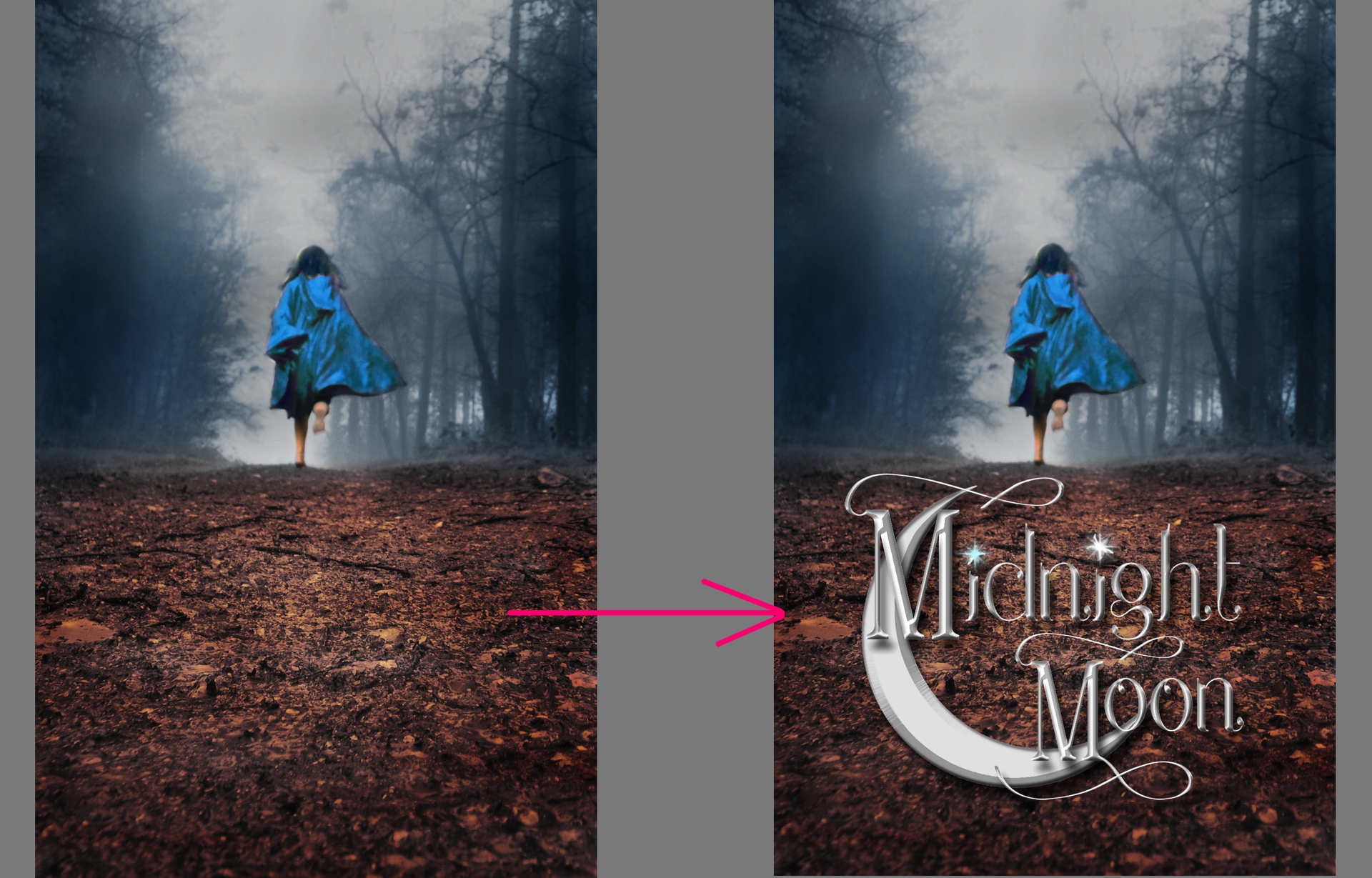
Next, I used this nifty star-sparkle tool to add some shiny stuffs on the star. After that, the title is finished and I sat it over the soil.
Time for some more magical shiny painting stuff! All I did was take paint random shapes and add glows to them. I used a mixture of color dodge and screen layers and brushes to achieve the effect.
I ended having some twisting around her and then traveling to the font. I feel like the movement of the magic kind of allows the eyes to easily connect the two.

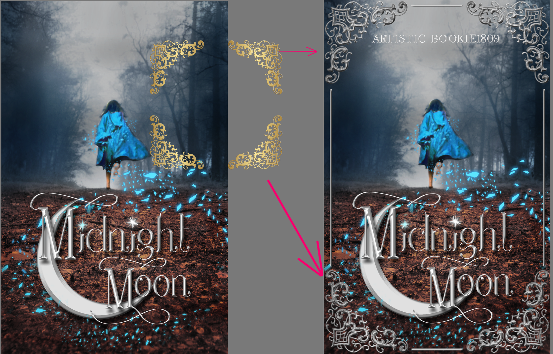
This cover didn't really need it, but I put a border/frame there anyways. I don't like using borders as it's one of those things that once people get used to it, they can't stop using it. Btw, ArtisticBookie1809, if you want a version of the cover without the frame, let me know.
And voila! Finished! It's far from perfect, but I'm slowly getting better at understanding what needs to happen for a fantasy cover to look amazing.
*If you like the cover, go read ArtisticBookie1809's story. If you like how I design, go ahead and drop a request when my shop is 'Open'.*

Bạn đang đọc truyện trên: Truyen247.Pro