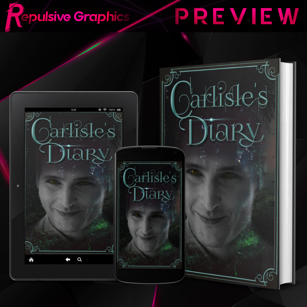
14🔸Carlisle's Diary cover + double exposure
Double Exposure. I freakin' suck at them, as you're about to find out. Double exposure manips are beautiful when done right. Takes an attentive eye to figure out how to perfectly compliment the manip. That said, this was my very first time doing this kind of manip, so apologies if it's not the best.
The Request:
-Carlisle's face
-ghost effect
-background has to be a forest
--Challenge Accepted!--
Design Process: 8+ hours
The 8+ hours it took to design this request actually came from the fact that I was studying how other people did their double-exposures. Also, I had to swap out pictures before finally landing on this one.
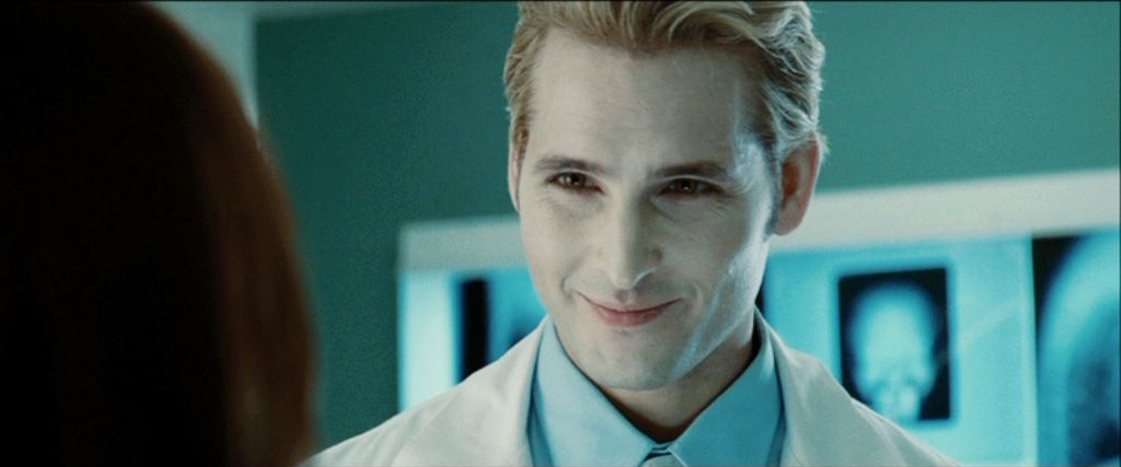
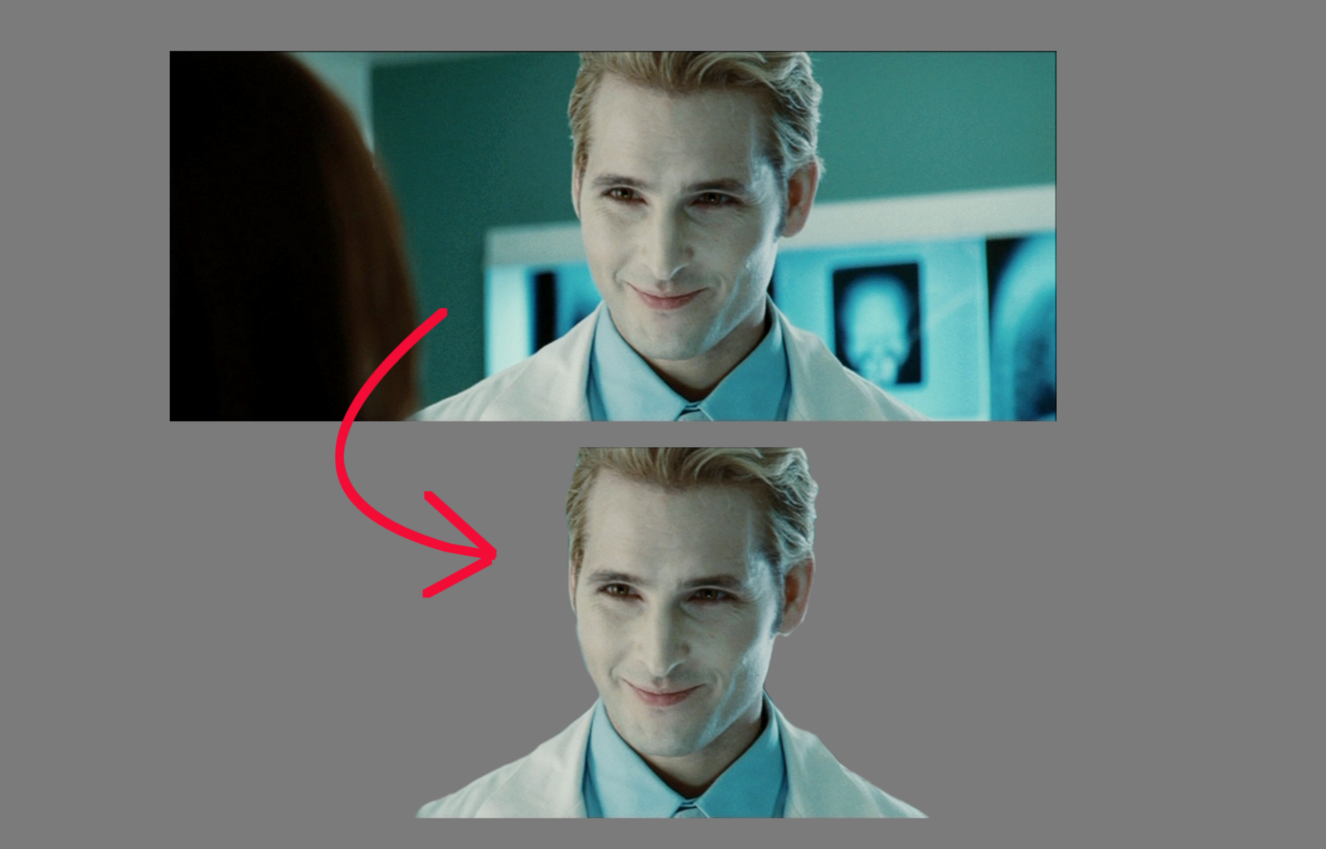
First step is to grab a cutout of Carlisle. There are multiple ways of doing this: layer masks, erasing the background, or select tools. I blurred/feathered out the edges so that the lines didn't seem to harsh.
Next, I uploaded the cutout and the forest background to GIMP. You can see that the cutout is beneath the forest layer.
I'm a firm believer in the fact that the program you use makes ZERO difference in your skill as a designer. What good is a Photoshop subscription, if you don't know how to fully utilize it. There are lots of free programs out there that can do a lot of what Adobe can do minus the price and hefty system requirements. So for those curious, I NEVER use Photoshop/Illustrator when making my designs. It's available to me via my sister, but I want to prove to people that there are ways to design wonderful things if you have no room in your budget or a crappy computer.
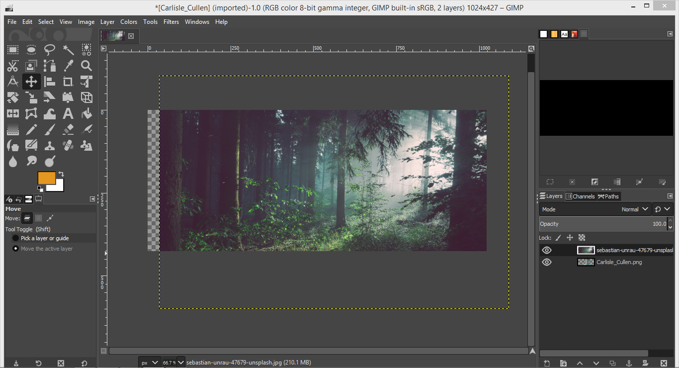
All I did was to right click on the Carlisle layer and select the "Alpha to Selection" button which lets you select all of the items on the specified layer. You can see the black and white dotted lines match Carlisle's silhouette.

Next, I right-clicked on the forest layer and hit "Add Layer Mask". The mask I'll be using is called "Selection".
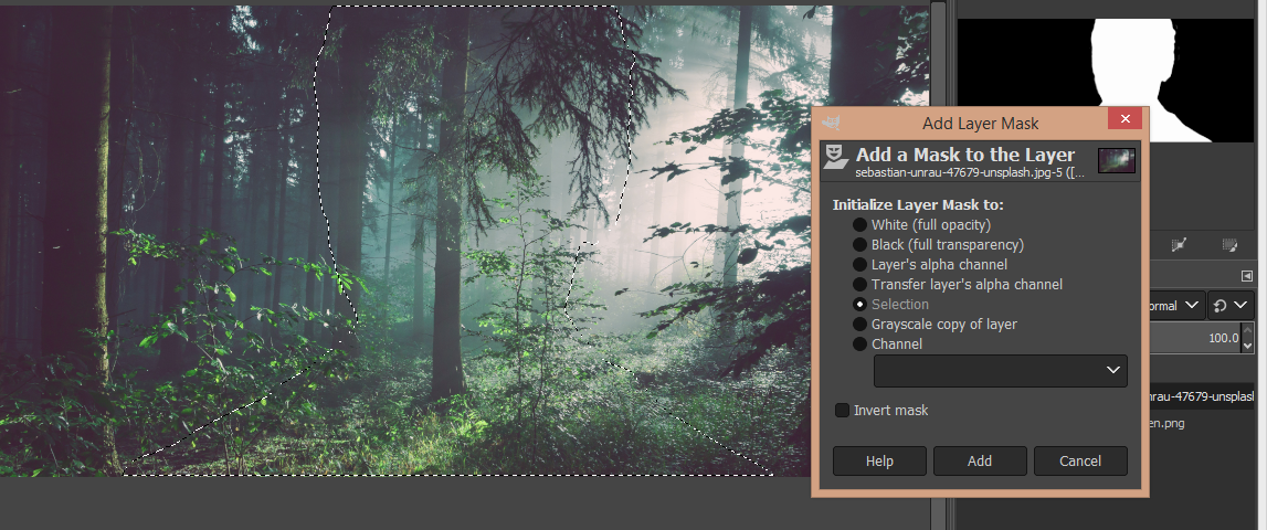
The "Selection" layer mask basically cuts out the parts of the forest that weren't inside the black and white dotted lines.
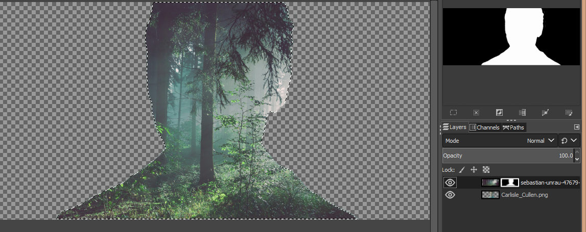
Now this part is the fun part! I made sure that I was still working on the layer mask. I took an airbrush/paintbrush tool and made sure the color I had selected was black. If you look on the upper right, the white silhouette is the selected area and the black is the area that's been cutout.
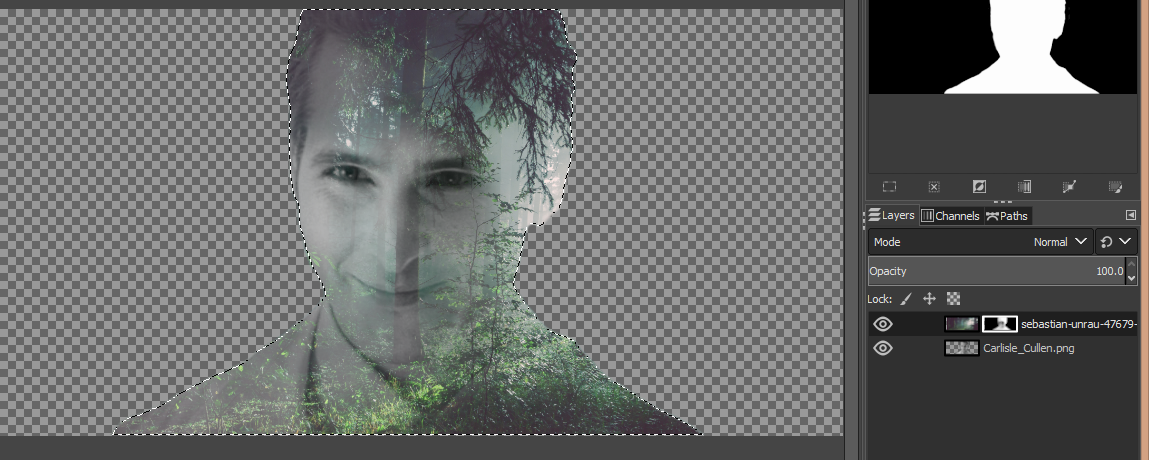
All I did was airbrush a bit of the black to expose Carlisle's face.
The next steps are quite simple. Upload the double-exposed pic to Krita. Add a frame and then add the title. Bevel/emboss both to give them both depth and a somewhat metallic touch. I didn't include an author specifically because the client told me not to.
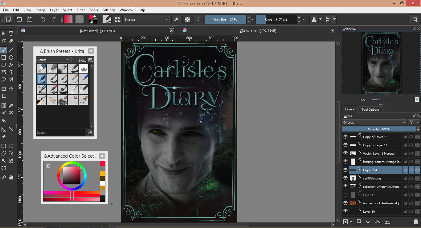
And voila! Finished!
*Thank you for following this tutorial. If you like the cover, go read CarlislesDiary. There's a reason it won 1st place for Fanfiction at the Universal Awards!*

Bạn đang đọc truyện trên: Truyen247.Pro