10🔸Dark Romance covers
These covers were designed for two romance writers: LisaTerence and AnkitaGhosh205.
I'm not one for dark romance or any kind of abusive romance stories, so this was the first time I've ever made these kinds of covers. I had a lot of issues finding good pictures that expressed the possessiveness that both of them were looking for.
That said, I really like what I did with Lisa's so the tutorial will be below.
Without further ado, enjoy the covers while I go and cleanse my search history. 😅
Covers:


Design Process: 3-4 hours
Like I said in the beginning, it was difficult for me to really find good quality pictures. I ended up using the picture below which depicts a woman lying down and look at something above her.
Part of what my sister taught me was to never look at what a picture is but to LOOK AT WHAT IT COULD BE.
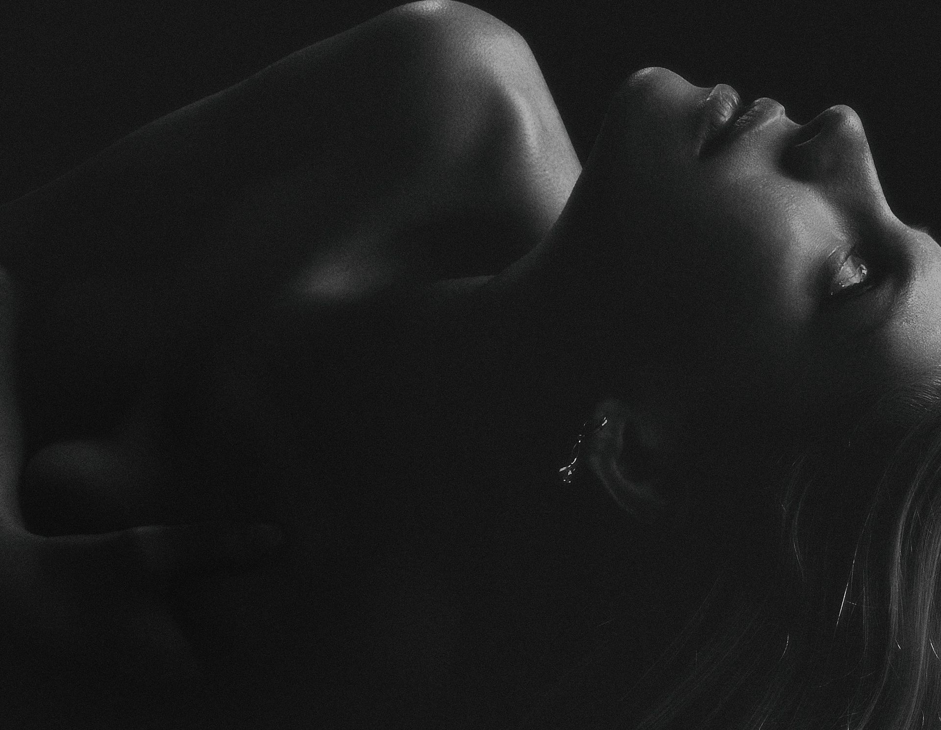
So I rotated and mirrored her around so she'd be gazing to the right. Since the viewer 'reads' a cover from left to right (just like actual reading!), it was wiser to have her looking towards our right.
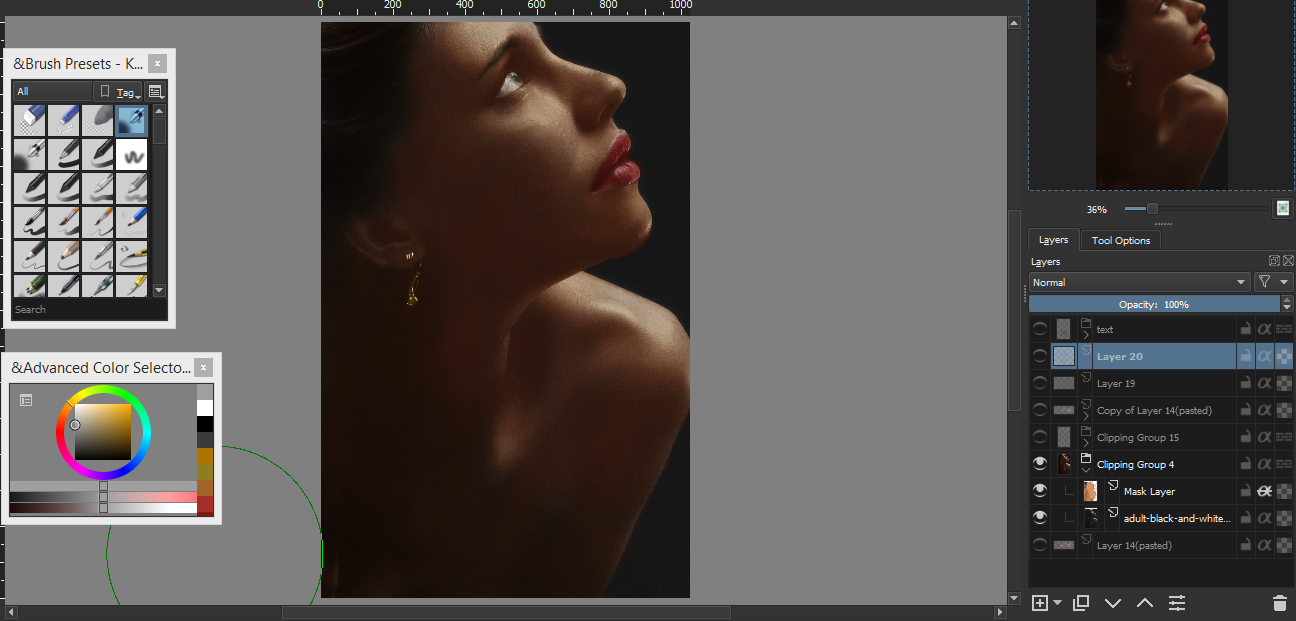
Aside from making sure she fit into the wattpad book cover size, I also liquified her lips and brow to give her a somewhat sad and longing look. I just slowly rotated her earring so it follows actual rules of gravity. You might also notice that the left picture has a grainy texture. To remove that I added a slight blur and reduced the noise.
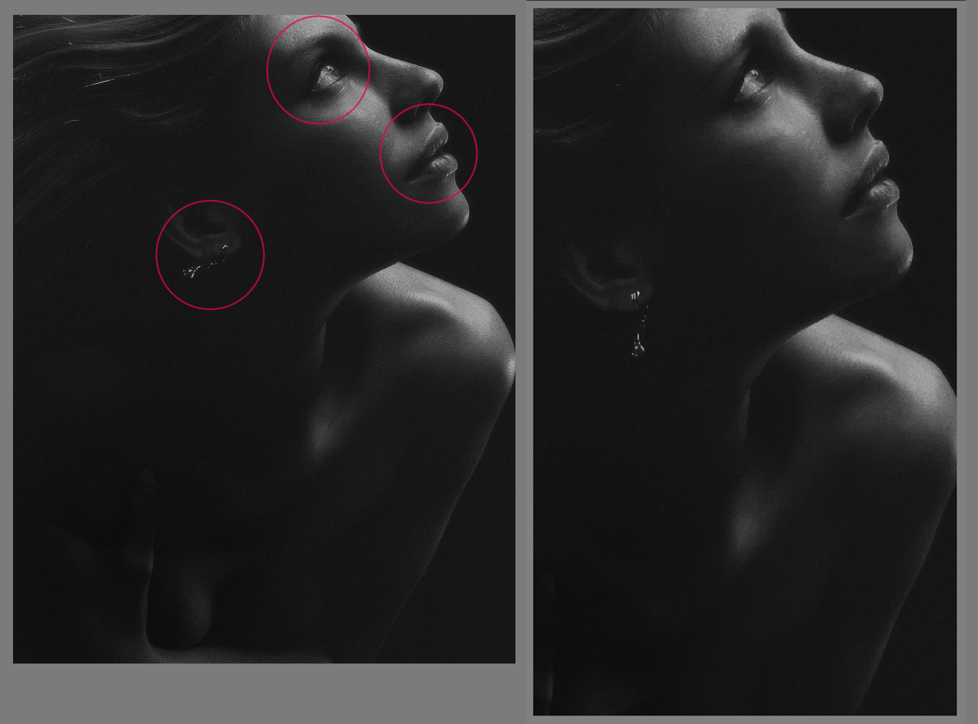
It's not a Repulsify cover unless something's been painted. The woman in the book is, I believe, Indian and Lisa kept reiterating the fact that she was a Mulatto, so I ended up painting her with a dark brown kinda olive skin. I gave her a few hints of red on her skin just so the color would look real. I also ended up accentuating the gold earring after Lisa's recommendation.
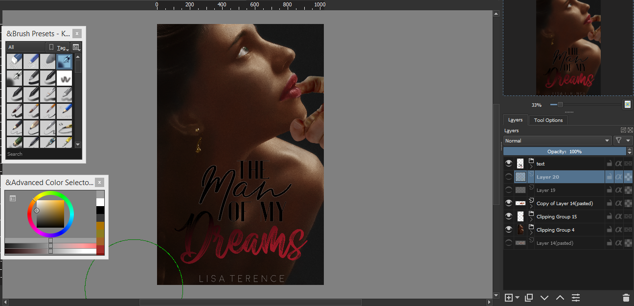
The next step was the title. She wanted a script font hence the fonts used for "man" and "dreams", but I felt like the other three words shouldn't be in script as too much cursive can make the copy seem overdone and amateurish.
All I did was alternate the scripts between sans serifs and voila: a somewhat cohesive font hierarchy was achieved! Since this is a dark romance, I had to reflect that via the colors hence the black and pink.

Now to show the possessive boyfriend. I know what you're thinking: "But Reppie that's a hand, not a man"
Yeah, but remember that saying: see it for what it could be. Well, I saw this hand as the man treating her delicately and yet the fact that she's visually lower than him symbolizes his power over her and her submission to him.

And voila! We are finished! The hand still doesn't sit right me as it feels a bit off, but to people who might just glance at it, it's probably not that noticeable. Tried it on my boyfriend and can confirm he didn't notice.
*Thank you for following through this tutorial! Let me know if it's helpful or not. Your feedback helps me improve. Have a wonderful day!*

Bạn đang đọc truyện trên: Truyen247.Pro