Piers (again)
This is the last one, I swear. (The last one for now, at least.)
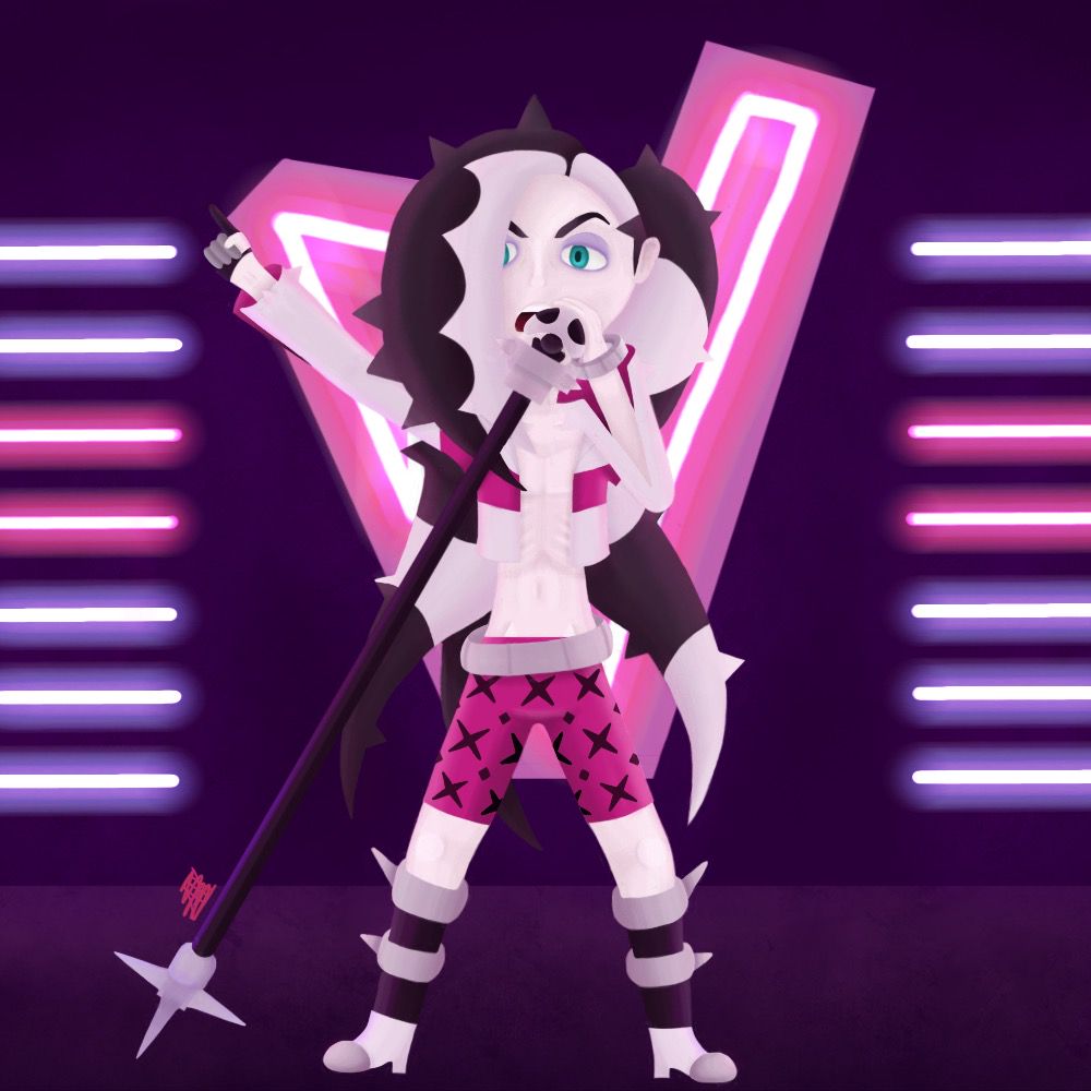
So this is basically the last drawing, but from the front. I'm actually a little embarrassed to be posting this... more on that below...
I picked pinker toned colors because I liked the way the last one turned out with the colored lights. (I still had to go over everything with a light pink at the end, though.) I actually started the sketch for this by mirroring the sketch on the last drawing because I'm lazy. I didn't realize with the last drawing that it was such a stiff and static pose that I had to try to make a less stiff pose by bending the knees and right arm. I still think it looks a little stiff, but not as much.
The shading... oh boy, that was... interesting. (The whole chest part was all shading.) Uhh... believe it or not, I've never drawn a shirtless guy (don't believe me? check out literally any page in this book), so that was way outside my comfort zone. But that's why I drew it- I was trying to get out of my drawing comfort zone. (Also a friend dared me to draw the last drawing from the front and I was like bet imma do it) It was very awkward to shade, way more than the last drawing. It felt weird to draw the hip bones and the ribs and stuff... ahhh just explaining it is embarrassing. But I hope the chest looks anatomically correct.
My 2 favorite parts of this are the eyes and the background. The bluish green eye turned out nicely, and it really made my day when I finished it. It's so simple, but it looks so good. It really stands out against all the pink in the drawing. And the background is so cool. Compared to the background in the last drawings, this one is intricate and crazy. Again, I used the same glow tool as I did last time for the glowing lights. I added some subtle shading to the background, with the top corners and the bottom darker and lighter around the glowing lights. Again, it's subtle, but I think it adds so much more dimension to the otherwise solid colored background.
Critiques?
-I think there may be some issues with the proportions. (Yes, I know the feet are too small, I couldn't fix them.)
-I still think the pose is not as interesting as it could've been, but I tried to make it less stiff.
-I didn't include some details, like the skulls on the shoes, the choker, and the "061" and Team Yell symbol on the shorts, but I did this purposefully because I thought it would clutter up the drawing. I just realized I forgot the lines on the jacket too, but that's not that big of a detail.
-The shading on some parts is bad (mostly the jacket).
Anyway, that's my fat analysis of my drawing. Not gonna lie, I am a little embarrassed to be posting this... it's not because it's poorly drawn or anything, it's just that I don't normally draw things as inappropriate or suggestive as this, so it seems odd for me to be showing this as something I created. (Yes, I know that a shirtless guy isn't the most inappropriate thing to draw, but compared to everything else I've drawn, it is.) I think some of the embarrassment comes from me just being an awkward person, or other reasons I can't explain...
Bạn đang đọc truyện trên: Truyen247.Pro