Mini art dump
I did a little bit of art over my hiatus, mostly at the beginning because I started going on Twitter more.
Synthetic rose
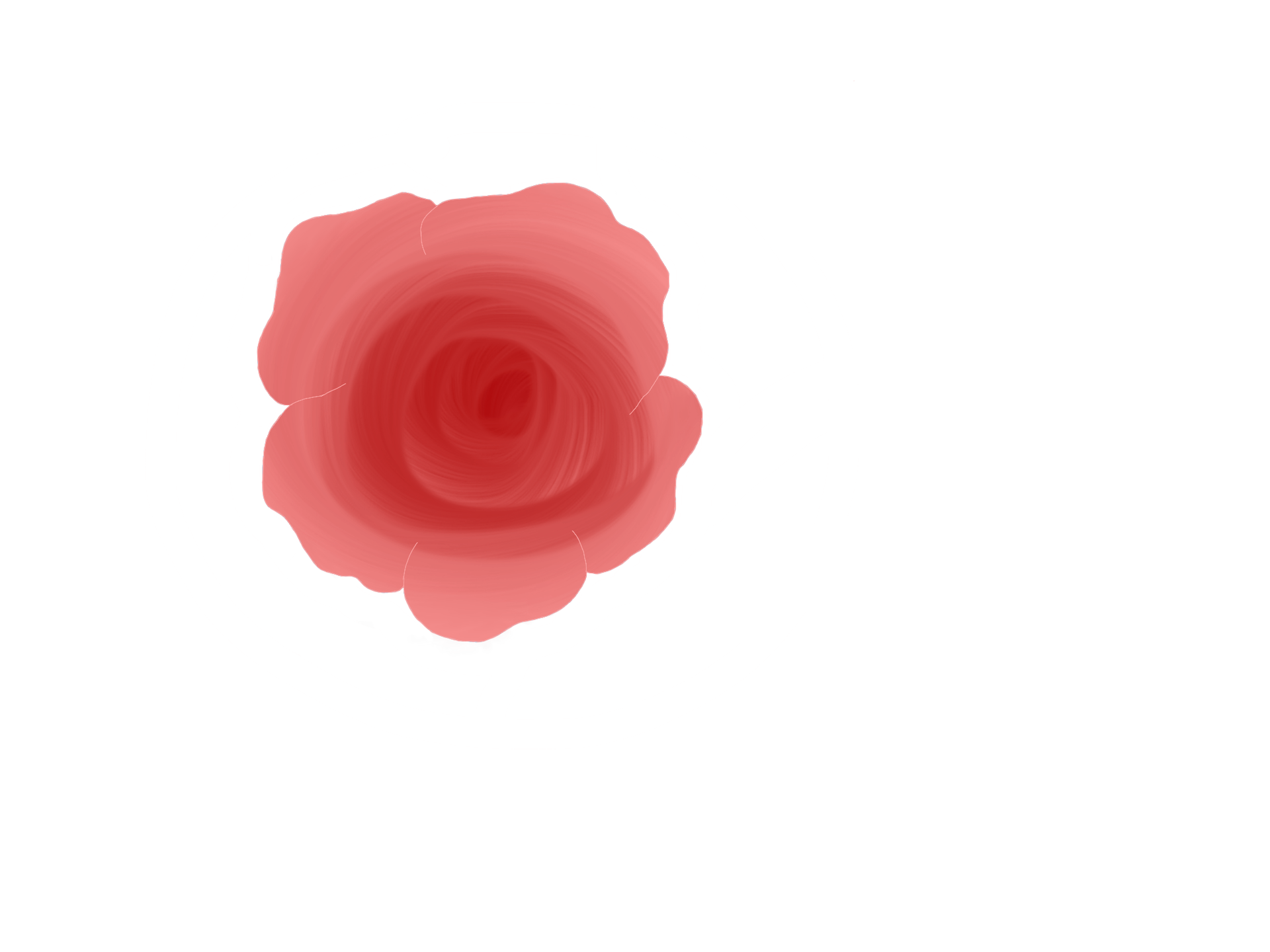
Made by swirling a red synthetic brush from the center to the outside. The synthetic brush (to my understanding) starts with a lot of color, but it fades. It blends with the colors and continues to carry that color until it fades. Then I drew an outline of a rose and erased outside the lines.
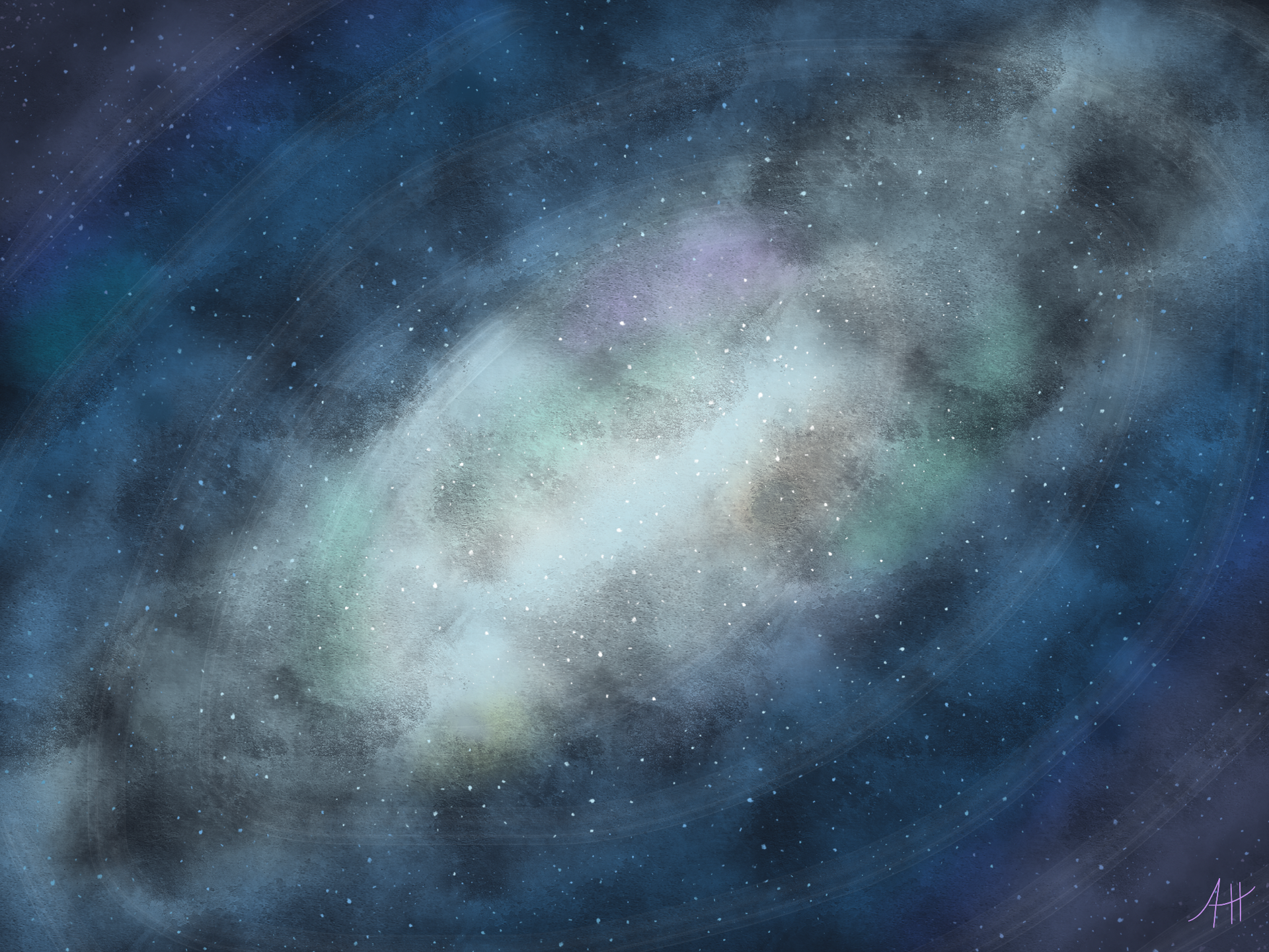
Swirling black galaxy
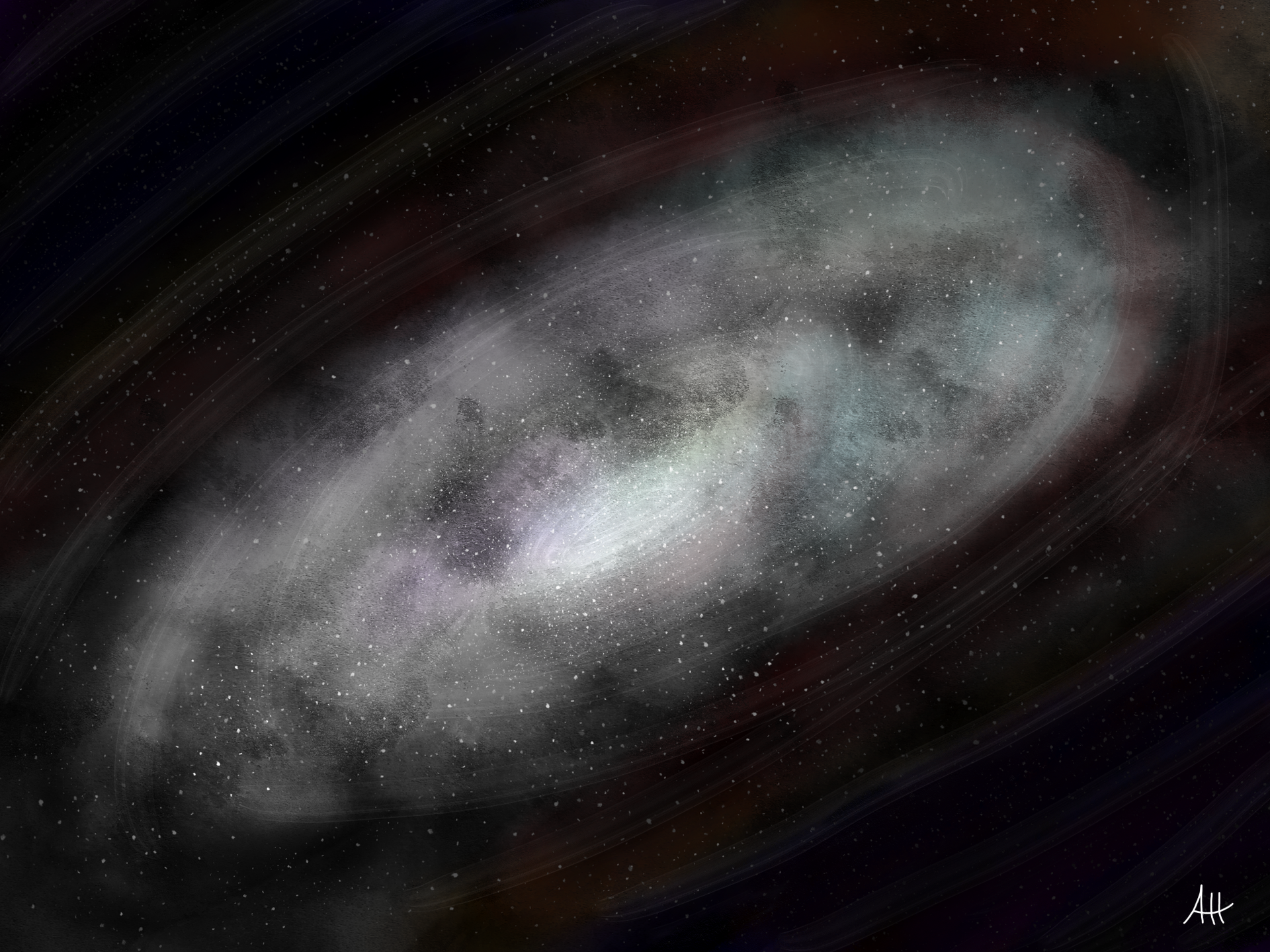
(Don't mind my signature at the bottom)
I tried to make it look like it was swirling. I used a specific paintbrush to get the "speckled" gray colors, and a speckle brush for the stars. As you can see, there are splashes of pastel colors here and there.
Copic marker rainbow
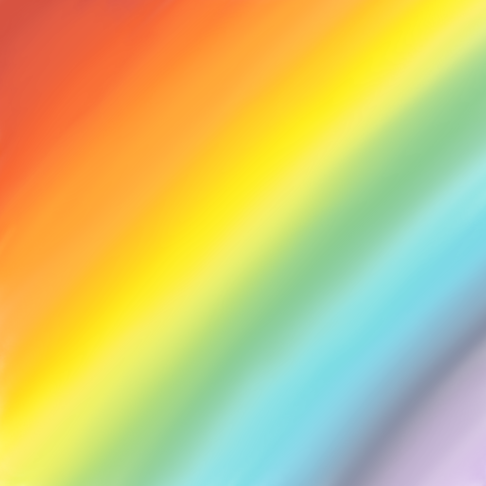
So the art app I use (Autodesk Sketchbook) has Copic marker colors which I've never used. So I used them here and blended them together. It's not very vivid, but I used this for some cool effects.
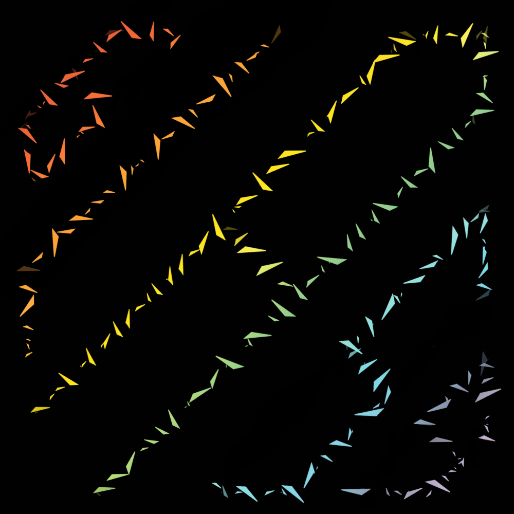
Shatter
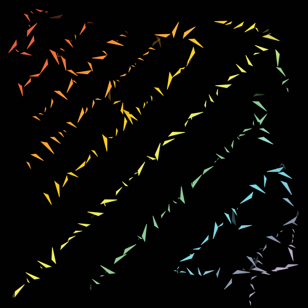
See the rainbow in the back? That's from the picture above. So to do this, I put a layer of solid black on top of the rainbow and used the speckled tip I used for the stars in the galaxy picture. I can change the style of the nib, so I found this one and it looked like shattered glass. Then I divided the square diagonally into 7 parts (one for each letter) and used the straight-edge tool and drew a line with transparent color. This erases the black and lets the rainbow shine through. The T in the center looks weird.
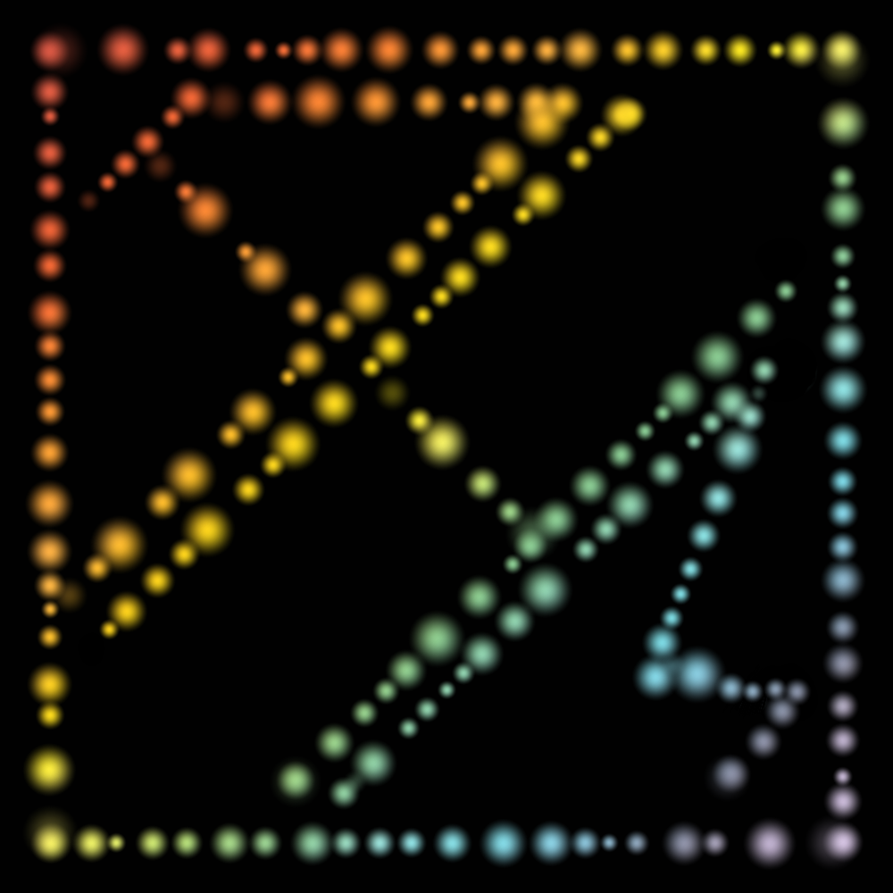
Glass
Same thing but this time with the less edgy-sounding "glass". This one I was more of a perfectionist with all the straight lines and the sizes of the letters. Glass sounds boring compared to shatter, but I still like this one.
Monogram
Same idea, but I did a monogrammed version. I used a blurry circle looking nib and added an outline near the edge. Also the M looks so weird.
I also did one of these with my irl name but my name is none of your business.
Swirling blue galaxy
I don't like this one nearly as much as the first one. I think the problem with this one is that there's too much blue and not enough black. I used the same paintbrush as I did the first one and used the Copic colors.
As for my random Pokémon drawings- I did absolutely none of them.
Bạn đang đọc truyện trên: Truyen247.Pro