Contest #6: Entries
I'm sorry if the feedback isn't as good as normal, I've just been super stressed lately and there's been a lot going on, so I'm sorry for that.
Here are the entries for the sixth contest! You all did an amazing job!
iworshipbangtan entry one
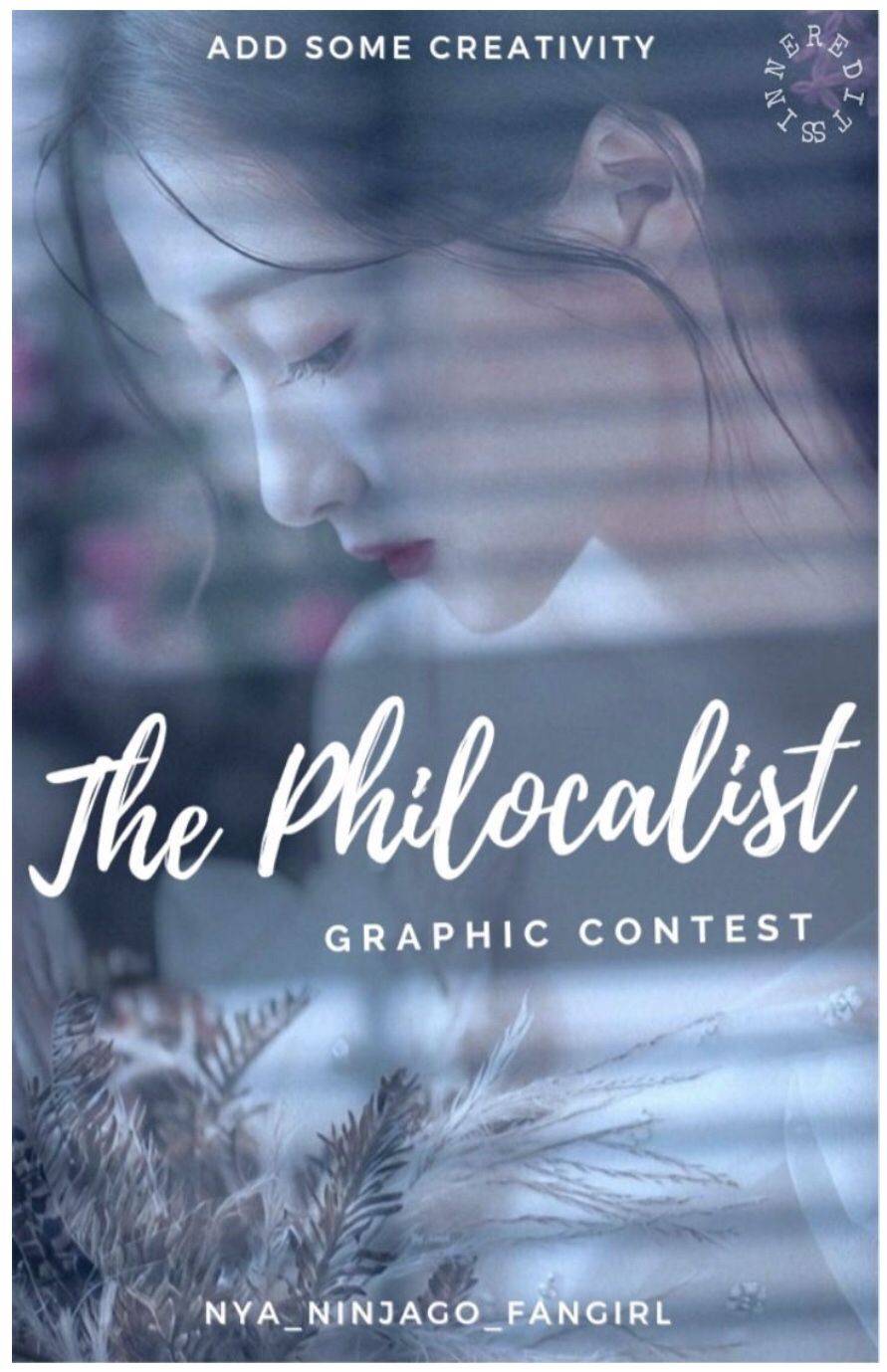
I love the window effect you used! It really emphasis how the girl is behind the window! I love the two font title, it definitely makes it stand out! Both fonts are easy to read. The placement looks like it's across a window blind (that doesn't make sense-) which ties everything together nicely! I can't fault anything!
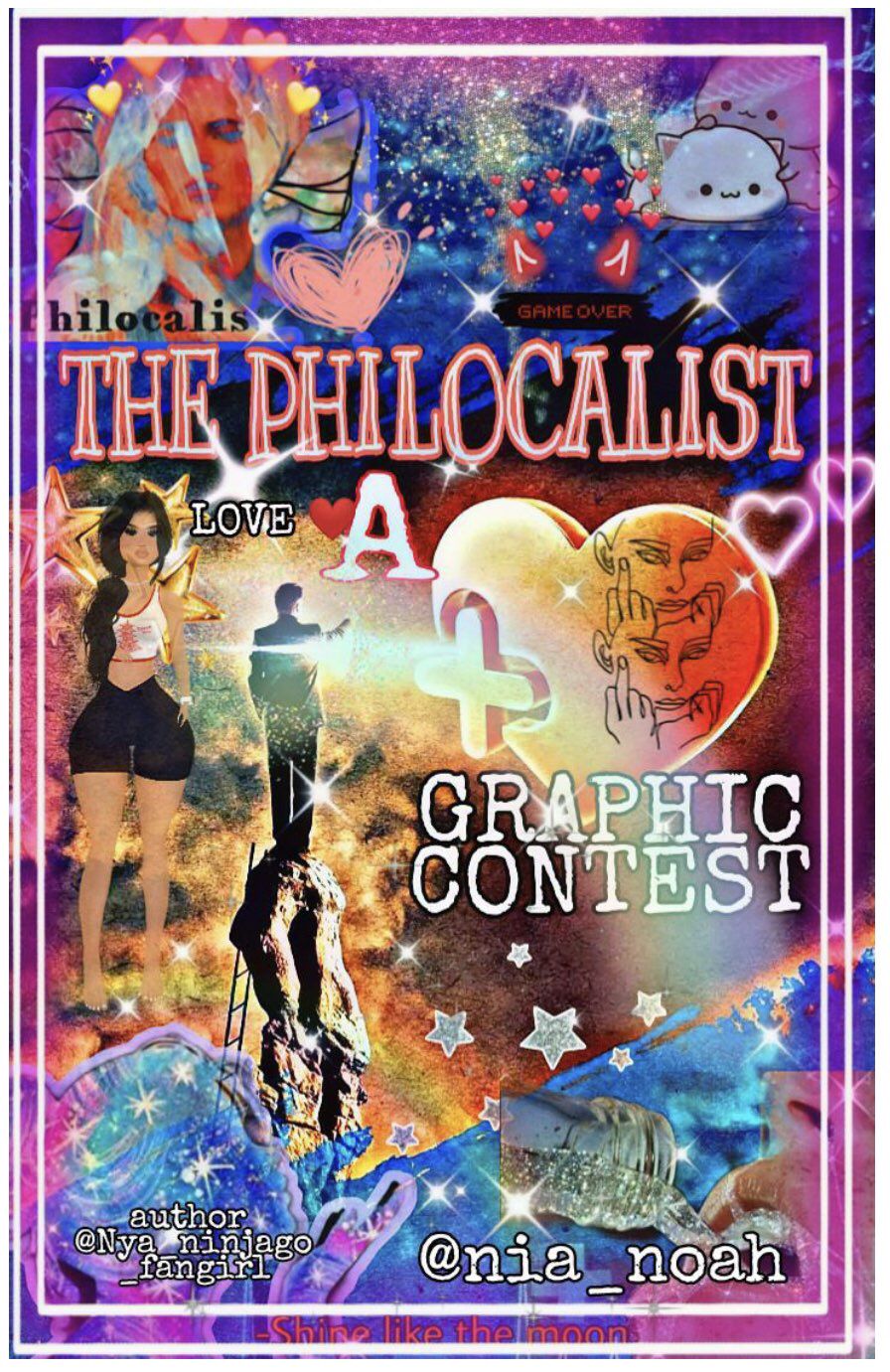
Entry two

She actually looks like me! Well, excluding the fringe and skin tone (I am super pale). I love the arty style of this one! The font choices are really good, again, both are readable. I love the filter you used, it adds more to the graphic and doesn't take anything away from the main part. It's a really nice graphic and I can't fault it!
I really like the fonts you used! They're easy to read. The placement works with everything else that's going on. I really like your graphic but it's just too busy. There's a lot going on and I feel like if there was a little less there, it would be an amazing graphic!
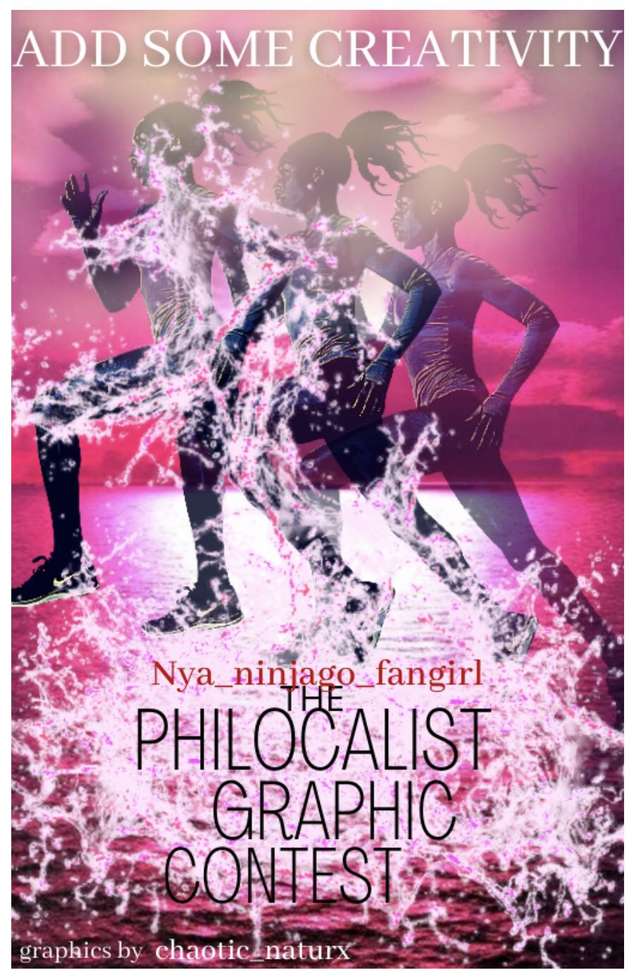
I like the staggered title! I maybe would have put graphic on the left and contest on the right but it still looks great! The fonts are easy to read but they could have been experimented with a little more. The text does seem very squashed at the bottom. I like the shadow effect you used on the runner. The flying water is a really nice effect and goes really well with the background, even if it's a little violent.
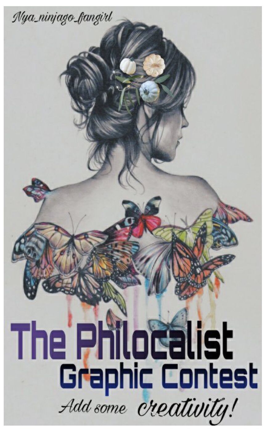
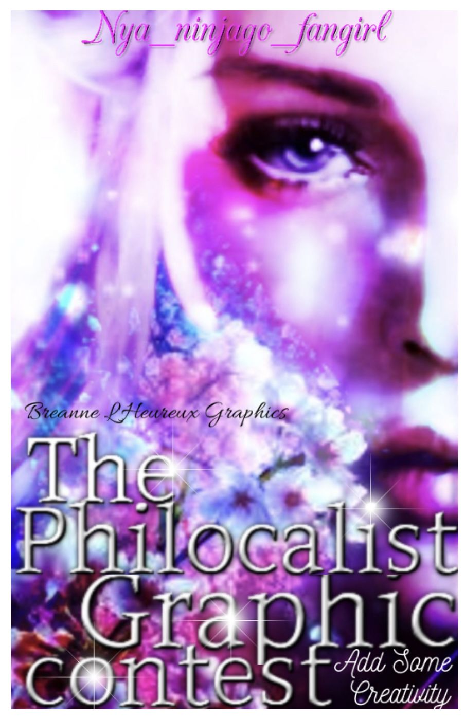
Lillian_Ambrose2601 - entry one
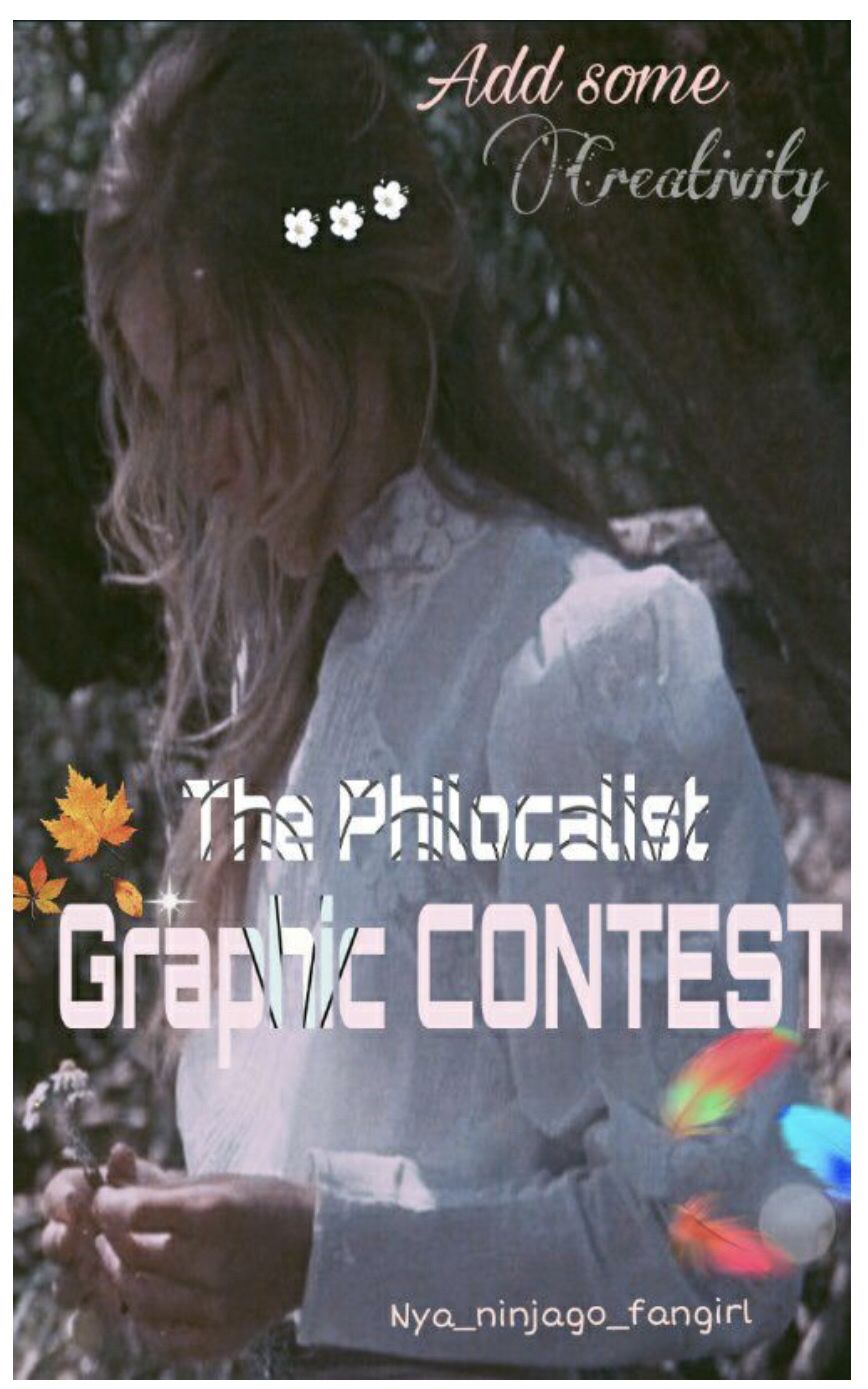
She actually looks like me too! I love the three flowers in her hair. I love the fonts you used and the textures on the text in the title work well! I really like the swirl effect on the C in creativity! I like the blurred effect on the feathers as it makes it seem like they're falling. The autumn leaves and the sparkle are a nice touch!
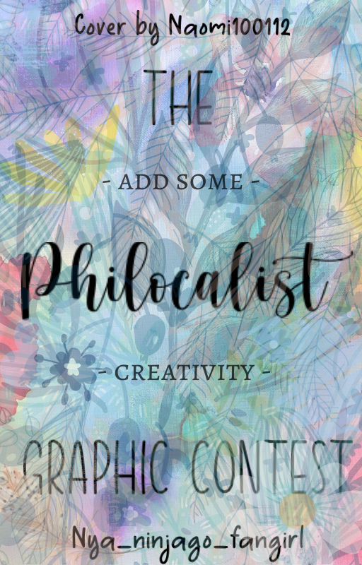
Entry two
I love the art! The flowers in the hair are a really nice touch! I really like the fonts you used! The placements are really good and suit the cover!

I was instantly blown away! I love the gold theme you used. The title font is so elegant and it matches well with the rest of the cover! The way you placed the subtitle is so creative. The golden swirls around the girl is ties in the gold theme!
I love the colourful background! I love nature so this really appeals to me! There's a lot of layers to it but I like it! It's aesthetically pleasing to me and I love that! The only layer that doesn't make sense is the blue paint/scribble in the right. The layer over the text is really nice too. Speaking of text, I like your font choices. They all compliment each other. I really like how the subtitle goes between the title, it makes it really stand out!

I like the background choice. I've recently been in a phase of unable to not make dark themed graphics so I like the darkness. The font choices and placements are really nice and work together. Your editing is quite...choppy. It's not as smooth as it could be, especially around the cats head. Another thing is that, this is for a graphic contest cover, not a graphic shop cover.
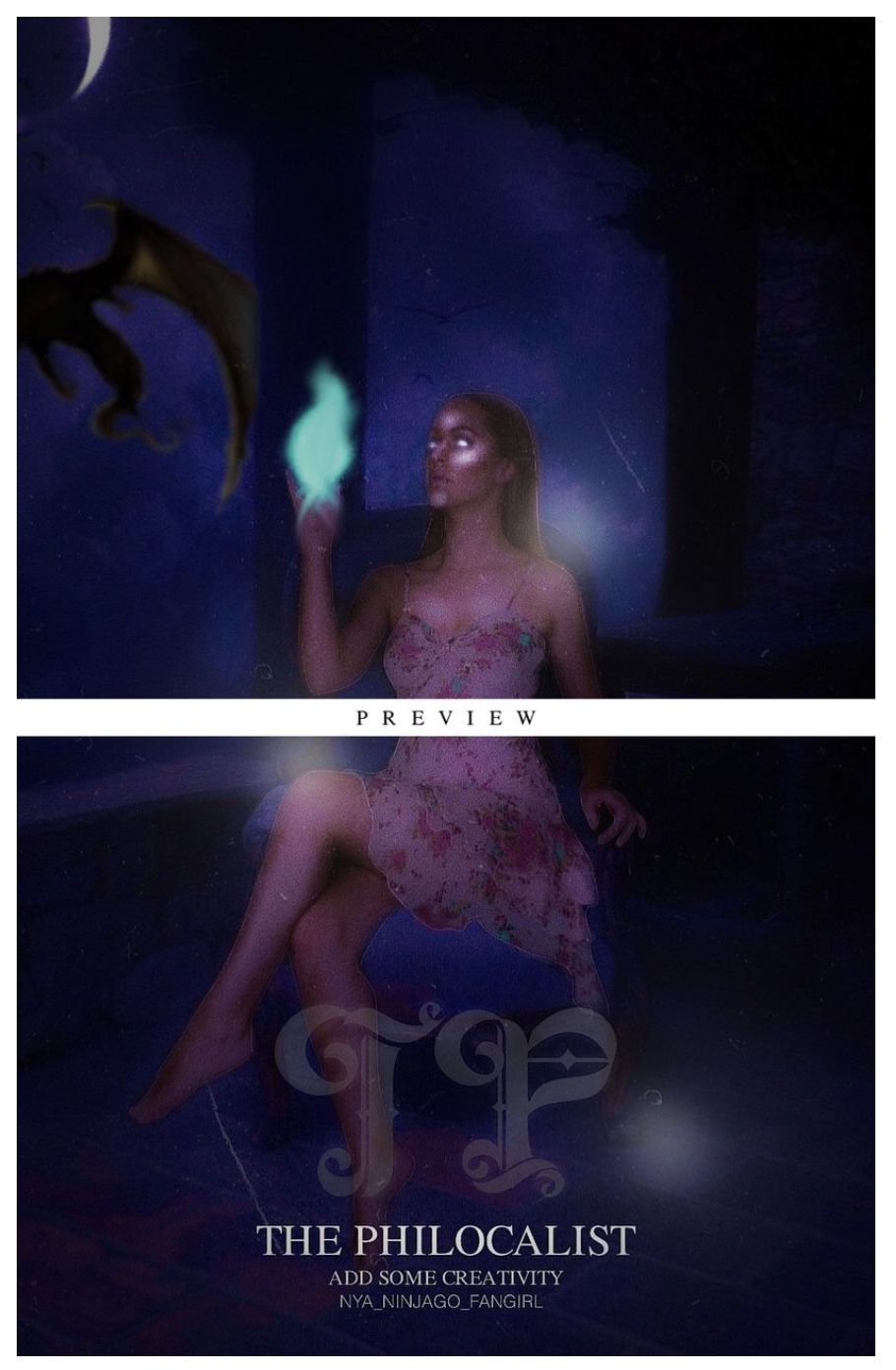
I love the manipulation style! I see this around a lot and his definitely took my breath away! I really like the glow on the girls hand, it represents a fantasy vibe (fantasy is my favourite genre to see designs of). I really like the darker background and it brings the main focus to the girl. I really like the font choice, however, it does seem cramped at the bottom. I would have preferred graphic contest to be on there too but other than that, a flawless entry!

I love the simplicity of your entry! The background brigs a sense of fantasy into it and makes the text stand out. The diagonal text is a really creative idea! The font choice is really good and it works! The glows tie in the fantasy again. I'm not sure if it's too much glow. The paper aeroplanes are a really cute touch!
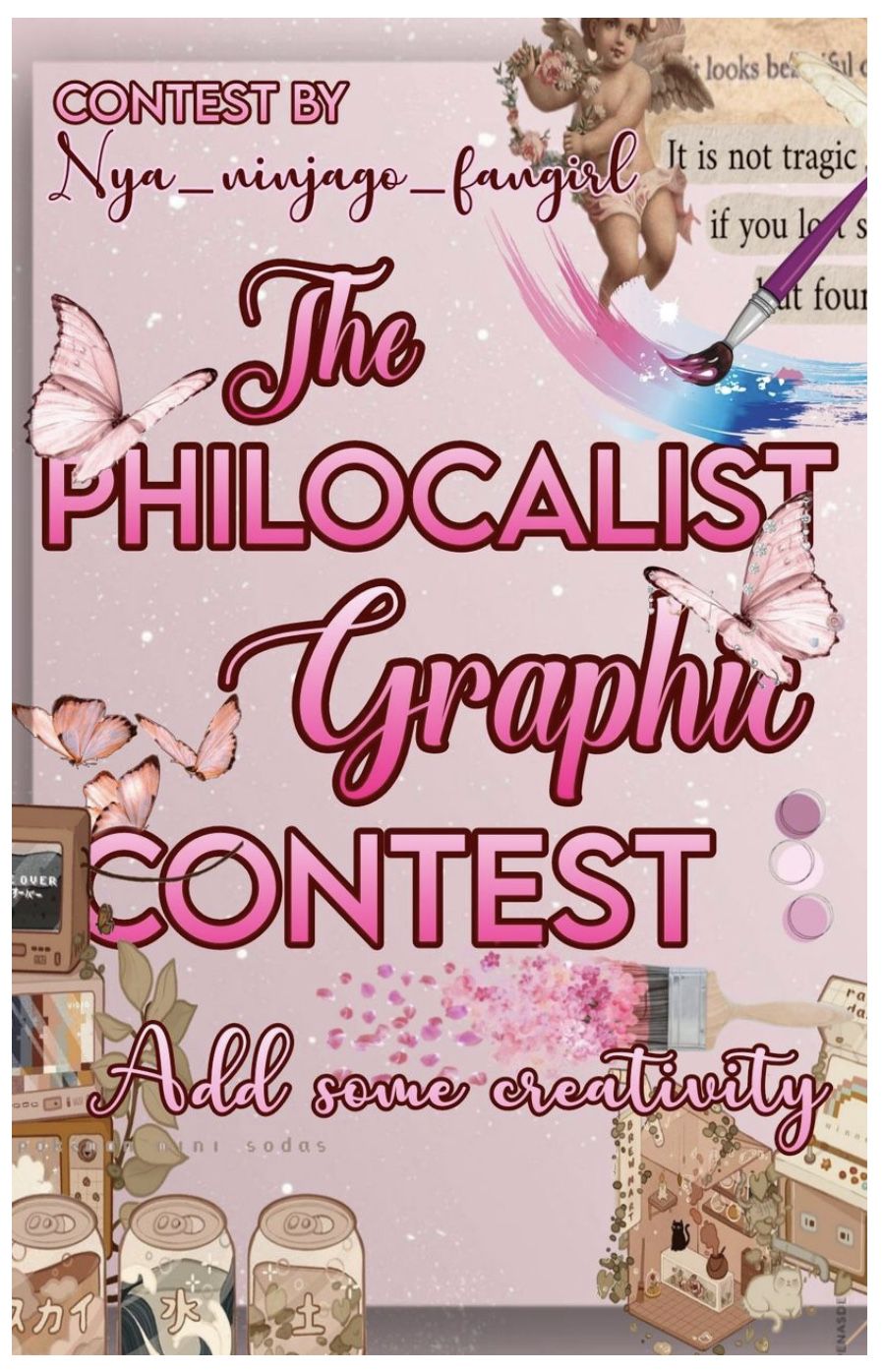
I like the pink theme! I really like your font choices and how they all differentiate from each other. The placements are really good! I like the vintage style border! However, I feel like the paint brushes are too much. The border has a lot on it and with the butterflies on too, the paint brushes don't necessarily work. Other than that, I love your entry!
I remember staring at my screen in awe when I first saw your entry! It's stunning! I love the girl, the flowers, everything! The font choices are amazing and work really well! The effect on the title is really nice and makes it stand out. The shine in some parts really draw attention to it too! It's just a shame that wattpad ruins the quality! There's nothing I can fault!

I remember staring at my screen in awe when I first saw your entry! It's stunning! I love the girl and the flowers along her hair. The jewels match the one on her head so it ties it in really well! The font choices are really nice and, I think everyone knows this now, two font titles are one of my favourites to see! It works so well! I love the pink theme! There's nothing I can fault!
If you've submitted your entry and it's not on here, please let me know!
Bạn đang đọc truyện trên: Truyen247.Pro