Contest #5: Entries
Entries are in in the order I received them/sent them to myself.
Also, I'm sorry if the feedback isn't as good as normal, I've just been super stressed lately and there's been a lot going on, so I'm sorry for that.
Paintfairy
Element: Lightning
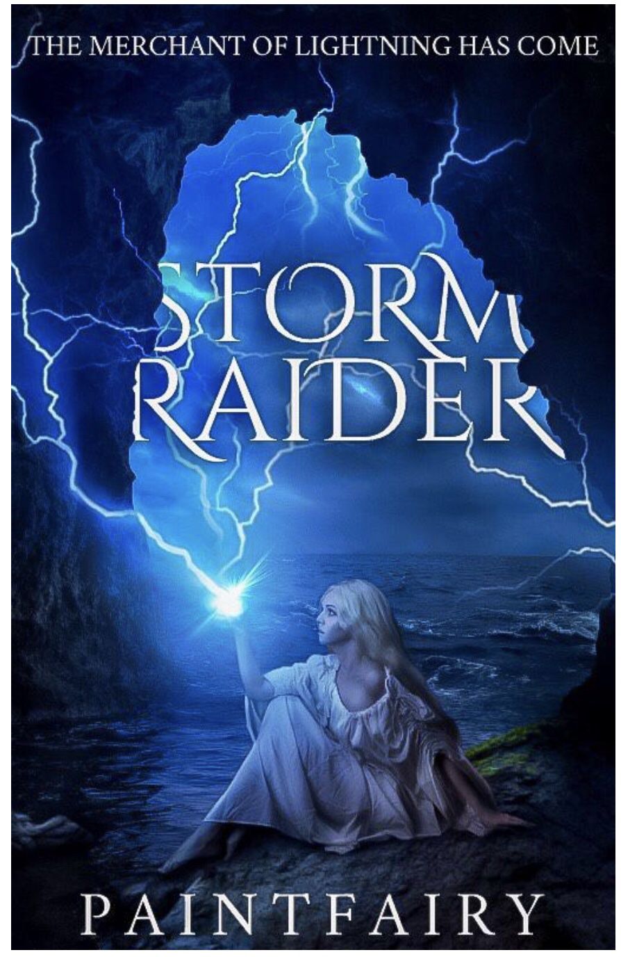
I love everything about this! The lightning is placed perfectly and the glow at her hand really draws attention to her. The glow that hits the girl is perfectly natural, like it's lighting her up. I love how you set her in a cave (it autocorrected to cage-) and made it seem like she was actually controlling the storm. I love how you used a play on lightning for the title. I love (I really need a new word) how the title is set behind the cave entrance. I adore the subtitle too, it's really creative and links well with the title and overall theme! There's nothing I can fault!
LuckyBugBooks
Element: Water

I'll start by saying, I love the picture you chose! It fits the theme and your element perfectly! The bottom picture ties it in really well and makes it more dramatic. I love the layered effect you used on the title, it reminded me of rippling water. I love how you used a quote for the subtitle. One thing, all nature, is a little hard to see against the flying water of the picture. Your font choices work amazingly well! Other than that, there's nothing I can fault!
HayleyLHeureux
Element: Nature
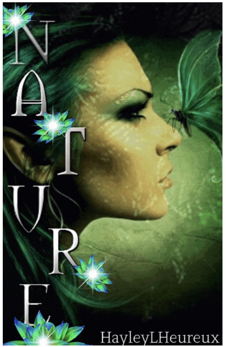
This instantly blew me away! I love how the title goes down one side rather than across. The glowing flowers match the theme really well. The butterfly on the girls nose is amazing! The green and silver theme work so well together! I really like the green, leaf like effect on the right, it ties your element together really well. Your font choice is stunning! I can't find any faults!
sam_dae
Element: Wind
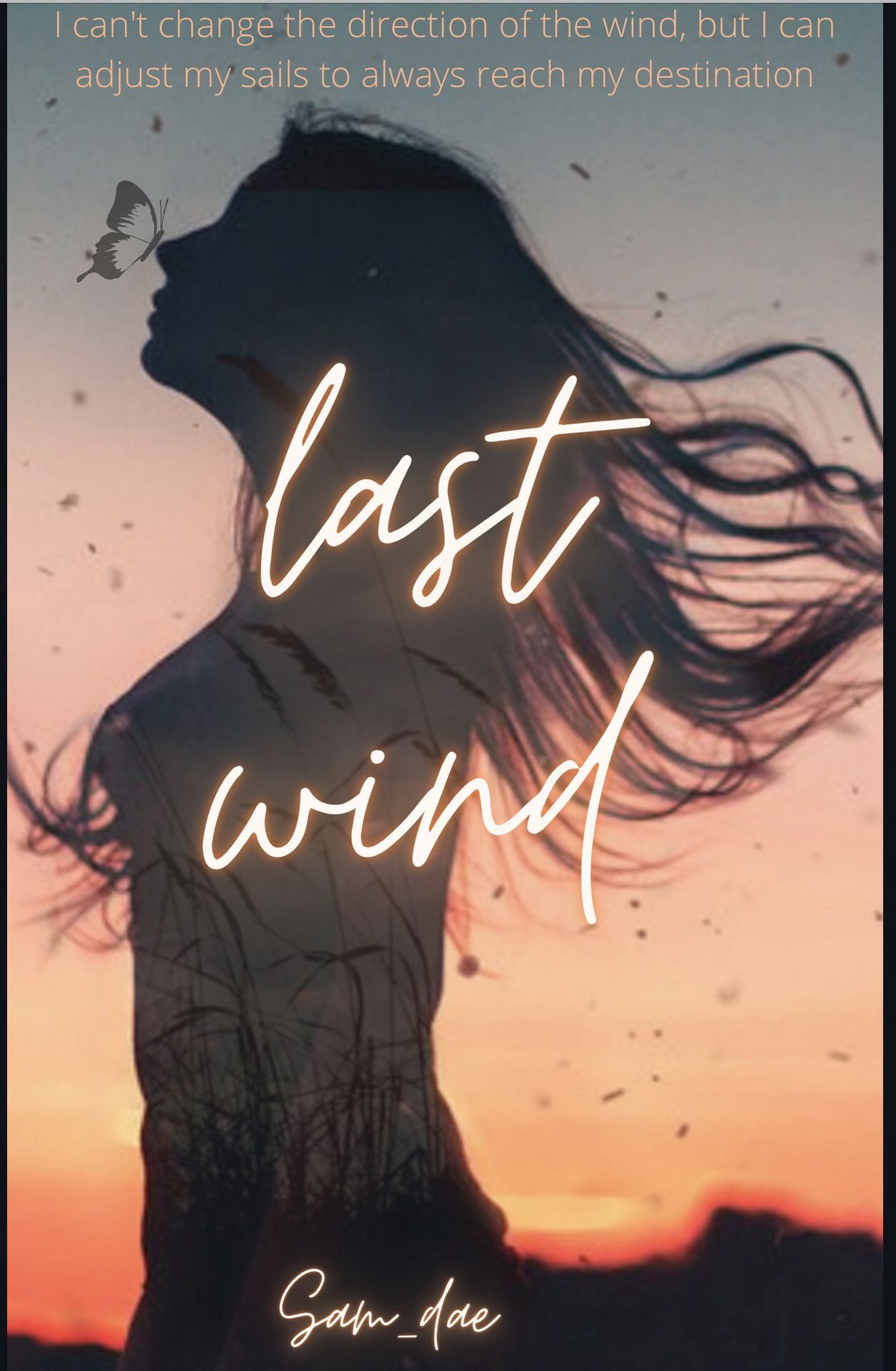
I love this! I love how the girls hair is blowing behind her. I really like how your main focus is the girl and the butterfly. I really like your title and subtitle choice! I love the font of the title, however, I'm not sure if the subtitle font matches with the theme. Other than that, everything else is really good!
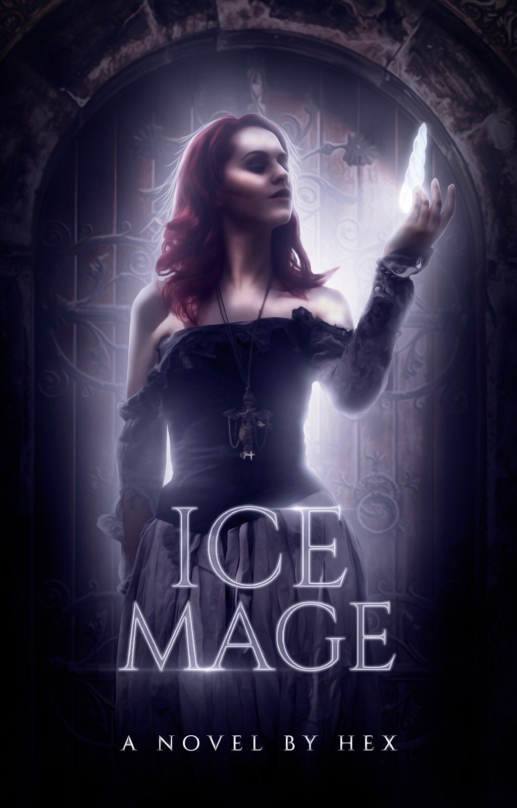
I was instantly blown away! I love your background and your face claim. I love how you edited her to make her look more animated/magical. I love the crystal she's floating, it definitely reminds me of ice. I love your title choice! Mage reminds me of the sims 4. I love your font choice and the faint glow across e, m and a. It really makes it stand out. I love the glow around her and how it gets brighter around the areas the crystal lights up. I can't fault it!
BreanneLHeureux
Element: Lava
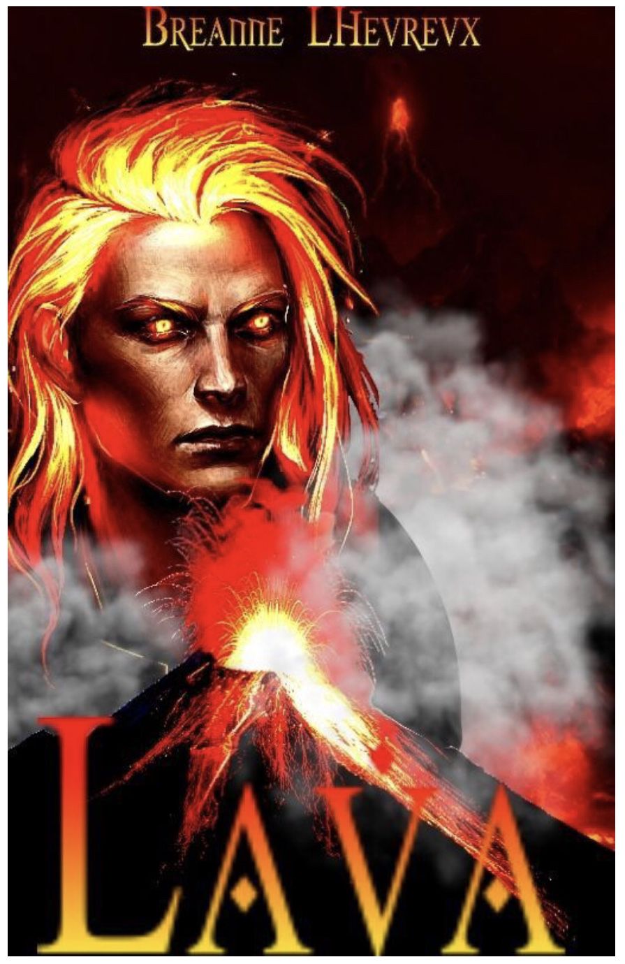
I love everything! I really like the gradient text of the title, it definitely matches your element. I love the volcanoes and the smoke. I adore the editing on your face claims hair! They sent shivers down my spine when I first saw this! I love the font choice and the placement!
Mignxn
Element: Moon
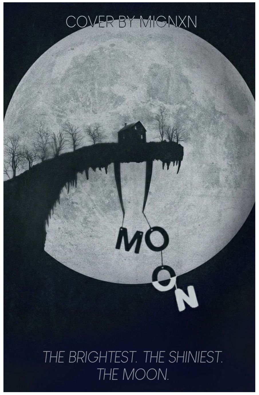
I love this! The hanging letters make it so unique! I love the gradient on the second o. I love the placement of everything! I love how the moon is placed behind the cliff! The colours work well together and match the theme of your element. The subtitle is short, unique and straight to the point. I can't fault it!
_miss_idealist_
Element: darkness
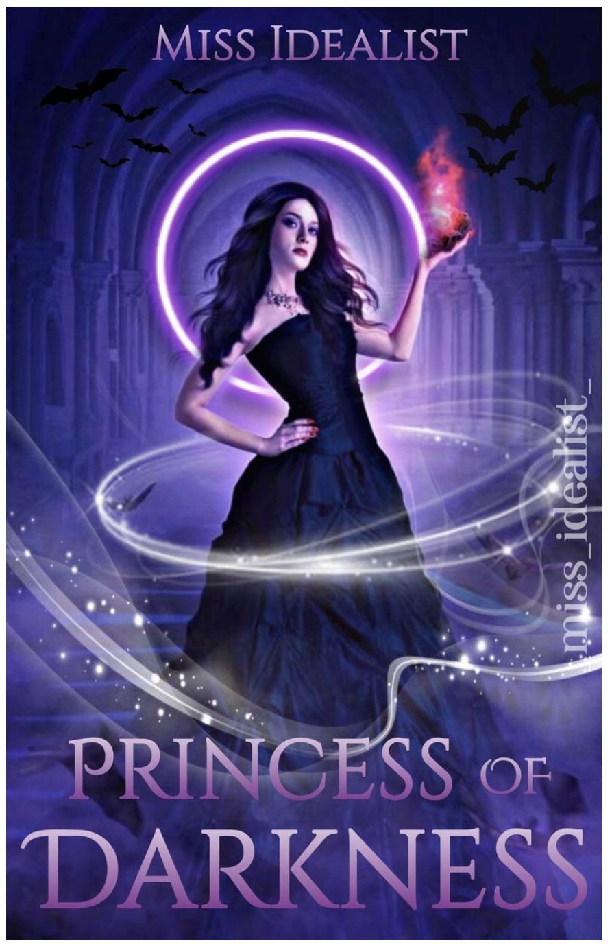
I love this cover! Purples and blacks always work well together! I like how the red glow and the white swirls bring a sense of magic to the cover. It brings it together really well. I love how the background ties in with the title, it brings it together nicely. The bats give it a haunted feel. The placements work really well. I'm not sure if the white swirls are used too much. If they one around her body could have maybe been a little toned down but other than that, I can't fault it!
Naomi100112
Element: Light
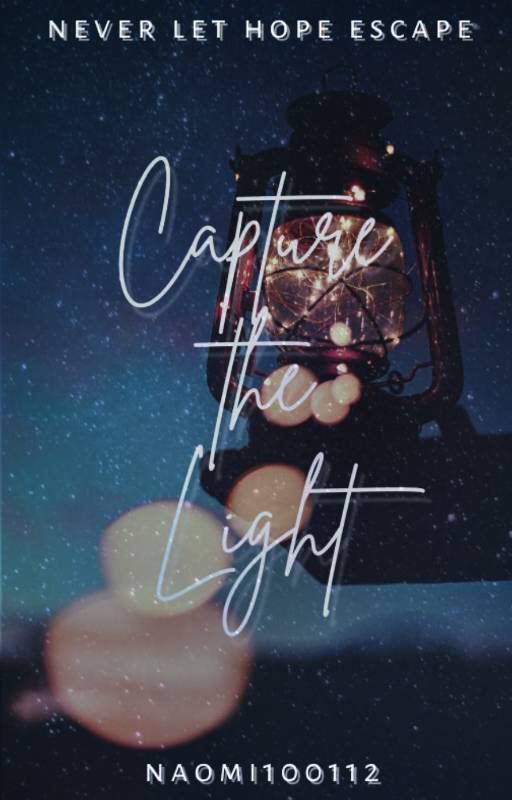
The background is so creative! I love how you used a lantern to bring light to your cover. I love the title and the subtitle! They're both so unique. I love your font choices and placements. One thing I will say, the part of the text that is on the lantern is a little hard to read. I'm not sure if the last two light circles are necessary. Nonetheless, I love your entry so much!
Lillian_Ambrose2601
Element: Metal

I love this! I love the fading effect around the left side of the head. I like how it fades into the hands. The font choices and placements are really good, they don't obscure the main focus of your cover. One thing, I personally think it looks a little too busy. I feel like there's a couple of things on there that aren't necessary. Other than that, I really like it!
If you've submitted your entry and it's not on here, please let me know!
Bạn đang đọc truyện trên: Truyen247.Pro