Contest #2: Entries

I love these! The background and roses are perfect. I love the effect you used with Valentine and with the crumpled paper. I love part of the roses overlap the letters. The placement of the letters work really well. I instantly fell in love with the subtitle instantly. The border works really well. Overall, there's nothing I can fault!


I love these! I like how you used different scenes for each one. The font of the title is a nice choice and I like how you made Valentine stand out. It's not hard to read. I love the balloons. I feel like the subtitle font could have been experimented with but other than that, I can't fault it.


I love these! I like the different approach of using more cartoony twist. I like the simplicity of them. I love the title and the subtitle. I like how the banner is the plain white instead of pink, I personally think it stands out more. At first I wasn't sure about there being no text but taking another look, it definitely looks better without it. I really can't fault anything.
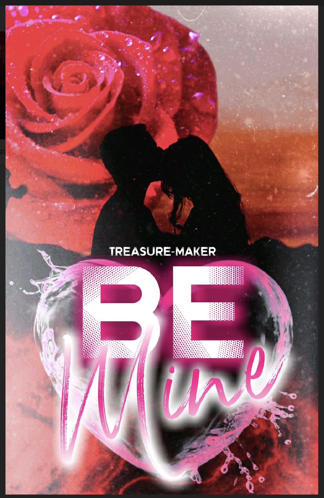
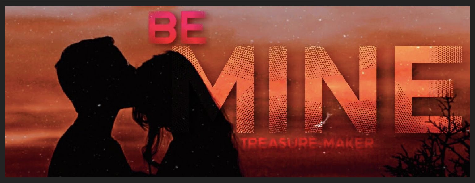
I love these! The background is a really nice choice. I love how you chose a silhouette couple and used them at different positions. I adore the pink water heart and how it blends in. I love the rose in the top. The font choice is really good and they compliment each other really well. I think the orange text works really well in the banner. There's nothing I can fault!
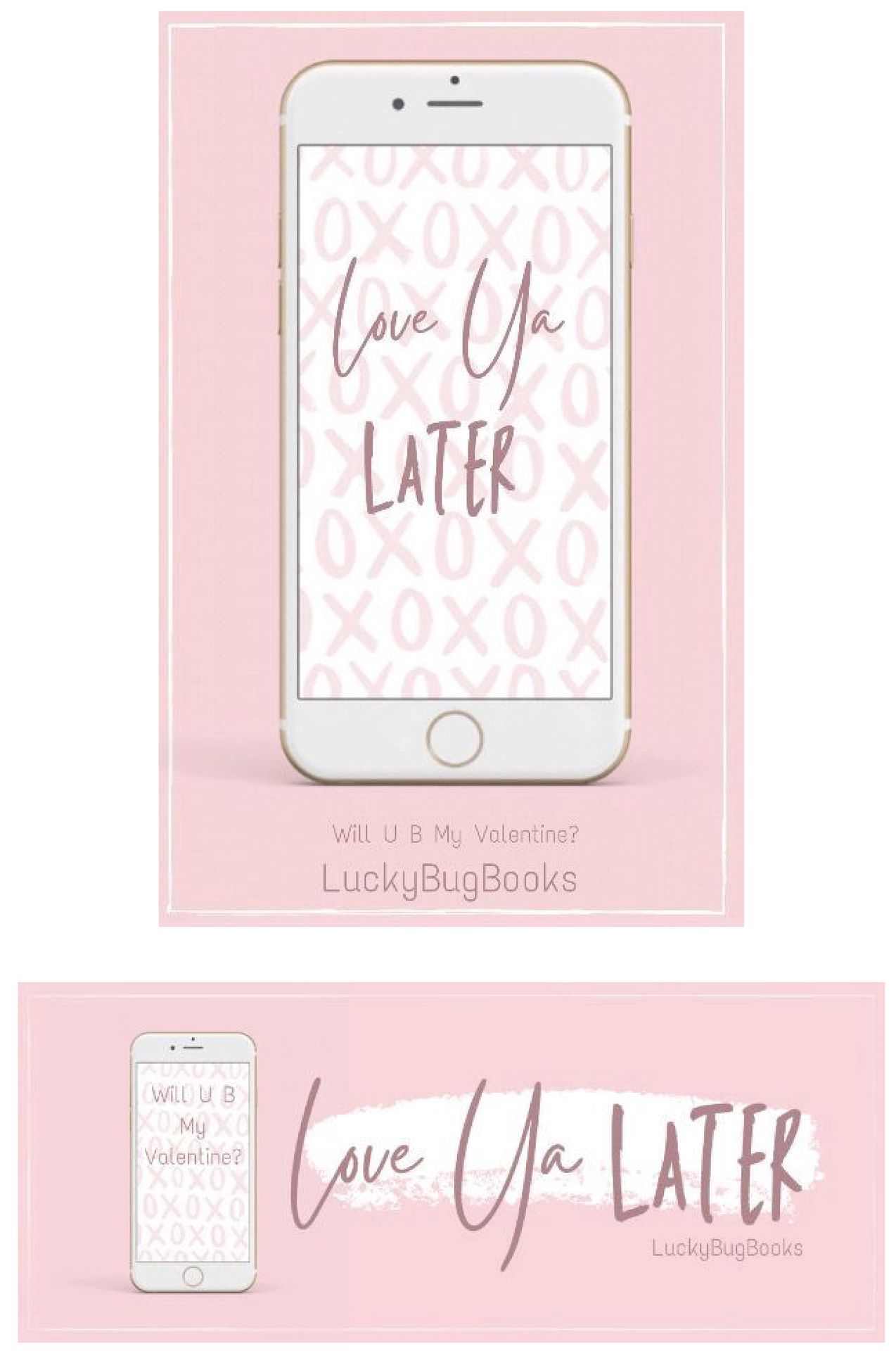
I love how this is more "younger generation". Especially with the current pandemic. I love the simple background of the phone and the actual background of the cover and banner. I love the fonts and your signature border. I love the simplicity of it. I can't fault it.

I love these! I love the pink beach background and the dotted border. Again I love the silhouette couples with the coloured backgrounds behind them. I love the two different overlays you used. I like the font choice and the placements.
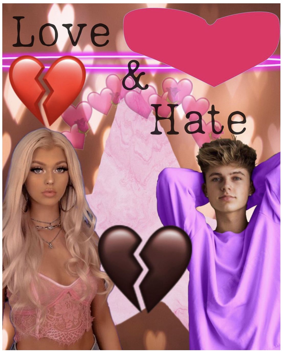
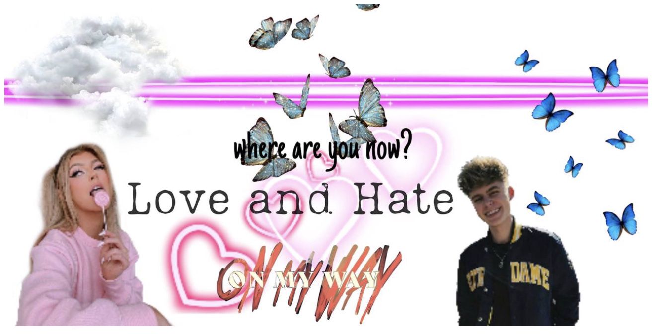
One thing I first realised is that it's maybe a little too crowded (more on the cover than the banner). There's definitely a lot going on. I'm not sure whether the pink heart in the top right is the best placement. It's extremely stretched out. The text placement works. I like how you used the same face claims on both the cover and then banner. One issue I had was that I couldn't find your entry anywhere because your username wasn't on anything (but thank you for the username update).

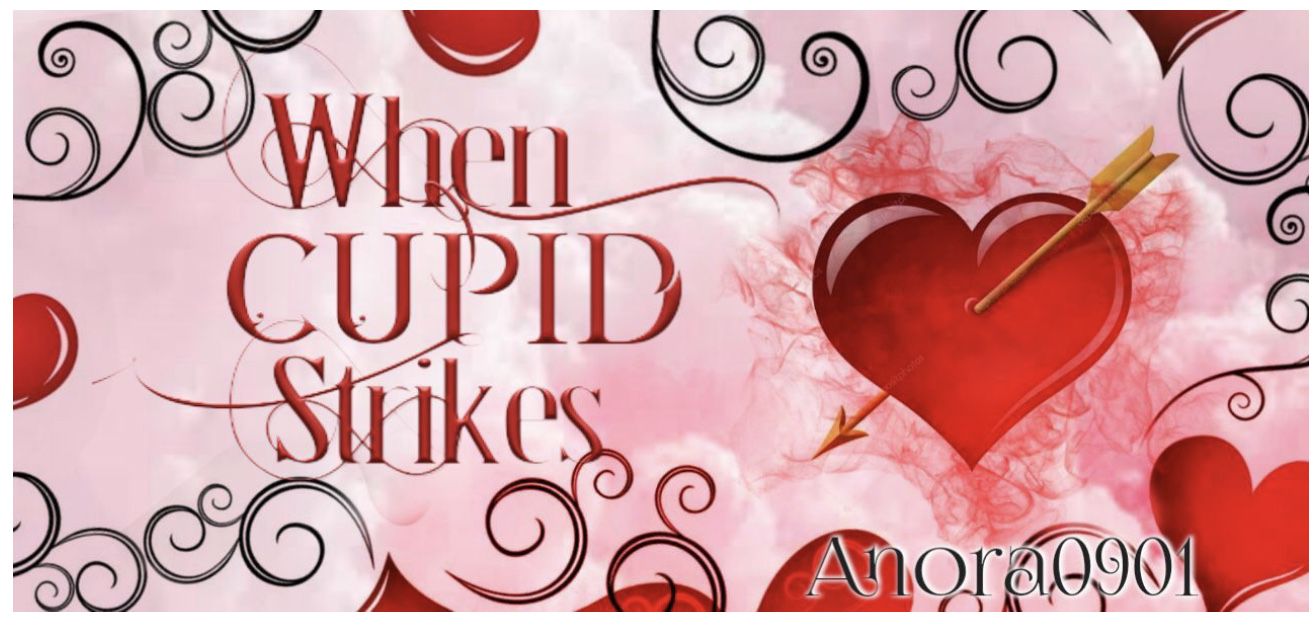
This is definitely different to what I was expecting and I love it. I love the typical arrow through the heart idea and I love the glow around it. The font choice is really good. I love the pink background you chose. I love the border patterns in the hearts on the cover. The placement is really good, although it clashes slightly with the border on the banner, but other than that, I can't fault it.
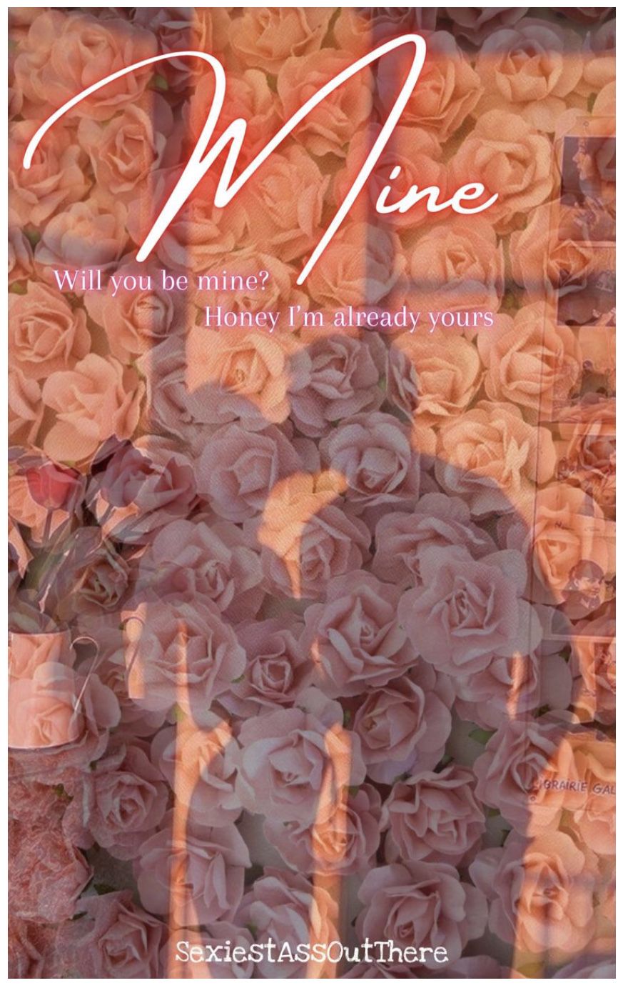

I love the pink rose background! I love the window aesthetic and how it's like you're looking inside the house to the couple. I love the fonts and the faint glow around "mine". I like how the subtitle is like a conversation. Again I love the silhouette couples.
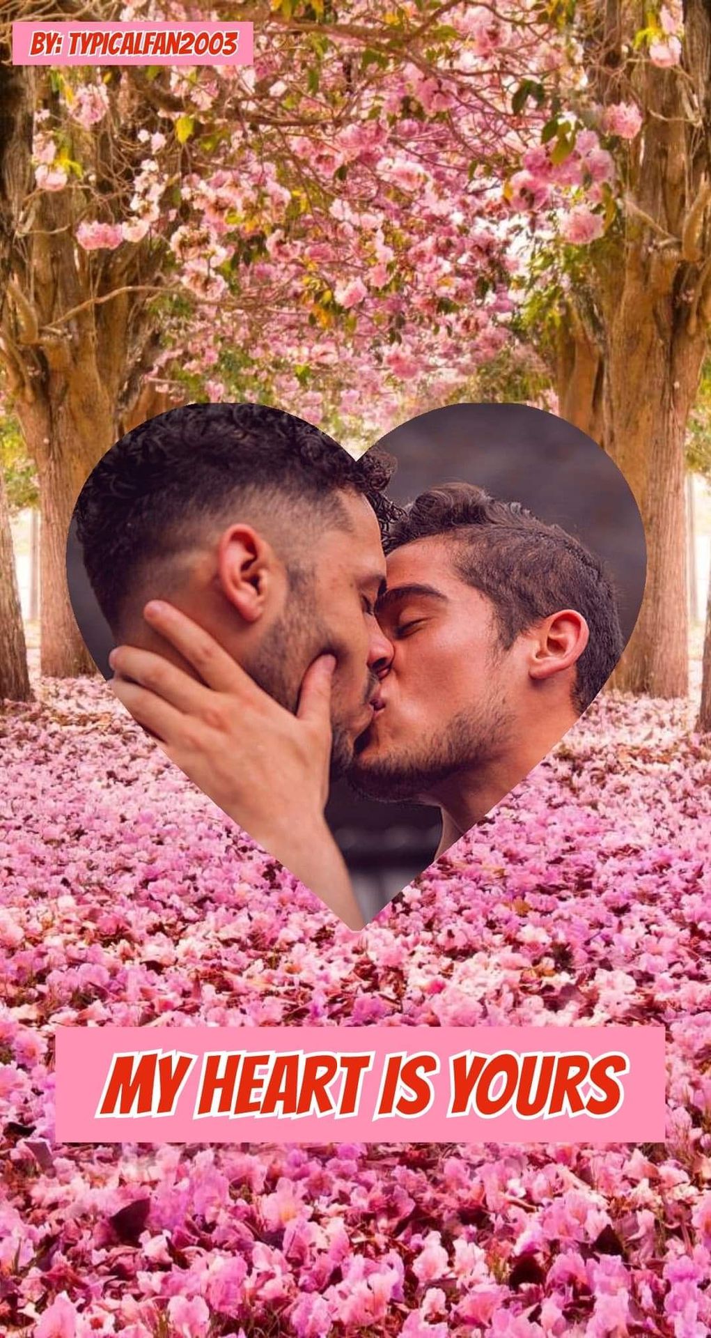

I love the tress with the pink petals across the floor. I love how you didn't stick to the Valentines Day normality and used an LGBTQ+ couple in a heart. I love the title and the placement is good.
rosesaremine_ (thanks for telling me about your entry not being here!)
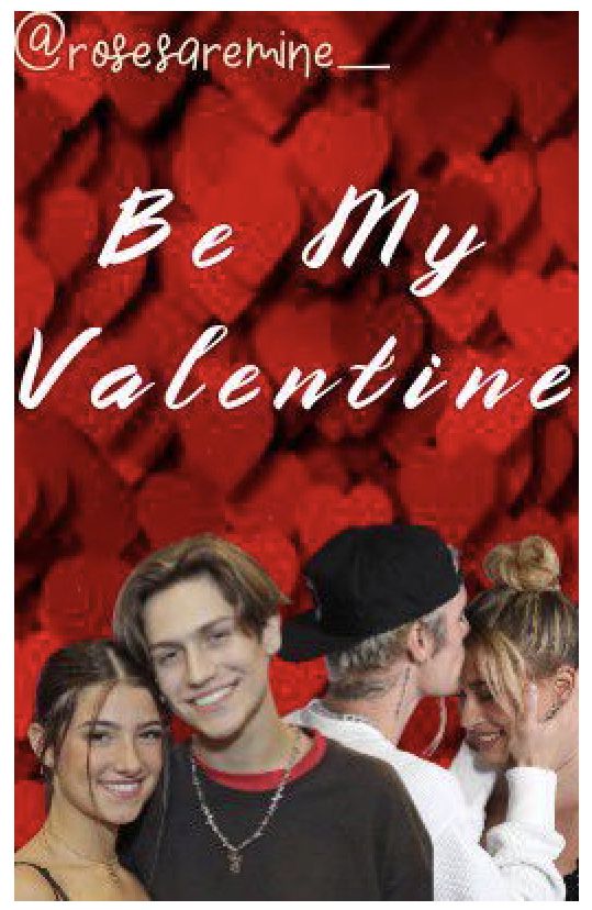

I love how you went with a red heart background and it definitely stands out. The font on the cover is a really good choice and the placement is really good. The font on the banner is really nice but I maybe would have used the same as the cover. I maybe would have used the same face claims across both of them. Other than that, I love them!
Bạn đang đọc truyện trên: Truyen247.Pro