★Art Contest Results★
At long last, Infinity's art contest comes to an end. We received all of your submissions and evaluated them according to the criteria we shared.
Before we get into the results, I'd like to thank every one of you for participating in this contest and giving us your precious time and effort, and for making this event possible. Honestly, we hoped for more people to participate, and trust me when I say that we really appreciate you trying to spread the word on your accounts!
Because of the low number of participants, we had to cut down the numbers of winners in each category. Since we had five eligible graphic designers, only two will win. And because there were two fan artists, we were forced to choose only one winner.
I'd also like to thank the judges for helping me out in evaluating every submission I received and discussing each piece, thus shedding light on different aspects to one another. Your effort was massive, and I cannot thank you enough for tolerating me all this time.
Much love to the panel of judges:
Judge Vanessa vrosei66, Judge Ray CaptainRayRay_, and Judge Maddie SixZeroNine. Thank you for all of your time, effort, and experience put into your judging.
As requested by the panel, the judging will be anonymous in order to prevent any possible conflict between the contestants and judges.
Even if you didn't win among the top ones, your participation is very appreciated. And have no fear, as I mentioned before, all the contestants will get prizes, those who won and who didn't. I mean, you did put a lot of effort into your work and that shouldn't go unrewarded.
Also, please note that all the submissions were compressed in order to reduce their sizes due to Wattpad's requirements. Thus, the pictures you're about to see are not in their real resolutions. They originally were much higher in quality, but such is Wattpad's system.
Don't worry though, all the entries were judged based on their original resolutions.
And now, without any further ado, let's get into the results!
✰━━━━━━━━━━━━━━━━━━━━━━━━━━━━━━━━━━━━━━━━━━━━━━━━━━━━━━━━━━━━━━━━━━━━━━━━━━━━✰
Graphics Category
Entry by
『Jejejejeje77』
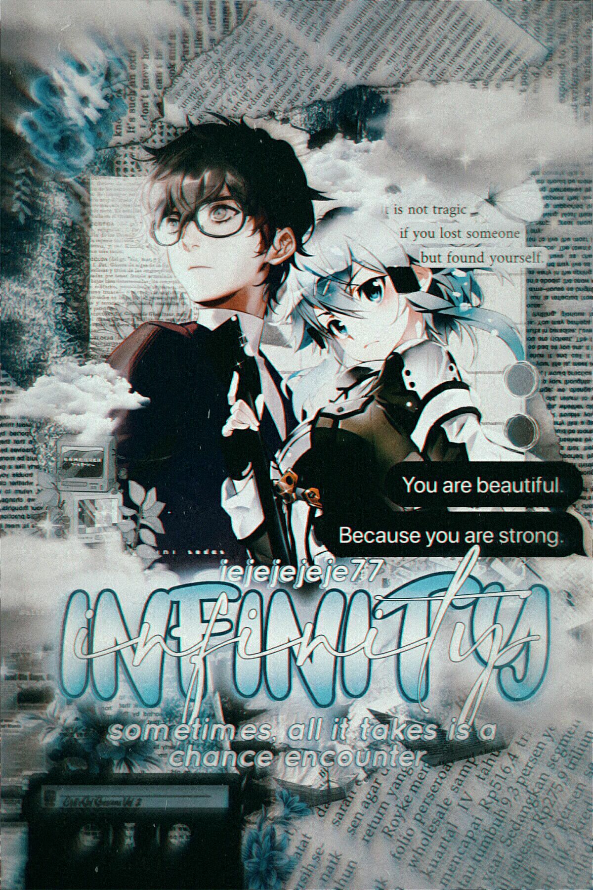
Scores
Judge 1: Creativity: 10/20
Ambiance: 14/20
Feels: 14/20
Clarity/Resolution: 13/20
Color Palette: 12/20
Judge 2: Creativity: 12/20
Ambiance: 15/20
Feels: 13/20
Clarity/Resolution: 14/20
Color palette: 13/20
Judge 3: Creativity: 15/20
Ambiance: 19/20
Feels: 17/20
Clarity/Resolution: 18/20
Color Palette: 20/20
Judge 4: Creativity: 15/20
Ambiance: 18/20
Feels: 16/20
Clarity/Resolution: 17/20
Color Palette: 19/20
Averages
Creativity: 13/20
Ambiance: 16.5/20
Feels: 15/20
Clarity/Resolution: 15.5/20
Color Palette: 16/20
Total Score
Final score= 76%
Feedback
Judge 1: The text below "Infinity" could be a bit more clear tho, the watermark could be in a different place. You can't see it too well and Emiko's hair blends in the background a bit. Maybe make it just a tad brighter
Judge 2: I love the aesthetics of this one! The placement of the renders makes it look like they're standing together and it's super cute! The subtitle is a little hard to read though, it'd probably help if you didn't have the zoom filter on it and gave it a small white stroke behind it. Other than that, it's super pretty!
Judge 3: Overall, the appearance is really nice and eye-catching. Also, it's always a bonus to have two renders have a really close art style since that makes the piece seem more realistic, kudos for that! I like the text messages you added on the right since they really represent Emiko and her character development, so that was such a nice detail! Colors-wise, the palette is calm and suitable, yet it seems a little... bland? Cold? In my opinion, increasing the saturation would've given the piece a bit more life. Otherwise, you did a fantastic job for your first time, keep going and you'll be a pro in no time!
Judge 4: This graphic's elements blend pretty well with each other and look like in "one piece." I think it's a decent one-toned style. The typography is well-done too, and the subtitle is a lyric from the song "Infinity," I believe. I think you overdid with the effects, adding too much noise/grain. The art style of the renders is pretty distinct. It would've been better if there's a clear separation between the "center of attention" and the background. The focal zoom should have been a tiny, tiny, bit more faded, and I'm glad the vignette is clear since the renders are standing out well! But overall, appearance-wise, it's really pretty!
✰━━━━━━━━━━━━━━━━━━━━━━━━━━━━━━━━━━━━━━━━━━━━━━━━━━━━━━━━━━━━━━━━━━━━━━━━━━━━✰
Entry by
『MRNEWMIND2007』
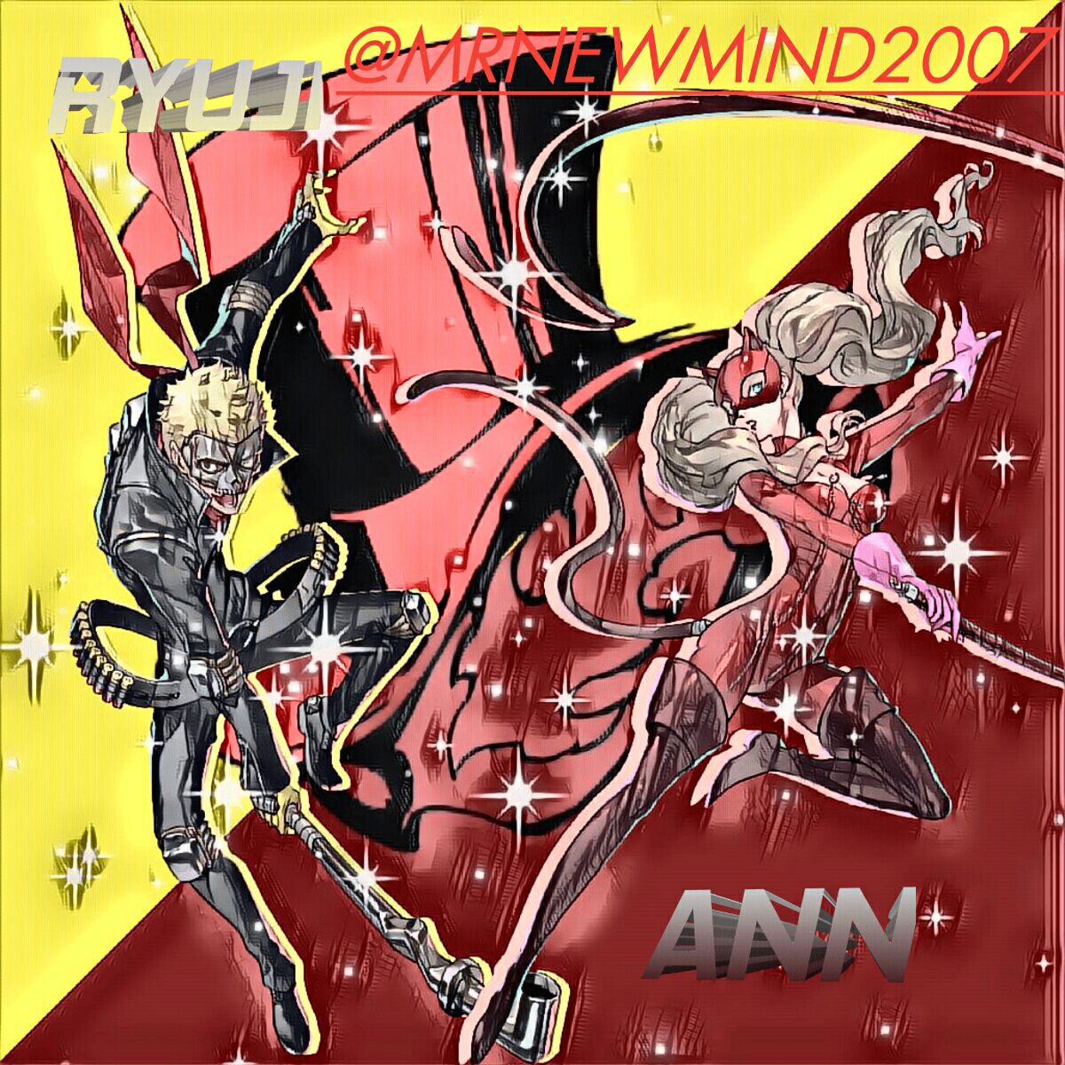
Scores
Judge 1: Creativity: 10/20
Ambiance: 15/20
Feels: 13/20
Clarity/Resolution: 10/20
Color Palette: 12/20
Judge 2: Creativity: 10/20
Ambiance: 14/20
Feels: 09/20
Clarity/Resolution: 11/20
Color Palette: 12/20
Judge 3: Creativity: 10/20
Ambiance: 13/20
Feels: 10/20
Clarity/Resolution: 12/20
Color Palette: 09/20
Judge 4: Creativity: 10/20
Ambiance: 12/20
Feels: 11/20
Clarity/Resolution: 14/20
Color Palette: 13/20
Averages
Creativity: 10/20
Ambiance: 13.5/20
Feels: 10.75/20
Clarity/Resolution: 11.75/20
Color Palette: 11.5/20
Total Score
Final score= 57.5%
Feedback
Judge 1: The proximity's kind of well-defined (the space of the render with the side edges). The color separation fits the character well. However, I think it would've been better if he lowered the opacity of the overall effect. The sparkles and the watermark are out of place. The color of the logo in the back makes the separation uneven. The typography doesn't have an impact or much appeal.
Judge 2: Red and yellow are always good two colors together and they really suit Ryuji and Ann's thief attires! I like the font you used for their names but it could've used darker shades of grey to make it stand out a bit more. One of the things that really threw me off was the watermark, it looks completely out of place! Maybe placing it at the bottom right corner while using a different font and gardianted text (crimson and black) would've been a much better choice. The logo also threw me a bit off, maybe making it a one-colored silhouette would've made the piece less crummy and helped to make the characters' renders more visible. Despite that, good job and keep it up!
Judge 3: This is pretty good. Like the pencil texture it has! The main issue I have with it, however, is the color scheme. The colors themselves aren't bad, but they're too similar in some spots and muddy up parts of the characters, making it hard to read out. Same with the username. It'd help if you used more contrasting colors, or even put some white/black in behind the renders or text to make it stand out more, and either increase or decrease the saturation in the background.
Judge 4: I like it! But the sparkles and colors throw me off a bit... The watermark could use a different font or color. Maybe the background color could be lowered so the characters don't blend into it.
✰━━━━━━━━━━━━━━━━━━━━━━━━━━━━━━━━━━━━━━━━━━━━━━━━━━━━━━━━━━━━━━━━━━━━━━━━━━━━✰
Entry by
『remuririn』
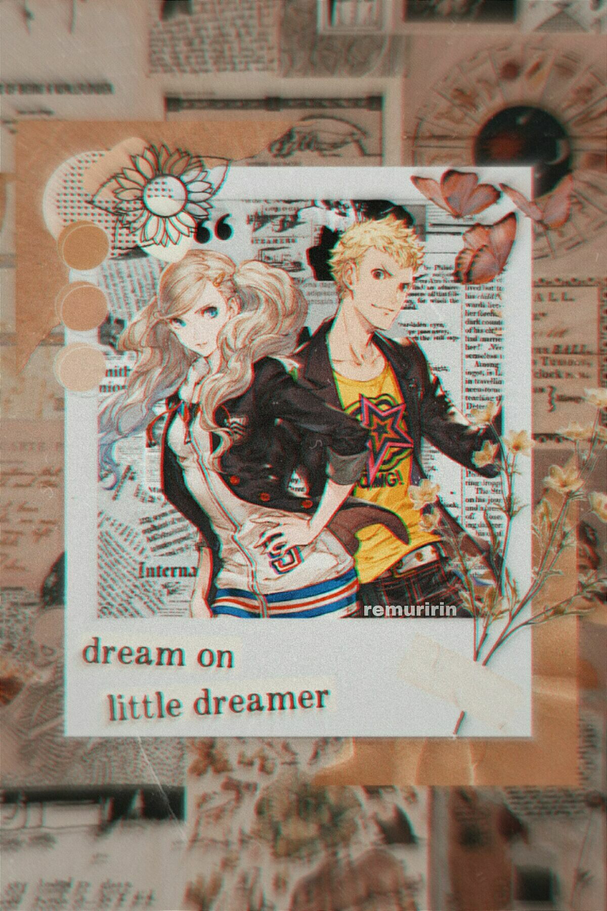
Scores
Judge 1: Creativity: 15/20
Ambiance: 17/20
Feels: 16/20
Clarity/Resolution: 17/20
Color Palette: 20/20
Judge 2: Creativity: 14/20
Ambiance: 16/20
Feels: 17/20
Clarity/Resolution: 16/20
Color Palette: 19/20
Judge 3: Creativity: 12/20
Ambiance: 13/20
Feels: 13/20
Clarity/Resolution: 14/20
Color Palette: 17/20
Judge 4: Creativity: 14/20
Ambiance: 17/20
Feels: 16/20
Clarity/Resolution: 18/20
Color Palette: 20/20
Averages
Creativity: 13.75/20
Ambiance: 15.75/20
Feels: 15.5/20
Clarity/Resolution: 16.25/20
Color Palette: 19/20
Total Score
Final score= 80.25%
Feedback
Judge 1: It's simple but it looks really nice overall! I like how she used a newspaper type of PNG for the background of the characters since it emphasizes the renders. ^^ I don't have anything I dislike in particular, maybe the only thing is that it's a pretty common aesthetic, but still okay!
Judge 2: Okie dokie, time for the meat and potatoes. I absolutely love the dirt color palette you choose since it blends well with Ryuji and Ann's hair color! The renders were an excellent choice, choosing the sprites from the Granblue Fantasy event--they have an amazingly detailed art style and colors! I'd say that the watermark could've been done in a better and more creative way but I can say that you wanted to play it safe. You still could've used a different font to match the sentence on the photo frame. Overall, the piece looks amazing and you did a remarkable job with it! Kudos!
Judge 3: Hmm, the watermark is in a good place! Maybe the grain and blur throw me off a tiny bit, especially for the "dream on" part. Overall, it looks amazing! My favorite graphic so far!
Judge 4: Ooooh, I absolutely love the colors in this! The text placement is super nice too. One thing I can say is the zoom effect is a little strong, which makes the resolution of Ann and Ryuji not as good as it could be. If it was decreased a tad bit it would help the resolution a lot. It looks amazing regardless!
✰━━━━━━━━━━━━━━━━━━━━━━━━━━━━━━━━━━━━━━━━━━━━━━━━━━━━━━━━━━━━━━━━━━━━━━━━━━━━✰
Entry by
『ANIMEgirlfan173』
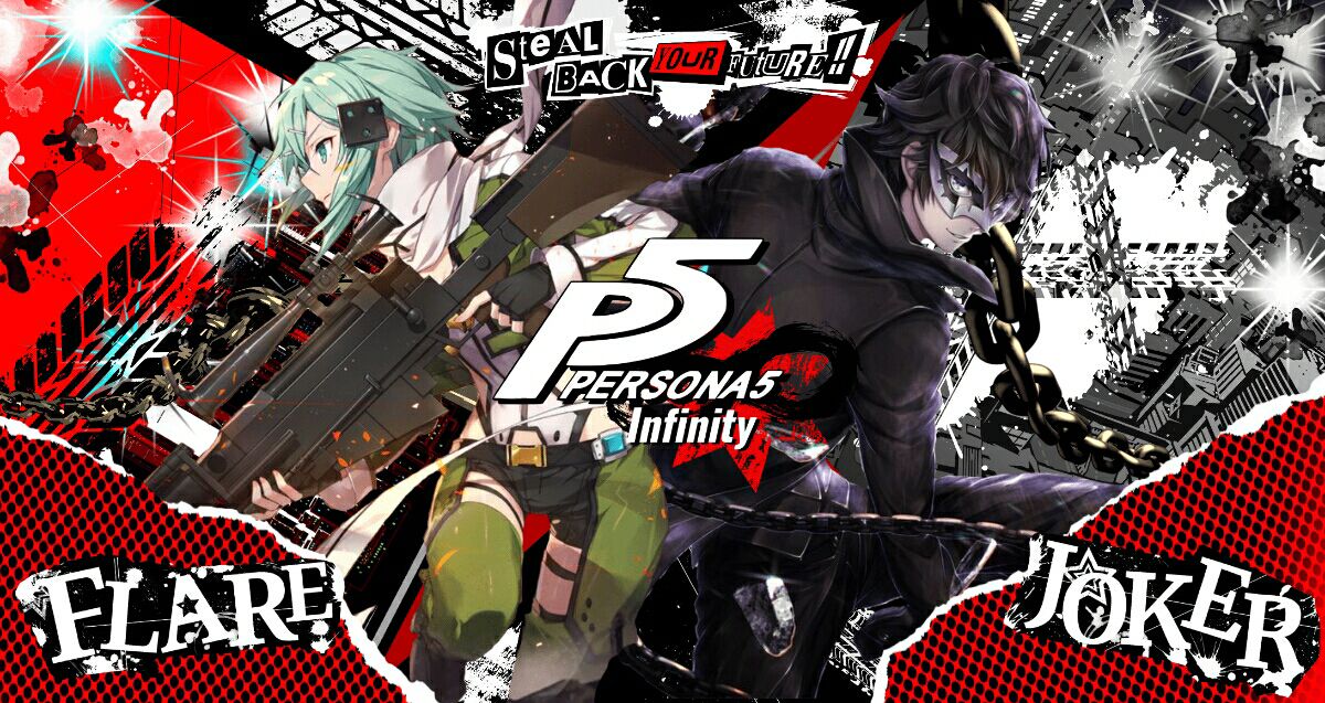
Scores
Judge 1: Creativity: 17/20
Ambiance: 16/20
Feels: 14/20
Clarity/Resolution: 15/20
Color Palette: 13/20
Judge 2: Creativity: 17/20
Ambiance: 18/20
Feels: 16/20
Clarity/Resolution: 17/20
Color Palette: 19/20
Judge 3: Creativity: 18/20
Ambiance: 16/20
Feels: 14/20
Clarity/Resolution: 10/20
Color Palette: 13/20
Judge 4: Creativity: 18/20
Ambiance: 16/20
Feels: 15/20
Clarity/Resolution: 15/20
Color Palette: 16/20
Averages
Creativity: 17.5/20
Ambiance: 16.5/20
Feels: 14.75/20
Clarity/Resolution: 14.25/20
Color Palette: 15.25/20
Total Score
Final score= 78.25%
Feedback
Judge 1: I think the black and white part for Ren makes him blend into the background. And the sparkles for Emiko... I don't know how to explain it but it puts me off slightly. It's always the sparkles! T^T
Judge 2: Ahhh, I love this! It really reminds me of the P5 style, and the render placement is really nice! I feel like the main problem with it, however, would be how crowded it is. While the P5 style does have a lot with the colors and such, here it's just so much going on, and it takes the viewer a moment before they can fully understand what they're looking at. A good way to fix this would be to give the characters' shadows behind them, it would also help the theme more. Another thing you could do is desaturate the background colors, or add more shade to them. Or you could make the backgrounds simpler altogether, like removing the sparkles and replacing the busy backgrounds with a simple color and semi-visible texture. Other than that, it looks so good!
Judge 3: Where to even start? First off, I LOVE you for choosing P5's theme! The characters' names and quotes look like they came out straight from the game! The renders are amazing too and are really close in their art style, so that's a bonus! I'd say that your biggest throwback is how crowded the background is. I get that you probably wanted to have a lot of details to make the piece feel more alive, butttt... that ended up being your weak point. The sparks really threw me off as well as the tire marks on both sides. The background behind Joker could've been simpler and less crummy and it'd still look equally as good! Also, Flare doesn't really suit the red color palette of the cover, maybe having her half in dark blue like the Velvet Room's theme would've made her feel more in place. Other than that, you did a really good job! Don't stop at all!
Judge 4: It's really good! The render placement (and the render itself) is really amazing, and fits the vibe well! The PNGs are pretty good too, plus the fonts fit the P5 theme. The sparkles seem a bit out of place though. Emiko doesn't fit with the color scheme, it would've been better if she added some sort of effects (adjustments on b&c, hsl, color balance) same with Joker to fit the red vibe (the lighting is purply) plus an overall effect. It would be better if the renders stood out a bit more.
✰━━━━━━━━━━━━━━━━━━━━━━━━━━━━━━━━━━━━━━━━━━━━━━━━━━━━━━━━━━━━━━━━━━━━━━━━━━━━✰
Entry by
『ethcreates』
Scores
Judge 1: Creativity: 20/20
Ambiance: 19/20
Feels: 18/20
Clarity/Resolution: 19/20
Color Palette: 19/20
Judge 2: Creativity: 17/20
Ambiance: 16/20
Feels: 16/20
Clarity: 18/20
Color Palette: 15/20
Judge 3: Creativity: 19/20
Ambiance: 17/20
Feels: 16/20
Clarity/Resolution: 18/20
Color Palette: 17/20
Judge 4: Creativity: 19/20
Ambiance: 16/20
Feels: 12/20
Clarity/Resolution: 17/20
Color Palette: 14/20
Averages
Creativity: 18.75/20
Ambiance: 17/20
Feels: 15.5/20
Clarity/Resolution: 18/20
Color Palette: 16.25/20
Total Score
Final score= 85.5%
Feedback
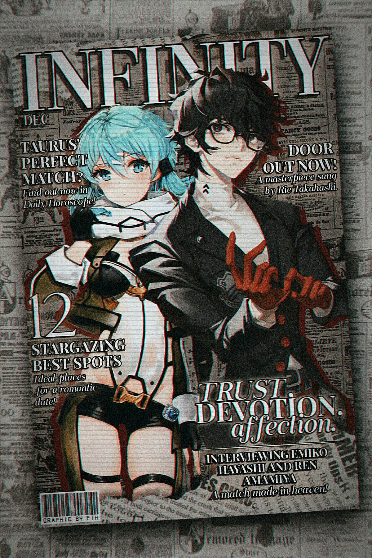
Judge 1: Shdjsj this is so cute, and the magazine aesthetic works really well here! I would say to maybe use a simpler font for the subtext, maybe something like Lemonmilk or Lovelo, so it's more readable against the background and other tiny text. Also since the rest of the colors are brown and gray, you could also desaturate the character just a little, that way it'd fit with the other colors and still stand out! It looks amazing though!
Judge 2: Hmmm, I really like how Emiko and Ren stand out! But for the color palette, it's a bit plain to me, maybe it is because I've seen a lot of graphics use a newspaper aesthetic? It looks really pretty! Maybe my favorite so far!
Judge 3: Jesus Christ! Now, this is really hard to write! XD
Truthfully, this is my hardest review to write in this category because there are a LOT of things worth talking about! For starters, I like the renders you chose, their placement is right at the center, so they'll be the first thing to see and have a nearly matching art style, and that's always a bonus! I really like the whole anime Vogue magazine theme, I've been a fan of it for years, and seeing you actually write the story's title instead was MINDBLOWING! I like how you innovated this small detail to make your piece less cliché and more of your own. The placement of the watermark on the barcode was an absolute big brain energy idea here (chef kisses) so that was really creative! And the subtitles... the SUBTITLES! They scream RenEmi with the loudest voice ever! The three words that describe the ship can't be any more true! The stargazing spots that indicate the characters' love for stars as seen in the story, were true icing on top of the cake. And the fact that you researched their horoscopes?! Talk about real dedication and attention to detail!
I also like the background you used for the magazine and the bigger background photos. The colors are retro which I take as a reference to Leblanc? I have no idea, I'm just throwing random analysis at this point, haha (correct me if I'm wrong though)! And it was a genius idea to add crimson shadows to the renders in order to fit Ren in the color palette given his gloves and blazer buttons. But not the same can be said about Flare, her clothes fit the color scheme, but her hair doesn't. Maybe having an aqua-colored shadow behind her would've been better? Overall, it's a real masterpiece and I can see how much time and effort you poured into it. Great job and keep it up!
Judge 4: GOD the subtitles fit the ship and I totally like the entire atmosphere! The blurring frame, the lines, and the vignette give a dramatic effect to it! Normally, I expect the magazine aesthetic to be pretty direct, but this one has another feeling underneath! Ahhh, this is my favorite so far! Everything to me is good overall! I always liked the Vogue Anime trend before, and I like the twists she added. For example, substituting "Vogue" for "Infinity," the story title. It's really creative, different from what I've seen so far since she actually added plot details from Infinity in the subheadings! The main story, perhaps the part where "Trust, Devotion, Affection." lies, really fits the couple! The watermark is creative, and blends well with the concept!
Hmm, maybe just add quotation marks to "Door"? XD Got confused a bit there. The stroke/shadow of the subtitle for the main heading is a bit too dark too. Minor proximity issues (really minor, haha). It's really good overall! Oh, and the colors, I'm fond of desaturated/low contrast aesthetic stuff, so I find it really pretty!
✰━━━━━━━━━━━━━━━━━━━━━━━━━━━━━━━━━━━━━━━━━━━━━━━━━━━━━━━━━━━━━━━━━━━━━━━━━━━━✰
Entry by
『stheressa101』
Disqualified - Not Sending Her Entry Before the Deadline
✰━━━━━━━━━━━━━━━━━━━━━━━━━━━━━━━━━━━━━━━━━━━━━━━━━━━━━━━━━━━━━━━━━━━━━━━━━━━━✰
Fanarts Category
Entry by
『Rena_789』
Scores
Judge 1: Creativity: 15/20
Ambiance: 17/20
Feels: 16/20
Coloring: 17/20
Line Art: 15/20
Judge 2: Creativity: 16/20
Ambiance: 17/20
Feels: 17/20
Coloring: 19/20
Line Art: 16/20
Judge 3: Creativity: 14/20
Ambiance: 16/20
Feels: 14/20
Coloring: 16/20
Line Art: 14/20
Judge 4: Creativity: 18/20
Ambiance: 15/20
Feels: 14/20
Coloring: 16/20
Line Art: 16/20
Averages
Creativity: 15.75/20
Ambiance: 16.25/20
Feels: 15.25/20
Coloring: 17/20
Line Art: 15.25/20
Total Score
Final score= 79.5%
Feedback
Judge 1: -
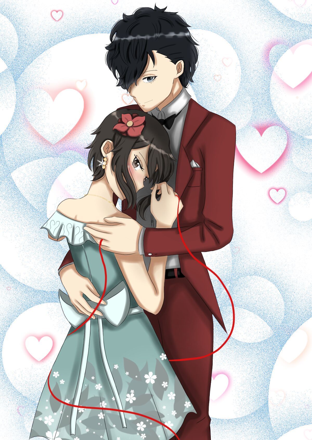
Judge 2: WJJDJSSJ IT'S SO CUTE!!! I wish I was in his arms like that sksksksk, seriously though this is adorable! I don't have any critiques for this besides there's not enough of it! I love it so much!
Judge 3: Okay... what in the actual hell?! O_O
Agkshuwbd, it looks so passionate and intimate and I'm LOVING it! The way Ren's holding Emiko in his arms is so gentle yet romantic and the way they're looking at us as if they know we're here, fourth wall breaking at its finest! I like the masquerade ball theme (instead it doesn't have masquerade masks) and the fact that you chose Ren's suit from that P5A event! Can I also add that Emiko looks ABSOLUTELY gorgeous? I'm in LOVE with that floral teal dress and the flower in her hair, it genuinely looks like something she'd wear! Ah, and the red string of fate, a trope I never get tired of no matter how old it might become, and I can see that you're a fan too! You've done amazingly well! Keep it that way!
Judge 4: IT'S SO CUTE, AAA!!! I LOVE THE COLORING AND SMALL DETAILS ON IT. THE RED STRING AND DETAILS ON THE DRESS ARE JUST MWAH!!!
✰━━━━━━━━━━━━━━━━━━━━━━━━━━━━━━━━━━━━━━━━━━━━━━━━━━━━━━━━━━━━━━━━━━━━━━━━━━━━✰
Entry by
『Magneta100』
Scores
Judge 1: Creativity: 15/20
Ambiance: 12/20
Feels: 10/20
Coloring: 16/20
Line Art: 13/20
Judge 2: Creativity: 15/20
Ambiance: 11/20
Feels: 10/20
Coloring: 15/20
Line Art: 12/20
Judge 3: Creativity: 14/20
Ambiance: 10/20
Feels: 10/20
Coloring: 12/20
Line Art: 16/20
Judge 4: Creativity: 13/20
Ambiance: 09/20
Feels: 11/20
Coloring: 13/20
Line Art: 15/20
Averages
Creativity: 14.25/20
Ambiance: 10.5/20
Feels: 10.25/20
Coloring: 14/20
Line Art: 14/20
Total Score
Final score= 63%
Feedback
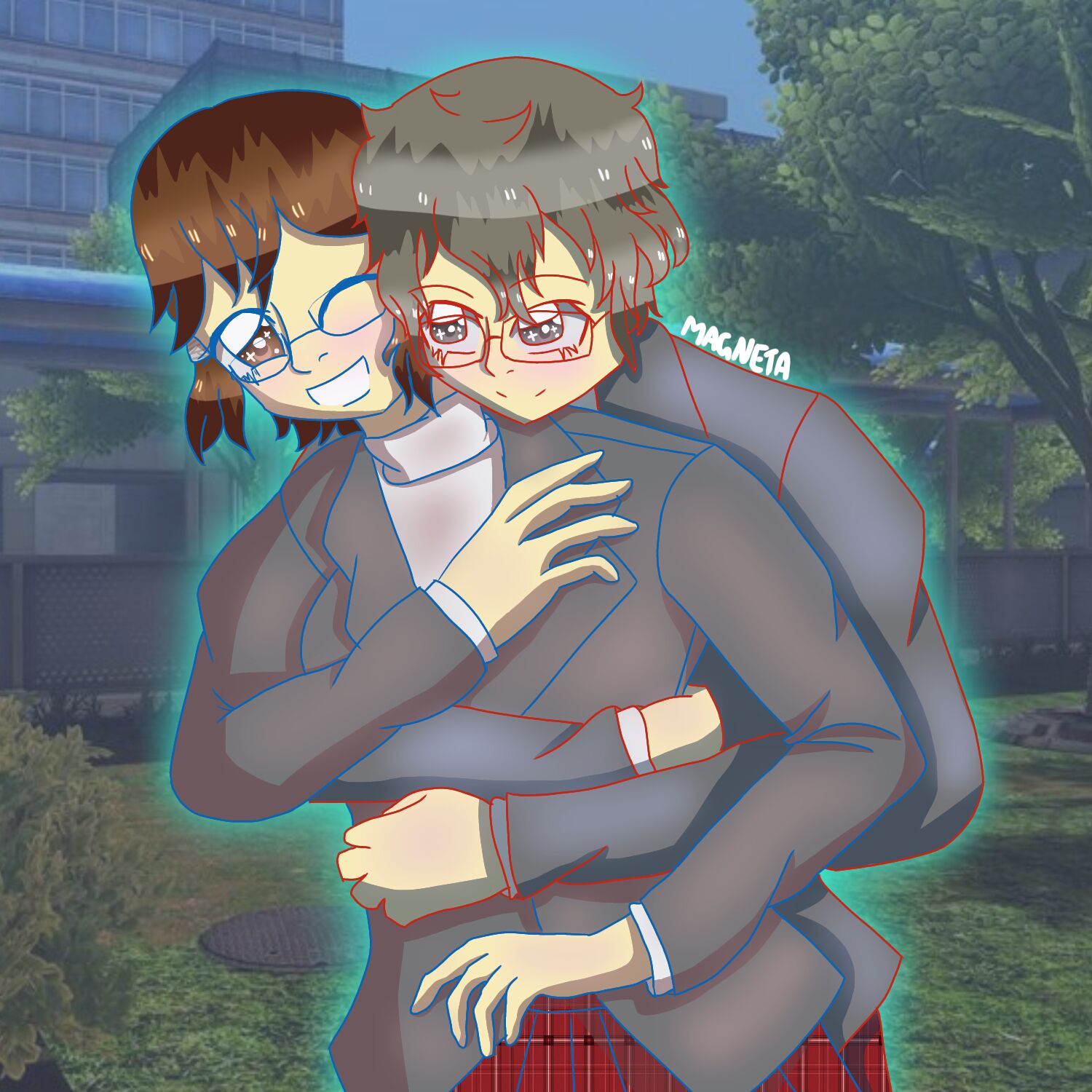
Judge 1: Ah, well... I have no idea how I should say this. I really like the concept of the drawing! Ren and Emiko's embrace/posture is so cute and intimate at the same time! However, the colors threw me off a bit, they're too bright and green-tinted. Ren's hair color and Shujin's blazers don't even look black to me, Emiko's hair should've been darker, and the skin must also be a bit darker. Using colored line art isn't always a good idea and that's the case here, having it in dark grey is much more appealing and realistic. Plus, the bodies look huge with their proportions a little bit off. Despite that, the drawing looks so adorable, bubbly, and lighthearted! Good work on this and thank you for doing it!
Judge 2: The colored line art is nice but I feel like they could have used a color picker to help and the blush may be a red-ish tone more.
Judge 3: It's super cute! Love the colors. Although it feels like the proportions are a little off? I don't know, it just feels like their torsos are just a tad bit too big, but that's me being nit-picky. It looks great!
Judge 4: -
✰━━━━━━━━━━━━━━━━━━━━━━━━━━━━━━━━━━━━━━━━━━━━━━━━━━━━━━━━━━━━━━━━━━━━━━━━━━━━✰
Results
Graphics Category
Fanarts Category
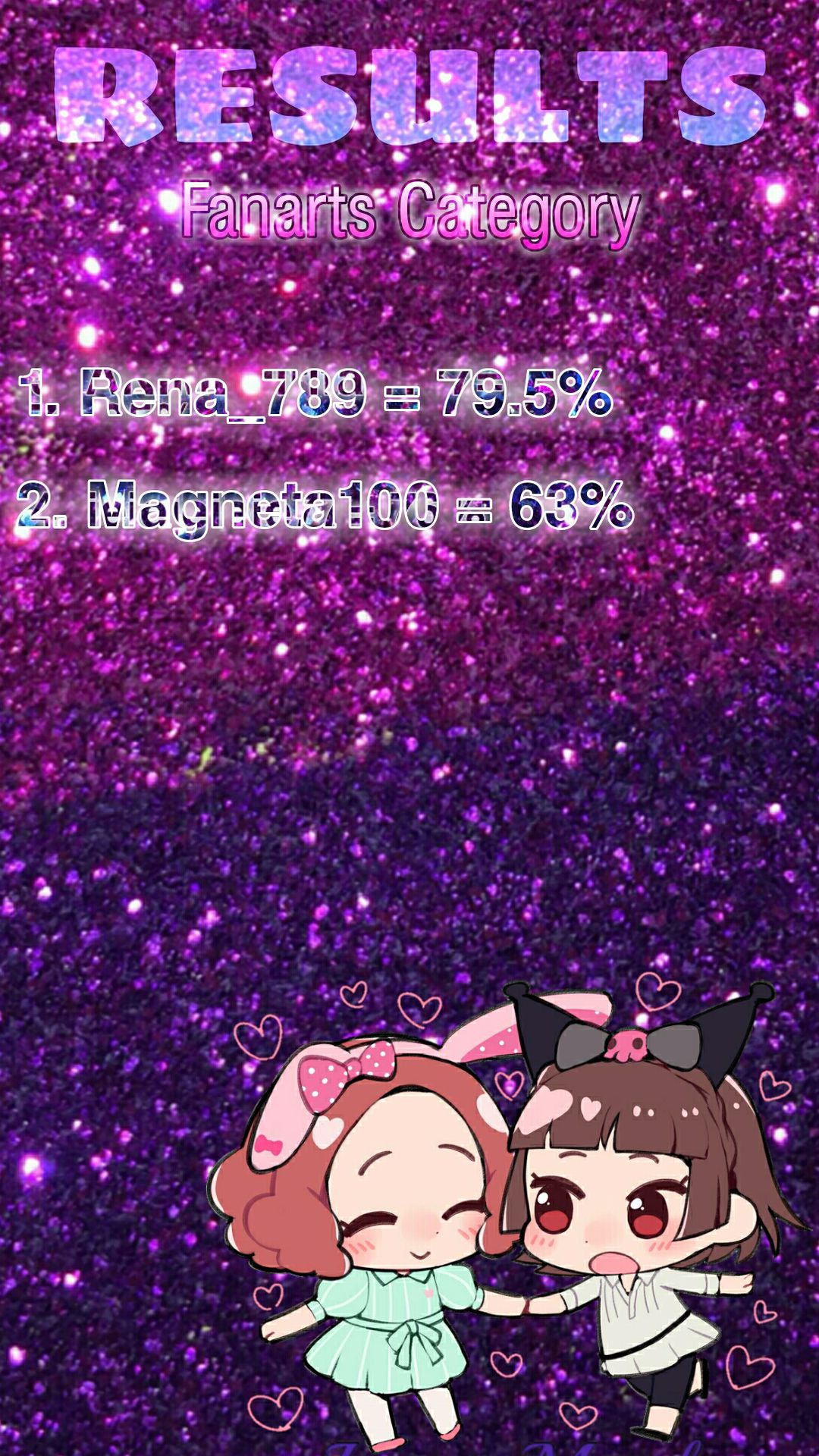
Winners
Graphics Category
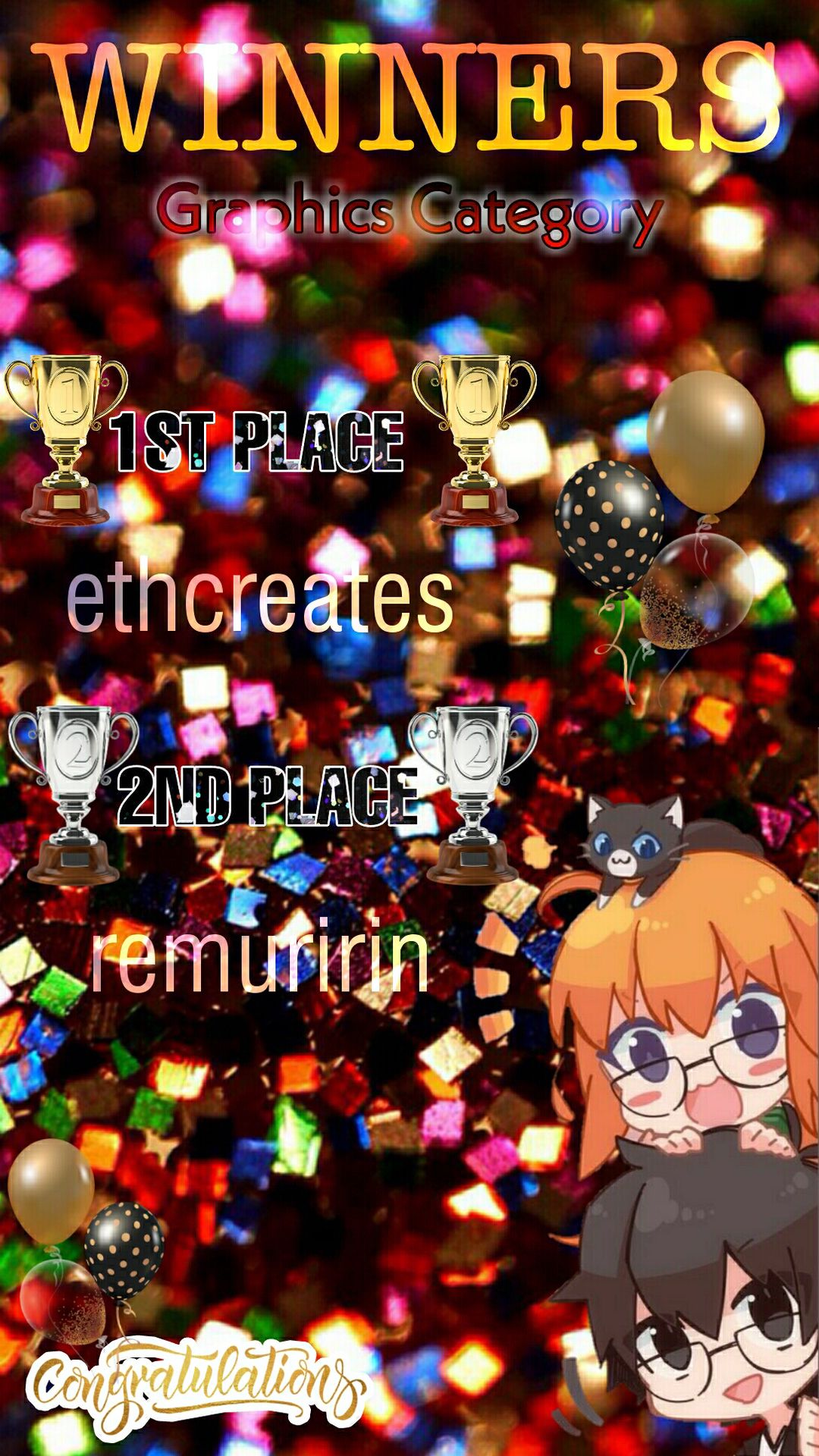
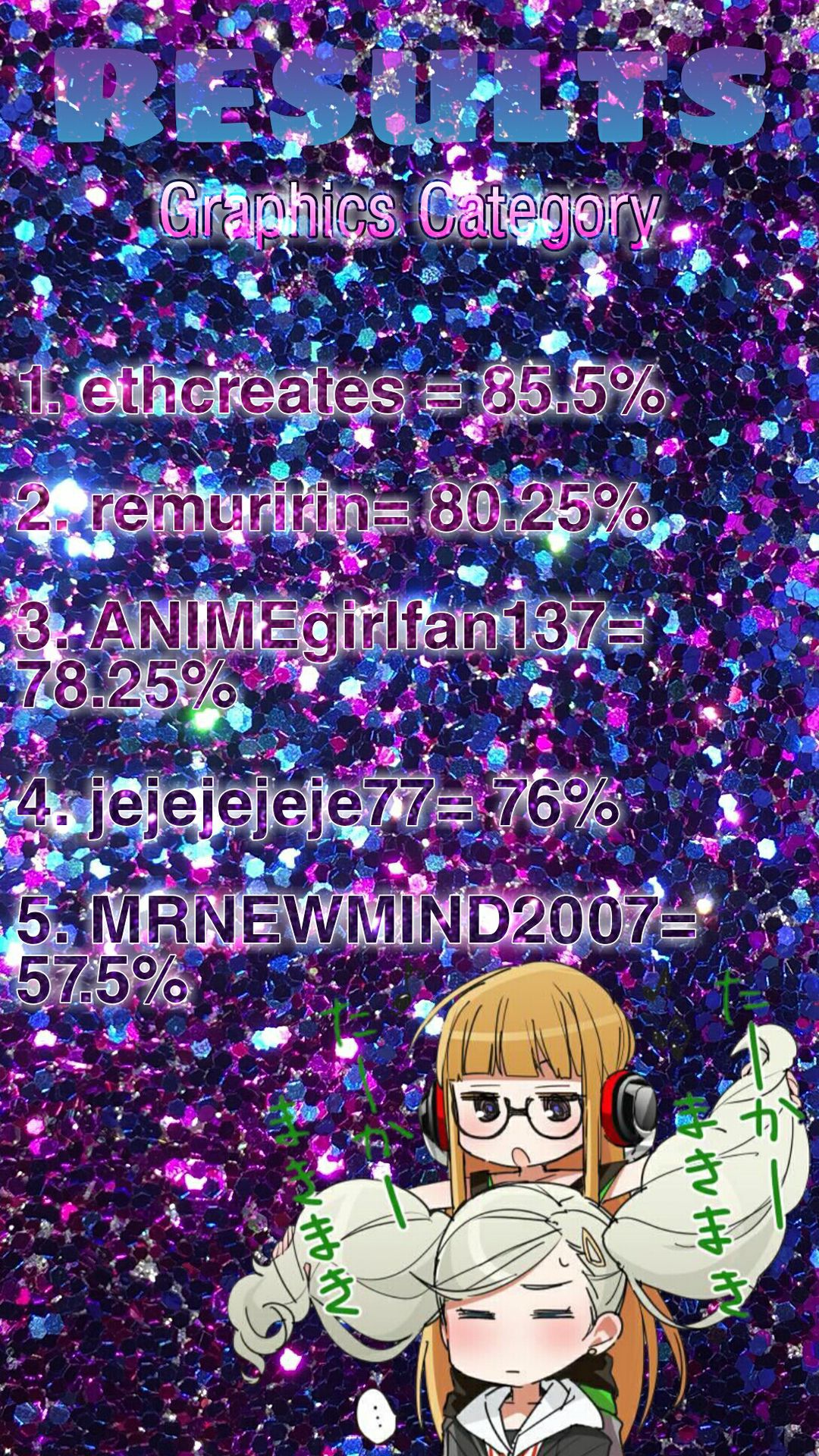
🏆1st Place🏆 - ethcreates
🎆2nd Place🎆 - remuririn
Woohoo, congratulations to our two winners! Your work has been amazing with clear attention to detail, aesthetics, and presentation. All of your hard work has been noticed by the judging panel and was given points according to it. Eth and Mimi, we're sincerely happy for you, and we were deeply honored to be witnesses to your work. You've done an excellent job and you shall be rewarded with your prizes as promised in the contest's promotional part!
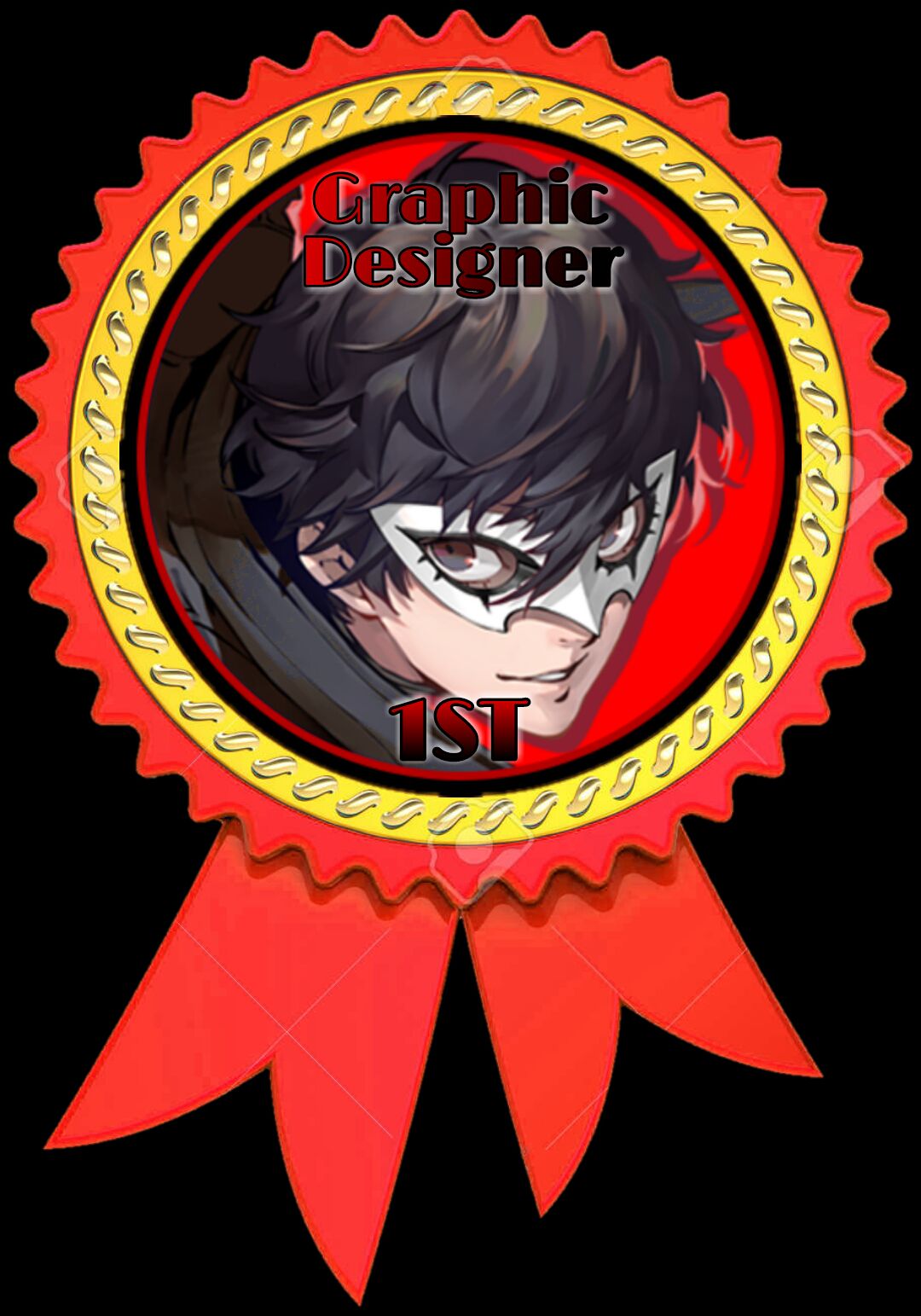
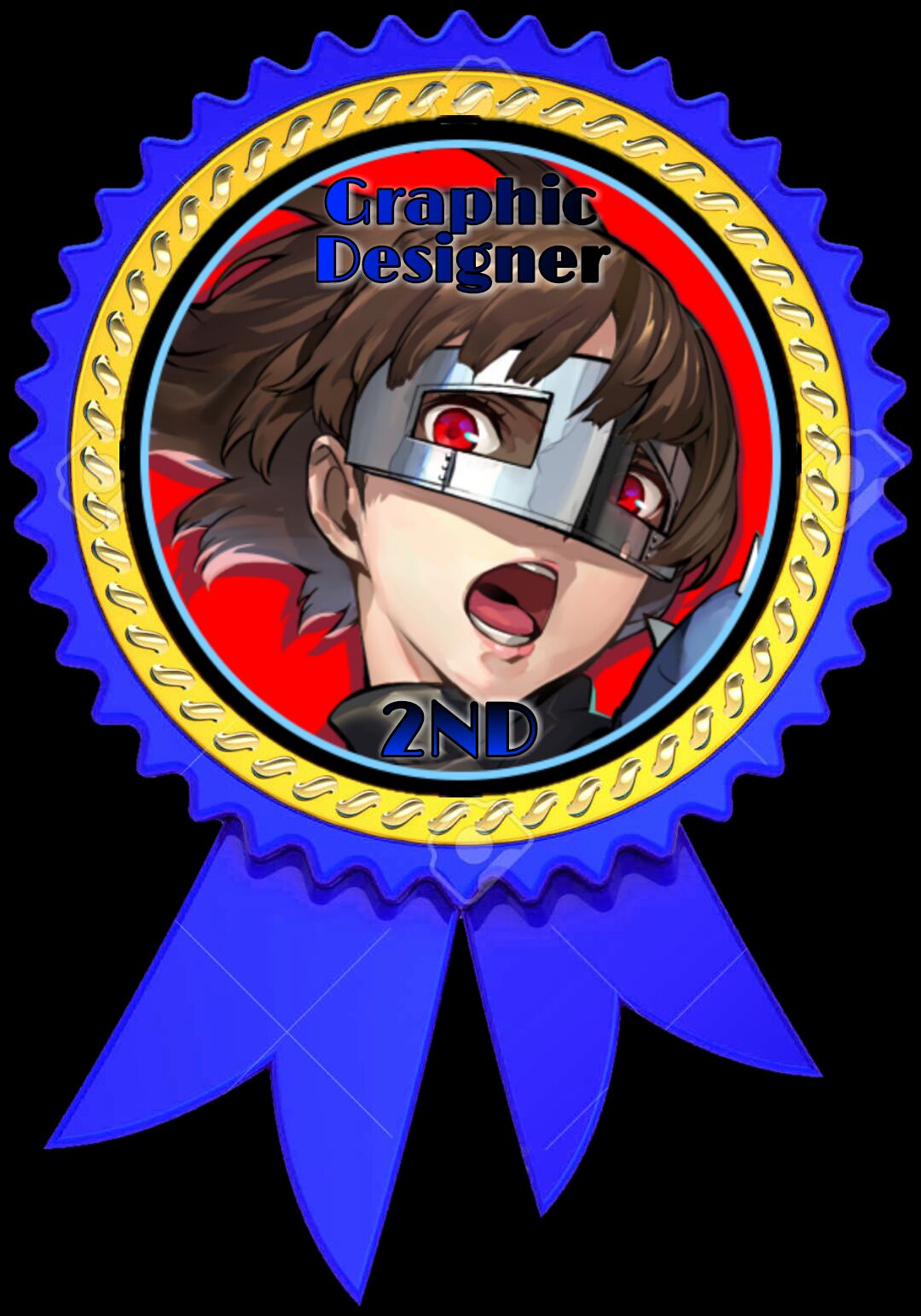
For now, here's a preview of the badges that'll be sent to you as soon as possible. You're free to place them wherever you want, on a book's cover, or anything! We hope they're to your liking! ^-^
Fanarts Category
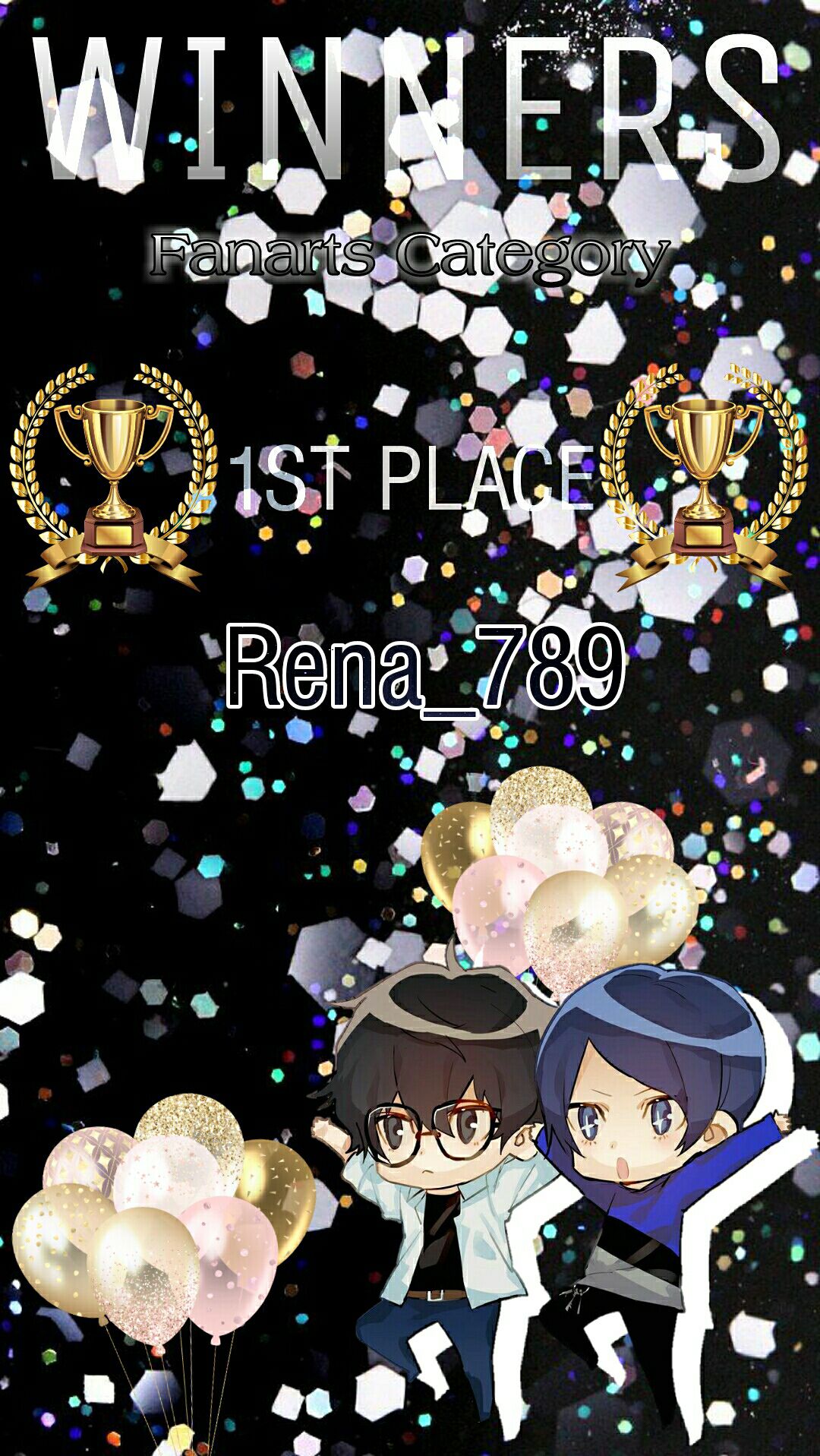
🏆1st Place🏆 - Rena_789
Congratulations, our artist (as we say in our native language)! Well, you're not called "Infinity's Main Artist" for no reason, haha! Your artwork has been a real pleasure for the eye from the first moment you lay your sight into it. As your friend irl, I can tell you with much confidence that you've improved quite a bit with your work, especially since I always see what you draw! You've done a breathtaking job and you deserve all the best!
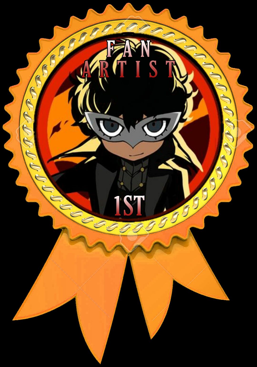
Your rewards will be delivered ASAP, but for now, here's a preview of your badge that'll be sent later! Feel free to use it however you want!
As for all the other contestants who didn't secure a place, don't worry. As mentioned before, I've prepared a gift for all of you! You've all done an amazing job and poured a lot of time and effort into your work, so it wouldn't go wasted and unrewarded at all! Your participation is very much appreciated and nothing can ever pay you back for everything you've done. As a token of gratitude, all of you will receive a thank you card signed by me, featuring our lovely original character, Emiko.
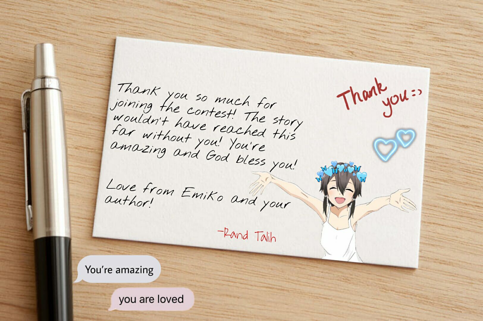
The gift will be sent to all of you either via Discord or Google Drive. So except those messages from me! UwU
The judges' gifts all be sent to them via private messages as well.
✰━━━━━━━━━━━━━━━━━━━━━━━━━━━━━━━━━━━━━━━━━━━━━━━━━━━━━━━━━━━━━━━━━━━━━━━━━━━━✰
In the end, I want to thank all of you again for making this event possible. It was a little bit of a shame since we anticipated that more people would join. We originally had plans to have 6 winners in general. And we were all sad that we had to disqualify a contestant for exceeding the deadline, but it is what it is.
We had a lot of fun judging and admiring your works, they all were beautiful in their own way. Please, don't feel down just because you didn't "win," you're all winners here! Your hands are blessed! But, we hope that this experience will be a stepping stone to all of you for further nutrition of your artistic capabilities. And as I love to say to my friends irl, "You can do it!"
Also, I'd like to thank you once more for the 100K views of this book! This event was made in the first place to celebrate all of you, because you are the ones who made this achievement possible. Despite all the difficulties, all of my writer's block, all of my slump states, all of my life's circumstances, I managed to pull it off thanks to all of your constant support.
It was because of you that I made it this far and became who I am today. Honestly, I never imagined that this book would become this popular and hit the 3 digits, I never thought that it'd become the platform of such an amazing community/fandom. You're all so supportive and loving to me and one another, I was seriously baffled to see that a non-toxic fandom like this can ever exist amidst the mess of the anime community!
In a way, you're all my heroes, my motivation, and my will to try and overcome my slump state and continue writing. I will keep writing as long as I still love anime and have a passion for it! Thank you, for everything you've done for me, for all of your support, for all of your kind words and messages, for... being there for me in my hardest times this year.
Thank you! I love you all so much! And God bless every single one of you!
Published on: Wed/Sep 29/2021
Bạn đang đọc truyện trên: Truyen247.Pro