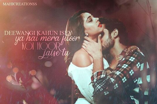
♥ Dekho Wo Agya ♥
Title of the chapter tho 🙈😂
Moving on, I'm sure many of you are excited to know the results.
We apologise for taking so much of time.
Then why, let's get started!
But before that special thank you to our judges meera55oberoi and Angelangela08
Thank you so much for your help and time guys ❤
Now the results,
Judge: Palak Muchhal (Angelangela08)
Starting with
🖌 Prompt 1 🖌
FIRST IMPRESSION (1.5/2)
What did you think about the edit when you had a first look at it?
~ It's simple and elegant. I really liked it.
DESIGN (2.5/3)
Cover design, typeface, message
~ It's conveying the message perfectly.
Interior layout, typeface, illustrations – is it easy to read; is it a pleasure to look at?
~ Yes, it's easy to read and pleasurable enough.
ORIGINALITY (2.5/2.5)
Is it a fresh approach? Has it been done too much?
~ Yes, it's a fresh approach and not done too much.
RELEVANCE (2.5/2.5)
Is the cover pertinent to the chosen prompt?
~Yes perfectly.
Total: 9/10
🖌 Prompt 1 🖌
FIRST IMPRESSION (1/2)
What did you think about the edit when you had a first look at it?
~ Good.
DESIGN (1.5/3)
Cover design, typeface, message.
~It's so simple but ok suitable with the lines.
Interior layout, typeface, illustrations – is it easy to read; is it a pleasure to look at?
~ Yes, pleasure to look but texts can be more clear.
ORIGINALITY (1.5/2.5)
Is it a fresh approach? Has it been done too much?
~ It's so common but not overdone.
RELEVANCE (2/2.5)
Is the cover pertinent to the chosen prompt?
~ Yes
Total: 6/10
🖌 Prompt 3 🖌
FIRST IMPRESSION (1.5/2)
What did you think about the edit when you had a first look at it?
~Alluring
DESIGN (1.5/3)
Cover design, typeface, message.
~ Simple and beautiful.
Interior layout, typeface, illustrations – is it easy to read; is it a pleasure to look at?
~ Yes it's pleasure to look but it's difficult to read.
ORIGINALITY (2/2.5)
Is it a fresh approach? Has it been done too much?
~Yes. No, it's not overdone.
RELEVANCE (2/2.5)
Is the cover pertinent to the chosen prompt?
~Yes
Total: 7/10
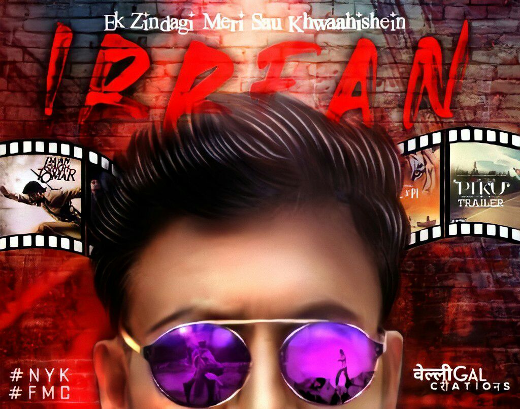
• VELLIGal
🖌 Prompt 2 🖌
FIRST IMPRESSION (1.5/2)
What did you think about the edit when you had a first look at it?
~Intriguing
DESIGN (3/3)
Cover design, typeface, message
~Everything perfect.
Interior layout, typeface, illustrations – is it easy to read; is it a pleasure to look at?
~Yes it's easy to read and it's a pleasure to look at this.
ORIGINALITY (2.5/2.5)
Is it a fresh approach? Has it been done too much?
~ Absolutely an amazing idea and presented so well. No, not done too much.
RELEVANCE (2.5/2.5)
Is the cover pertinent to the chosen prompt?
~ Yes
Total: 9.5/ 10
🖌 Prompt 1 🖌
FIRST IMPRESSION (1/2)
What did you think about the edit when you had a first look at it?
~ Good
DESIGN (1.5/3)
Cover design, typeface, message.
~It's simple.
Interior layout, typeface, illustrations – is it easy to read; is it a pleasure to look at?
~Yes and yes.
ORIGINALITY (1.5/2.5)
Is it a fresh approach? Has it been done too much?
~Yes it quite fresh.
RELEVANCE (2/2.5)
Is the cover pertinent to the chosen prompt?
~ Yes
Total: 6/10
🖌 Prompt 2 🖌
FIRST IMPRESSION (1/2)
What did you think about the edit when you had a first look at it?
~It's nice.
DESIGN (1.5/3)
Cover design, typeface, message.
~Message is not so clear.
Interior layout, typeface, illustrations – is it easy to read; is it a pleasure to look at?
~yes it's OK.
ORIGINALITY (1/2.5)
Is it a fresh approach? Has it been done too much?
~ It's done too much, things are not so clear.
RELEVANCE (1/2.5)
Is the cover pertinent to the chosen prompt?
~ No
Total: 4.5/10
@sunshine-in-disguise
🖌 Prompt 2 🖌
FIRST IMPRESSION (1/2)
What did you think about the edit when you had a first look at it?
~ simple but unique.
DESIGN (1.5/3)
Cover design, typeface, message.
~ the message is not so clear.
Interior layout, typeface, illustrations – is it easy to read; is it a pleasure to look at?
~ yes and yes.
ORIGINALITY (1.5/2.5)
Is it a fresh approach? Has it been done too much?
~ Yes fresh approach
RELEVANCE (1.5/2.5)
Is the cover pertinent to the chosen prompt?
~ Yes.
Total: 5.5/10
• SSO_8389
🖌 Prompt 1 🖌
FIRST IMPRESSION (1/2)
What did you think about the edit when you had a first look at it?
~ Good.
DESIGN (1.5/3)
Cover design, typeface, message
~ It's so simple but the message was missing.
Interior layout, typeface, illustrations – is it easy to read; is it a pleasure to look at?
~ Yes
ORIGINALITY (1.5/2.5)
Is it a fresh approach? Has it been done too much?
~yes, it's a fresh approach.
RELEVANCE (0.5/2.5)
Is the cover pertinent to the chosen prompt?
~ no
Total: 4.5/10
• SSO_8389
🖌 Prompt 2 🖌
FIRST IMPRESSION (1/2)
What did you think about the edit when you had a first look at it?
~ It's nice.
DESIGN (1.5/3)
Cover design, typeface, message.
~ Message is not clear.
Interior layout, typeface, illustrations – is it easy to read; is it a pleasure to look at?
~yes.
ORIGINALITY (1.5/2.5)
Is it a fresh approach? Has it been done too much?
~ yes, it's crisp.
RELEVANCE (0.5/2.5)
Is the cover pertinent to the chosen prompt?
~ No
Total 4.5/10
£•£•£•£•£
Judge: Darshan Raval (meera55oberoi)
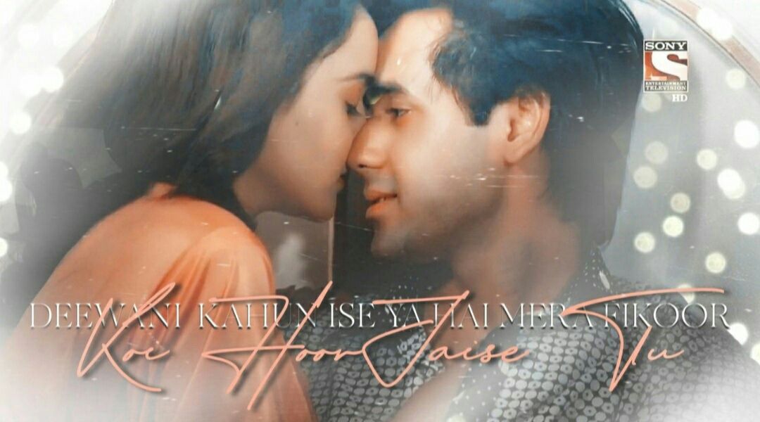
• ElysianCoral
🖌 Prompt 1 🖌
FIRST IMPRESSION- 1.5/2 marks.
What did you think about the edit when you had a first look at it?
~ I really loved it.
DESIGN- 2.5/3 marks
Cover design, typeface, message.
~ It's quite good and clean.
Interior layout, typeface, illustrations – is it easy to read; is it a pleasure to look at?
~ Yes, it's easy to read and a pleasure to look at.
ORIGINALITY- 2.5/2.5 marks
Is it a fresh approach? Has it been done too much?
~ Its a fresh approach.
RELEVANCE- 2/2.5 marks
Is the cover pertinent to the chosen prompt
~Yes.
Total: 8.5/10
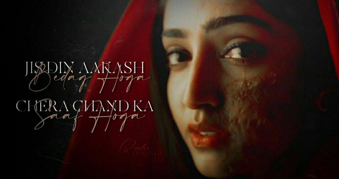
• VELLIGAL
FIRST IMPRESSION- 2/2 marks.
What did you think about the edit when you had a first look at it?
~ It's eye-catching.
DESIGN- 2/3 marks
Cover design, typeface, message.
~ Its good. The cover design is eye-catching. The typeface is also good and clean.
Interior layout, typeface, illustrations – is it easy to read; is it a pleasure to look at?
~ It's a pleasure to look at and easy to read.
ORIGINALITY- 2.5/2.5 marks
Is it a fresh approach? Has it been done too much?
~ It is a fresh approach.
RELEVANCE- 2.5/2.5 marks
Is the cover pertinent to the chosen prompt?
~ Yes
Total: 9/10
• tHe_LiTtLe_mOrPhEuS
🖌 Prompt 1 🖌
FIRST IMPRESSION- 1.5/2 marks.
What did you think about the edit when you had a first look at it?
~ It's good.
DESIGN- 1.5/3 marks
Cover design, typeface, message.
~ It's simple but beautiful
Interior layout, typeface, illustrations – is it easy to read; is it a pleasure to look at?
~ It's a pleasure to look at but difficult to read.
ORIGINALITY- 2/2.5 marks
Is it a fresh approach? Has it been done too much?- Yes, it is a fresh approach.
RELEVANCE- 2/2.5 marks
Is the cover pertinent to the chosen prompt?
~Yes
Total: 7/10
• tHe_LiTtLe_mOrPhEuS
🖌Prompt 3 🖌
FIRST IMPRESSION- 1.5/2 marks.
What did you think about the edit when you had a first look at it?
~ It's beautiful especially the thought behind this.
DESIGN- 2/3 marks
Cover design, typeface, message.
~ Simple and beautiful.
Interior layout, typeface, illustrations – is it easy to read; is it a pleasure to look at?
~ Its a pleasure to look at but a little difficult to read
ORIGINALITY- 2.5/2.5 marks
Is it a fresh approach? Has it been done too much?
~ It is.
RELEVANCE- 2 /2.5 marks
Is the cover pertinent to the chosen prompt?
~ Yes
Total: 8/10
• sunshine_in_disguise
🖌 Prompt 2 🖌
FIRST IMPRESSION- 1.5/2 marks.
What did you think about the edit when you had a first look at it?
~ It's good but very simple.
DESIGN- 1.5/3 marks
Cover design, typeface, message.
~ It's simple.
Interior layout, typeface, illustrations – is it easy to read; is it a pleasure to look at?
~ It's nice but not very clear to read.
ORIGINALITY- 1.5/2.5 marks
Is it a fresh approach? Has it been done too much?
~ It is.
RELEVANCE- 1.5/2.5 marks
Is the cover pertinent to the chosen prompt?
~ Yes
Total: 6/10
• neha_loves_ishqbaaz
🖌 Prompt 1 🖌
FIRST IMPRESSION- 1.5/2 marks.
What did you think about the edit when you had a first look at it?
~ It's nice
DESIGN- 1.5/3 marks
Cover design, typeface, message.
~ It's simple.
Interior layout, typeface, illustrations – is it easy to read; is it a pleasure to look at?
~ It's nice but not very clear to read.
ORIGINALITY- 1/2.5 marks
Is it a fresh approach? Has it been done too much?
~ Yes. It's a fresh approach.
RELEVANCE- 1 /2.5 marks
Is the cover pertinent to the chosen prompt?
~ No
Total: 5/10
• neha_loves_ishqbaaaz
🖌 Prompt 2 🖌
FIRST IMPRESSION- 1.5/2 marks.
What did you think about the edit when you had a first look at it?
~It's simple but good.
DESIGN- 2/3 marks
Cover design, typeface, message.
~ It's nice
Interior layout, typeface, illustrations – is it easy to read; is it a pleasure to look at?
~It's good but not very clear to read.
ORIGINALITY- 1.5 /2.5 marks
Is it a fresh approach? Has it been done too much?
~Yes. It's a fresh approach.
RELEVANCE- 1.5/2.5 marks
Is the cover pertinent to the chosen prompt?
~Yes
Total: 6.5/10
• SSO_8389
🖌 Prompt 1 🖌
FIRST IMPRESSION- 1/2 marks.
What did you think about the edit when you had a first look at it?
~It's simple
DESIGN- 1/3 marks
Cover design, typeface, message.
~ It's nice.
Interior layout, typeface, illustrations, Is it easy to read? Is it a pleasure to look at it?
~ It's good but not very clear to read. But it should be of the size of the banner.
ORIGINALITY- 1/2.5 marks
Is it a fresh approach? Has it been done too much?
~ Yes it is a fresh approach.
RELEVANCE- 1 /2.5 marks
Is the cover pertinent to the chosen prompt?
~ No
Total: 4/10
• SSO_8389
🖌 Prompt 🖌
FIRST IMPRESSION- 1/2 marks.
What did you think about the edit when you had a first look at it?
~It's simple
DESIGN- 1/3 marks
Cover design, typeface, message.
~ It's nice.
The approach is good but the message is not clear according to the prompt.
Plus it should be of the size of the banner.
ORIGINALITY- 1/2.5 marks
Is it a fresh approach? Has it been done too much?
~ Yes it is a fresh approach.
RELEVANCE- 1 /2.5 marks
Is the cover pertinent to the chosen prompt?
~ No
Total: 4/10
£•£•£•£•£
|♦| Total Marks Scored|♦|
1) VELLIGal:
9.5 = 9 = 18.5
2)ElysialCoral:
9 + 8.5 = 17.5/20
3) tHe_LiTtLe_mOrPhEuS :
7 + 8 = 15/20 (Prompt 3)
4) tHe_LiTtLe_mOrPhEuS:
6 + 7 = 13/20 (Prompt 1)
5) sunshine_in_disgusise:
5.5 + 6 = 11.5/20
6) neha_loves_ishbaaaz:
4.5 + 6.5 = 11 (Prompt 1)
7) neha_loves_ishbaaaz:
5.5 + 6.5 = 11 (Prompt 2)
8) SSO_8389:
4.5 + 4 = 8.5/20 (Prompt 1)
9) SSO_8389:
4 + 4 = 8/20 (Prompt 2)
•♣•♦•♣
I think the result is pretty much clear.
Congratulations to those who are selected for round 2 and those who didn't please don't get dishearten there'll be plenty of opportunities for you to showcase your talent. I hope you have enjoyed making edits and had a good experience here.
Good Luck!
*The promised review for the eliminated entries is posted in the next chapter.* \
~* Designs selected for Round 2 ~*
By ElysianCoral
By VELLIGal
#Musicophilias
FMC 💙🎶
Bạn đang đọc truyện trên: Truyen247.Pro