Pixel art #5
First of all and before showing you the new ones, I have edited the previous pixel arts. Here are the new versions:
You probably can't see the difference because it's not obvious at all. The upper squares of the blazons are a bit larger (in height). I added a 1 pixel line because in the first version they were actually rectangles and not squares. Here it's almost unnoticeable but it would have been different with the next blazons since they are made from the same base:
.
.
.
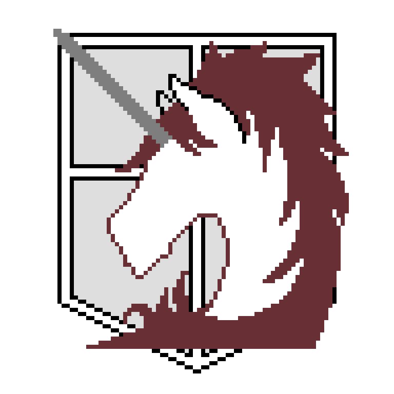
NEW PIXEL ARTS:
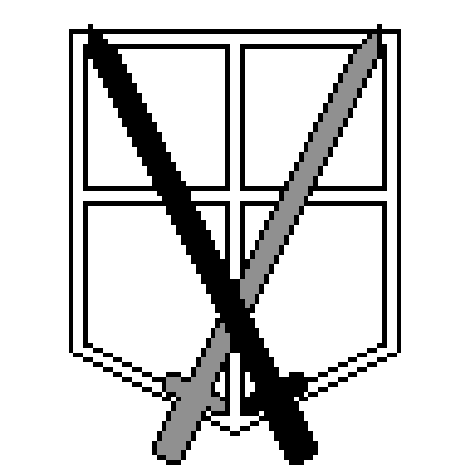
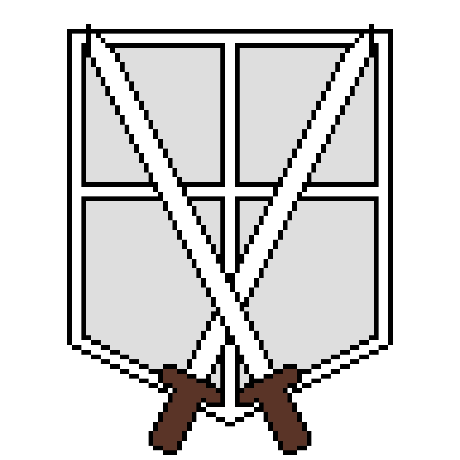
Here are the Military Police Blazon as a pixel art, in both manga and anime versions:
Manga colors
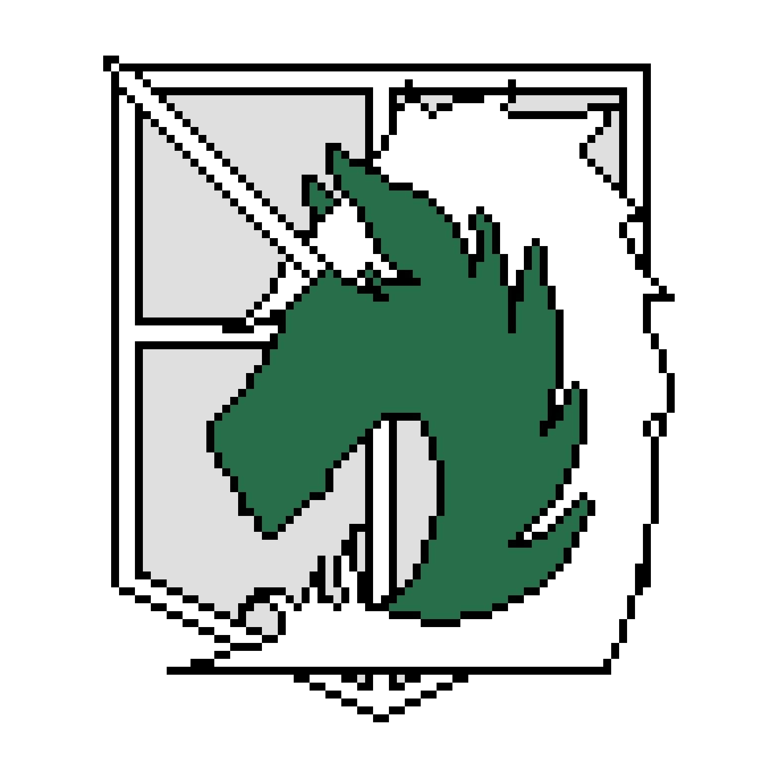
Anime color
Which one do you prefer? (I personally like the anime one again, it's always better with colors, and I like the white hair)
Please give me your opinion about these works! I'm kinda proud of it because they look just like the original logos. But I took me forever to make it as accurate as I wanted it to be. It took me hours to do, probably around 10 in total. Yes I'm extremely slow XD
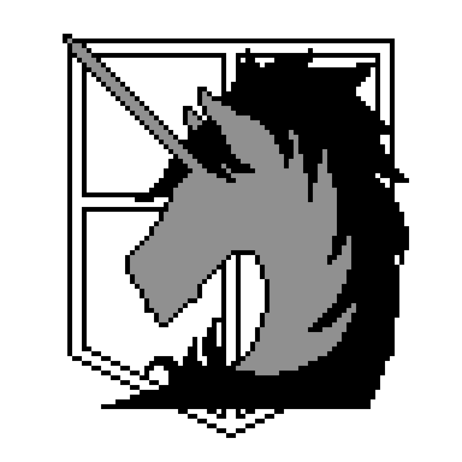
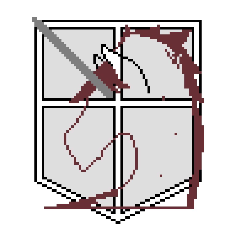
How the work progressed:
I'm sorry I should have taken more screenshots in the beginning but I wasn't thinking about explaining here how I did this. If it interest you, I'll do it for the next time. If not just tell me so that I don't waste time for nothing ^^
First thing I did: the horn. It's geometric, easy to place, exactly in the diagonal of the square.
Then the bottom line, geometric as well. Geometric shapes are obviously the easiest things to draw and to place in a pixel art. Afterwards they are useful to draw the rest because they can be used as points of reference.
Then the left part of the horse. It was modified after this screenshot but I always do like that. I draw, and then I modify gradually until I have the perfect shape.
After that I did the ears because it's pretty easy since it's a regular curve.
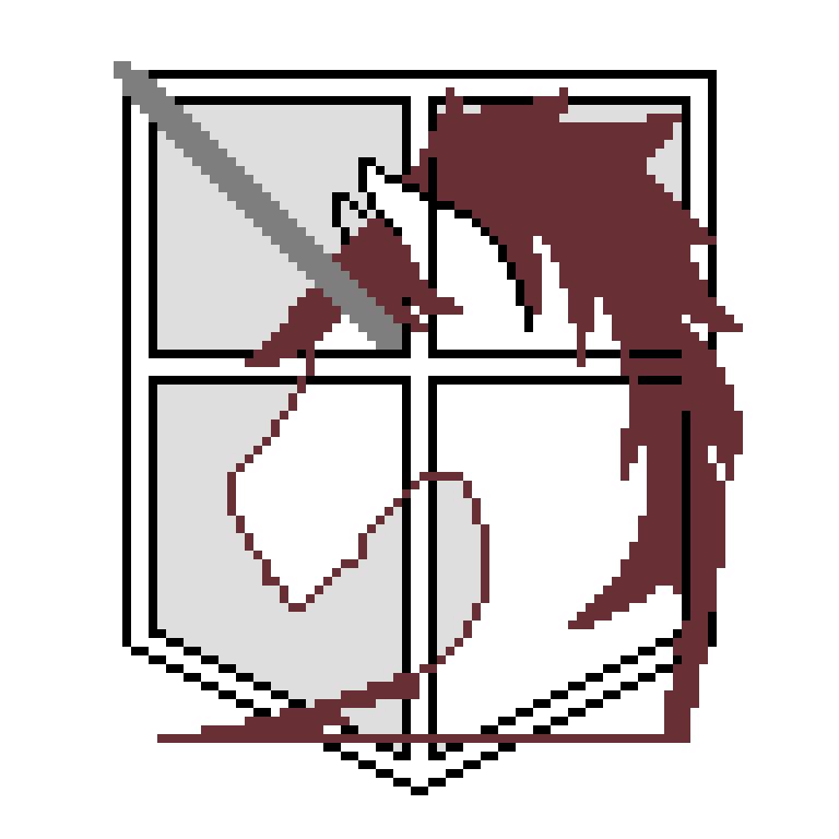
But then came the hair. It was hard as hell. You can easily figure that this kind of thin shapes are difficult to do. I tried to place the tips of the hair but it was still rather hard. It evolved gradually while I modified what I did in the beginning.
A
dding the hair... (it took a while, no kidding). When I first drew it it was awful.
Adding the hair on the neck... (And little modifications of course)
Final editing...


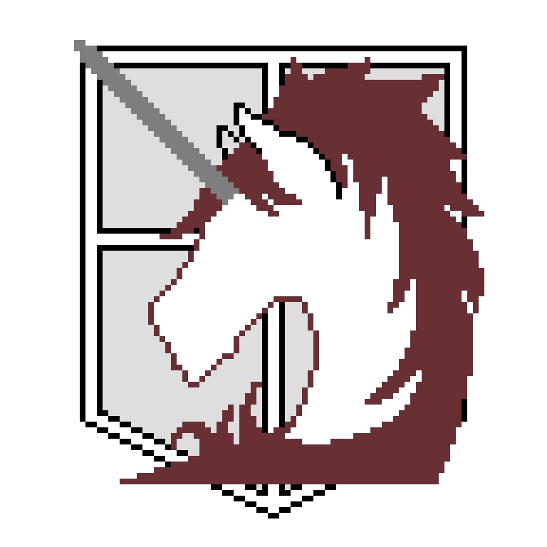
Colorizing... (and last rectifications)
I don't put the right colors in the first place so that I can easily differentiate the different parts (the hair and the background for example) that can have the same color in the end.
Do you like the result? :)
Bạn đang đọc truyện trên: Truyen247.Pro