Art Tutorial #1: Mapping the Human Face
Hey guys! Welcome to my first art tutorial!
I'm going to be showing the Daniel Greene method of face mapping today, which I have found to be the easiest and most effective method to understanding proportions. This has been requested a few times, and I know the face can be one of the hardest (and most avoided) tasks when it comes to art. I hope this helps all of you reading this become more realistic artists.
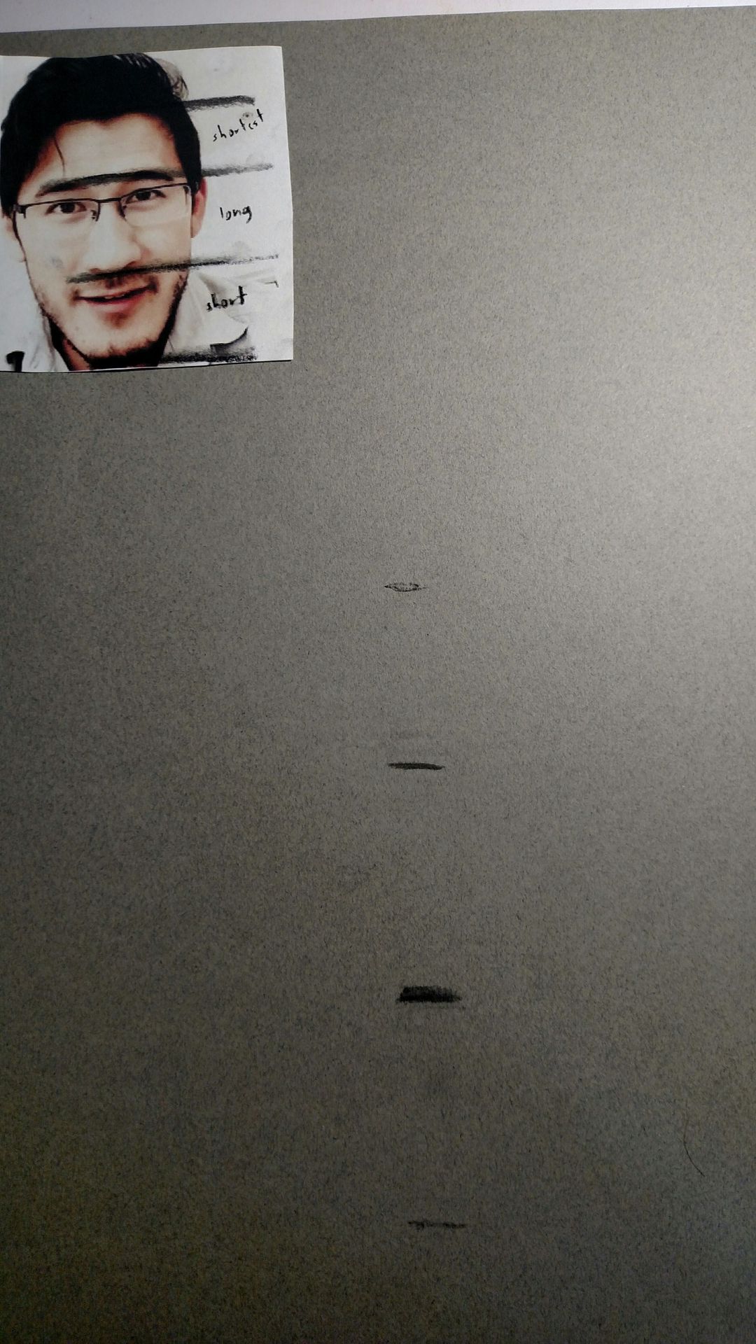
Im starting off today with a black and white drawing of Markiplier. For beginners, I suggest finding a face that is streight on and not tilted, because that adds a whole new level of difficulty and we want to be focusing on proportions, not foreshadowing. A self portrait would actually work best for beginners, because the camera flattens and skews proportions, but do what you think is best. (Try too avoid glasses and beards as well. For this tutorial we're going to largely ignore Mark's)
I am drawing this on toned grey paper, which I find more forgiving than white paper. It is hot pressed so it's super smooth and doesn't have a tooth (grain), but it also doesn't hold pigment well so I only suggest hot pressed paper when drawing with charcoal.
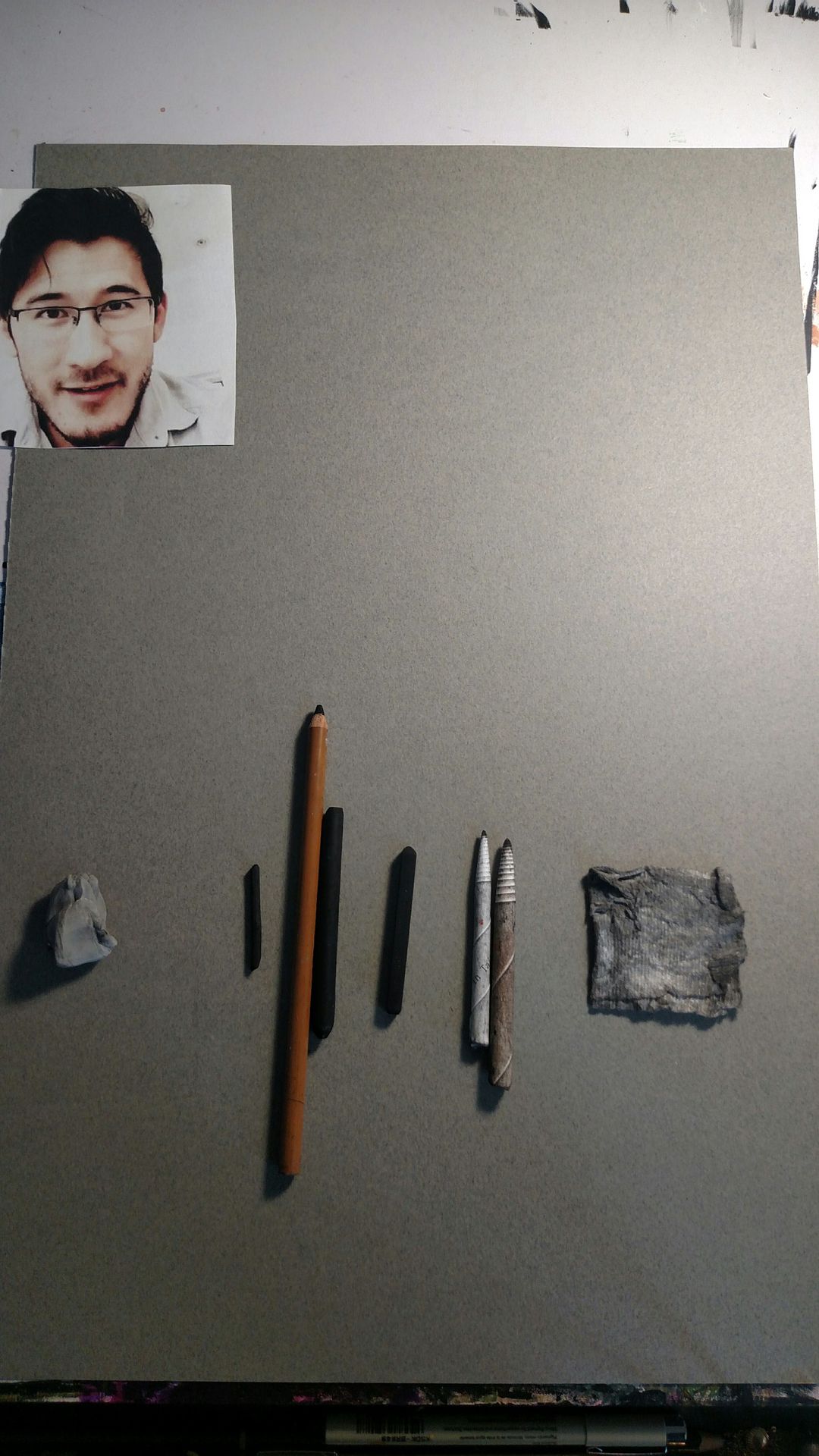
My supplies include:
Kneaded eraser (also known as dustless)- a putty that is easily cleaned by pulling and is gentle on paper. Can be twisted into a point and can lift pigment.
Vine charcoal- A thin, soft charcoal that I use for sketching. Can be easily brushed away.
Compressed charcoal- comes in pencil and stick form. I rarely use the stick unless I need to fill in dark areas (like hair) and don't want to turn my pencil into a nub. It's super dark, but doesn't come off easily and isn't that great to smudge either.
Conte crayon- even darker than compressed charcoal (and a little cheaty, but I won't tell anyone). It's a waxy, pure black that can't be achieved with charcoal.
Smudging sticks- rolled up paper used for harder smudging, can be cleaned by rubbing it against another piece of paper. Does show streaks so it's not good for skin.
Toilet paper/tissue- I used to use tissue, but I found a piece of toilet paper works better (it has to have a high ply though). Creates very soft values and is great for skin tone, but removes almost all of the pigment.
I will only be using vine charcoal and my eraser for this part of the tutorial, but you will see me use the pencil for measuring. This method can be used with pastels, paints, pencil, but I always suggest vine charcoal to start because it's so easy to erase and leaves no marks.
Let's get started!!
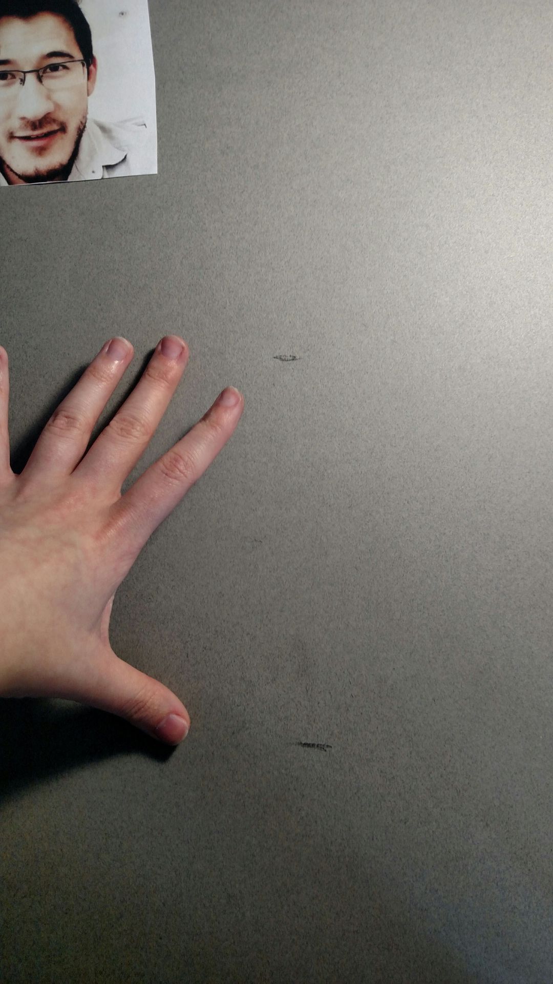
So we're going to start off by marking out our face. I use my thumb and middle finger to roughly get the size from the bottom of the chin to the hair line. (Try it out on your own face, it works)
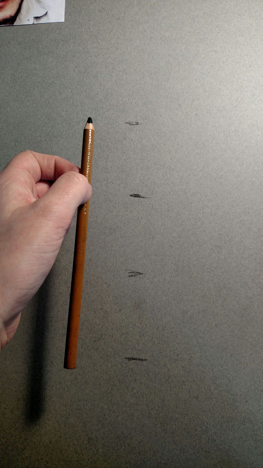
Next, using your pencil, split the face into even thirds. The second line will be the top of the eyebrows, and the third will be the bottom of the nose. This might take a while, but it's easy to get the hang of.
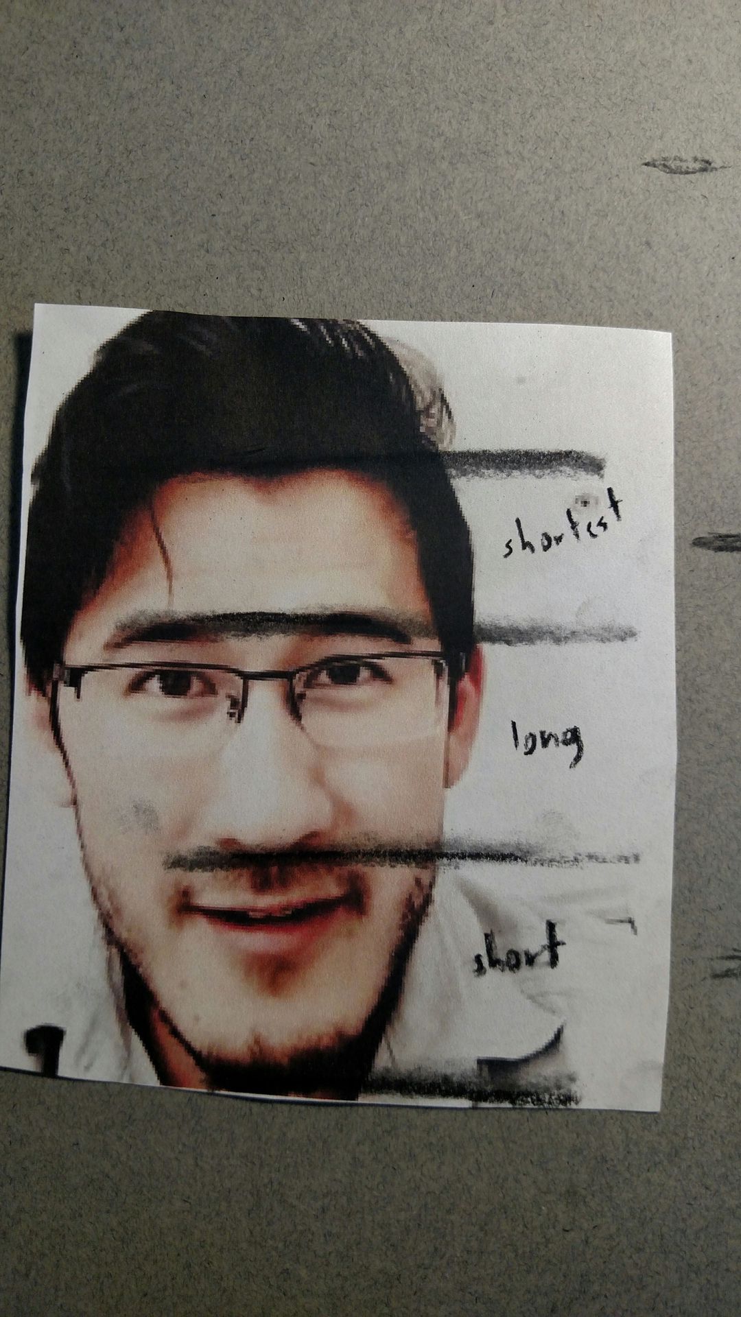
That gives us our starting point, but not all faces follow that kind of proportion. Measure out your picture (or if you're doing a self portrait, always use a straight arm when measuring your face in a mirror) and determine which sections of the face are longest and shortest. In Mark's case, his forehead is shortest, and the middle section of his face is just slightly longer than the section from the bottom of his nose to chin.
Do not be impacient with this step, and don't touch the top and bottom line. This gives you a growing/shrinking head and, especially if you're head is on a body, you will throw off your proportions. This is a very important step, and can make or break your portrait. Take your time.
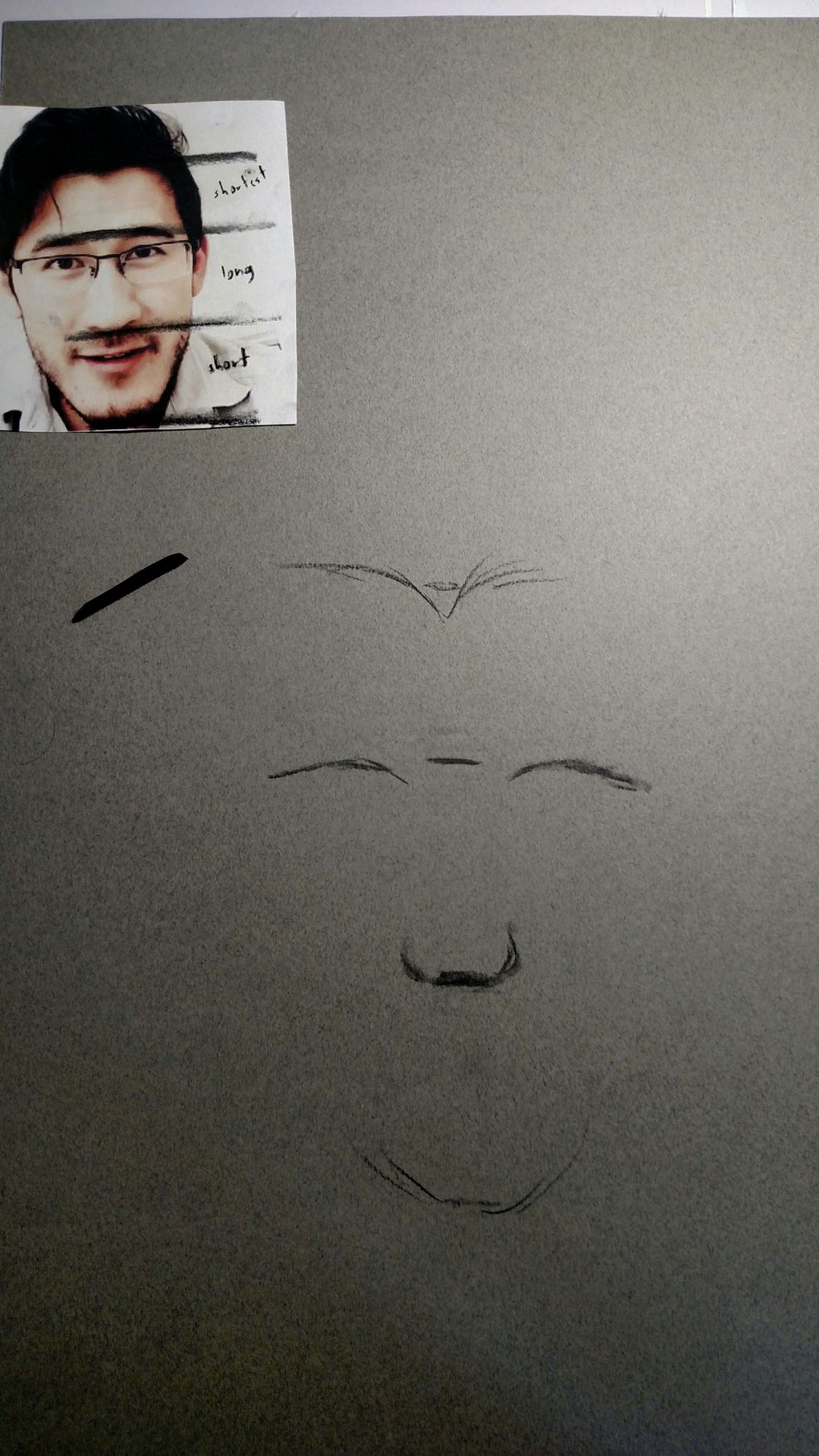
It's time to start marking off what we know. Mark has a slight widows peak, so I added that in, but a normal hairline will match up with your top line. The next line is the top of the eyebrows, then the bottom of the nose, and then the chin. Don't worry about being too precise right now.
We are going to draw in the thickness of the eyebrows, eyelids (Mark's are nonexistent), and the bottom of the eyes. Next comes the mouth thickness. Use your pencil again to measure and determine which section from nose to bottom lip and bottom lip to chin, is longer, and then draw in the thickness of each lip (Mark's top lip is almost nonexistent as well, so I didn't draw it in)
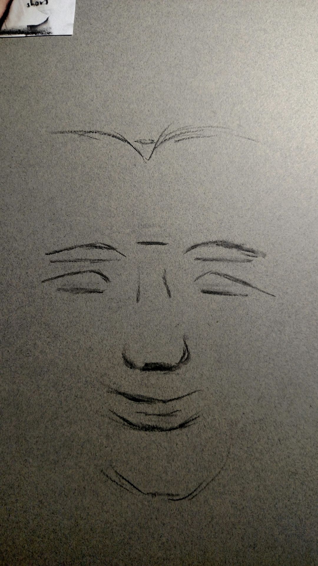
Now that we have all the vertical proportions done, it's time to clean some of this up. The space between the eyes are one eye length, and subsequently a half an eye length away from the face dividing line. Add in the irises as well, because they will be later used as measurements. Make sure they are both the same size.
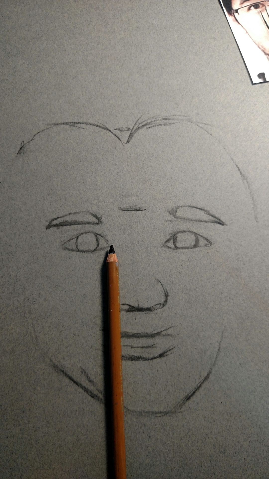
The nose comes next. The edge of the nostril will always match up with the inner corner of the eye (unless a person is smiling, then it may go past it, depending on how hard they are smiling and how it effects their nose).
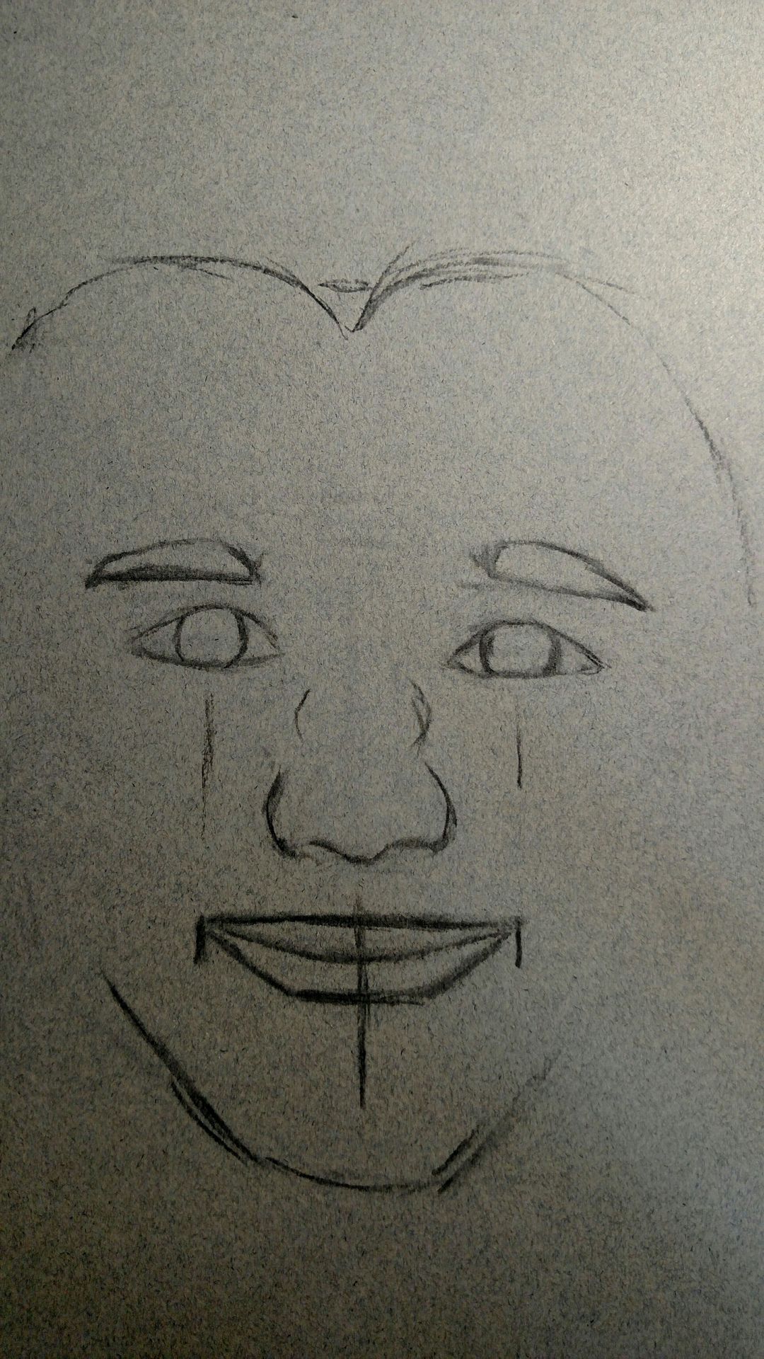
Last we are going to work on the horizontal proportions of the mouth. Typically, the corners of the mouth line up with the inside edge of each iris, however, Mark is slightly smiling, so his line up with the center of the Iris. Use your pencil to determine which part of the Iris your lip corners line up with. Remember these are just guidelines, so as long as you have the important points and thickness correct, it doesn't need to look perfect.
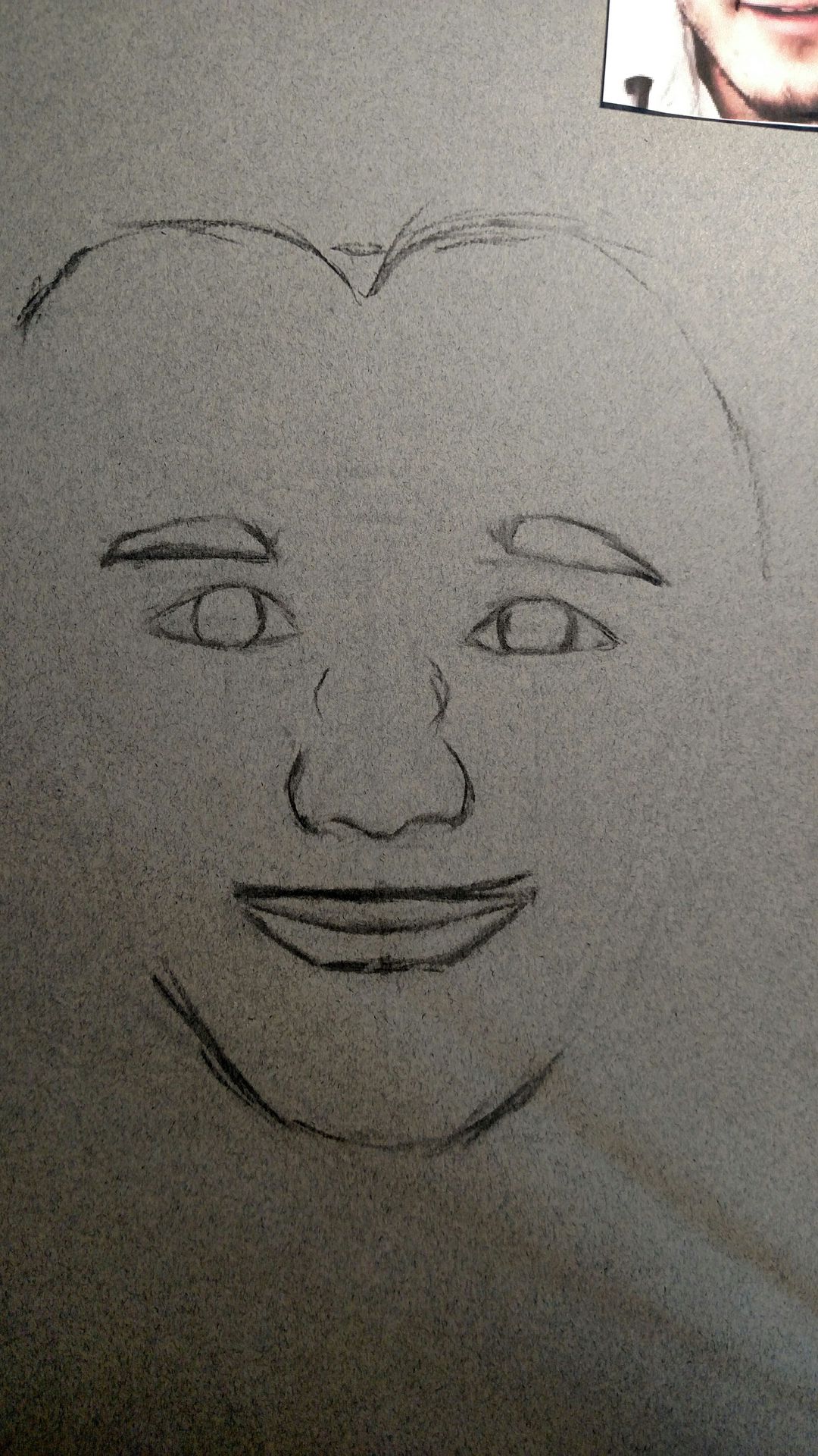
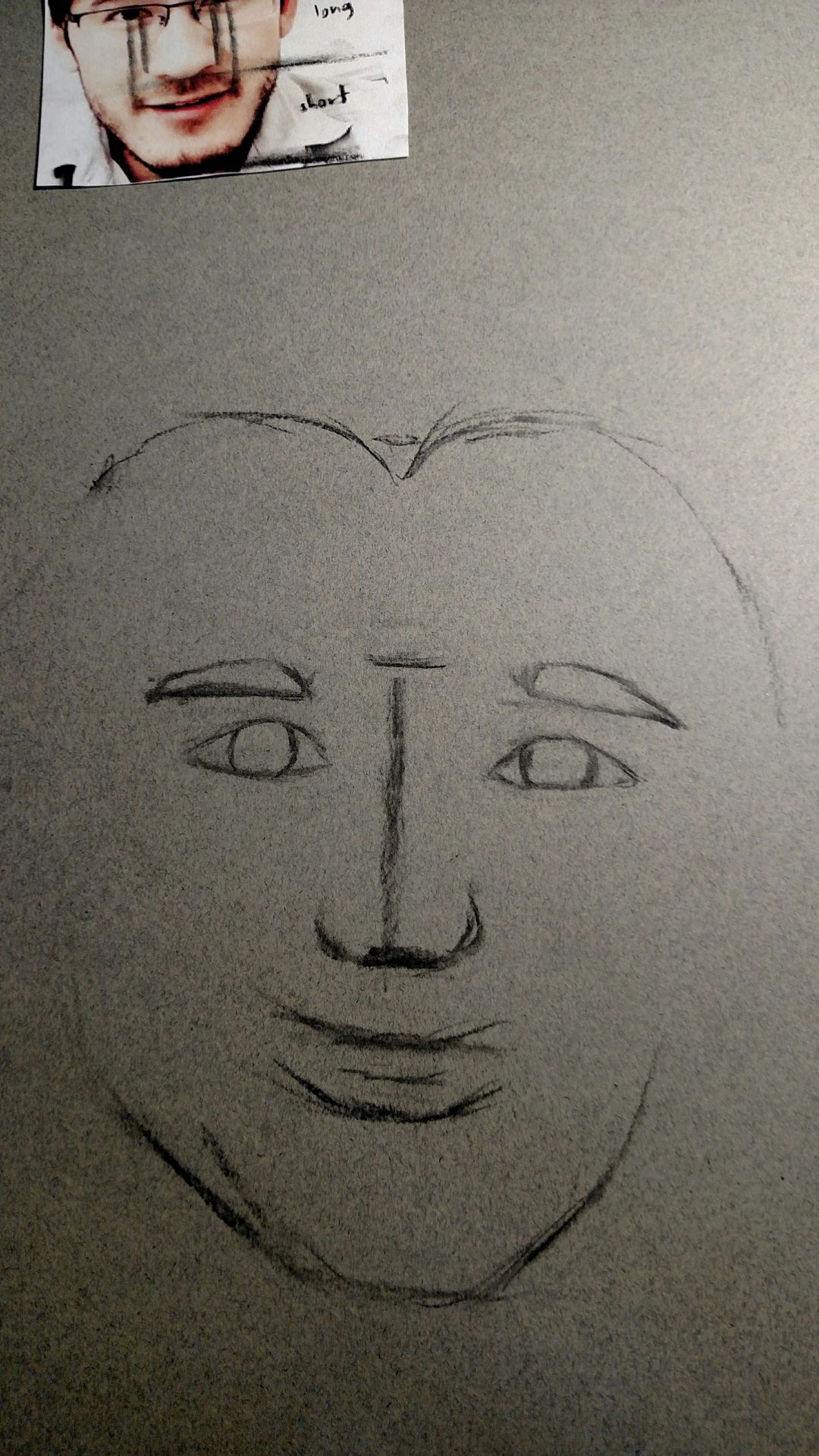
And there we go! A good starting point for a realistic portrait! After this, filling in the details is a piece of cake!
In my next tutorials, I will show you guys how to do eyes, mouths, noses, skin, and hair! I'd love to see your attempts at face mapping using this technique, and feel free to tell me what you thought of this tutorial!
Bạn đang đọc truyện trên: Truyen247.Pro