| 𝔯𝔢𝔰𝔲𝔩𝔱𝔰 |

score: 41/50
thoughts: i love the bright colors you went with. i feel like the title could have been placed above tiana, but i can understand why you wanted to put it over the glowing circle. good job!
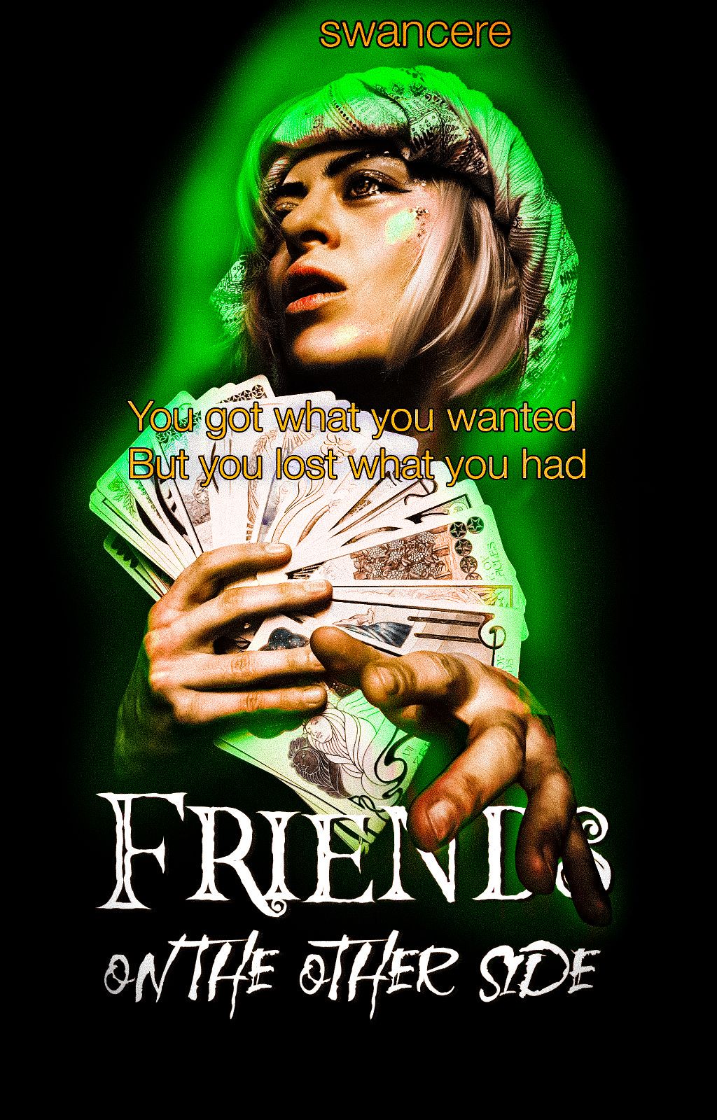
score: 40/50
thoughts: i like that you have the glow around the person. you also have cards which is in the song. the cover overall looks 3d as the hand goes over the text. the only thing i would like to see you improve on is the text placement, specifically for the subtitle and the authors name. wonderful job!
•____________________________•
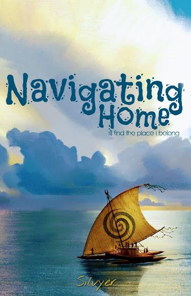
score: 26/50
thoughts: i notice that your title is not a listed song in the movie moana. maybe next time you could try to use a better quality image and use more layers. i look forward to seeing your final product in the next round. well done!
Ang
— did not submit —
(DISQUALIFIED)
•____________________________•
DISTRICT NINE: HUNDRED ACRE WOOD
Mars

score: 43/50
thoughts: you have a nice cover overall, but the subtitle looks odd the way you did it and the balloon appears to be too bright when everything else is darkened. i like that you made eeyore into a vector. good job!

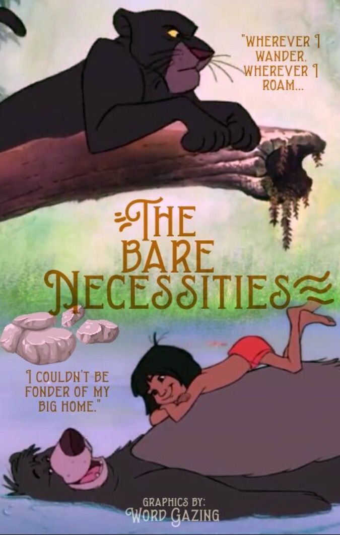
score: 43/50
thoughts: i love that you chose to do a light color scheme with your district, however, since it is already so light it was a bit difficult to read the text. it was very interesting to see the honey dripping from the cover, that was cute. great job!
•____________________________•

score: 44/50
thoughts: i like what you did with your cover: the title is you can fly and you chose to trap the fairy in a jar so it could fly, but it would be stuck. the final product is a bit fuzzy, but the font looks nice and simple. good job!
Fillia
— did not submit —
(DISQUALIFIED)
•____________________________•
DISTRICT ELEVEN: ANCIENT RUINS
Shay

score: 39/50
thoughts: i like how simple this is, it actually does resemble a real book cover. the only bad thing i have to say is that the text could have been lower to the bottom of the cover and the image is very blurry on my side. with that said, well done!
score: 38/50
thoughts: the cover seems plain to me, but the text placement is good and can be clearly read. next time, be sure to choose better quality images for more points in the future. wonderful job!
•____________________________•
DISTRICT TWELVE: NOTTINGHAM
Cowgirl
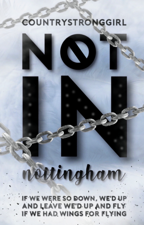
score: 48/50
thoughts: i love how you chose to do a text based cover, it looks so beautiful! it is simple, but effective. great job!

score: 42/50
thoughts: you used a great amount of layers, so that is great! i like the dark and foggy look to it. however, since it is so dark, i would say that changing the font color to something brighter would have looked better, in my opinion. good job!
Bạn đang đọc truyện trên: Truyen247.Pro