── cover dump

I made some new covers and i like them very much so I had to share. I've been wanting to become better at making covers anyways so these were a great practice lmao.

This was supposed to look totally different but it turned into this and I think it still looks good anyway! When I first made it I thought it looked really cool, but after making the rest of these I thought the rest were way cooler— 😳 honestly the more I look at this one the more I'm not liking it 😩 ughhh I just need to stop looking at it.

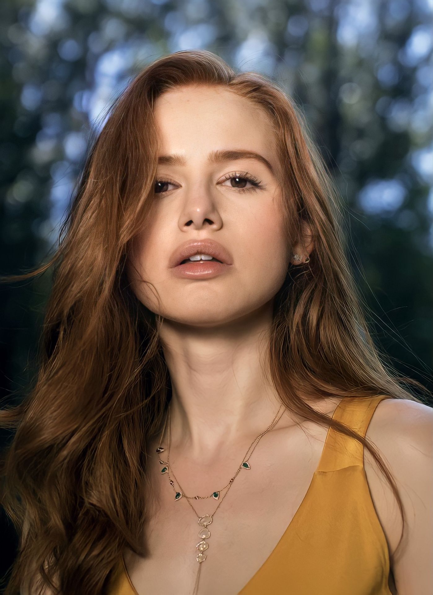
This one wasn't even supposed to be a cover I just wanted to practice doing highlights and seeing if I could change her hair color! And omg in this picture she was previously wearing a necklace!! I bet you couldn't tell! 👀
This is what the picture looked like before i did all the editing that i did...

This one was such a pain to do omg. It's mostly cause they didn't really have good pics that I could put together and it make sense. But I finally came up with something when I found a good picture of Cody saintgnue. Idk where the idea to put the branches came from but I love them!!
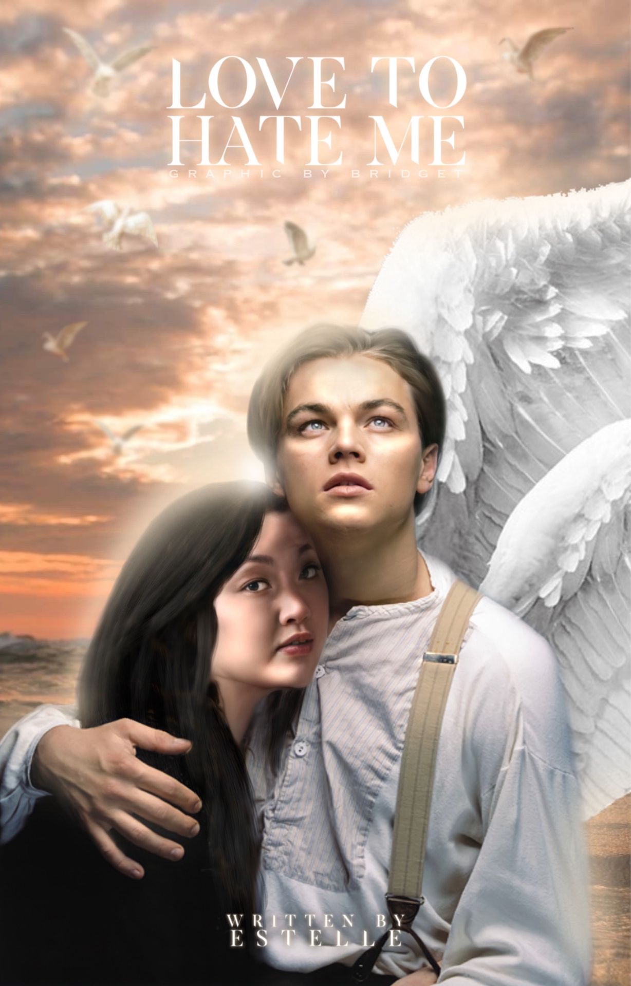
Ahhhhhhh and this one!!!!! My newest graphic!! This was the first time I've made a cover where the people actually look like they're together and I think it ended up looking really good!! I love everything about it! Like the little birds in the background and the sun peaking through between them! And I had to draw on all her hair!! This took me so long lmaoo but it ended up looking amazing!!
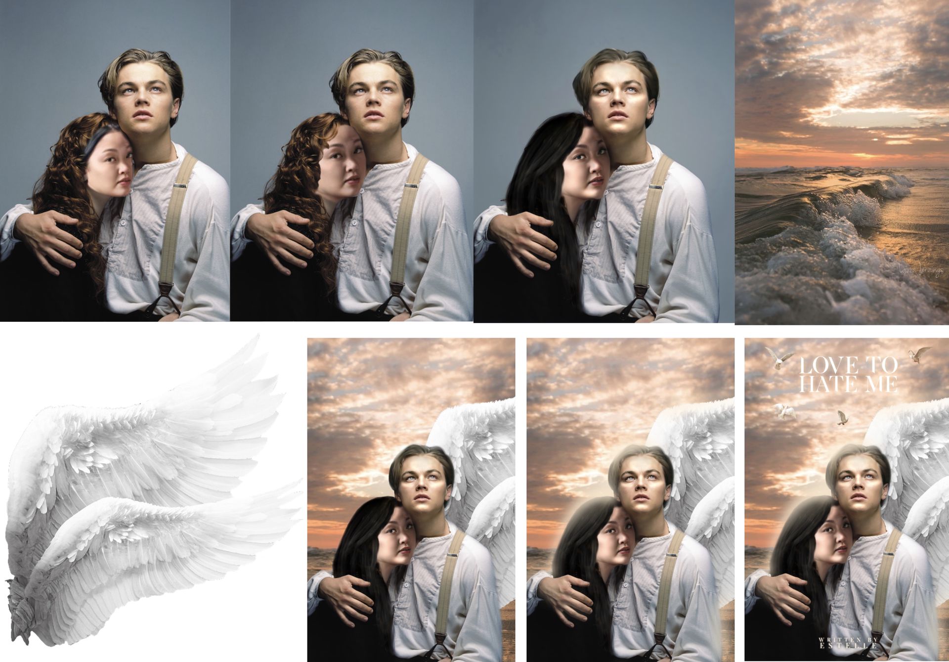
Here's a rough look at this tragic processes! I laugh so hard when I look at the first wanna be manip. But the I repositioned her head and made it look a little more real. Then I literally drew her hair on with a hair like brush on ibispaintx and blended her neck in so it wouldn't look weird. Finding the background for this was the hardest cause I didn't know if i should make it a light or dark background. I ended up choosing light for some reason but i think it ended up looking really good!! After that i added a glow around them and then when I went to put the title on there I felt like there was too much empty space so i added the little birds then blurred them so they would look better blended in with the background! I then fixed a few tings up and there it was!
(You guys probably didn't read this but that's okay, ill just come back to it when I needed to remember my thought process of making this lmao)

After making all those crazy hard ones I thought I should calm down and make something simple! It took me forever to decide where I should put the "POV" but I love the idea of the magazine letters. The little butterflies in the back are super cute! When I started making this cover I thought it would be so easy to find pics of Ariana and it is, but a lot of the pics aren't exactly what I needed!
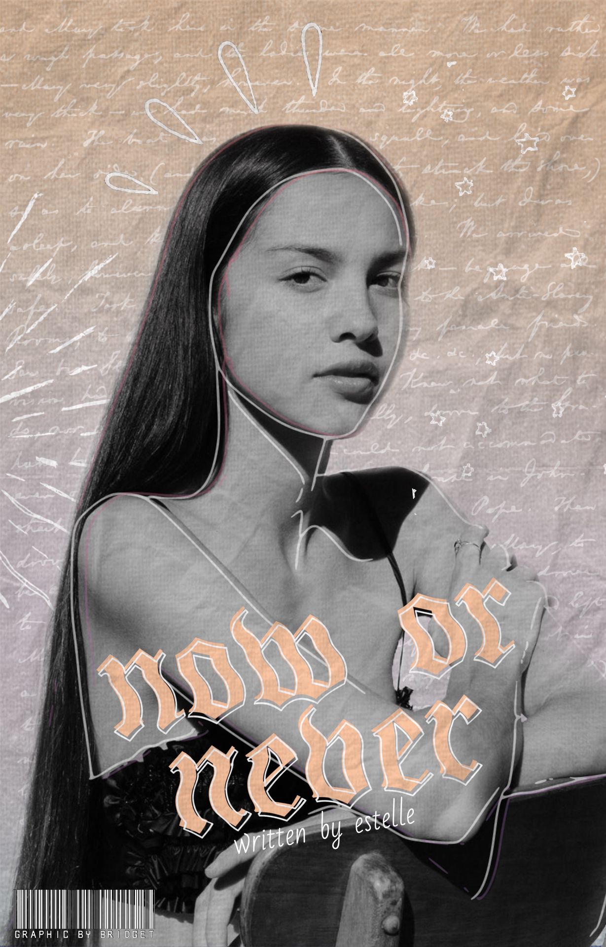
This one is kinda like my cover for this book, but I did want to make it a little different! I like the bottom left corner where I changed my "graphic by bridget" thing into a little barcode. I wanted it to kinda look like a notebook?
Is it the inside or the outside of the notebook? The world may never know!
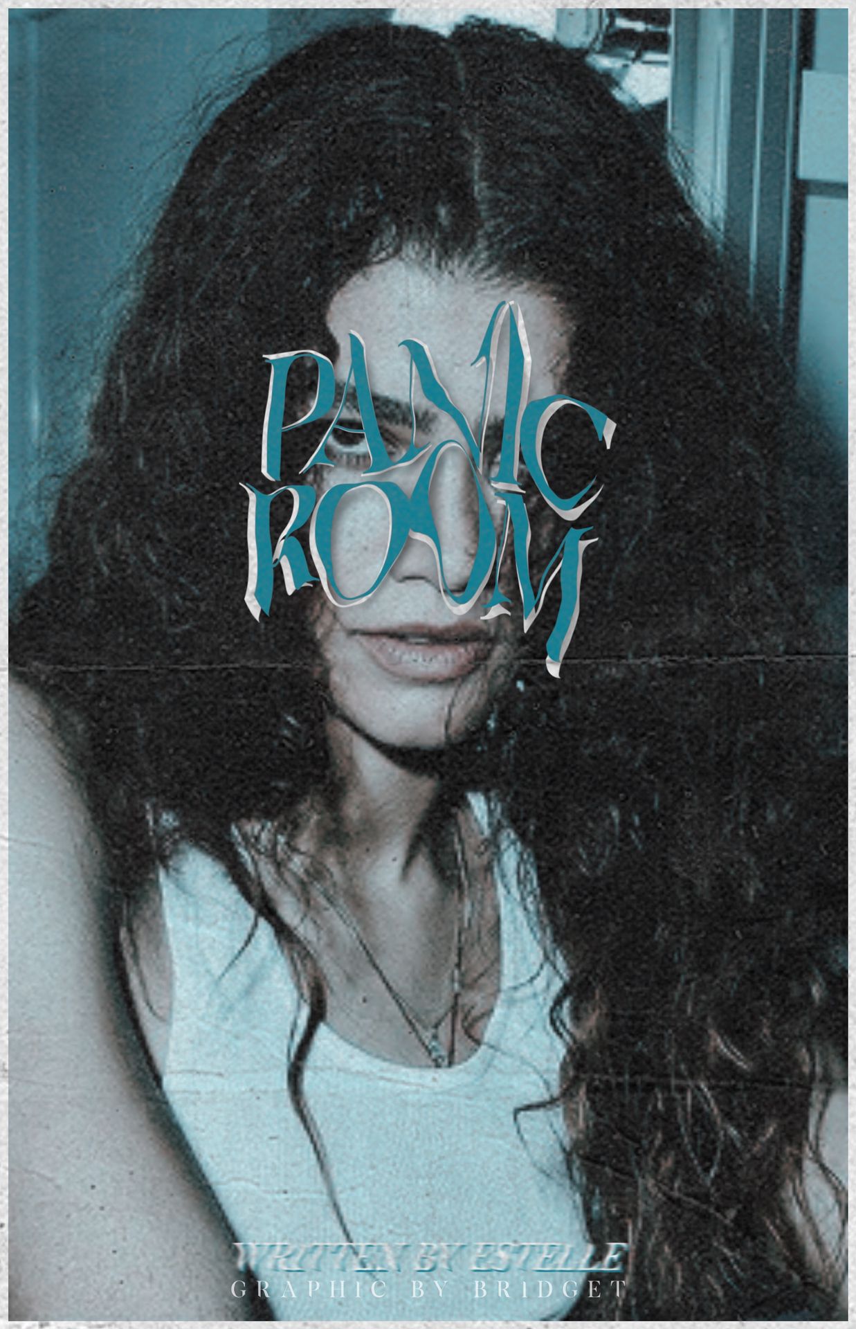
I got this idea from an edit I saw on Pinterest! I'll try to link it in the comments if I find it! I wanted to make a triply cover that still looked pretty cool. It looks good for my first time but i'm still kinda iffy about it.

Bạn đang đọc truyện trên: Truyen247.Pro