graphic advices 1/2
━ graphic advices 1/2
┈┈┈┈┈┈┈┈┈┈┈┈┈┈┈┈┈┈┈┈┈┈┈┈┈┈┈┈
find the right size - (in pixel sizes, px)
cover: 512 x 800 or 1024 x 1600
icon: 500 x 500 or 800 x 800
header: 1920 x 600
banner: 800 x 200
movie poster: 1500 x 1200
┈┈┈┈┈┈┈┈┈┈┈┈┈┈┈┈┈┈┈┈┈┈┈┈┈┈┈┈
know the kind of styles
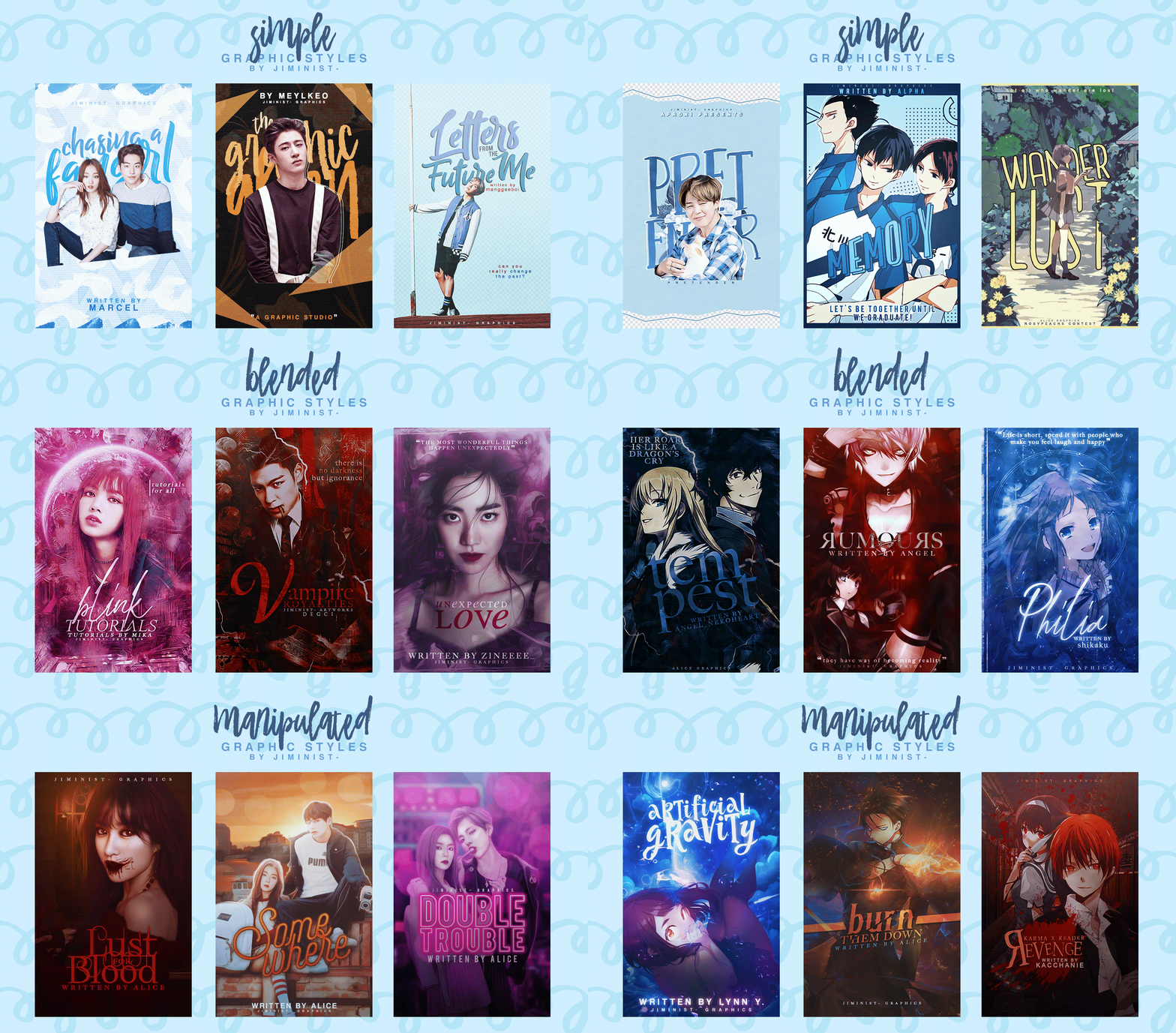
simple: may vary as it in can include something very lightly edited or heavily edited as you wouldn't noticed how long it takes to make a simple cover depending what you're aiming for. under the categories of simple may include pastel, aesthetic, typography, vector and etc, also it can be mixed alongside with manipulation and blended.
manipulation: making any manipulation edit involves transforming or altering something using various methods and techniques to make something look realistic or at least believable such as changing colours of a person's hairs, eyes, clothes, background and etc. you're aiming to make something that look like it's real but at the same everyone know it is edited.
it can also include object-based or anime edits as they also do involve a manipulation part as it does not have to be just model-based. making a manipulation can either sometime be easy or difficult depending what you do as it can mixed with other styles.
blended: i would describe blended graphics as two layers or more that are blended into each other. a bad blended is not about just erasing the bottom of a model png to a one texture background and tadah. it involves a bit more than that as you should try to use at least five or more textures to make a decent blended graphic. blended graphics can either be nice and simple or extremely hard if you really want to go all out.
i also want to mention that sometime blended graphics may be mixed up with as a mixture of both blended and manipulation or a manipulation edited itself so yeah you can call it whatever you like so dw :D

┈┈┈┈┈┈┈┈┈┈┈┈┈┈┈┈┈┈┈┈┈┈┈┈┈┈┈┈
using model/object png properly
there are so many ways to use a png but sometime when placing a png be careful how you arrange them. sometime people stretch a png making it look unnatural so be careful of that. and avoid showing sharp and nocticable edges if it's not intentional as people don't want to see a manipulation edit where a person is missing half their body so try to hide it with something or blend it.
also sometime you will find a png that is poorly cut with either a really smooth cut, have white edges around them, some part are missing, or there is a shadow. you can alway clean it up with an eraser, so take your time to clean a png if it's badly cut or find the original picture or use a full picture and cut a png out yourself.
┈┈┈┈┈┈┈┈┈┈┈┈┈┈┈┈┈┈┈┈┈┈┈┈┈┈┈┈
designing with text
adding text is actually the hardest thing well for me cause you want your text to be readable and look good overall with how you place them. have text varies in color enough to be seen in combination with the cover. If you have a cover with a dark background, opt for white (or light colored) text. If your cover has a light background, go with a dark-colored (not always black but just avoiding using white so light-darkish colours) text.
contrast of the lettering or text should work with (not against) the cover. for example your title may be in a scripted/cursive font and your watermark/subtitle would look good with a serif font to suit the overall look. It is possible to create font contrast using the same typeface and bolding one element and not bolding the other. the minimal contrast in font type can be made up for with more contrast in colour or size.
the element of size is also important as you don't want your text all have a same size, you will mostly prefer having your title bigger than your watermark/subtitle. alignment is also annoying factor when placing your text i mostly add my watermark either at the bottom or top of the cover and sometime in the middle with just below the title. centering the title well can lead to a stale and uninteresting design but you may find that centering the title is what works best. the text on your cover needs to be balanced, so don't throw all sorts of different alignments on there. more than three is probably too much.
┈┈┈┈┈┈┈┈┈┈┈┈┈┈┈┈┈┈┈┈┈┈┈┈┈┈┈┈
suitable font
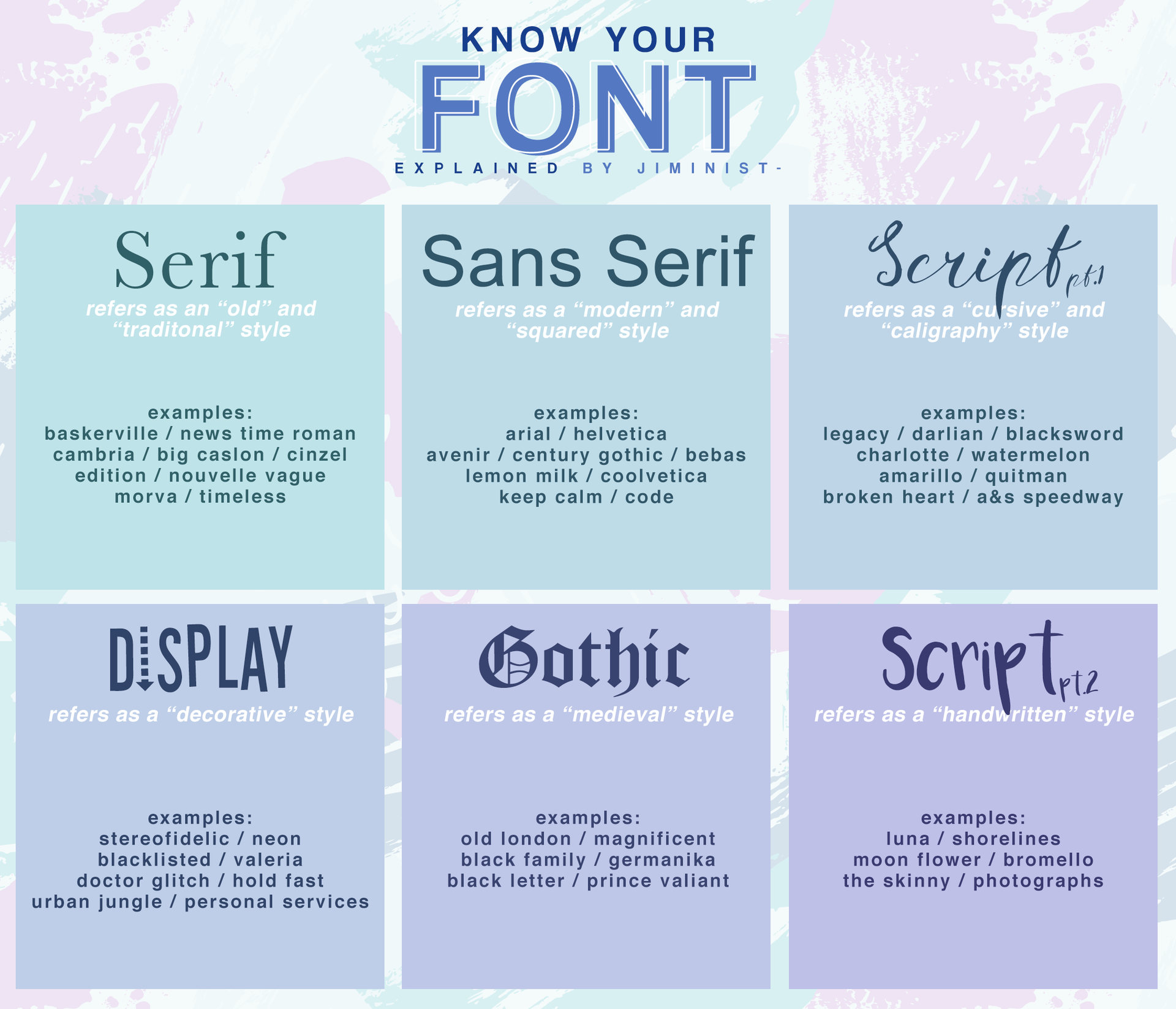
find a suitable font for your graphics as you don't want to use a cute-looking font on a horror themed graphic and vice-versa. so focus on choosing a font that suits the cover's theme, mood and overall look. fo example if you're making an angst/dark cover using serif or gothic and script particularly those that are the cursive kind will look better than a cute-looking font such as a script font with a handwritten style. but most of time any font would the covers as it matches the overall look since it's alright using san-serif on an angst/dark cover. i can't tell what fonts looks good on particular type of covers since it's up to you and you will just know if it's fits the overall look or not.
here's something i made explaining the different kind of fonts:

┈┈┈┈┈┈┈┈┈┈┈┈┈┈┈┈┈┈┈┈┈┈┈┈┈┈┈┈
suitable colour scheme
try to match colour to the background or your character(s) make it look good overall and stick to a theme. you can alway search on colour palette if you're stuck on what is colour scheme to do, you can search up things like "pastel colour palette" or "blue and purple colour palette" to help you
┈┈┈┈┈┈┈┈┈┈┈┈┈┈┈┈┈┈┈┈┈┈┈┈┈┈┈┈
know the limit if something is 'too much'
avoid putting too much stuff on a graphic such as too much textures, characters, colours, fonts, pngs and etc. especially if it's a cover as there is very limited space to add everything and sometime having too much of something can make your cover look crowded/messy.
┈┈┈┈┈┈┈┈┈┈┈┈┈┈┈┈┈┈┈┈┈┈┈┈┈┈┈┈
Bạn đang đọc truyện trên: Truyen247.Pro