How I make aesthetics

I receive a lot of questions on my aesthetics, so I thought maybe it's time I show you guys how I make them.
My process is very simple. I'm not even sure if I can call this a tutorial because I just use three free apps. Over the years I have made a ton of book covers/aesthetics and there are some little tips and tricks I picked up along the way (which I'll share with you). But my process is still total idiot-proof.
Even you can follow it (:
Where to find images
This one is no-brainer of course - Pinterest.
If you don't know what Pinterest is or how to use it, baby girl what you doing??? This app is an absolute must for an ~aesthetic~ Wattpad life (and also your future wedding preparations). If you're wondering where your favourite author got the picture for your favourite book cover – it is most likely from Pinterest!
I have elaborate boards on Pinterest based on the themes of my books (e.g. desi things, desi fashion, modest fashion).
It is a hobby of mine to casually scroll through the app when I'm watching something or listening to a podcast or whatever. I have been collecting and decorating my boards for years now, and because of this, it usually takes me like 10-15 mins to make per aesthetic.
I don't think I need to further elaborate on how cool Pinterest is, but I will give you guys one tip to improve and optimise your search:
• add aesthetic for better results.
Let's search for some muffin photos.
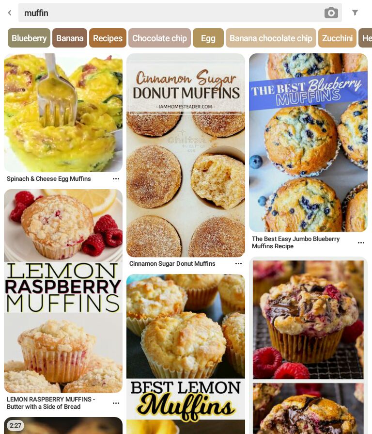
The results are pretty bland, right? Now let's add aesthetic to the word.
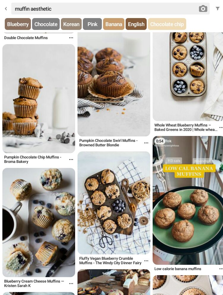
See the difference? Better results instantly.
How to choose photos
This is the most important step, you guys. If you don't use good photos that work together, your boards will not come together as you want them to.
There are two criteria my images need to meet when I'm choosing a picture for a particular board.
• it needs to fit the chapter/character I'm using it for.
• the pictures need to be coherent.
I do the latter by ensuring the pictures I'm going to use for one board has coherent colours and undertone.
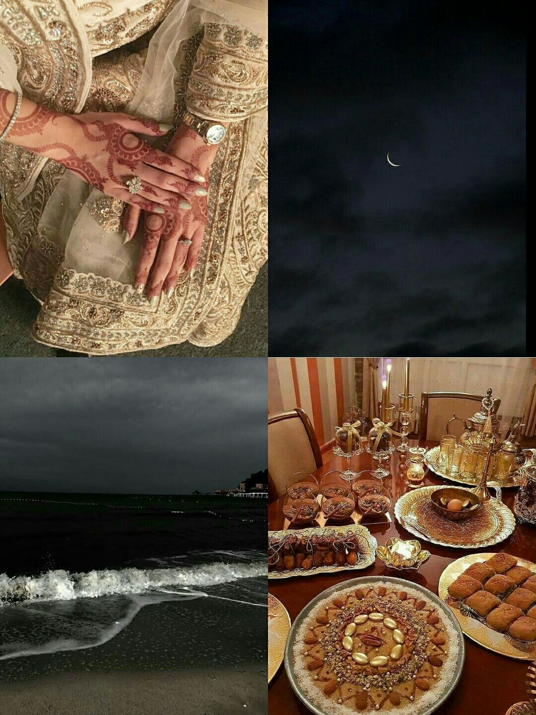
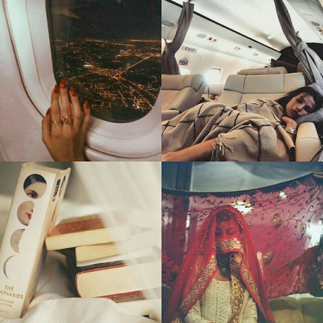
Here is a screenshot of my photo album where I have four photos for your better understanding.

We clearly have a fancy lady here. She loves to travel, likes to read books, liked to take naps in planes (relatable), and would you look at that - she's getting married.
Notice that all the pictures here share similar colours more or less - tan, white, some splashes of red and a little hint of orange-ish here and there. The palette works - and the undertone throughout is quite coherent too (all the pictures are warm).
Note: If you do not understand the difference between colours and undertones, just Google it!
I also often match two and two. An example would be this one.
We have two golden/brown pictures here and two black/grey. But they still work together, and that's what's important.
How to make aesthetics
I have my pics and I'm satisfied with them, now to combine them I use this app:
I always use a very simple four-grid layout. You can use whatever fancy layout you desire (this app has quite a few options). But this is what I prefer.
I also always keep the ratios of my character aesthetics 3:4.
Here is an example of a collage that is a standard 1:1.
And the same collage that has been formatted to 3:4.
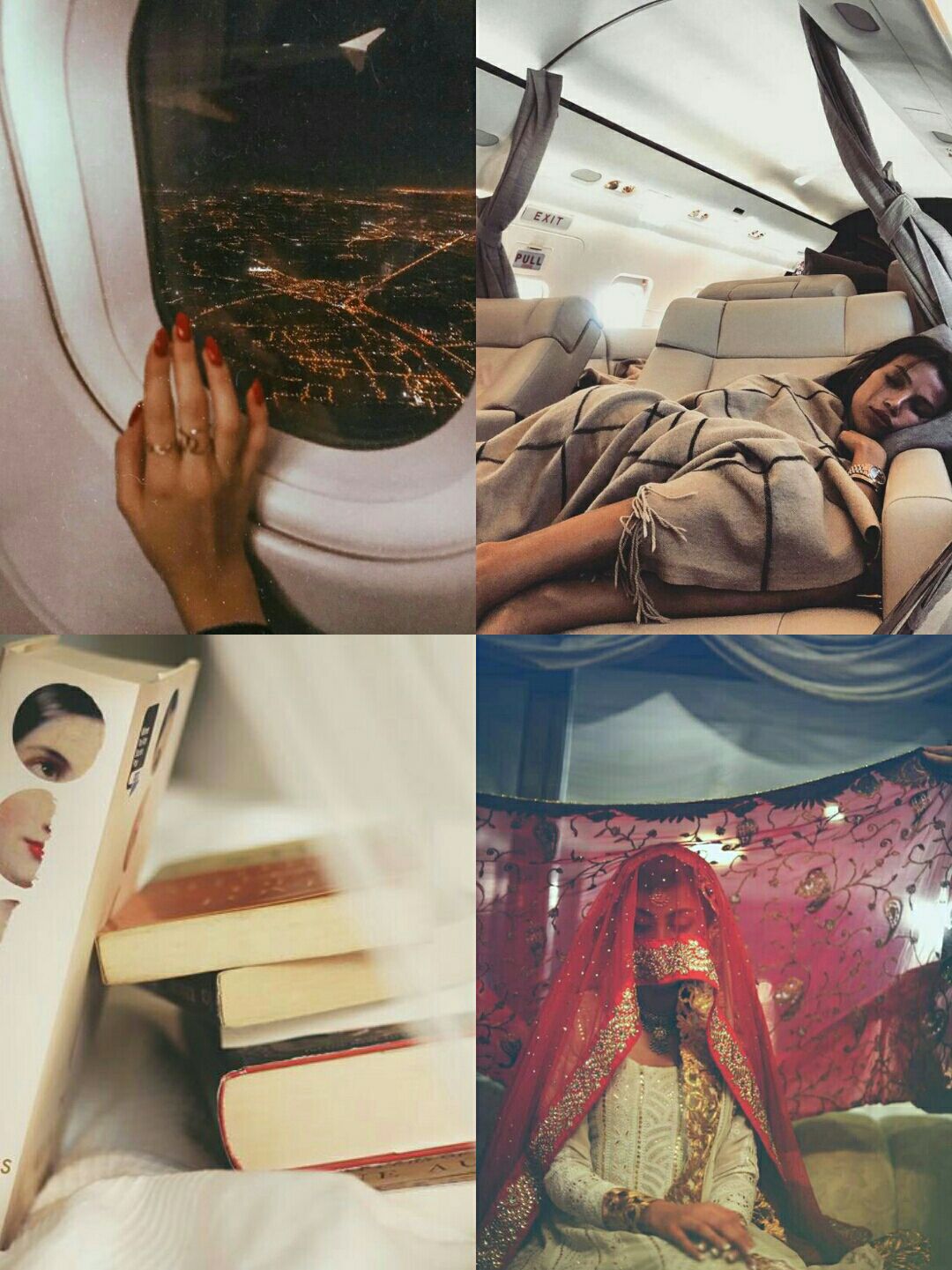
I'm not sure if you guys can see the difference, but I see a pretty significant one. The latter to me preserves the quality of the pictures better and makes them look more elegant.
In addition, if I want to add text and stuff, I use this app.
Guys, Phonto is my second Pinterest. It is not your average text app - it is so much more.
I make my page dividers with it, and also my headers and footers (like the ones for this chapter).
It is the coolest thing ever and I wouldn't even know what I would do without it.
Make sure you use high quality photos (Wattpad takes down quality a lot!) and just keep practicing. It is one of those things you get better at the more you do.
That's pretty much it, I guess. I think I covered everything. Hope you guys find this guide useful.
Till next time.
XO

Bạn đang đọc truyện trên: Truyen247.Pro