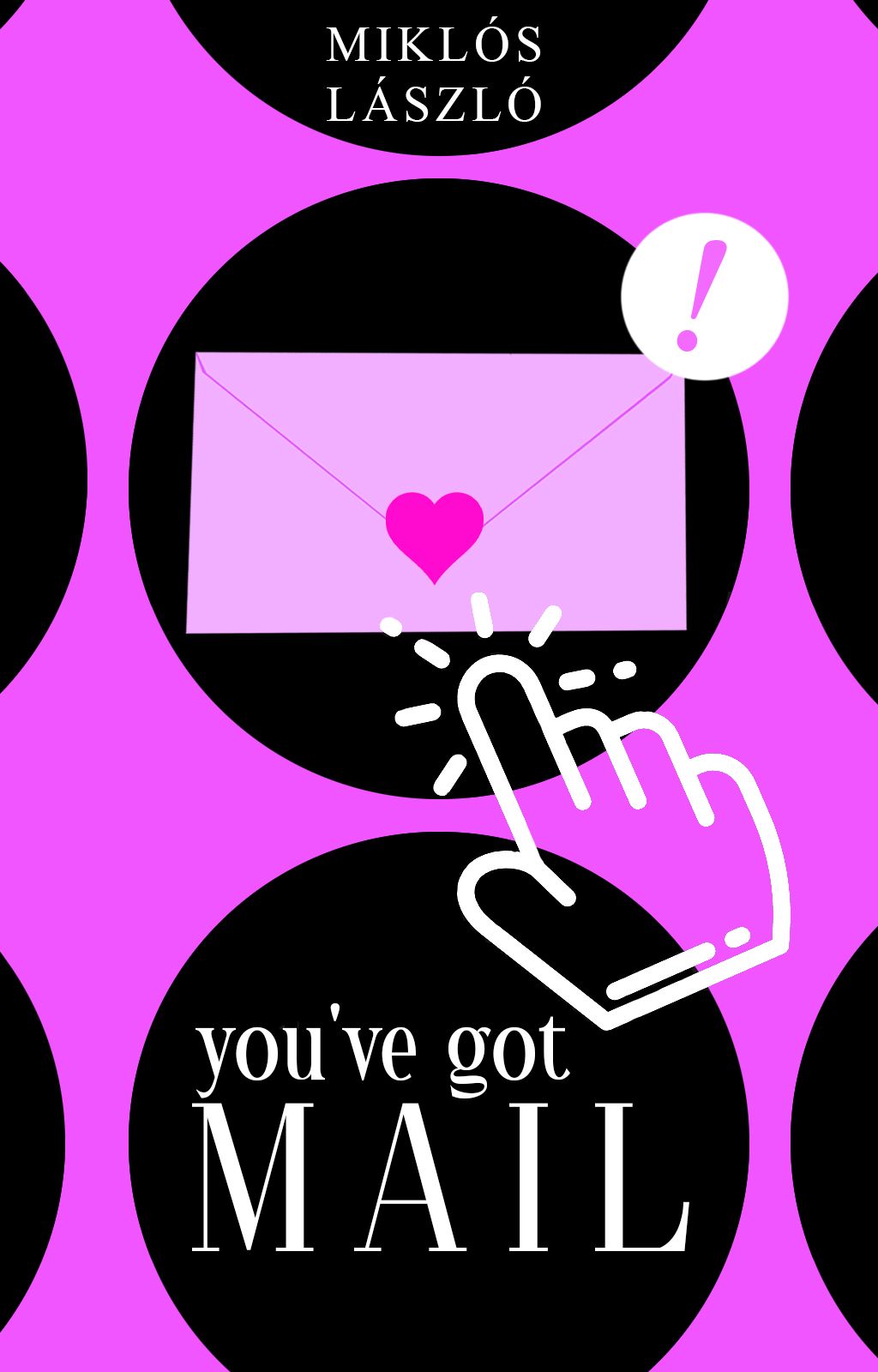
contest| you've got mail
Recently, I've joined a number of contests and duckdammit, am I nervous, terrified and excited at the same time.
One of the contests in question is a 10k reads celebration contest hosted by LadySnowdrop, to whom I congratulate once again on such a huge milestone!
The fate has decided on the prompt, so I've gotten the following directions:
Color scheme: black and pink
Genre: romance
Object: letter
If you've taken even a small glance at this portfolio, you've probably noticed there's no romance in here. Eirlys really did set a challenge in my path and maybe I did lie in bed thinking 'what the duck am I going to do'. But somehow I overcame that hurdle.
Before the cover reveal, I would like to thank _isabelle_b for suggesting something I would never think of (because a) the idea was brilliant, b) she is brilliant, and c) I avoid vectors almost like it's the devil himself). Thank you very, very much! <3
And now, ladies, gentlemen and fellow ducklings...
The entry.

Vectors in my mind represent something modern, simplified. When we think about it, a lot of stuff that we use are as simple as they could be for the sake of practicality. Good examples would be the operating systems of our computers and mobile devices. Big, simple, recognisable icons that are easily accessible and placed somewhere convinient.
Given object was a letter and genre was romance. I'd say there's nothing more romantic than getting a letter from someone dear to you, no matter how many words are in there. It's the effort they've put in to get that piece of seemingly meaningless paper to you. And just that effort makes it worth it.
This cover was a baby of modern and romance, and very much inspired by the movie "You've Got Mail". It's a movie about two business rivals who can't stand each other, but on the Internet they're two strangers exchanging emails and slowly falling in love with each other. I highly recommend the movie if you haven't watched it yet.
As far as the process goes, the technique was fairly easy, it was assembling the elements in a pleasing way without making it feel empty that was difficult. I tried to go for a browser kind of look, where you have all the bookmarks and notifications and other important stuff. When I've put it together, it felt like the letter didn't stand out as much as it should have. This layout was inspired by icons on the phone (you know how some phones display their icons with a circle around them? like that!). And as the final touch, I found a cute hand pointer and it filled up the space quite nicely.
I got carried away a bit. But I hope you enjoyed the cover!
What are your thoughts? :)

Bạn đang đọc truyện trên: Truyen247.Pro