Designer & Photoshop Tips (Belated 400 Followers Gift)
a/n: if you need proof of my severe procrastination problem, most of this was written in late march when I just hit 400 followers- HOW DID I GET ALL 550 (549,550, same difference. I spy you, unfollowers) AMAZING PEOPLE. oh, right. A follow is part of the payment for a custom request......
Anyway, here it is. The three-month late gift I never actually got around finishing.
400 followers- I can't even. And so, as a small gift, I want to give you some tips that will help you become a better designer, whether you use Photoshop, Pixlr, Gimp, mobile app(s), etc.
Please note that I'm in no way a professional, and I am still growing as an designer as well, and these are just a handful of tips that will help, especially with beginners. So tag all your beginner friends ^_^
p.s: I actually keep most of my graphic designing knowledge in an old notebook that used to be a notebook for English class. That's where I write some tips other people give and some of my favorite style settings, topaz settings, different dimensions, stuff like that. I find it very helpful. On with the tips!
💠Plagiarizing is a no-no
The number one rule of graphic designing. What do I mean, you may ask? DO NOT ERASE A WATERMARK TO REPLACE IT WITH YOUR OWN. Or, post a graphic that is not yours without proper credit. Or, something along those lines.
To understand the seriousness of this, it's one of the worse things you can do as a graphic designer. Do not claim a graphic/resource is yours without appropriate credit because you do not want an angry mob of designers chasing after your sorry ass.
Besides, if you are willing to dedicate the time to mastering your skills, eventually you'll be envious of your own artwork too.
💠Use pictures with high resolution
No one wants fuzzy images on their covers. High quality stock and resources are the way to go. This is usually what kills a graphic.
For example:
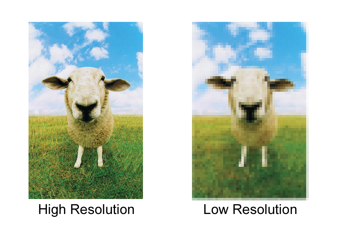
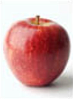
Whereas high resolution is more clear and professional like:

You see, if you want high resolution pics on something you found on google, it's actually quite simple. Maybe you just don't want that fuzzy picture of idk, an apple? Here's where you go.
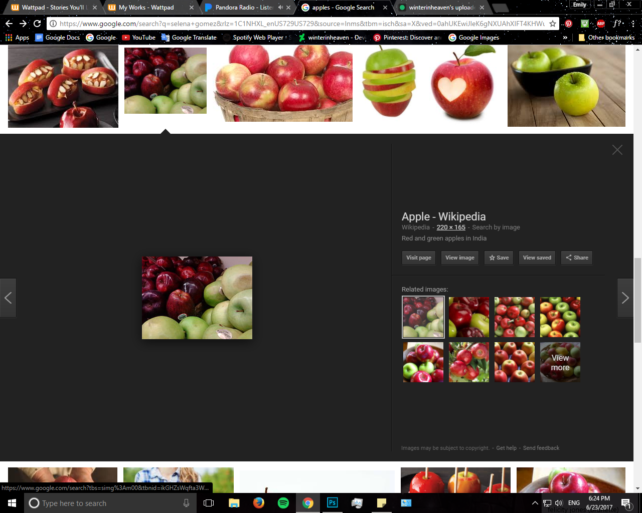
See where the mouse pointer is at, click it, and you'll receive a page of the same pictures, but with different resolutions.
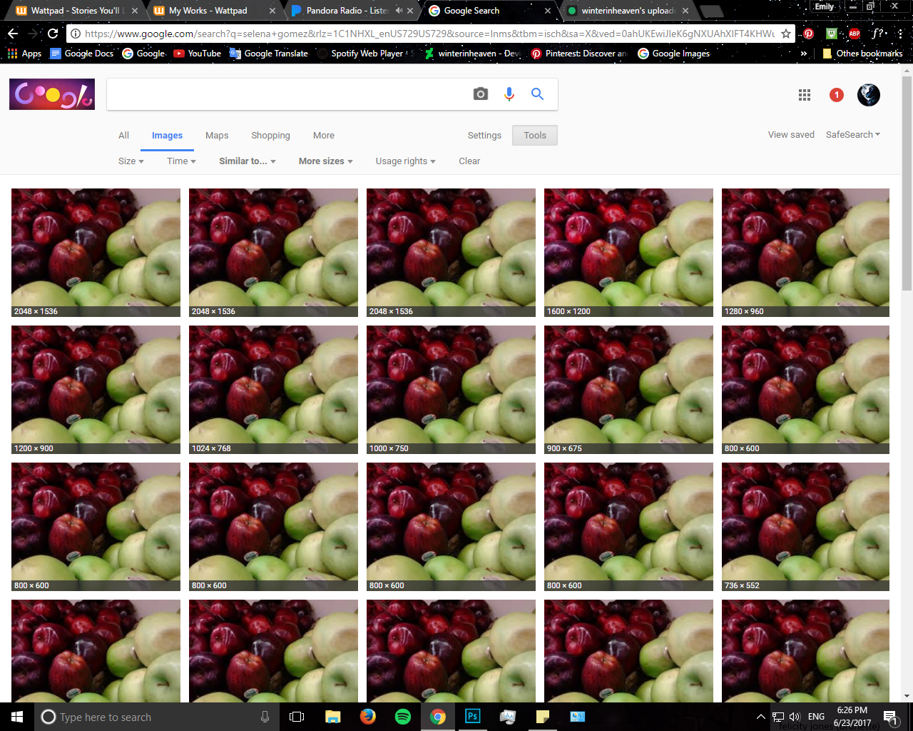
Go for the first result, which should have the highest resolution. And there you go, it's as easy as that.
Now if you are looking to assemble a photopack, or the results of a celebrity aren't promising, go on social media and search up their fan base. Fan bases often upload high resolution pics of a celeb- they're quite helpful.
If neither of the options are promising, here is just one of the many ways you can make a picture high resolution. (works only on photoshop, i think)
1) Go to Filter-> Sharpen -> smart sharpen
2) Increase the percentage amount to your liking and click OK.
It's as easy as that.
Otherwise, if you don't feel like doing that, play around with Topaz clean by adjusting the texture of your picture.
💠 Fonts and text style is important
Sometimes, the graphic is great and all...until it comes down to the font/color/placement. This matters just as much as the object of focus in the background.
see, a bad example of font usage is:

DON'T THROW UP- THE BUCKET IS RIGHT- oh, you made it. Thank goodness.
Anyway, this was made by me about a year or so ago with google drawings.... Yeah, you can already see the background isn't the best....but the text makes it hideous.
The colors for the font used does not match or fit in with the cover. Sure, sometimes you want the text to stand out, but not in a cringeworthy way. Also, don't make the same mistake I did. Try to limit your number of fonts to two, at most.
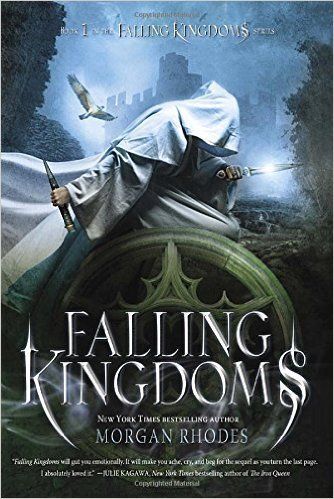
Now this one, you can see that it's stunning. The text effect causes the title to stand out but doesn't steal the main focus from the model. Everything about this font fits this cover and the color stands out, yet does not contrast in a way that makes your eyes inwardly cringe.
Of course, please don't overdo the text styles. Especially those that don't remotely match the color scheme. It might be tempting, but resist! If all other colors fail, use black/ white/ or gray.
💠 Don't be afraid to ask questions.
As almost all of my teachers have said, the way you learn is by asking questions. Most designers are nice and willing to answer some questions. Of course, I can't speak for everyone but don't be scared to try!
💠 Enter contests!
Contests are a great method to expanding your grpahic talents. Some prompts may force you to go out of your comfort zone and others may be just right. Besides, it also forces you to become creative and think of things outside of the box. Plus, it kind of promotes your graphics, especially if you win. You also receive criticism from fellow designers as well.
💠 Practice makes perfect.
Overused but true. Keep practicing and you'll get the hang of it. Find some time in your hectic week to practice, if you really do want to get better.
Now for some tips and tricks that will make your life easier for PHOTOSHOP- enjoy :)
🎲The Pen Tool
When I first started using PS, I never thought I'd get the hang of the pen tool- mainly because it seemed so confusing to me. But this makes one hell of a cutting tool. The pen tool is quite similar to the polygon lasso tool, except you can actually undo a mistake without redoing the entire selection.
Here's a helpful tip. When you use the pen tool, notice the small gear icon on the top? Click on it, and check the box for "rubber band." What this does is that you can see where the line is BEFORE you make a point. It's a lifesaver.
🎲How to cut out hair without erasing the strands
OK, so when you have a model with this:
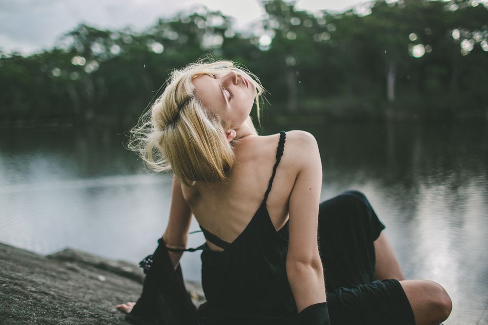
Chances are, you'll cut out the stray strands of hair when cutting the model out. And here is how you keep the model.
1) Use your preferred cutting tool (ex: the pen tool) and make a selection of your model WITH the hair strands.
2) Click on "layer mask" It should cut out the background and leave you only with the model.
3) Right click the layer mask and click "select and mask" for ps CC and "refine mask" I believe, for ps cs 6 ( I dunno, I use CC)
4) This will pop up.
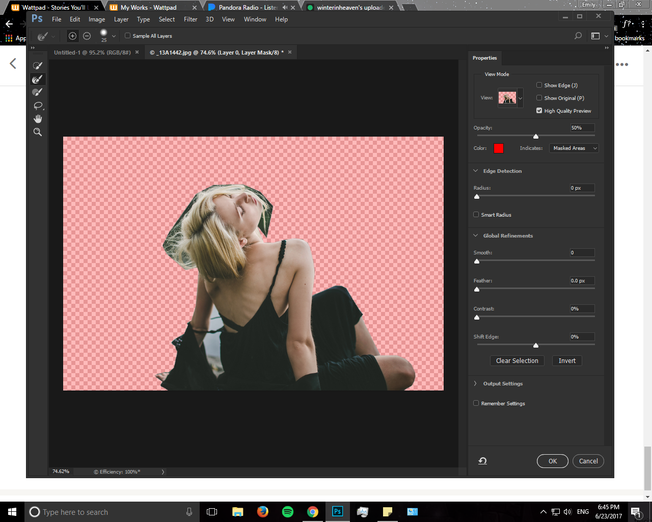
(Okay, not the red part, probably. That was adjusted by me with the opacity setting so I could see the difference.)
5) Click on output settings & unclick "decontaminate colors" and change output to to "layer mask"
6) Click on the brush icon I currently have selected on the left side, and go around the hair places.
7) To make the edges more smooth, play aroudn with the smoothness option between 2 and 10.
8) Click Ok. Then, right click layer mask and select "apply layer mask."
Result:
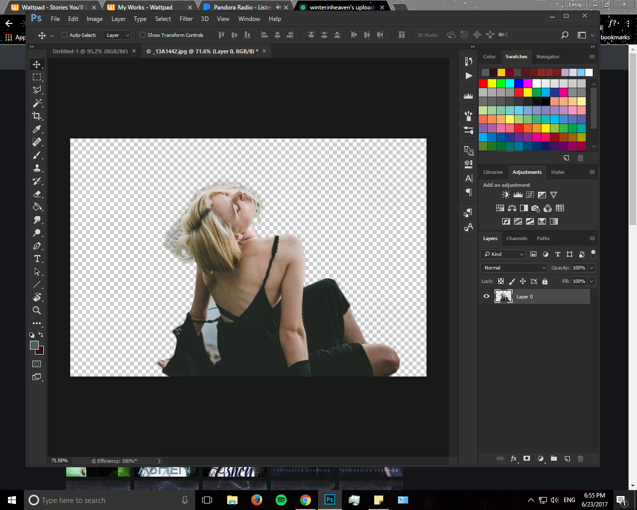
Play around with the eraser tool w/ low opacity to get rid of the remaining leftovers. I'm too lazy to finish cutting this out, so whatev.
🎲Commonly used dimensions (well, the ones I use anyway)
-wattpad cover: 512*800
-bookmark: 300*800
-header: 1920*600
-map: 1400*1600
-youtube banner: 5048*1152
-typical chapter banner: 1203*602 (quote banners, I guess)
-900*1000 (best used for chapter sections, like "part one" of the ROSE Project)
And that's it for now. Feel free to comment below any questions, requests, or tips.
Until then......
Bạn đang đọc truyện trên: Truyen247.Pro