Round Two: Entries
Here are the entries for the second round!
Most of you went for the two font titles

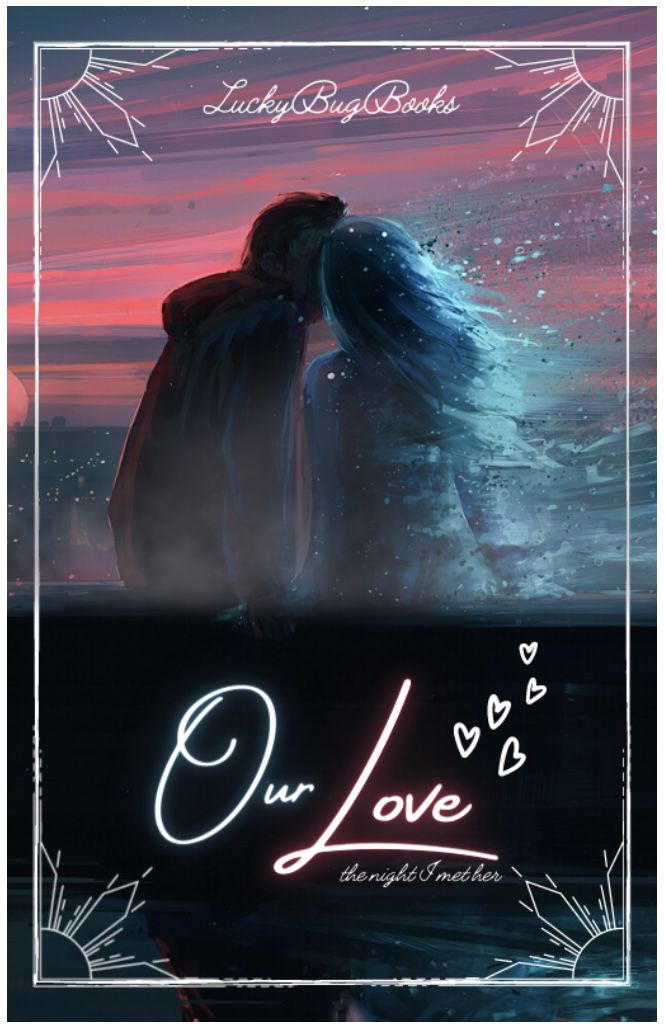
Typography~16 out of 20
I really like the fonts you used! The cursive fonts go really well together and tie in the romance theme! However, I feel like Lemonmilk isn't the best font for a romance cover (even the lightest version). It looks almost too blocky (or chunky) for me. I also feel like the text as a whole is too cramped at the top. There is space a little further down and near the bottom that the text could go to without affecting the main scene of the cover.
Quality~9 out of 10
I really like the image you used! It really stands out! However, it does get blurry near the light. I suggest you try enhancing the photo for better quality.
Colour scheme/Palette~10 out of 10
The colours of the picture work well and they tie in the romance theme as well as the making the main part stand out!
Overall Prompt Followed~19 out of 20
I love your cover! You stuck to the prompt really well and created a lovely romance cover! The picture as a whole stands out!
Overall comment:
I really like your entry! You made a really nice romance cover! Working on the points I've stated above would make it even better!
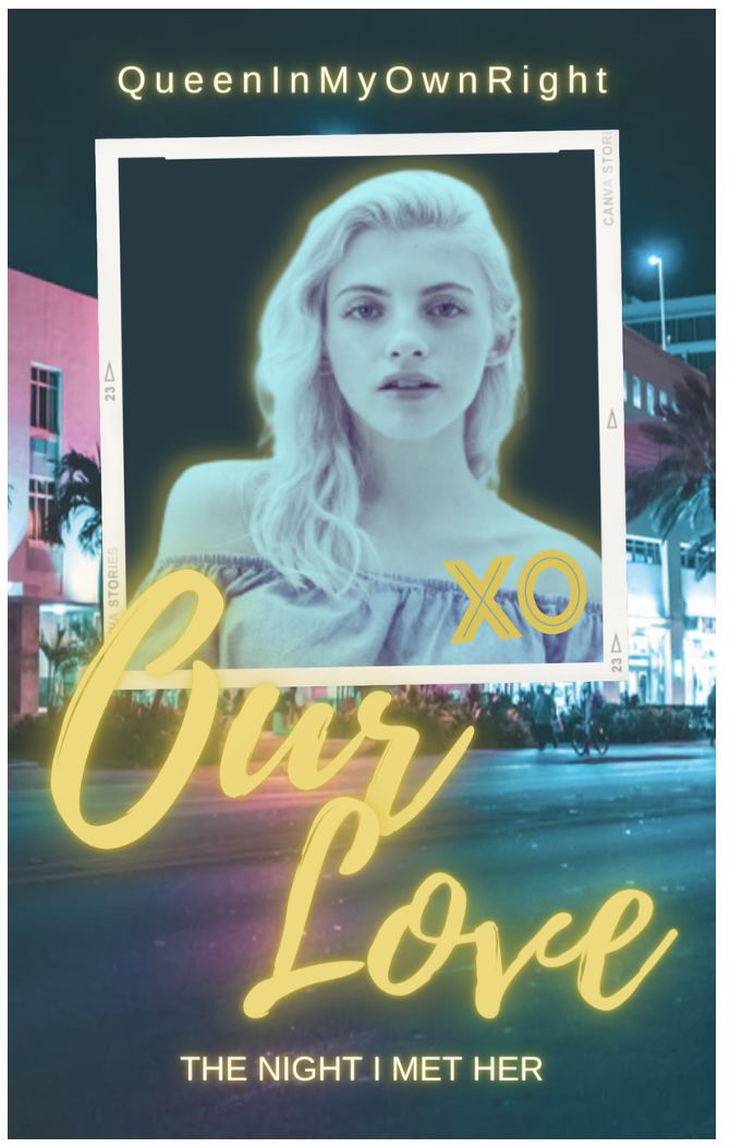
Typography~18 out of 20
I love the fonts you used! Both fonts really make it stand out and bring the romance theme out! The subtitle is a little small and a little hard to read. If it was a little bigger, your typography would have been perfect!
Quality~10 out of 10
Your images are extremely clear and they aren't blurry at all! They go really well together!
Colour scheme/Palette~10 out of 10
The colours work really well together and match the overall theme!
Overall Prompt Followed~19 out of 20
I love your cover! You stuck to the prompt really well and created a lovely romance cover! Everything works well together!
Overall comment:
I really like your entry! You made a really nice romance cover! I love the addition of the hearts above the title. If the subtitle was a little bigger; this would be perfect!

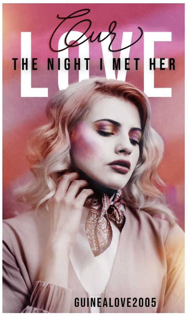
Typography~16 out of 20
I really like the placement of your text, it definitely makes it stand out! I feel like the fonts could have been experimented with more as they don't necessarily give me romance vibes. The title could have been a little bigger too (as your username is bigger than the title).
Quality~10 out of 10
Your images are extremely clear and they aren't blurry at all! They go really well together!
Colour scheme/Palette~10 out of 10
The colours compliment each other well!
Overall Prompt Followed~17 out of 20
You stuck to the prompt well! I just feel like it doesn't give me enough romance vibes!
Overall comment:
I really like your entry! I love the red beach background and the face claim! She does look a little too blended in. Working on this and the points above will definitely help it improve!
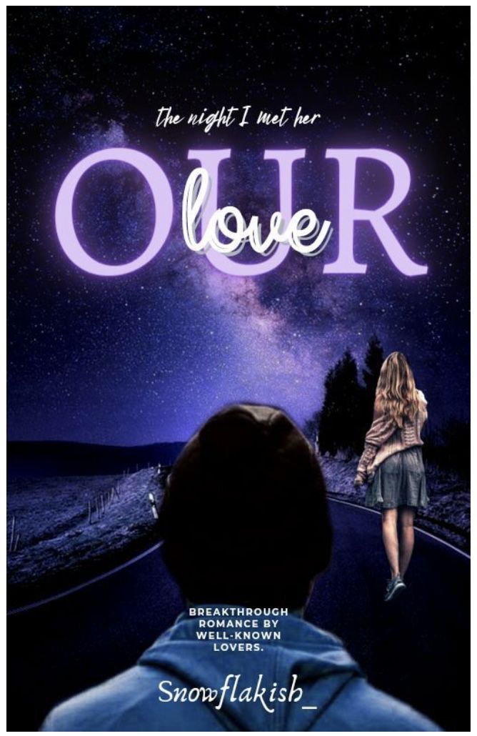
Typography~ 19 out of 20
I love the fonts you used! They go really well together and bring out a romantic vibe! I'd love was moved a little more to the left a little bit (so it didn't overlap with the r) this would be perfect!
Quality~ 10 out of 10
Your images are extremely clear and they aren't blurry at all! They go really well together!
Colour scheme/Palette~10 out of 10
All the colours go really well together and they all compliment each other!
Overall Prompt Followed~19 out of 20
I love your cover! You stuck to the prompt really well and created a lovely romance cover! Everything works well together!
Overall comment:
I love your cover! I love the background and how you put Neve into a Polaroid frame and casted her out a bit (if that makes sense, I don't know how else to word it). The XO could have maybe been on the actual frame but other than that, and what I mentioned above, there's nothing I can fault!

Typography~19 out of 20
Your fonts work really well together! The pink glow fits nicely with the background. I really like the placement of the title! The subtitle is on a good spot too!
Quality~10 out of 10
Your images are extremely clear and they aren't blurry at all! They go really well together!
Colour scheme/Palette~10 out of 10
All the colours go really well together and they all compliment each other!
Overall Prompt Followed~19 out of 20
I love your cover! You stuck to the prompt really well and created a lovely romance cover! Everything works well together!
Overall comment:
I love your entry! I know you said romance isn't your strongest genre, it still came out amazing! I really like how the roses came through the silhouettes, it was a really creative idea! I like how Caitie is stood behind the silhouette couple. However, she does look a little too blended into the background. The editing on the silhouette girls hair is a little choppy but other than that, you did amazing!
Typography~19 out of 20
I love the two font title! I really like the cursive font on our and how it goes into the capitals! The placement works and I love how the subtitle goes over the title!
Quality~10 out of 10
Your images are extremely clear and they aren't blurry at all! They go really well together!
Colour scheme/Palette~10 out of 10
The colours go really well together and they all compliment each other!
Overall Prompt Followed~19 out of 20
I love your cover! You stuck to the prompt really well and created a lovely romance cover! Everything works well together!
Overall comment:
I love your entry! I love the background and I love the picture you chose of Neve. I love the final product and there's nothing I can fault!

Typography~16 out of 20
I really like your font choices and the placement! I feel like the guns and grenade don't quite match the rest of the theme. The fonts of our don't match. The subtitle font is lovely and the placement is really creative!
Quality~10 out of 10
Your images are extremely clear and they aren't blurry at all! They go really well together!
Colour scheme/Palette~10 out of 10
The colours go really well together and they all compliment each other!
Overall Prompt Followed~19 out of 20
I love your cover! You stuck to the prompt really well and created a lovely romance cover! Everything works well together!
Overall comment:
I really like your entry! The blending is a really creative idea and it came out amazing! The border brings out a romantic theme and the silhouettes are a nice touch! I think I see the idea behind the guns and grenade and the way it formed love was creative. Working on the points above would make your entry even better.

Typography~19 out of 20
Your font choices are really good! The subtitle being in speech marks fits the idea of Vincent looking back at his memories of his love. I really like how our and love cross over with no clipping!
Quality~10 out of 10
Your images are extremely clear and they aren't blurry at all! They go really well together!
Colour scheme/Palette~10 out of 10
The colours go really well together and they all compliment each other!
Overall Prompt Followed~19 out of 20
I love your cover! You stuck to the prompt really well and created a lovely romance cover! Everything works well together!
Overall comment:
I love your entry! I really like the castle setting and girl is stunning and she fits in so well! I love the light smoke at the bottom! An overall amazing entry!
Typography~19 out of 20
Your font choices are really good! Again, I love the two font title you used! The placement is really good.
Quality~10 out of 10
Your images are extremely clear and they aren't blurry at all! They go really well together!
Colour scheme/Palette~10 out of 10
The colours go really well together and they all compliment each other!
Overall Prompt Followed~19 out of 20
I love your cover! You stuck to the prompt really well and created a lovely romance cover! Everything works well together!
Overall comment:
I love your cover! I really like the purple effect and how the title matches it. The editing is flawless and the overall look is stunning!

Typography~18 out of 20
I really like your font choices! They work well together and the placements work! However, I would have used a fuller font for the subtitle, but other than that, it's amazing!
Quality~10 out of 10
Your images are extremely clear and they aren't blurry at all! They go really well together!
Colour scheme/Palette~10 out of 10
The colours go really well together and they all compliment each other!
Overall Prompt Followed~19 out of 20
I love your cover! You stuck to the prompt really well and created a lovely romance cover! Everything works well together!
Overall comment:
I really like the creative route you took with this! The Polaroid frames with memories on/in are a really nice touch! I really like the small hearts and drawn effects. The only thing that doesn't quite fit is the gold line near Neve's mouth, other than that, it's amazing!
Bạn đang đọc truyện trên: Truyen247.Pro