Round One: Entries
Here are the entries from round one. The comments I made are below your entry.
The order of the graphics has nothing to do with the scores, it's just the order I received them/sent them to myself!
𓅓𓅓𓅓
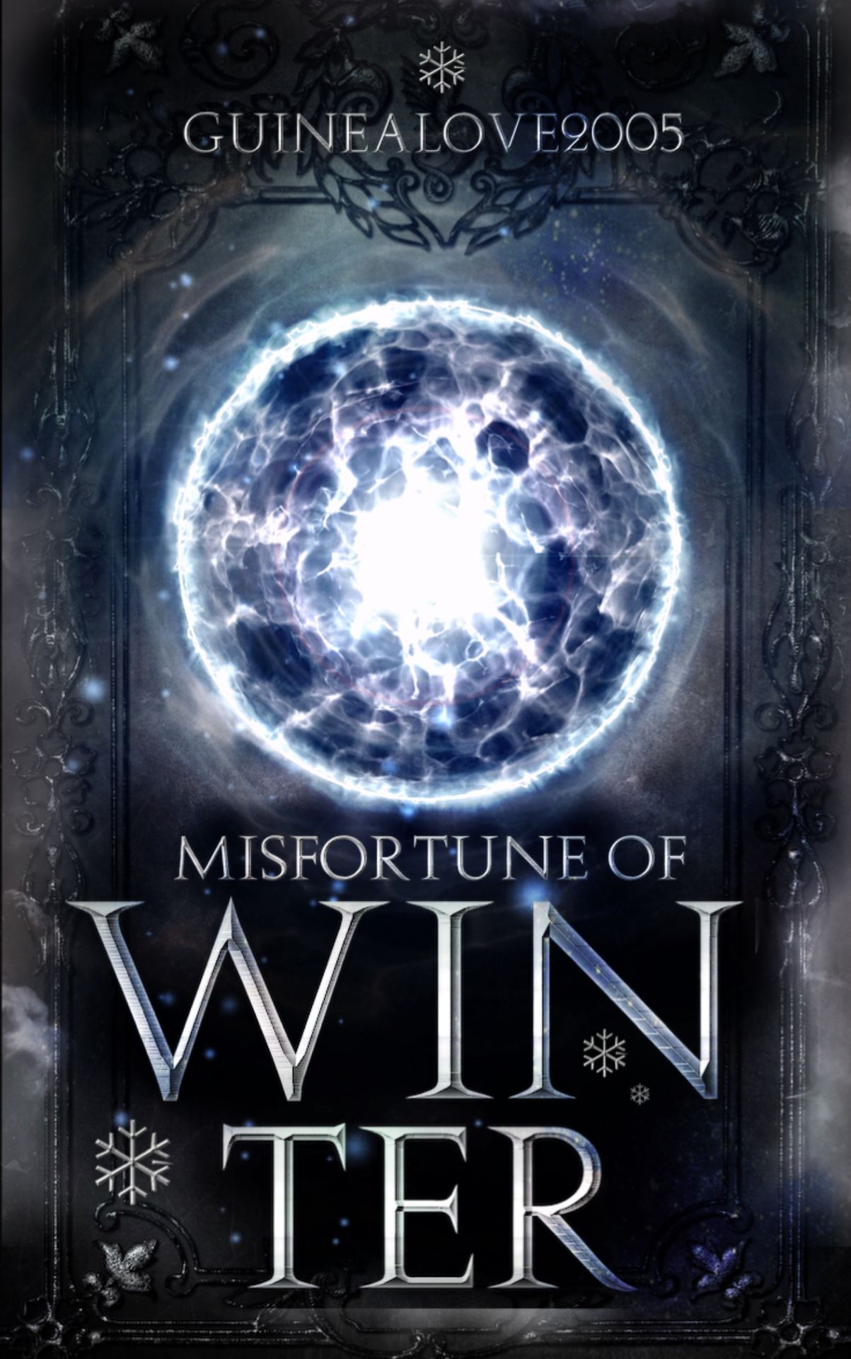
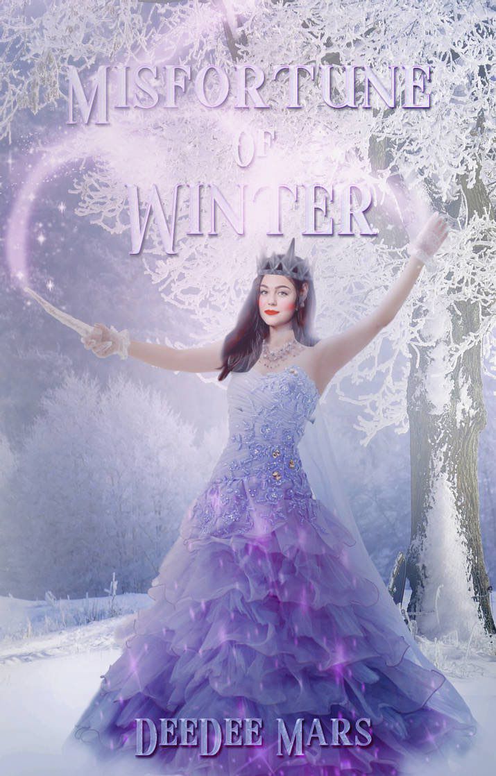
Typography~20 out of 20
Your typography is outstanding! I love the texture in the title as well as the overall effects. The text placement is amazing as it doesn't cover the main part of the cover (yes I'm assuming it's the sparking sphere in the middle). The font choice gives me fantasy vibes.
Quality~10 out of 10
Your images are extremely clear and they aren't blurry at all! They go really well together!
Colour scheme/Palette~10 out of 10
The white/silver palette works really well! The blue and silver bring out the fantasy genre!
Overall Prompt Followed~18 out of 20
The prompt was followed really well! One thing is that the subtitle was compulsory, however, there was no room for it so I understand.
Overall comment:
I love everything about this cover! It gives me so many fantasy vibes and I like how you didn't go too overboard on the winter theme! I love your border, font choices, placement, everything! There's nothing I can fault!!
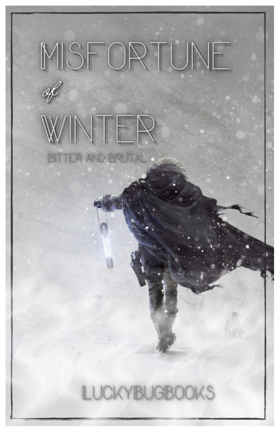
Typography~17 out of 20
I love the fonts you used! The capital font gives me fantasy vibes and I love it! I like how you used two different fonts for the title, it makes it really stand out! The placement of your title and subtitle is really good! One thing is that, the subtitle is a little hard to read because it blends into the background a little bit.
Quality~10 out of 10
Your images are extremely clear and they aren't blurry at all! They go really well together!
Colour scheme/palette~10 out of 10
The white and grey colour palette work together well. I love how the pale glow incorporates really well into the current colour scheme.
Overall prompt followed~19 out of 20
You followed the prompt really well and it gives me fantasy vibes!
Overall comment:
I love everything about this cover! It gives me so many fantasy vibes and I like how you didn't go too overboard on the winter theme! I love your border, font choices, placement, everything! There's nothing I can fault!!

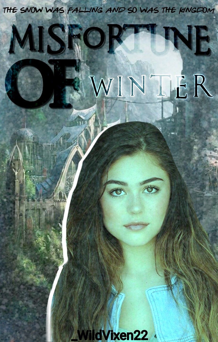
Typography~16 out of 20
I love your font choices! The capital font works well for fantasy and the calligraphy/handwritten font brings a sense of mystery! One thing is that the title doesn't really stand out. To me, it looks almost too blended in and it needs something to bring it out more! This could be something as simple as an outline to a shadow.
Quality~9 out of 10
The image is great but is a tiny bit blurry (I'm not sure if that's the photo itself or wattpad lowering the quality.
Colour scheme/palette~9 out of 10
I love the pale/grey blue. It definitely reminds me of ice.
Overall prompt followed~19 out of 20
You followed the prompt really well and it gives me fantasy vibes!
Overall comment:
I love everything about this cover! It gives me so many fantasy vibes. I like how you used an almost supernatural idea which brings out the fantasy even more! I feel like it would have been even better if the title stood out more. Other than that, there's nothing I can fault!

Typography~19 out of 20
Your typography is outstanding! I love how you used different fonts for M and W with the rest of the two words being calligraphy fonts! It really makes it stand out.
Quality~10 out of 10
Your images are extremely clear and they aren't blurry at all! They go really well together!
Colour scheme/palette~10 out of 10
The red and white work amazing together!
Overall prompt followed~19 out of 20
You followed the prompt really well and it gives me fantasy vibes!
Overall comment:
I love the subtitle and how you linked it back to the title as well as linking to your cover scheme! I love the red glow on the staff which brought back the fantasy. Also, I loved your face manipulation! They're so difficult and you definitely smashed it!

Typography~18 out of 20
I love your font choices! It draws attention to the title! The placement is really good!
Quality~10 out of 10
Your images are extremely clear and they aren't blurry at all! They go really well together!
Colour scheme/palette~10 out of 10
The pale blue and white work really well together!
Overall prompt followed~12 out of 20
The glow gave me fantasy vibes and the snow kept it linked to the title. However, there's no subtitle, which was compulsory. Also, I asked around and the person you used in the cover isn't either of the assigned face claims.
Overall comment:
I like how it gives me fantasy vibes and how everything links together. However, next time, I suggest you reread the prompt so you don't miss anything.
Typography~19 out of 20
I love your font choice! I like how you stuck to calligraphy and it gives off a different fantasy vibe. I love the writing on the hand. The placements are really good!
Quality~10 out of 10
Your images are extremely clear and they aren't blurry at all! They go really well together!
Colour scheme/palette~10 out of 10
The blue, white and silver work really well together!
Overall prompt followed~18 out of 20
I love how everything comes together to create a fantasy vibe! I like how you didn't too heavy on the winter theme!
Overall comment:
I love everything about this cover! I really like how your main focus is the snowflake orb. The faint glow on the crown brings it back to the fantasy genre. I'm not sure if the orb is meant to be behind the hand or if the hand is meant to be holding the orb. Other than that, I love it a lot!

Typography~19 out of 20
I love the effect you used on the title! It makes it really stand out and create fantasy vibes. I love the font you used for the subtitle, except, the z and heart are a little hard to read. The placements are really good!
Quality~10 out of 10
Your images are extremely clear and they aren't blurry at all! They go really well together!
Colour scheme/palette~10 out of 10
I love how all the blues and white work together! It really suits the cover!
Overall prompt followed~19 out of 20
I love everything about this cover! It gives me so many fantasy vibes. The glows and snowflakes link it back to the title!
Overall comment:
I love the shattered glass effect you used! It really makes everything stand out! Again, I love the effect on the text! I really like the flowers and butterflies on Mika's head. I saw you made two covers, and if I didn't have the specific face claim, I would have accepted the first one!

Typography~17 out of 20
I love the text placement! I like how they are out of the way of the crown! I like how misfortune has it's own line! I feel like, the fonts could have been experimented with more. I personally don't think Serif fonts work well with the fantasy genre.
Quality~10 out of 10
Your images are extremely clear and they aren't blurry at all! They go really well together!
Colour scheme/palette~10 out of 10
The blues, yellow and white work so well together!
Overall prompt followed~19 out of 20
I love everything about this cover! It gives me so many fantasy vibes.
Overall comment:
I love everything! I really like how the crown became your main focus. The glow around it brings back the fantasy. Again, I feel like the fonts could have been experimented with more but other than that, I love it a lot!

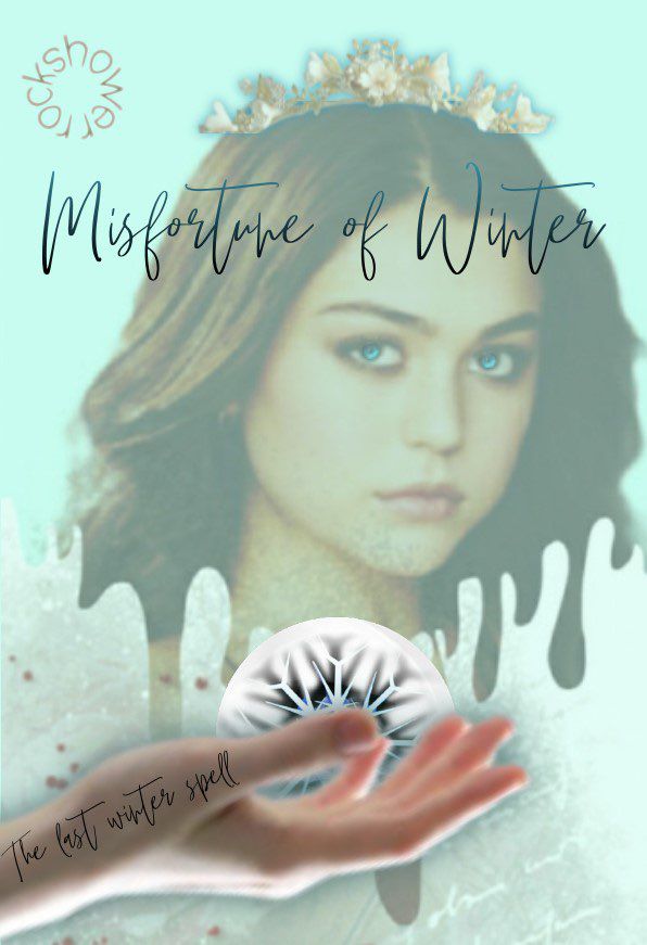
Typography~17 out of 20
I love the calligraphy font! The placement is good too! One thing, is that the of is a tiny bit hard to read.
Quality~9 out of 10
Your images are clear and they aren't blurry They go well together!
Colour scheme/palette~9 out of 10
The pale/pastel colours work well together. The faint glow brings the fantasy genre into it.
Overall prompt followed~14 out of 20
I like the glows. However, it doesn't scream fantasy. To me, it seems more like a romance or teen fiction style cover. There's also no subtitle, which was compulsory.
Overall comment:
I like the cover! However, the editing could have been smoother as there's lots of sharp edges around Mika. Other than that, and my points above, I like it.

Typography~20 out of 20
I love the fonts you used! The effects on the text make it really stand out! The placements are amazing and it really suits the cover!
Quality~10 out of 10
Your images are extremely clear and they aren't blurry at all! They go really well together!
Colour scheme/palette~10 out of 10
The blues and white go really well together!
Overall prompt followed~19 out of 20
I love your cover so much! It really gives me fantasy vibes! There's a lot of winter, but it works amazingly well with the cover!
Overall comment:
I love everything about this cover! It gives me so many fantasy vibes! I love the font choices, placement, everything! There's nothing I can fault!!
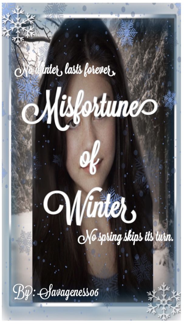
Typography~18 out of 20
I like the font choice! The placement could be better as the title covers Mika. I really like your subtitle choice!
Quality~7 out of 10
The background image, border and snowflakes are clear and not blurry. However, Mika seems stretched out.
Colour scheme/palette~10 out of 10
The pale blue and white work really well together!
Overall prompt followed~18 out of 20
I love your cover so much! It really gives me fantasy vibes! The snowflakes tie in the winter theme.
Overall comment:
I really like your cover! I love the winter theme with the sparkles. Like I said earlier, Mika is stretched and the editing could have been better as the edges are sharp. Other than that, I really like it!
Typography~19 out of 20
I love your font choice! The effect on your title is really good! However, the of is blended in with the glow from the wand trail.
Quality~10 out of 10
Your images are extremely clear and they aren't blurry at all! They go really well together!
Colour scheme/palette~10 out of 10
The purples and white go amazingly well together!
Overall prompt followed~18 out of 20
The prompt was followed really well! One thing is that the subtitle was compulsory. I love it!
Overall comment:
I love everything about this cover! It gives me so many fantasy vibes! Also, did you do a face manipulation? It really stands out! There's nothing I can fault!!

Typography~19 out of 20
I love your font choices! I really like how you put a slight blur on of. It makes misfortune and winter stand out a lot!
Quality~10 out of 10
Your original images are extremely clear and they aren't blurry at all! They go really well together!
Colour scheme/palette~10 out of 10
I love how well the grey/blue and darker blues go together!
Overall prompt followed~19 out of 20
You followed the prompt really well and it gives me fantasy vibes!
Overall comment:
I love everything about this cover! I really like how you blurred the background, it really makes the title stand out more!
Typography~18 out of 20
I love your font choices! The placement works really well! However, the parts of the letters that are on the lighter part (the top right) are harder to read.
Quality~10 out of 10
Your images are extremely clear and they aren't blurry at all! They go really well together!
Colour scheme/palette~10 out of 10
The colour scheme works really well!
Overall prompt followed~18 out of 20
You followed the prompt really well and it gives me fantasy vibes!
Overall comment:
I really like your cover! I like the white outline around one side. I would have definitely preferred it over the one side. Other than that, I can't fault it!
Bạn đang đọc truyện trên: Truyen247.Pro