ix: TEXT EFFECTS
Text effects. Today, I'm going to show you how to make your phonto text (on your graphic!) look cool in tons of easy ways, using just Picsart features. (These are just a few of my favorites, there are lots more)
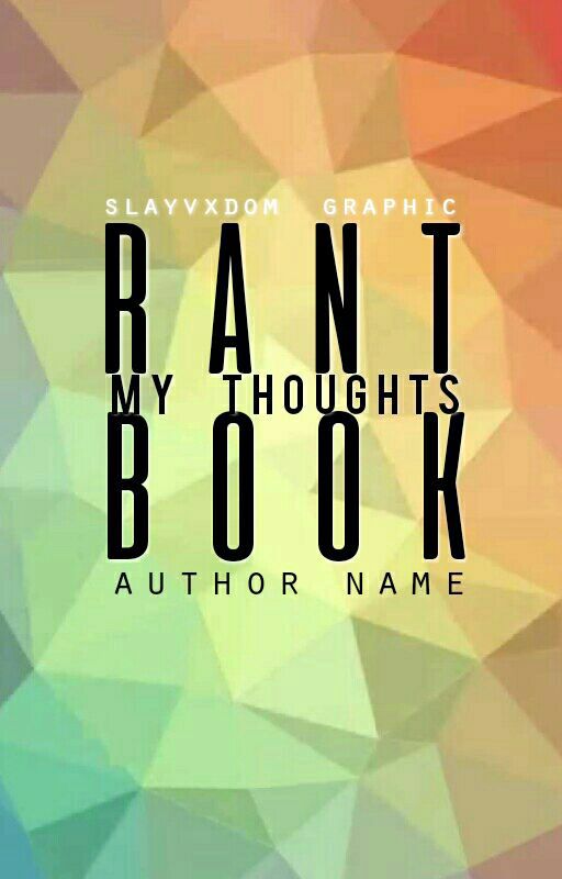
1. open up your Picsart app and go straight to edit with the graphic you just finished adding typography to using Phonto.
(I'm using the graphic below- one of my premades actually, haha)
THINGS TO REMEMBER
- Never use the stretch text effects on calligraphy-style fonts, nor the clone.
-
1st TEXT EFFECT - stretch
1. Click on tools, the second most left button on the toolbar at the bottom, behind add-ons
2. Hit stretch
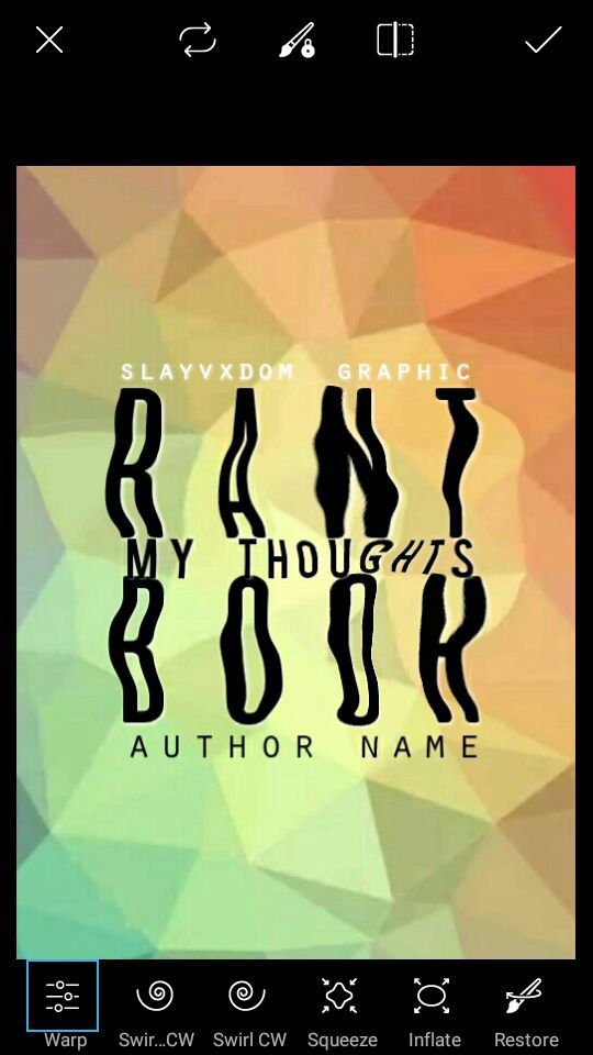
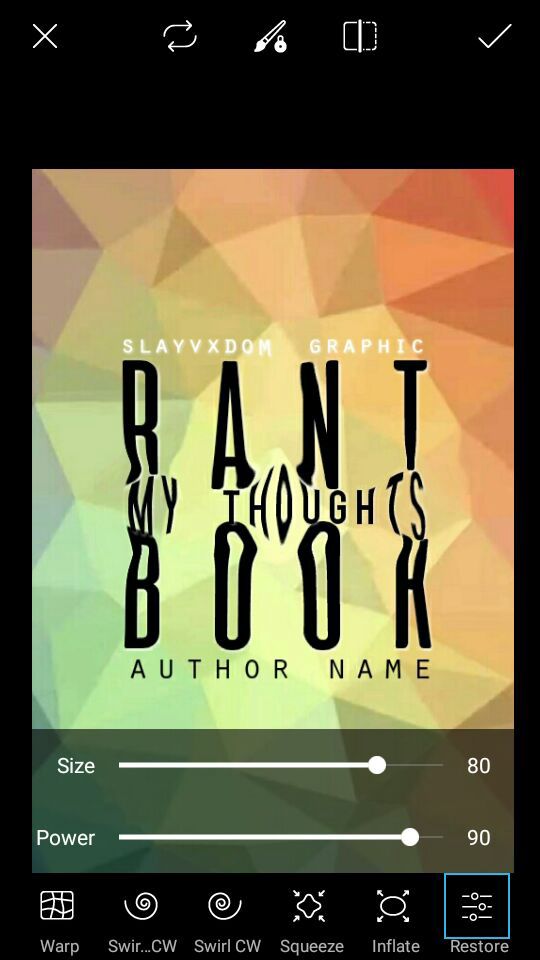
Play around with the features in stretch. There's warp, the one I used on the graphic (above), swirl, which has two different directions, squeeze, and inflate. I love squeeze & inflate because- ok, wait. I'm going to let you in on a lot of cool stuff concerning squeeze and inflate.
So I'm squeezing and squeezing my text, but then it ends up like this. Whoops. I love how the text in the middle looks, but ew, I can't stand the title words! What do I do know?

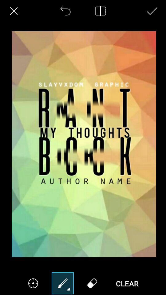
There's a brush on the end of the toolbar that says restore. Click on it. Then, use that to ''restore'' the former state of the title words, but keep the words in the middle by not letting the restore brush touch them. Below is how my words ended up.
Pretty cool, right? Alright, let's move on to the next text effect.
2nd TEXT EFFECT - clone
1. Hit tools on the toolbar at the bottom again, but this time, hit clone.
2. (this is pretty easy) Slide through the words. I'd recommend starting at a space and then ending at a space between the letters, but it's your choice. Either way, it looks pretty cool.
3rd TEXT EFFECT - selection / effect

1. Click tools once more, except this time press on ''selection''.
2. Once you get to the page, at the bottom the default is the square shaped selection brush. There's also a circle brush. I'm only going to be showing you the square/rectangle tool, for now at least haha.

Simply drag a line through the letters and then drag down. So don't have your original line be right through the center. After you've done that, let go. You'll see the circle/oval/square/rectangle you've created is immobile, waiting for you to do something. Up top, click on effects.
Now, just filter the selected area of text into whatever you want ;'') For my text, I used a pop art filter. Another effect I really like is inverse. Especially for a spy-type graphic.
4th TEXT EFFECT - texture on your words

1. Press ''add image''
2. Take your texture (some I'd recommend using are gold textures, lighting textures, just.. real good stuff lol) and place it on your words so that it covers it all.

3. Go to erase
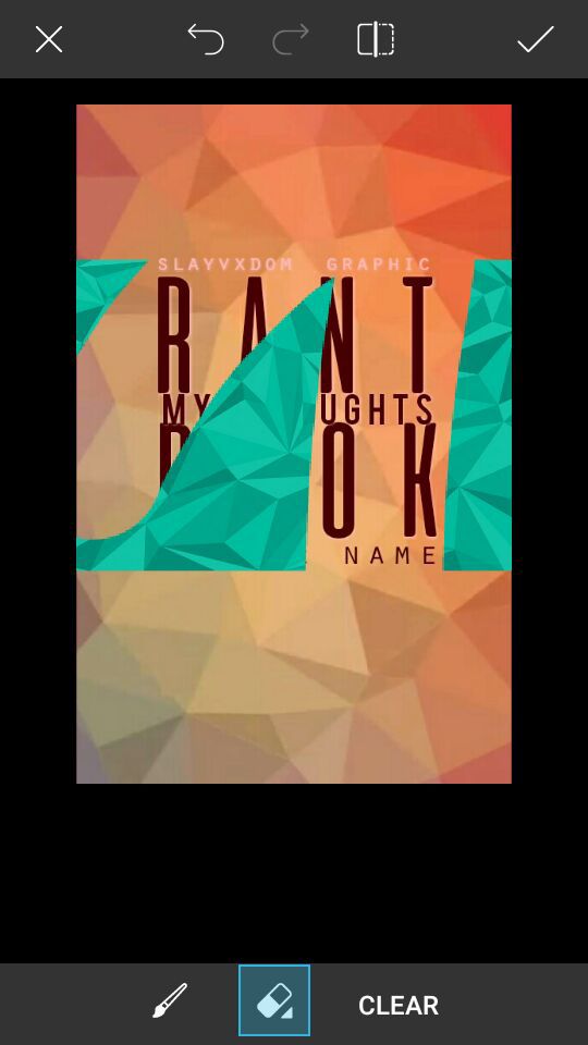
Erase it all, and by all I mean all. Don't leave anything. (the image above is just to show you that I was erasing it)
4. Now, after you've erased all of it, at the bottom tap the brush icon. Make your brush smaller & harder, and then draw over the words. It'll result in something that looks like the below.

Tips -
- If you plan to do this for a graphic, then use either white or black as the original text color. Those are shades that look like shadow colors, so if, (and this is likely) you don't cover it all up with the texture, the text underneath will look like a shadow. Or, at least, it'll look more natural.
Hope this helped you! Comment below if these tips helped you, if they were too confusing, etc.
Remember to vote & comment!
Bạn đang đọc truyện trên: Truyen247.Pro