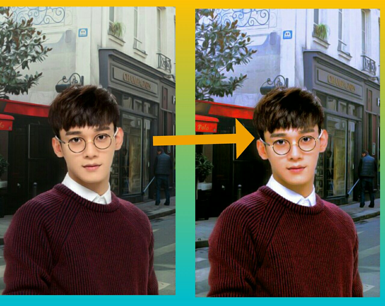
Effect PSD #2
(I already made the cover that's why there will be no changes through the screenshotted tutorial.)
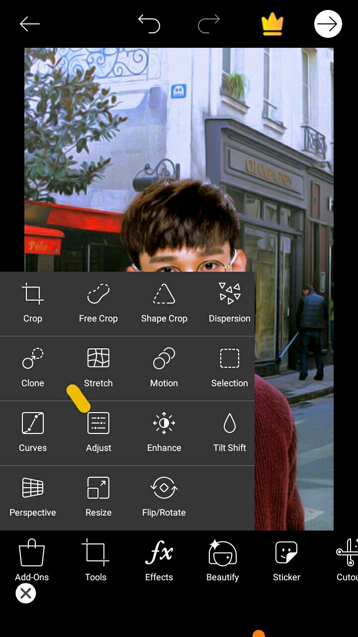
Go to adjust
Important
Highlight
50-%
Shadow
50+ %
Saturation
15+%
Contrast
20+%
Clarity
20+%
Hue
(Up to you)
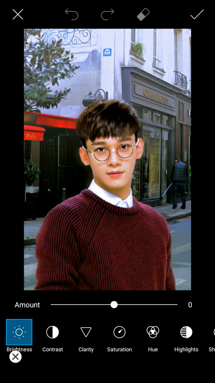
Next, go to curve
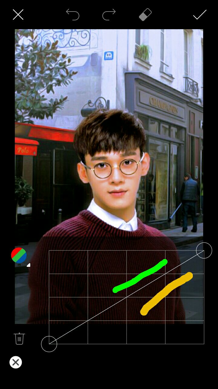
The one means your making the picture lighter, the yellow I highlighted means you'll be making the photo dark.
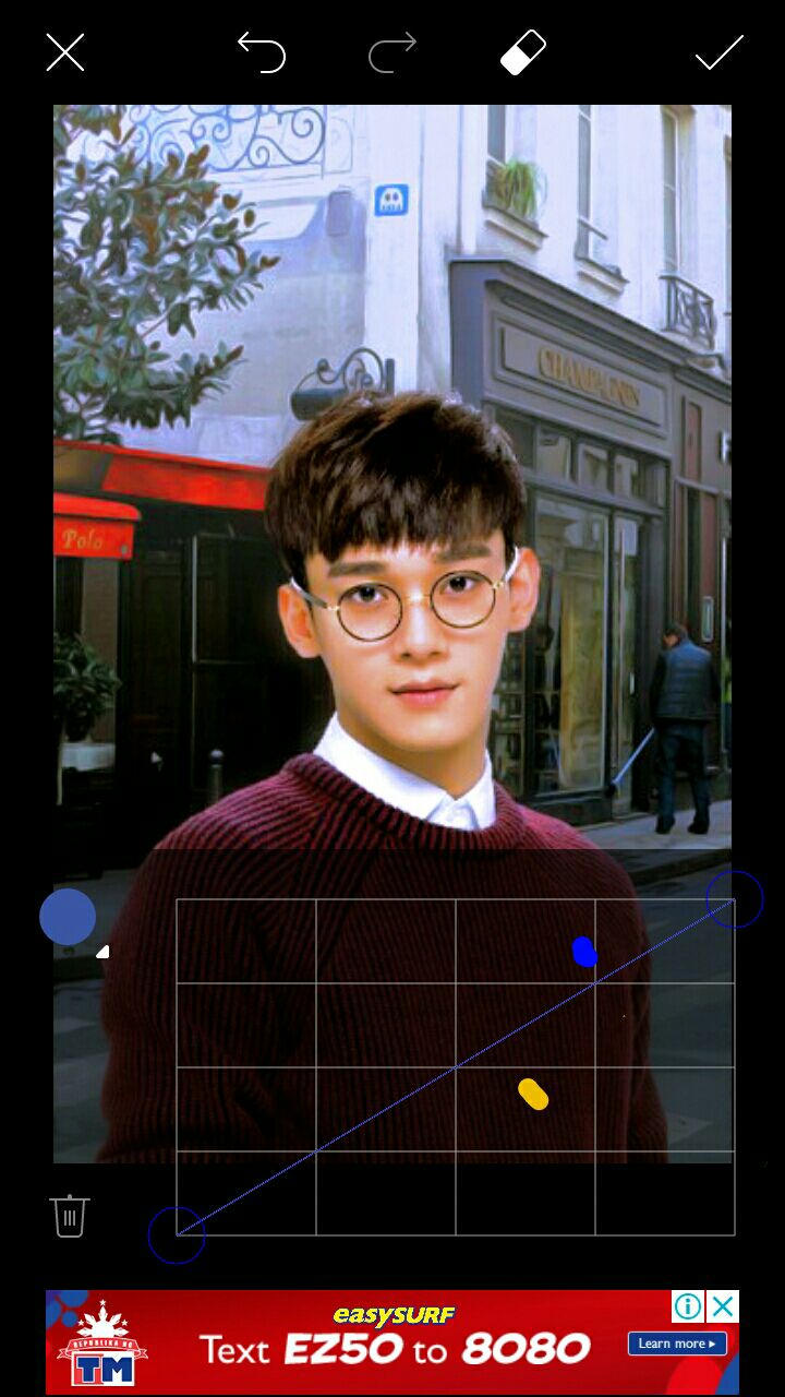
The blue will make the photo blue. It will make the red stand out as well.
Then the yellow, would make the photo yellow.
Both color will combine in places you want it.
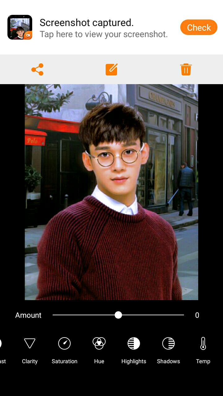
And that's it!
✨Please Vote✨
Bạn đang đọc truyện trên: Truyen247.Pro