
Contest #1 Results
You all amazingly well in our first contest here. But, there are some that stood out way farther than the rest.
So let's give the spotlight to them, shall we?


I
really loved the blended textures you used here. They're pretty and they work together. Although, the vibe of this piece didn't really match the relaxed yet fun type of graphic I was going for in this contest. Overall, you did a great job!
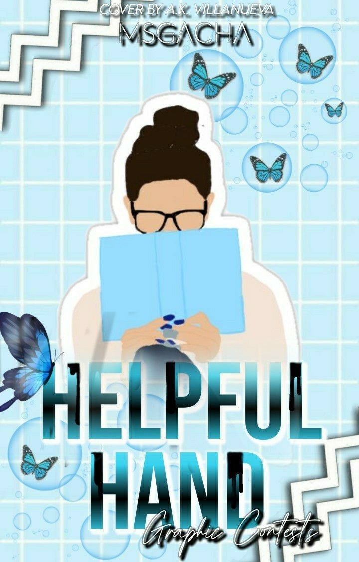
Well done on transforming this template. Vectors are very common, buy they're also not quite easy to work with. And because of this, I commend you for your efforts in pulling of the look.
The butterflies and the zigzag stickers really work well with the vector, but the bubbles... Not so much. When it comes to the use of shadows, that could use some practise. To make this a bit better, I suggest adding a light shadow under the bubbles, a little stronger one under the butterflies and one under the vector.
When it comes to font choice, I really like what you used for the first two words. It was very clear and easy to read. But the last two words were too dark and covered by the blackness of the shadows and the stroke. Maybe use a thicker font, but not too thick. The shadow could possibly work, but there was too much stroke.
Overall, you did great! Your interpretation of my contest's vision is beautiful!

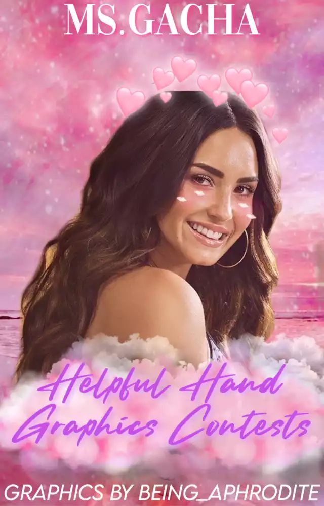
One of the things I like about this is that it really matches the current color scheme of the contest.
It's relaxed, welcoming, and still looks fun. The only things I would like for you to note is:
1. Fonts - remember to use the least amount of fonts as possible to keep things looking neat. It could've also worked if you made "Ms. Gacha" in the same font you used for your watermark.
2. Text Visibility - the font choice of your title is commendable. Although, readability wise, it can be improved. The color you used was a bit too bold, and wasn't really easy-going with the pink cloud behind it. And, it was a tad too small to easily be seen. To fix this, I suggest making the cloud a bit bigger, and making the text white with a purple shadow instead.
But in spite of all that, you're work is outstandingly good. Keep these things in mind and I'm sure you'll be the one to beat next time.

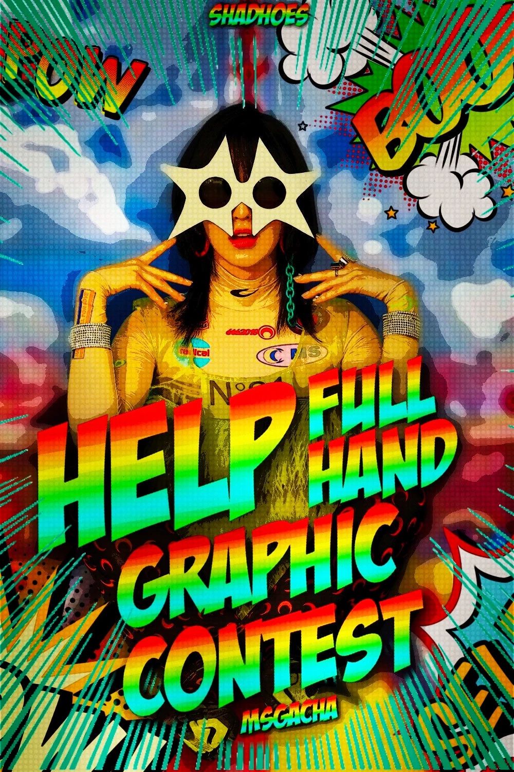
Finally, our winner! Congratulations, you did amazingly.
I love how the colors pop, and the 80's comic vibe you pulled off. It's really fun and colorful, exactly what I was looking for.
I really like how you singled out the word "help". It really emphasizes the very purpose of these contests.
If there's one thing I'd like to change, it would be the heavy amount of contrast. It could be toned down a little, so our eyes don't get blinded by its glory.
As I've said before, you did amazing! Job well done ❤️
---------------------------------
Thank you to everyone who joined! And, don't be discouraged if you didn't win. Remember, it takes a lot of loses before you can earn a win. So keep on working hard, and even when you feel you're at the bottom, you'll eventually work your way to the top!
PS, I'll be updating the graphics to work with our new cover by Shadhoes!!!
Congratz to all our winners ❤️❤️❤️
Bạn đang đọc truyện trên: Truyen247.Pro