kerozeo
-Vellichor review for @kerozeo
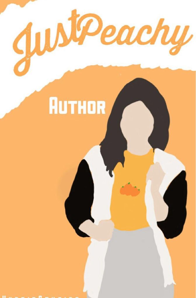
CONS:
• The vector is very choppy.
• This is not the proper wattpad cover size.
• The placement of the authors name is kind of awkward.
• The 'Just' and 'Peachy' don't look right touching.
• The white isn't appealing because of the curve.
• I don't like the font you used for 'Author'.
• I think the girl would look much better centered and maybe with a white outline.
PROS:
• Good color scheme.
• I like the font.
WHAT TO FIX:
• Make the vector smoother around the edges of each color.
• Place the authors name in a different place.
• Space 'Just Peachy' farther apart.
• Use the correct cover size.
• Change the font for the Author.
• Center the girl and give her a white outline.
• Straighten out the white and 'Just Peachy'.
• Maybe use a ripped paper effect instead of the white.
• Change the color of her neck.
OVERALL:
There are definitely some things that need improvement: 6/10

Bạn đang đọc truyện trên: Truyen247.Pro